The 4 Most-Common Design Portfolio Mistakes
You’re reading Creating a Standout UX/UI Design Portfolio: The Ultimate Guide. Quickly navigate to other chapters:
To make a portfolio that truly stands out, the first step is to avoid 4 common mistakes that plague so many UX/UI design portfolios.
To create a top 1% design portfolio, go one step further: do the opposite of these mistakes, turning them into strengths.
I’ll give advice on just how to do that along the way 🙂. Let’s dive in.
The most common portfolio mistakes
Here are the most common product (UX/UI) design portfolio mistakes:
(You can read them all or skip around, no problem 😎)
I’ll also talk about practical strategies for fixing each.
Portfolio mistake #1: Poor visual design
If you are (or want to be) a product designer, a UX/UI designer, or an all-purpose UX designer… visual design is part of your job.
So if you can’t make your own dang portfolio look good, hiring managers will (rightly) think twice about it! 😬
Even for less-than-highly visual roles, the truth is: your book will be judged by its cover. Bad visual design can rule out a portfolio almost instantaneously.
Visual design takes time to master (I have a 36-hour video course on it!), but we can address some common mistakes fairly easily.
Example time! Here’s a quintessential “bad visual design” portfolio 🙈
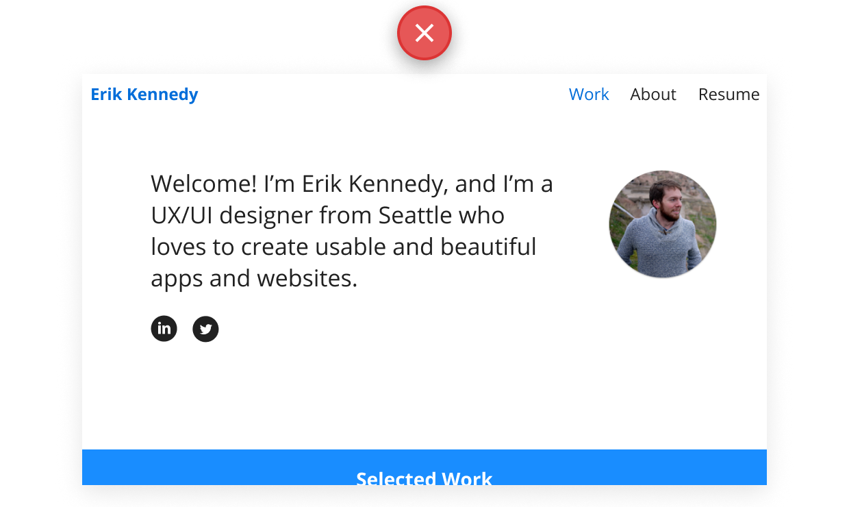
What’s wrong with it?
- Overused font. This is Open Sans, the vanilla-but-not-even-crisp-feeling font topping the Google Fonts charts.
- Overused color. A plain blue, the most boring color in the world. Are you the most boring designer in the world? 🤔
- Unconsidered details. The selected “Work” contrasts less than the unselected “About” or “Resume” 🤦♂️ (more on this). The pitch-black social icons are too heavy compared to the text above them 😱
- Overly-simplistic concept. Everything here (text, images, icons from an icon set) is easy to do in Figma. That means it’s common, you see it everywhere, and it doesn’t leave an impression.
- Totally boring logo. It’s a smaller thing, but writing your name in Open Sans certainly doesn’t speak wonders about your creativity 🤷♂️
OK, so being critical is easy. How do we fix these things? Many possible ways – here’s one:
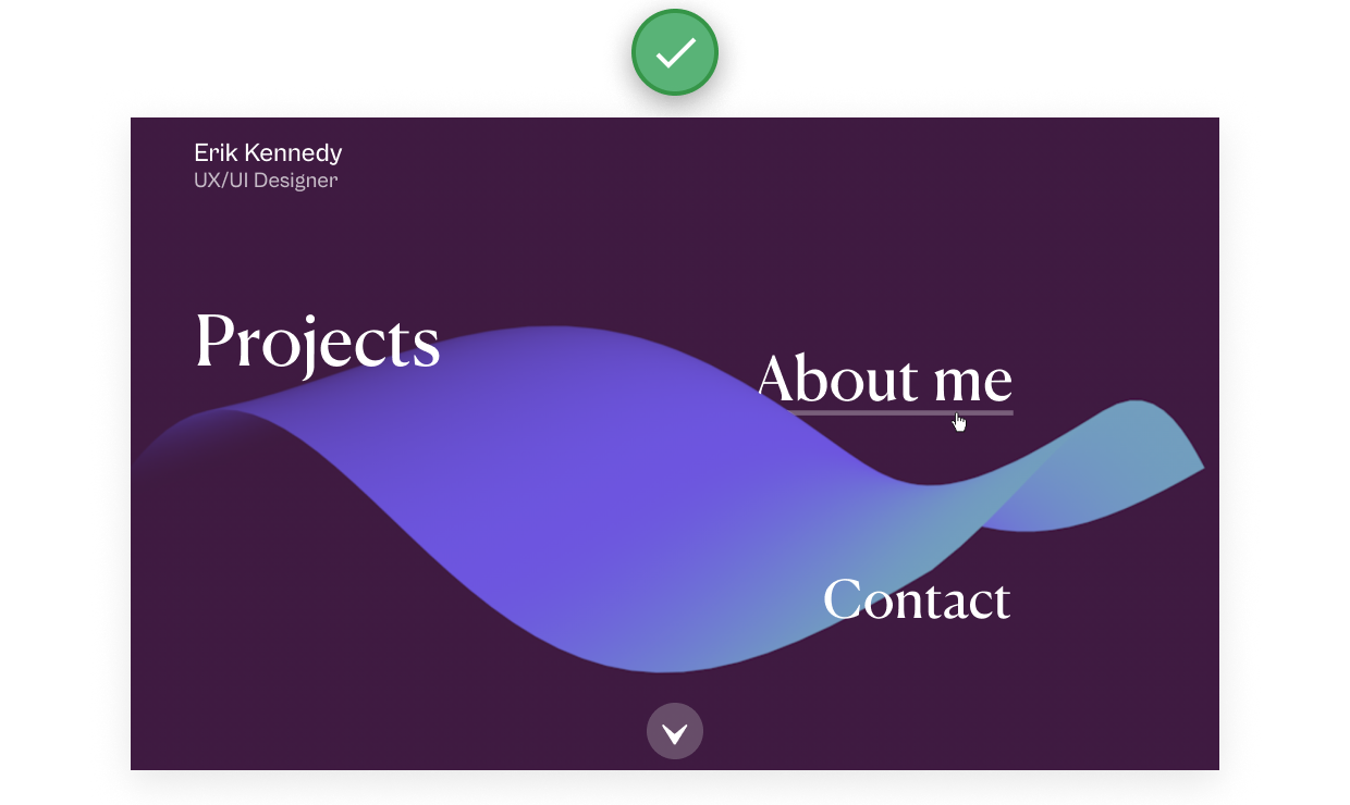
What’s better about this concept?
- Interesting visual concept. The 3-D carpet isn’t crazy complex to do in a 3-D program, but it’s Hard to Do in Figma™️, which means it immediately feels fresh and different.
- Tasteful font. The flared quasi-serifs of Canela feel elegant.
- More interesting colors. A rich purple background. A gradient of blue across the 3-D carpet. Nothing crazy here. Almost anything is better than solid blue rectangles.
So now, ask yourself. If you were hiring a designer, and you received the two portfolios above?
- What would you assume about each designer?
- Who would you hire?
In this series, I’ll talk more about “starting with a (visual) splash” and making interesting case study displays, but at the highest level, having excellent visual design starts with determining your brand.
(I’ve actually got a 42-minute video tutorial on that 😎)
What should the brand of your portfolio be? The short answer is: any brand is OK, as long as you can explain why it makes sense.
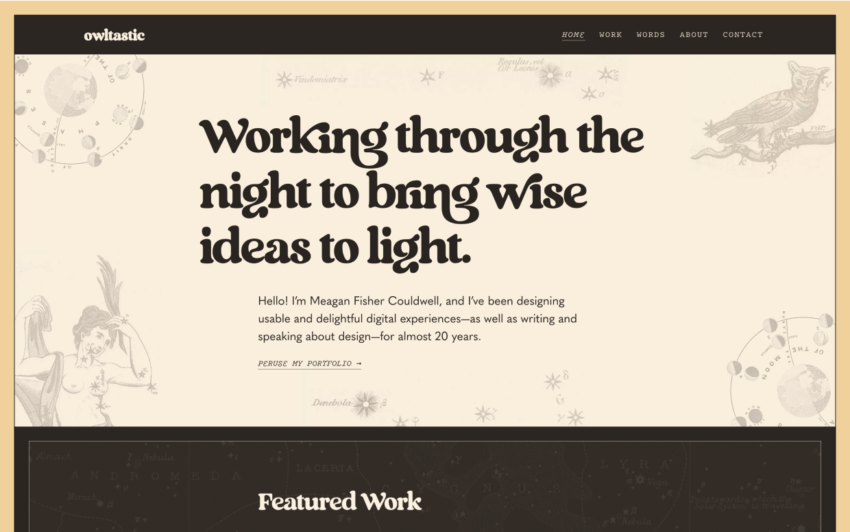
You could go for a very strong brand, like Meagan Fisher Couldwell’s portfolio – which is astrological and retro.
You can also have a very neutral brand, like Grace Walker’s portfolio – which is clean and simple:
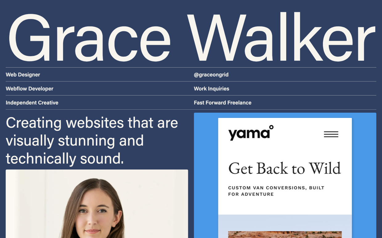
Both look fantastic. Both show skill in visual design.
Once you determine you determine your brand…
- You can use it to pick fonts with justification
- You can pick colors that make sense
- You can add visual motifs that tie everything together
Enough on that. Let’s move on.
Portfolio mistake #2: Overemphasis on process (& deliverables)
Way too many product design (UX/UI) portfolios are a tour de deliverable. They focus on the process, not the results 😬
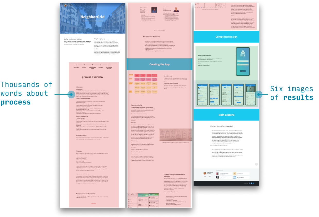
The most common way of talking too much about process is simply listing one deliverable after another.
They’d win at this game 🙃:
But the internet is littered with design managers admitting the process-heavy writeups aren’t useful.
Do you know why? Listen closely:
If you can achieve the results, it’s expected you know the process. If you can’t achieve the results, it doesn’t matter how much process you know!
In the section on great example portfolios, we’ll look at how to talk about process without simply descending into UX buzzword bingo.
Portfolio mistake #3: Too much text
I was guilty of this in the earliest iteration of my portfolio. Look at this beast of a read! 😬
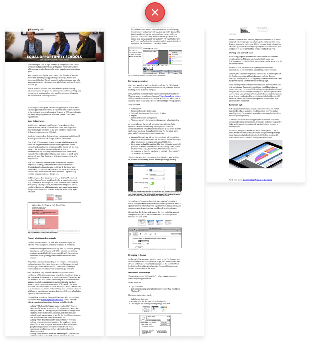
Fortunately, the solution is easy: include less text, you dummy! 🤦♂️
(Here’s my current portfolio)
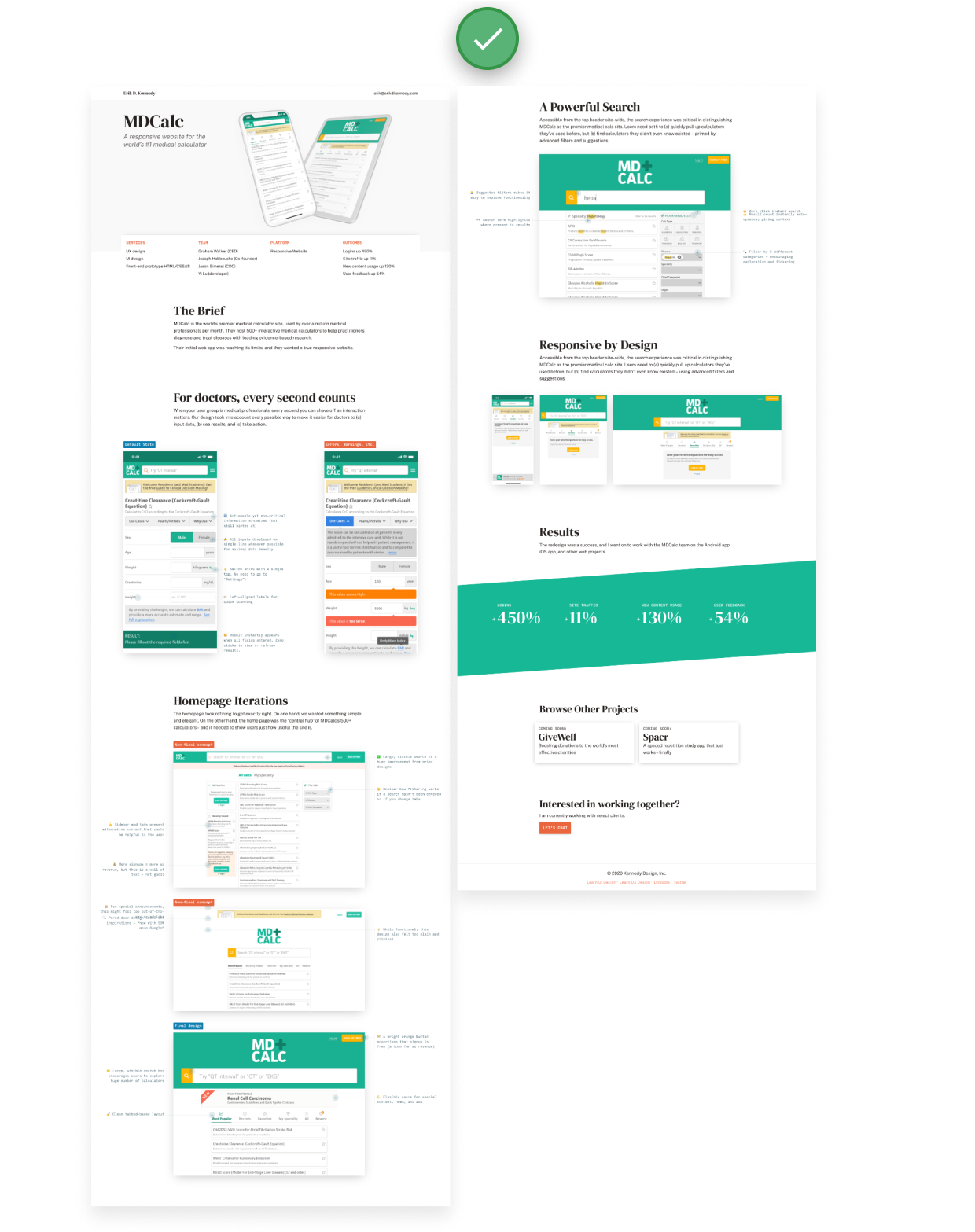
Notice all those images and labels and captions and stats and lists? 😁
A good portfolio is not simply more concise, it’s also scannable.
To make your portfolio scannable, include – as frequently as is reasonable – elements that better catch the eye of scanners:
- Images
- Lists
- Bolding & italicization
- Annotations and captions
- Pull quotes
- Stats
- Emoji (if it gels with the brand 🙂)
There are two benefits here: (1) it’s easier to read, duh, but also (2) it provides many avenues to catch the eye of hiring managers “just giving a quick glance” (which is all they have time for anyways).
They’ll skip a whole wall of text, but if they see an interesting bolded phrase, they might just dive in 😉.…
Portfolio mistake #4: No real-world results
There’s something powerful about Jakob Linowski’s portfolio:
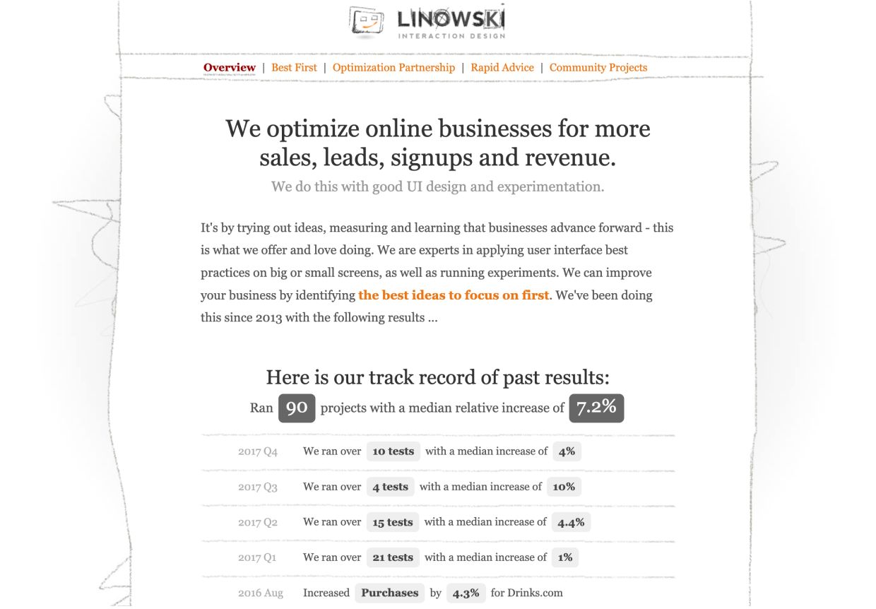
He literally just lists it out, over and over again:
- Here’s who I worked for
- Here’s when
- Here’s how much I improved their goal metric
Put yourself in the shoes of someone looking to hire a designer. How much do you trust this guy over some random portfolio? 🤔
To me, there’s no comparison. Jakob understands how to make things happen using interfaces. If he didn’t, he couldn’t achieve these results!
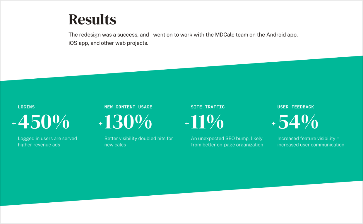
For most designers though, we aren’t quite so focused on conversions. So even if our portfolio homepage isn’t simply a table of improved stats, we still might mention what went up-and-to-the-right e.g. in a project writeup:
So how do folks go wrong here? I think there are 3 tragic scenarios where designers end up without real-world results to show:
- It’s not a real project
- It’s a real project, but you didn’t have specific goals
- It’s a real project, and you had goals, but you didn’t measure them
To solve problem 3, include “get baseline measurements of all goal metrics” in your checklist for starting a new project 👍
To solve problem 2, start by watching my video on brand and goals 😀
But problem 1 is a doozy. Let’s talk about it…
How to get real projects as a beginning designer
There’s a nasty chicken-and-egg problem with creating a great portfolio. Maybe you’ve noticed?
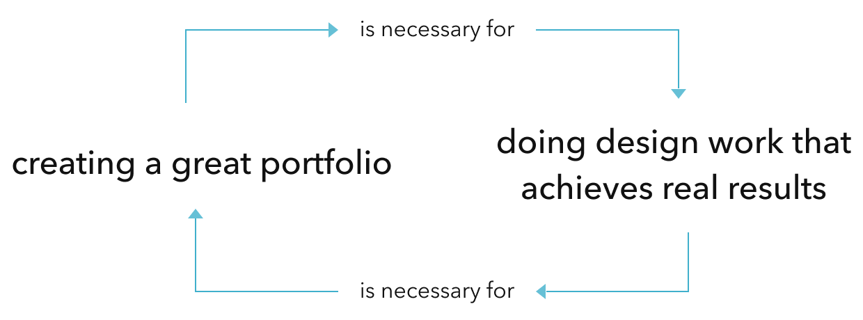
With tricky bootstrapping problems like this, I think there’s not necessarily one great way to get real projects (if there was, we’d all be doing it!). So instead, you have to figure out which way makes the most sense for you, personally.
Here are 5 strategies I’ve seen work:
- Design for a side project that will actually be developed
- Design for a friend’s business
- Design for a local business whose owner you know
- Design for a non-profit as a volunteer
- Design for a freelance client
1. Design for a side project that will actually be developed
Know any developers? Great! Pitch them side project ideas – or ask them for their own ideas.
It only takes two (in this case) to put out a live site or app that can get real-world users, real-world feedback, and real-world results.
Bonus 🎉: side projects remove the hassle of writing contracts, negotiating rates, and building consensus on teams – all of which come with freelance or full-time design work! 😅 They also allow you to have complete creative control over the output, which means your portfolio write-up will look even better!
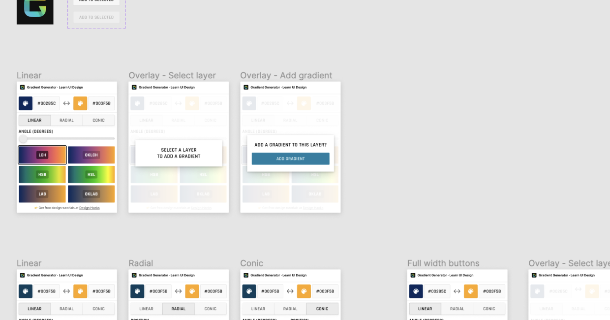
For instance, at the time of writing, I’m creating a Figma plugin (for creating brilliant gradients) with dev Chris Meehan. Why? Because I never have before, and I think it’d be useful 🙂
Worth pondering:
- What apps or small sites do you wish existed?
- Do you have any hobbies or activities that would benefit from a small app?
- What small apps/sites would make your work easier?
2-3. Design for a friend’s business or local business
People who know you are more likely to trust you (and your skills) based on past experience, rather than require proof by portfolio.
This means it’s easier to do design work for a friend, or maybe a local business you frequent.
My very first UX project was for a college friend, and, as of writing, my most recent client project was for a friend-of-a-friend. Both were much more low-key than the “traditional” way of winning business with a portfolio 😎
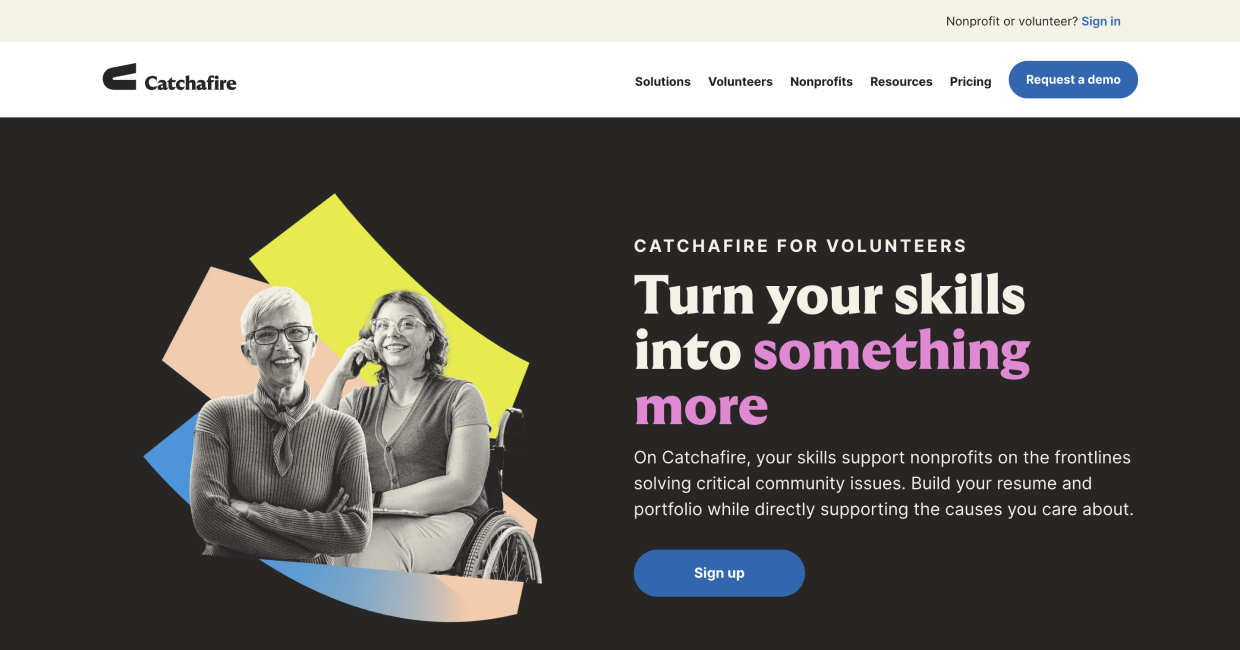
4. Design for a non-profit as a volunteer
Another way to get your first job is to do it for free. And if you’re doing something for free, why not do it for a good cause?
Sites like catchafire.org help match non-profits with skilled volunteers for design (and other) projects.
A few caveats here:
- If you work for free, be prepared for your work to be treated like it’s worthless. I wish there was a less harsh way to say this, but it’s an honest concern. Clients tend to value work in proportion to what they pay 🙊
- A non-profit team that can’t ship a great site may not be able to simply because a junior designer is working with them 😬
But the better you are with people & teams, and the closer you are to the org, the more this option will make sense.
5. Design for a freelance client
Even if you’re shooting for a full-time design role, it might be worthwhile to take a few freelance jobs first (as you build your portfolio). Why?
- You can win a freelance client over a beer. For freelance projects, there’s less formalized process around portfolio, design interviews, etc. A freelance client may hire you over nothing more than than some great ideas pitched in a friendly conversation.
- You can “try out” different teams, industries, platforms. No better way to get a taste of the diversity of roles you could take on that work on pre-defined shorter projects.
- It’s a quicker way to fill out your portfolio. Designers who work full-time at a business tend to do a lot more work that isn’t directly portfolio-applicable. However, the quicker, more concrete projects that orgs hire freelancers for typically fit way better as great write-ups.
Again, none of these methods are a surefire way to easily win a great project you can seed your portfolio with. However, reflect on which avenues make the most sense for you personally – given your work experience, your network, your skills, etc.
Wrapping it up
We’ve now covered 4 crucial mistakes that so many design portfolios make. If you can avoid these, you’re already way ahead.
Next we’ll talk about how to apply best practices to the two main page types: the home page and the project writeup page. We’ll wrap up by looking at some brilliant example portfolios.
See you there? 🫡
Continue to Chapter 2: Creating a Great Portfolio Home Page
Get 30 ways to add to your portfolio
From homepage to project case study, I'll send you 30 (illustrated) techniques for spicing up your portfolio.
Practical design tutorials. Over 60,000 subscribed. One-click unsubscribe.