4 Rules for Intuitive UX
This is my advice on improving the UX of your designs WITHOUT hours of user research sessions, paper prototyping playtime, or any other trendy UX buzzwords 😎
(Seriously, search this page “design thinking”. 0 results. Nailed it!)
Who’s this article for? Easy:
- Developers. You created your own app, but every time someone downloads it, they struggle to use it. And if someone’s actually told you this, then it’s really bad.
- Graphic designers. Looking to make the transition into digital, but trying to learn UX by reading articles online is… a very painful way to die 😬
- PMs. Your job is already like 25% UX designer. Would be nice to level up those skills.
- And the hustlers. Anyone working on digital side projects nights/weekends. This one’s for you too 🍻
If you’re already a UX designer, I don’t expect this article to go over super well with you. I’m basically skipping over entire chunks of our field in favor of focusing entirely on the single most lacking skill in aspiring UX designers (or UX-adjacent folks who find themselves designing screens).
I call it “speaking interface”.
When I started as a professional UX designer, I was shocked how many times my clients would hand me the initial wireframes (or the living, breathing, in-browser MVP) and there’d be completely obvious UX mistakes all over them. I’m not talking about things you need hours of research and A/B testing to discover. I’m talking, like, dead simple mistakes.
For lack of a better example:
Somewhere out there, there's a team that knows HTML, but doesn't know the difference between a radio button and a checkbox. pic.twitter.com/VBwk8Jxekd
— Erik D. Kennedy (@erikdkennedy) May 24, 2017
Now my clients weren’t this bad, but look - you don’t need to be Bret Victor to understand that if you can only select ONE thing from a list, you need RADIO BUTTONS, not checkboxes. To understand that, you just need to be able to speak interface. And that’s the craziest thing to me. Interface fluency is something anyone can achieve.
Frankly, you just need the presence of mind to (A) pause every single time you’re confused or frustrated by some app, (B) verbalize what about the interface makes you confused/frustrated/etc., and then (C) figure out how you could avoid that specific snafu that in your own designs.
Rinse and repeat that non-stop and you’ll be a pro in no time.
What I want to talk about today is four little rules that will help eliminate these pain points in your own designs. They’re the heuristics that are a level or two deeper than “use radio buttons if the user can only select one thing”. But, if you can remember to obey the things in this checklist, you’ll be that much closer to creating designs that your users can use easily right off the bat, freeing up your time for other, more important things.
(That’s when the ooother UX designers can lecture you on the newest academic user research methodologies 😉)
Here’s what we’ll be covering:
Any questions? Let’s dive right in.
1. Obey the Law of Locality
Put interface elements where they effect change.
All else being equal, you should put the elements in your interface near where they effect change. This is because, when a user wants to make a change to the system, they will unwittingly glance at where that change will happen.
So, let’s say you have a list of things. Where do you put the “ADD A NEW THING” button?
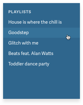
Q: Well, where does the change happen?
A: At the end of the list.
Great, put the button at the end of the list.
WAIT. You’d think this would be pretty simple. But there’s a temptation.
The temptation is to just put it where we have space for it.
For instance, if you have a menu, maybe you’d think “We have a menu! Why not just put it in the menu!?”
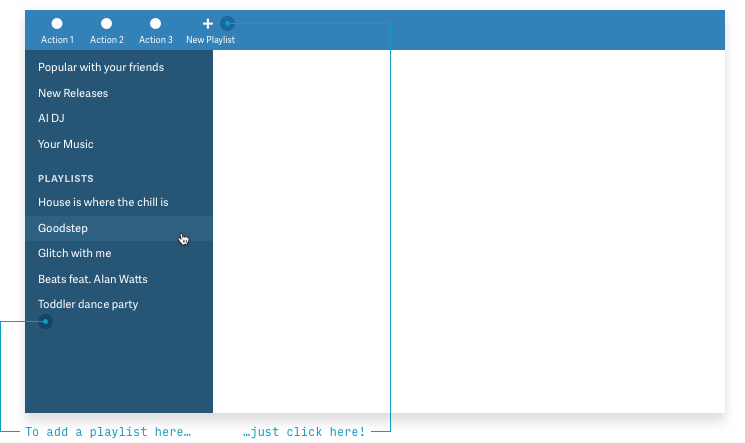
The answer is, of course, because users won’t look for it there.
(And the ultimate answer is that having a place where “we just put things” will ultimately render your app an unusable mess that people will abandon the first chance they see a half-viable alternative)
Don’t think I’m joking. Have you ever noted this interface?
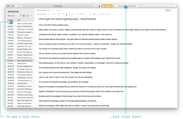
An equally-bad/common alternative is to take something you saw A Respected Tech Company do and steal it for your own app, without any thought as to if it makes sense for you. “We need an ‘Add’ button? I’ve seen one of those. Hold my beer!”

Look. Another button in a place users will never look for it. To compound things, users will suspect this button actually adds a new whatever-is-currently-displayed-on-the-big-blank-white-space. Because that’s where the control is.
Your users want you to follow the Law of Locality.
So, now that we know it, let’s use it.
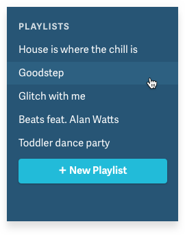
Bam.
But maybe you’re a born UX designer and you always visualize what happens when there’s 1000 items instead of 5 and you realize: there’s still an issue here. If the user creates a TON of playlists, this button will disappear hundreds of pixels offscreen!
So maybe you could anchor the button near the bottom of the list, but have it always be visible, no matter how many hundreds of playlists the user has created.
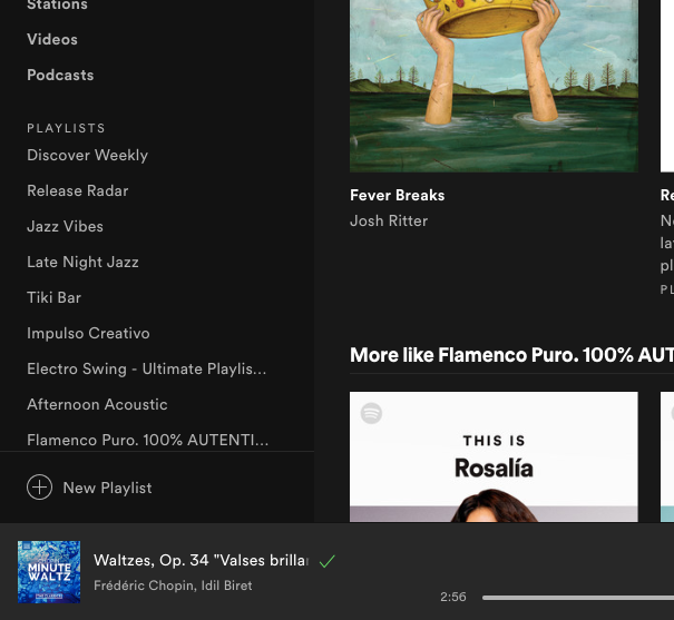
Brilliant! And this is what Spotify has done.
Another possibility is to say “Hey, we can’t reliably and consistently show the button at the bottom of the list. Where’s the nearest logical place to put it?”
And the answer is, (I think pretty obviously) the top of the list.
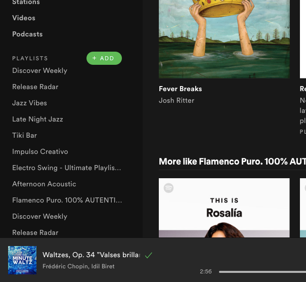
Sacrebleu! This is actually just what Spotify-competitor Rdio did, before they were acqui-shut-down by Pandora.

The lesson here is clear. Never sell your company, and always always obey the Law of Locality.
(There are actually 3 laws of locality, and “Put UI elements where they effect change” is only the first. If you’re interested, read more here)
Next!
2. ABD: Anything but Dropdowns
Any time you feel tempted to use a dropdown, ask yourself if one of these 12 controls is better instead.
One non-obvious lesson of UX design is that dropdowns are pretty much the worst control.
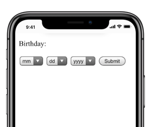
They’re not always bad, but you’re working against the following:
- Dropdowns take too many clicks/taps. One to open, a few more to scroll around to the right option (on mobile), another to select the right option, and (on mobile) another to close. (Compare to the single click use-cases of many of the options listed below)
- Dropdowns don’t show you the options! You have to click into them to see the possible values, and on mobile, you can often only see a couple at a time.
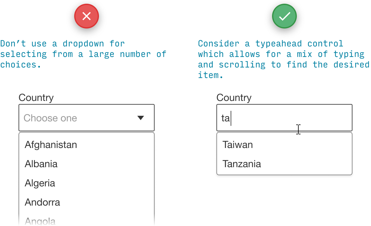
- Long dropdowns are ridiculous to navigate. A country dropdown for an app used worldwide could have 195+ countries. At some point, almost any other method of asking a user their country would be quicker than having them scroll through a dropdown (“Smoke signals?” AGCKKHKGH).
This is pretty straightforward, so let’s just cover some examples for the various major cases of dropdown replacement.
If you’re choosing between 2 options…
We already have some fantastic options for allowing users to choose 1 of 2 things, all of which (A) show the options right away and (B) require fewer taps/clicks.
For questions to which there is no “default” answer, and either might be picked with roughly equal frequency, try a segmented button.
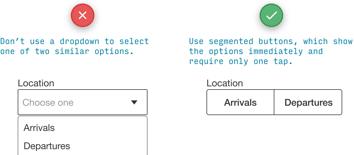
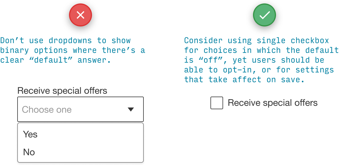
If there is a “default state” that corresponds to “Off”, try a checkbox. A checkbox is also good for settings that don’t effect change until the user presses Save or Submit.
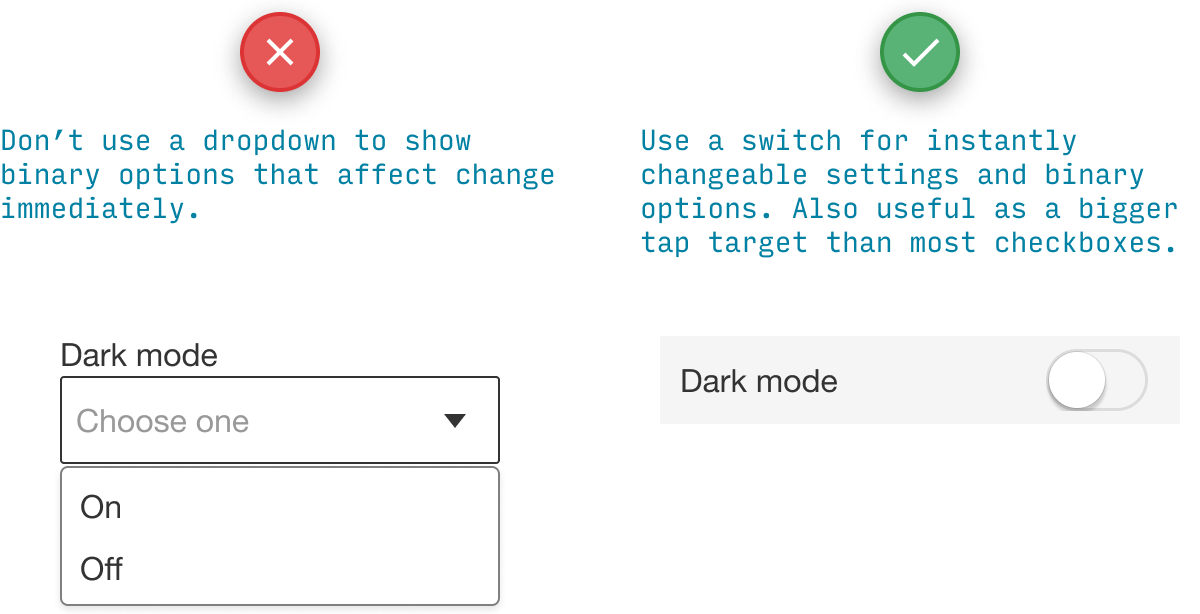
Similar to the checkbox is the switch, which is good for changes that should apply immediately.
Checkboxes and switches only make sense when there are two options. However, the following controls make sense for 2 to roughly 5 options, so you might try some of the following instead.
If you’re choosing between 2–5 options…
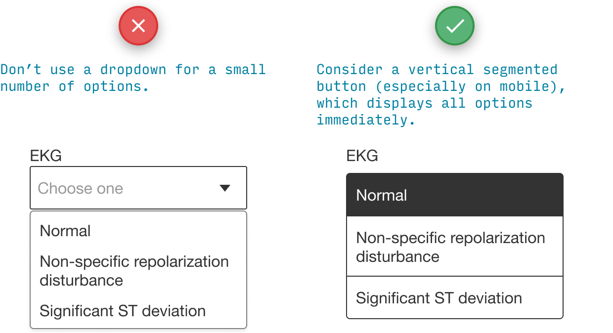
We covered segmented buttons above (and they apply here too) but it’s worth mentioning that when there are more options, vertical segmented buttons allow even more flexibility of answer length.
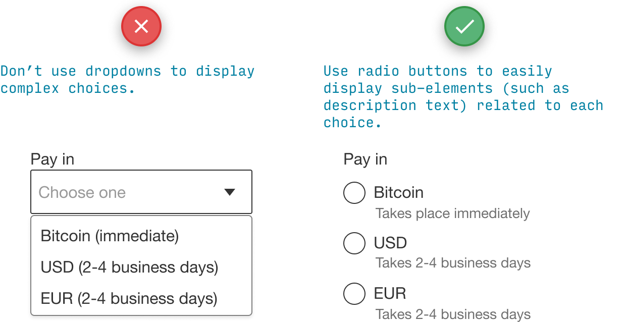
Radio buttons are similar, but particularly useful if you need to display a couple sub-elements for each choice.
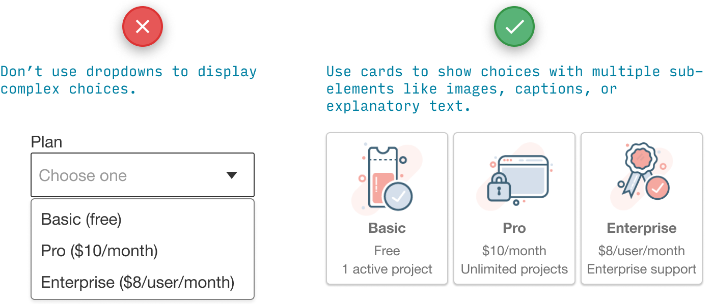
For detailed displays of just a few choices, cards are where it’s at.
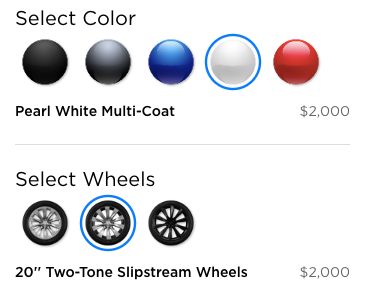
One trick I like is displaying visual options literally.
If you’re choosing between many options…
When there are enough options that scrolling through them is annoying, consider a typeahead control. It’s like a search bar that shows top matching results as you type.
If you’re choosing a date…
Picking a date from dropdowns is the worst. If I ever do this, then I’ve really failed as a UX designer.
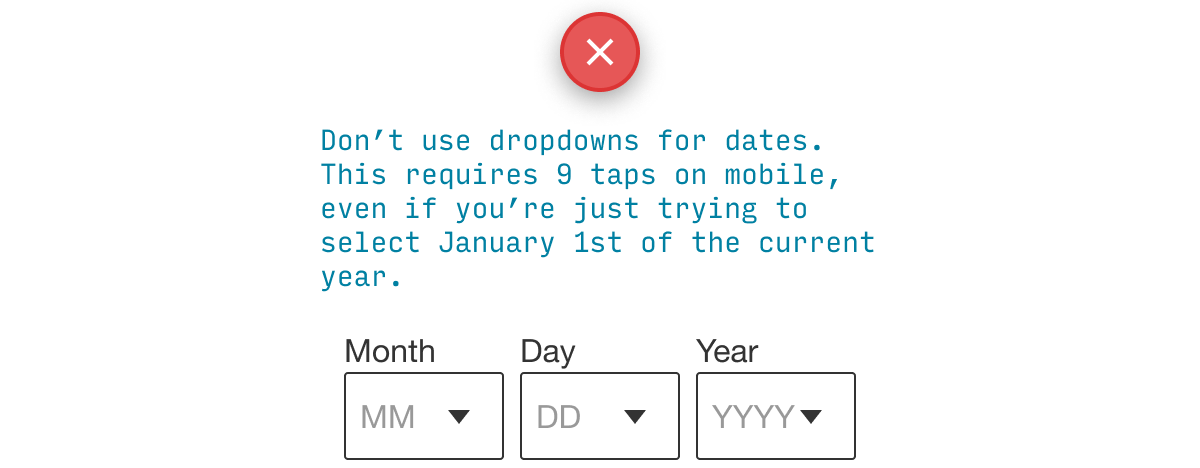
But what do you use instead? Well, it depends. First question: what type of date are you picking?
- Poisson dates. Dates most likely to be in the near future, tapering off as you go farther into the future (or nearer to the present), e.g. date of an appointment you’re scheduling, date of a flight you’re purchasing
- High-variability dates. Dates that have a similar probability of being anywhere in a wide range of time, e.g. date of birth, day-and-month of your birthday
(Yes, I named “Poisson dates” after the mathematical distribution 🤓)
For different types of date-picking, you should use different controls.
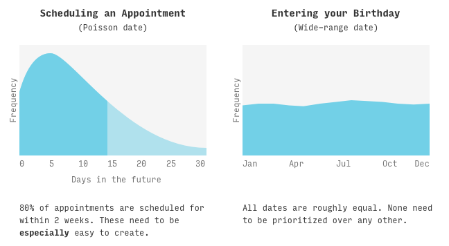
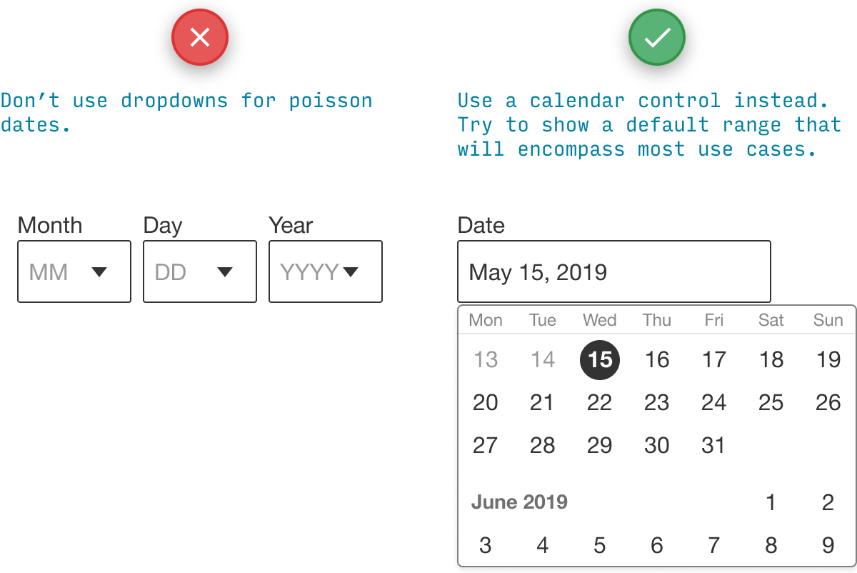
For Poisson dates, you want to make it DEAD SIMPLE to pick dates in the most common range (e.g. for scheduling an appointment, it might be the next, say, 14 days). It’s perfectly OK if picking dates outside of that range is a little tougher.
A calendar control fits the bill rather well for Poisson dates. If you know the date to-be-picked is most likely in the next 2–4 weeks, you’re golden.
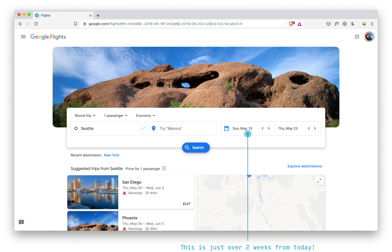
Rather creatively, Google Flights defaults to you selecting a flight roughly 2 weeks in the future, which is perhaps an opportunity for confusion (“I didn’t choose this!”), but probably a better date to default to, and closer to the hump in the Poisson curve.
Date text inputs are probably the best option for high-variability dates, where (A) there’s no reason to favor any date over another, meaning (B) all options will be equally difficult to select.

If you’re choosing a number…
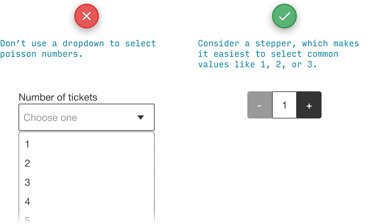
Numbers come in all kinds of flavors, but you’re most likely to be tempted to use dropdowns when you’re dealing with counts - e.g. the number of tickets, the number of people, the number of rooms, etc.
How often do you need 1 ticket? Plenty.
How often do you need 10 tickets? Not so much.
How often do you need 10,000 tickets? Is this some kind of cruel joke?
For counts of things, you’re also dealing with Poisson distributions, and should use a control that biases towards lower numbers - like a stepper.
For wide-range numbers (like, say, SSNs), you weren’t going to use a dropdown anyways… I hope.
So can I ever use a dropdown?
Sure.
Remember, they work OK when…
- Users rarely need to change the default value
- There are very few options - e.g. only 3 will be visible on the default iOS control
- The user is not on mobile (whereby many of these problems are mitigated)
The particularly observant among you may have noticed that the Google Flights interface I lauded above actually has three prominent dropdowns!
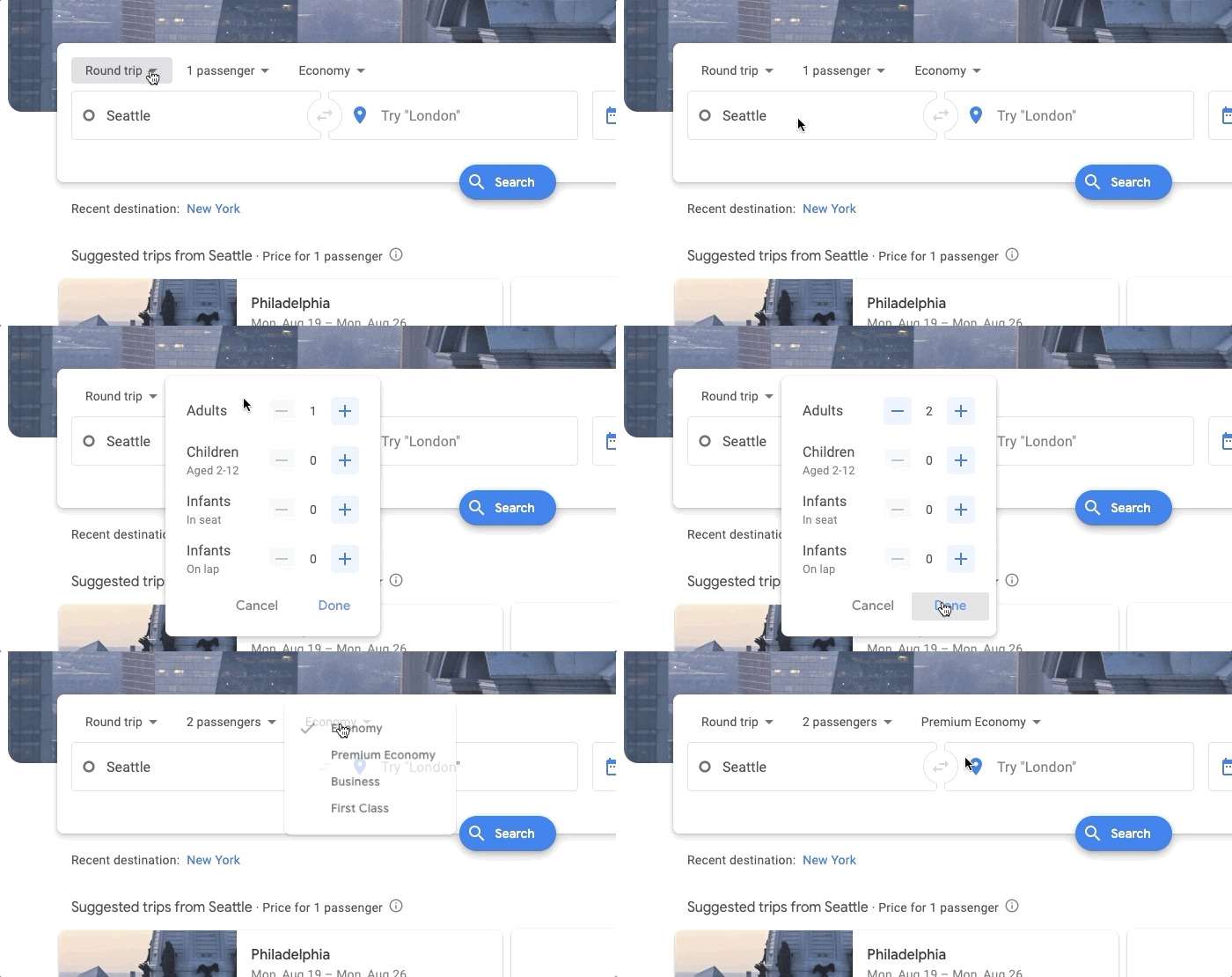
They actually do a great job with this. The potential usability issues are swiftly mitigated with:
- Custom controls that show all options on tap (including on mobile) – and replace 4 dropdowns (for Adults, Children, and Seated Infants and Lap Infants) with 4 steppers in a single dropdown.
- Removing the “Economy” dropdown on mobile
- Few options and smart defaults for each control
If you want to print this section out and stick it on your wall, I’ve created a printable cheatsheet of dropdown replacements.
Anyhow. Let’s move on.
3. Pass the Squint Test
If you squint your eyes, the Most Important Thing should catch your eye first – and the least important elements should catch your eye last.
Pop quiz: what does a user need to do to use this page?
(NB: I’ve blurred it out so you have to go by gut instinct, but it’s a data entry form, to give you a hint)
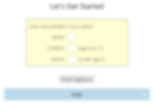
My best guess is two things:
- Check any applicable checkboxes (??) in the yellow area
- Press the blue “Submit” button
Did you guess the same?
Wrong and wrong.
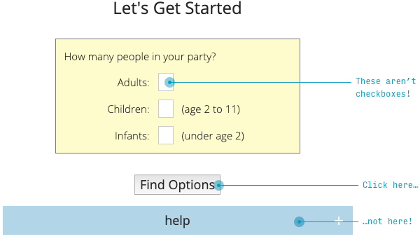
- The “checkboxes” are actually very small numerical text inputs. (If you already read Anything But Dropdowns, you know Poisson numbers should be steppers)
- The Most Important Thing (“Find Options” – which is a very confusing way to say “Submit”, by the way) is gray and unnoticeable. A much less important thing (“Help”) is immediately next it, but bigger and more visible.
The Squint Test says the Most Important Thing must be the most visible thing. What’s the MIT? The ticket textbox (or stepper 😉) controls and “Submit” button.
If you make it past this page, the next page is even worse.
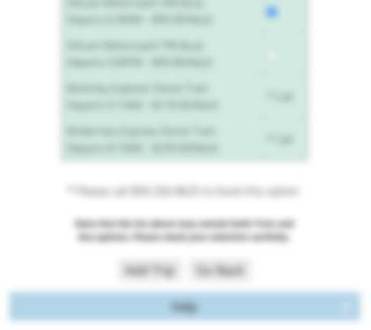
What will you click: gray button the left, or identical gray button on the right?
Hope you chose left!
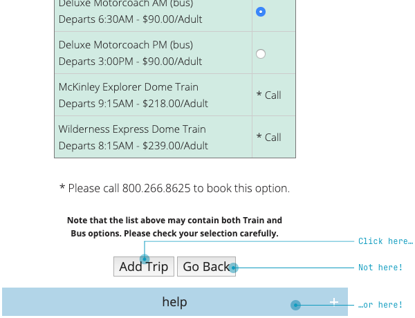
Again, when I squint my eyes and look at the design, I can’t tell what’s important.
Like the Law of Locality and Anything But Dropdowns, the Squint Test is a fairly simple law to enforce. Here’s like a 30-second wireframey redesign.
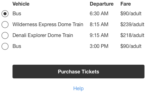
Does it work?

You tell me. Four radios and a button. And a tiny little link below it.
I’m not trying to pick on AlaskaTrain.com. You see this kind of stuff all over.
Here’s the signup screen for the city guide app Foursquare (blurred, of course).

How do you actually submit the required data? (i.e. the Most Important Thing)
Hint: it’s hidden in plain text in the upper-right corner 😉
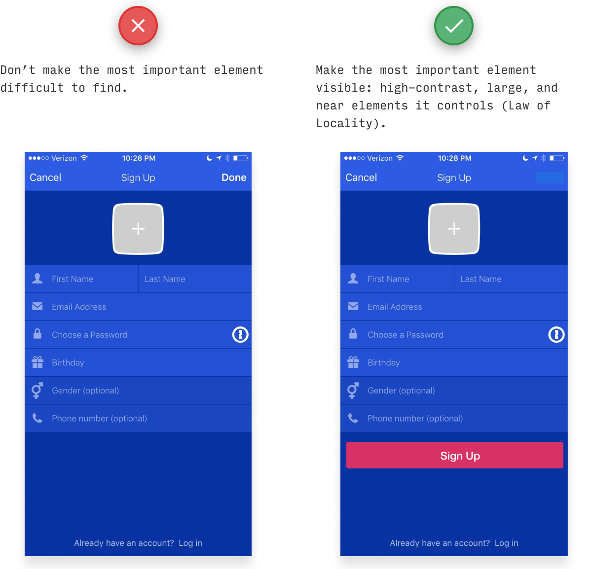
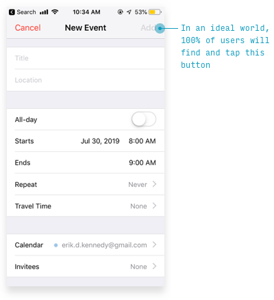
But Foursquare is just following Apple’s design standards here. Unfortunately, violating the Squint Test is a tradition even among industry leaders.
One way to find the Most Important Thing is to consider what percentage of pageviews will involve a certain action. Here’s flashcard/memorization software Anki analyzed in this way.
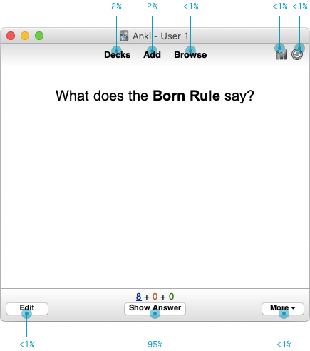
For every 100 flashcards I view, I will then go on to…
- Show the answer (approx. 95 times)
- Navigate back to the list of decks (twice)
- Start adding cards (twice)
- Use some other feature (very rarely)
This sort of analysis really hints at what kind of interface would work better here.
- Emphasize the most-commonly used functionality (at first approximation, “most used” equals “most important”)
- Deemphasize, hide, or remove the less commonly used functionality
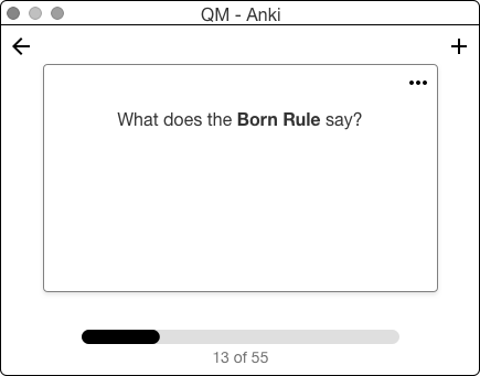
Now this is just a start (I’d want to see if users understood that the unlabelled plus button added cards, for instance). But with just a couple simple heuristics, we’ve reduced a cluttered, confusing interface of 10 UI elements down to just 5. A reduction of… check my math here… 50%.
For more on the Squint Test, check out my YouTube video redesign of the Timezon.es web app. Or, if you don’t have 10 minutes, here’s a scannable, illustrated blog post with the same step-by-step redesign.
4. Teach by example
If you’re introducing users to new concepts, a few examples can be worth 1000 words - which your users wouldn’t read, anyways.
We have a weird tendency to try and explain things in words when examples would be much clearer.
Consider the startup Teeming.ai, who reached out to me to ask about their homepage design. Subheads on the page read:
- “Teeming takes the isolation out of remote work”
- “Teeming helps with remote team building” as well as “learning, problem solving, having fun, and motivating each other”
- “Teeming and video for synchronous [communication]”
- “Works with all your favorite video platforms”
But here’s my question for you. What does Teeming actually do?
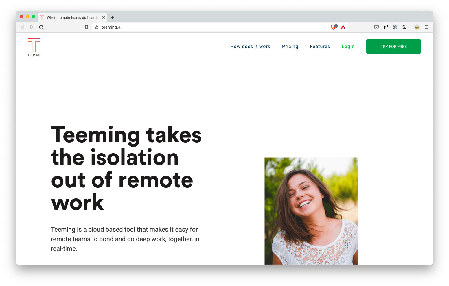
It’s tough to tell. I know it has something to do with… good vibes for remote workers? But I have no concrete idea how it would help me, so I wouldn’t otherwise try it, recommend it, etc.
(Sorry Teeming, you know I ❤️ you)
Next, let’s look at IFTTT. Maybe you already know what they do - in which case, pretend you don’t, and try to figure it out from these headlines on their homepage:
- Automatically light the way for the pizza delivery guy (Dominoes+Hue)
- Post your photo anywhere and see it everywhere (Instagram+twitter)
- Make your voice assistant more personal (Google Assistant+iOS Calendar)
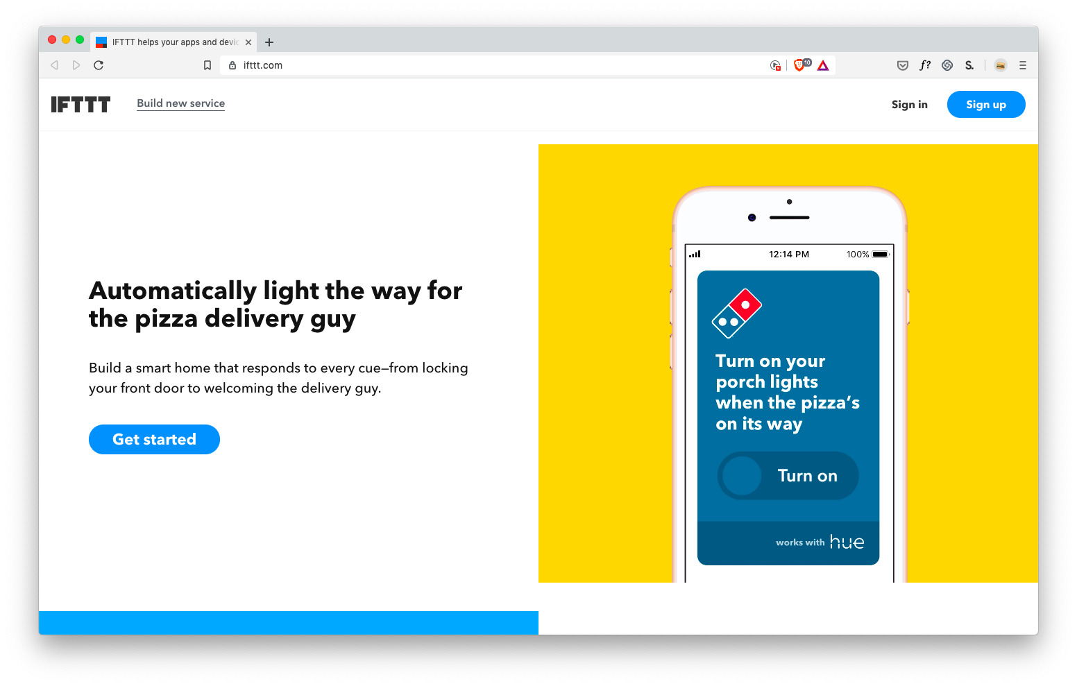
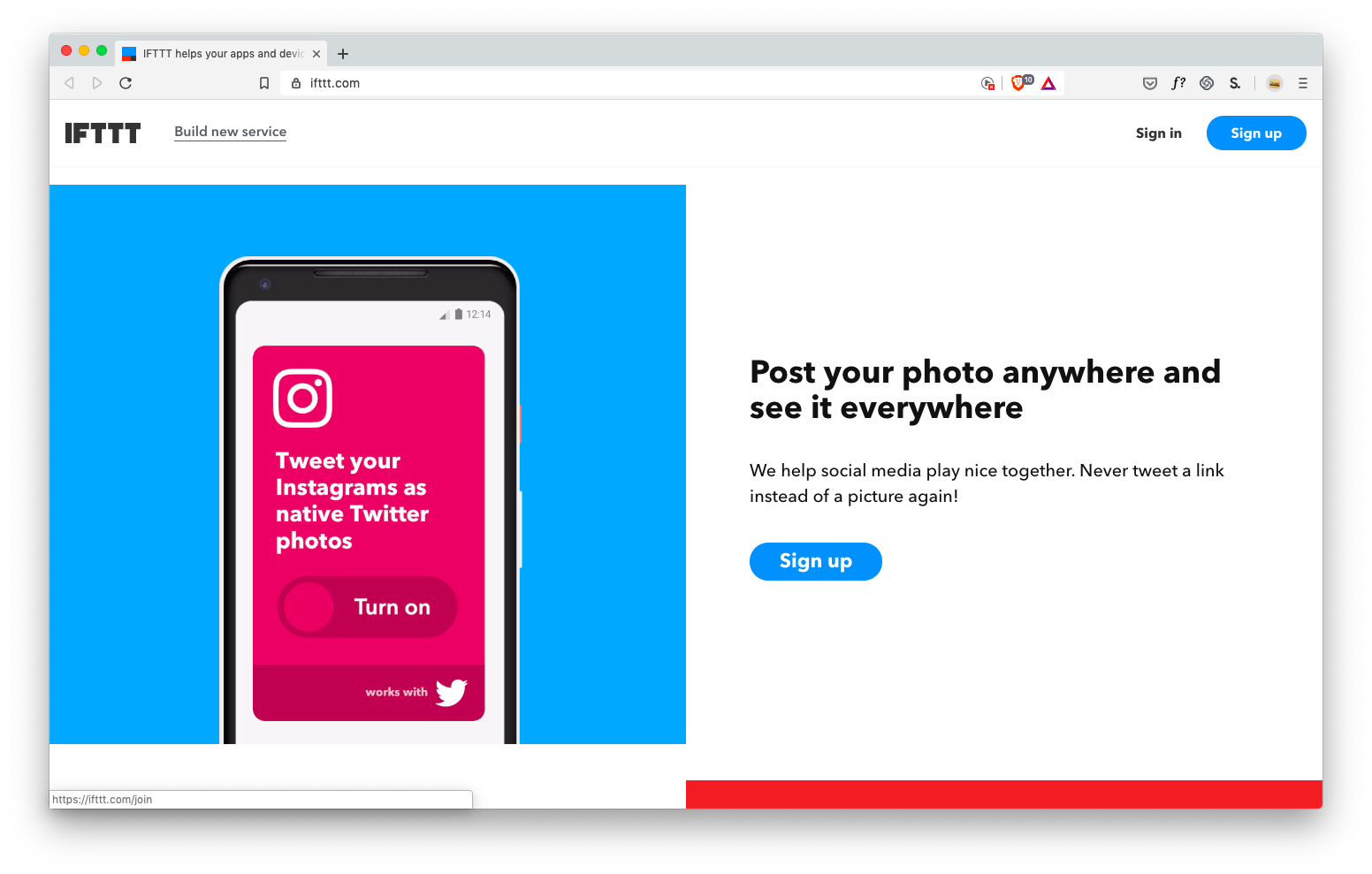
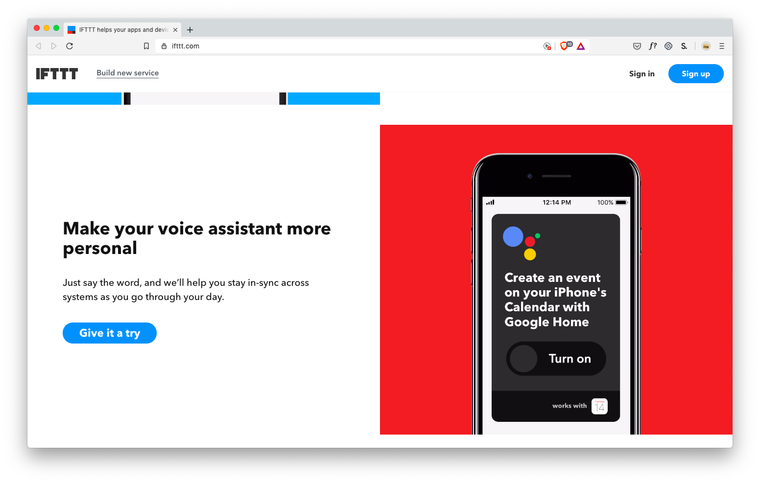
You don’t have to list too many examples to paint a decently clear picture: IFTTT hooks apps together to do things they couldn’t do alone.
The crazy part is, if you visit their homepage, they first explain it in text:
IFTTT helps your apps and devices work together in new ways. IFTTT is the free way to get all your apps and devices talking to each other. Not everything on the internet plays nice, so we’re on a mission to build a more connected world.
YAAAAWN.
My question: which gives you a better idea of the app? The examples, or the description? 🤔
I think it’s the examples. The description only resonates once I see a few examples of how it can help me.
The description of your complex new app/feature only resonates once I see a few examples of how it can help me.
But examples aren’t just for landing pages. Here’s what you see when you first sign into project management tool Basecamp.

Rather than seeing a totally blank page, you see two obviously pre-fabricated example projects that teach you, by example, how the whole app works (and also gives you an idea of what the tool will look and feel like when you’ve been using it a while).
Seriously, I can browse through fake chat logs by fake users discussing fake file uploads and fake to-do items.
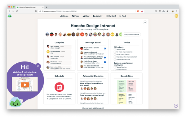
There’s even a friendly… mountain?… telling me I can watch a 2-minute explanatory video about this sample project.
And thank you, Mr. Mountain, for the lead-in: providing videos showing usage is another way of teaching by example! Not only does the sample project model teach by example what my projects will look/feel like, but the video teaches by example what it looks like to use the software.
Brilliant.
If your app allows users to create something, a showcase is a great way to teach by example just what’s possible.
The beloved painting app Procreate won an Apple Design Award, the App Store Editor’s Choice, the App Store Essential awards, and John Gruber called it “groundbreaking”, etc. – and yet none of this is as viscerally exciting as seeing what you can create with it.
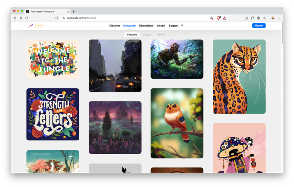
Whoa.
That’s no MS Paint.
The showcase is a powerful tool for making it clear just what’s possible with your app.
So: if your app does something new and unfamiliar – or relies on new and unfamiliar concepts – you should get acquainted with the ways of teaching by example. The moment you realize that you’re introducing users won’t have seen before, you should start thinking: how can I give an example to make this clearer?
The moment you realize that you’re introducing users won’t have seen before, you should start thinking: how can I give an example to make this clearer?
In review, my favorite ways of doing this:
- On any page that tries to get the user to use a feature/app/etc., show examples of what they can do with your tool
- Use the “first load” experience to provide sample data, showing by example what the properly-working app will look like
- Strategically inject help content (like articles, videos, or tooltips) inline with the feature that show how to use it
- Does your app allow users to create something? Include a user-submitted gallery of examples to spur imaginations
Make sense? Let’s call it a day.
Alright, that wraps things up.
There are plenty more rules for “speaking interface” that I cover in my video course Learn UX Design, but these are some of the ones that I’ve used the most over the years. If you like these, check out more of my design writing on Design Hacks, where I send occasional, original design writing – as well as updates when Learn UX Design is open for enrollment.
Design Hacks
Over 60,000 subscribed. No spam. Unsubscribe anytime.