How to Create a Great UX/UI Portfolio Home Page
You’re reading Creating a Standout UX/UI Design Portfolio: The Ultimate Guide. Quickly navigate to other chapters:
How do you design a great portfolio homepage that stands out from the masses?
- Start with a splash above-the-fold
- Nail the project previews
- Include social proof
- Showcase your passion for design
- Make the next steps clear
Feel free to skip around 😎. Otherwise, we’ll take this top to bottom.
1/ Start with a splash (above-the-fold)
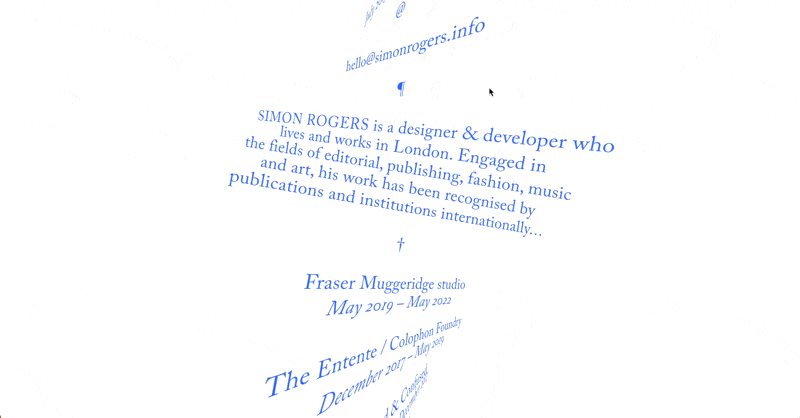
Put yourself in a recruiter’s or design manager’s shoes. You’ve just dragged your eyes across approximately 523 portfolios that all look EXACTLY like this:
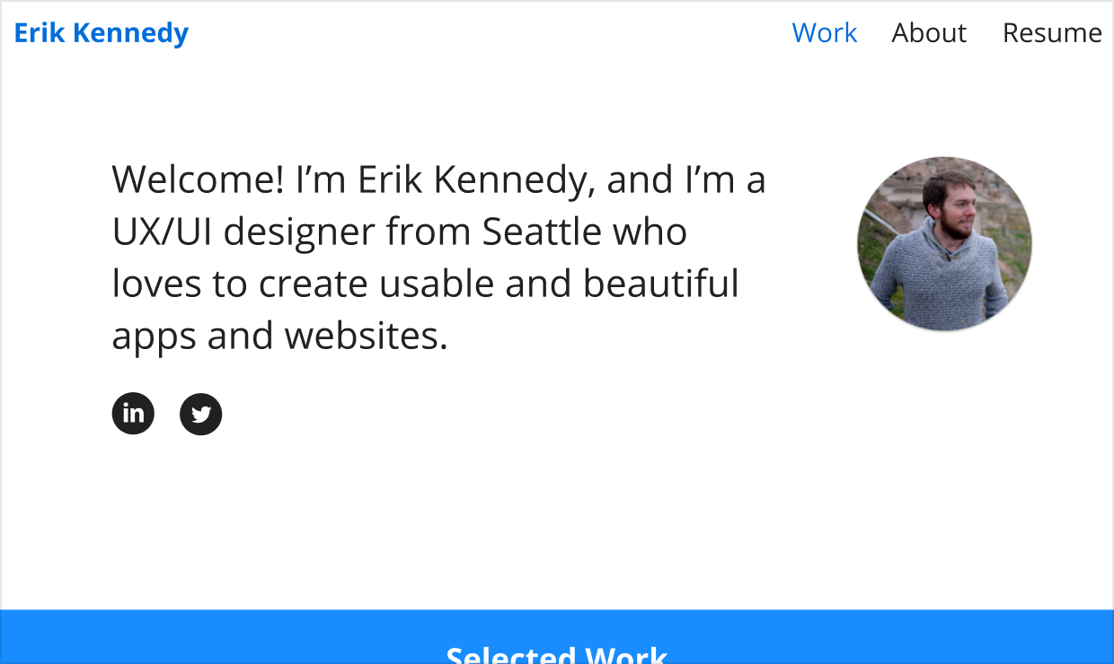
In a world like this, the best thing you can do is strongly and immediately distinguish yourself.
And the most reliable way to do that is to do something Hard to Do in Figma™️.
What can you do that’s Hard to Do in Figma™️?
When everyone uses the same tool, everyone gets the same results.
I love Figma, but the popularity of it (and similar vector editors) means our designs overwhelmingly feature things that are easy to do in Figma. Things that are Hard to Do in Figma™️ will automatically appear fresher and more interesting.
What’s easy to make in Figma?
- Rectangles
- Rectangular images
- Rectangular textboxes
- Things that don’t move or interact
Ok, fine.
On the other hand, what’s Hard to Do in Figma️?
(According to my thesis, those things will feel fresher and cooler)
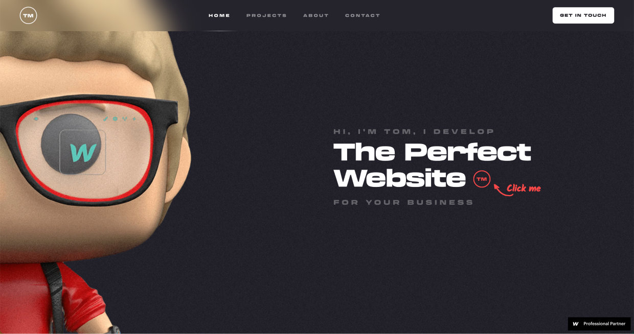
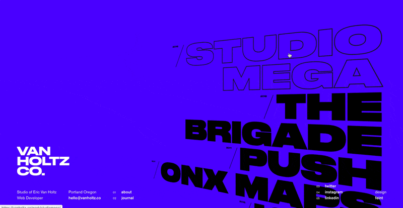
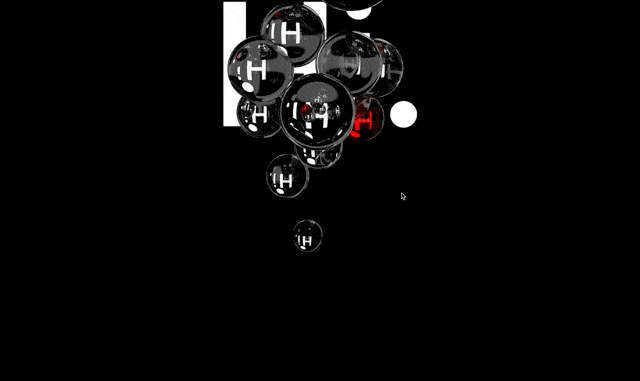
🔥 3-D is Hard to Do in Figma:
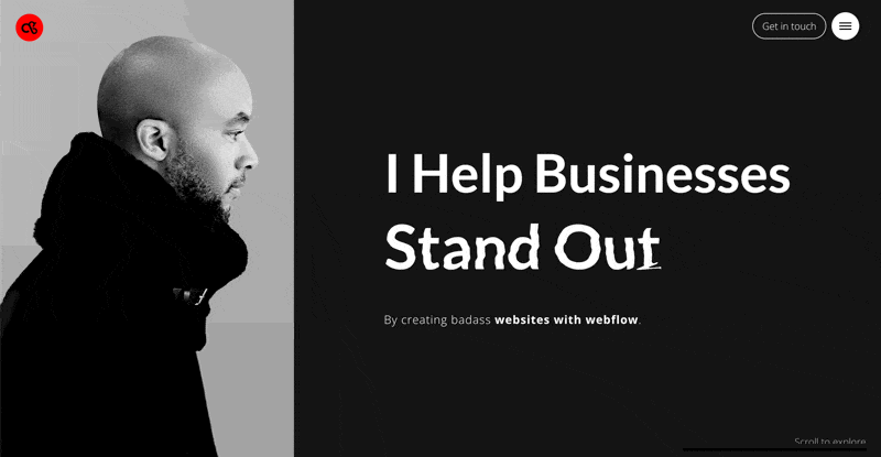
🔥 High-quality photography – and animated filters – are both Hard to Do in Figma:
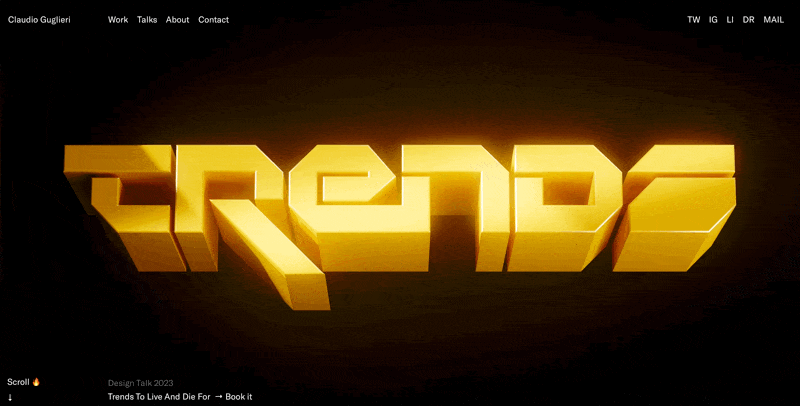
🔥 Wild, in-your-face, brain-melting animation is very Hard to Do in Figma:
Now, like finding your very first portfolio project, finding what Hard to Do in Figma element to include depends a lot on you personally – your career path, your network, your skills.
- Always wanted to learn 3-D? Now’s your perfect chance!
- Have a friend who’s great at photography? Hire them for some glamour shots 💅
- Are you a master of typography? Perfect – let it shine ✨
- Met a rock-solid illustrator online? Cool, why not commission them for something inimitable?
- Coming from the world of development? Great, add in front-end effects galore
Special study: front-end effects
I want to zoom in on that last idea – front-end effects. It’s a great way to (fairly easily) make designs more interesting.
Figma (and other vector-based design apps) default you into thinking about how the design looks at ONE moment in time.
But our designs can change. They can react. We color with magic ink, duuuude 😲
- A simple design that playfully reacts on hover can make me chuckle
- A simple design that uses the third dimension can make me go “whoa!”
- A simple design that changes with time immediately seems cooler

The elements of the designs above are not hard. All 3 are largely typographical 🤷♂️. But by incorporating some front-end animations, they absolutely sizzle 🔥🔥
For a more complete list of Hard to do in Figma techniques, see this post.
2/ Nail the project previews
Once you grab your audiences’ attention with a fun, out-of-the-box above-the-fold section, it’s time to get to the meat of things: the projects.
This part is a little more clear-cut than the above-the-fold 🙂
Remember the basics
For every project, you should include the following 3 things:
- What you did (e.g. user research, UX, UI, brand, logo, etc)
- Who it was for
- A nice visual
Optionally, you could also include:
- When you did it
- The platform it was for (e.g. iOS, web app, etc)
- The agency or team you did it with (if applicable)
Gabriel Valdivia nails these basics wonderfully on his portfolio:
But if you want to bump things to the next level, I recommend adding “a hook”.
Adding a hook
A hook is something that makes the reader want to click and learn more.
What is the most interesting/impressive “party fact” about the project or your work? – that’s your hook.
(It can be a bit shameless, but hey – portfolios are literally websites for self-promotion 🙈)
Here are the hooks in my own portfolio:
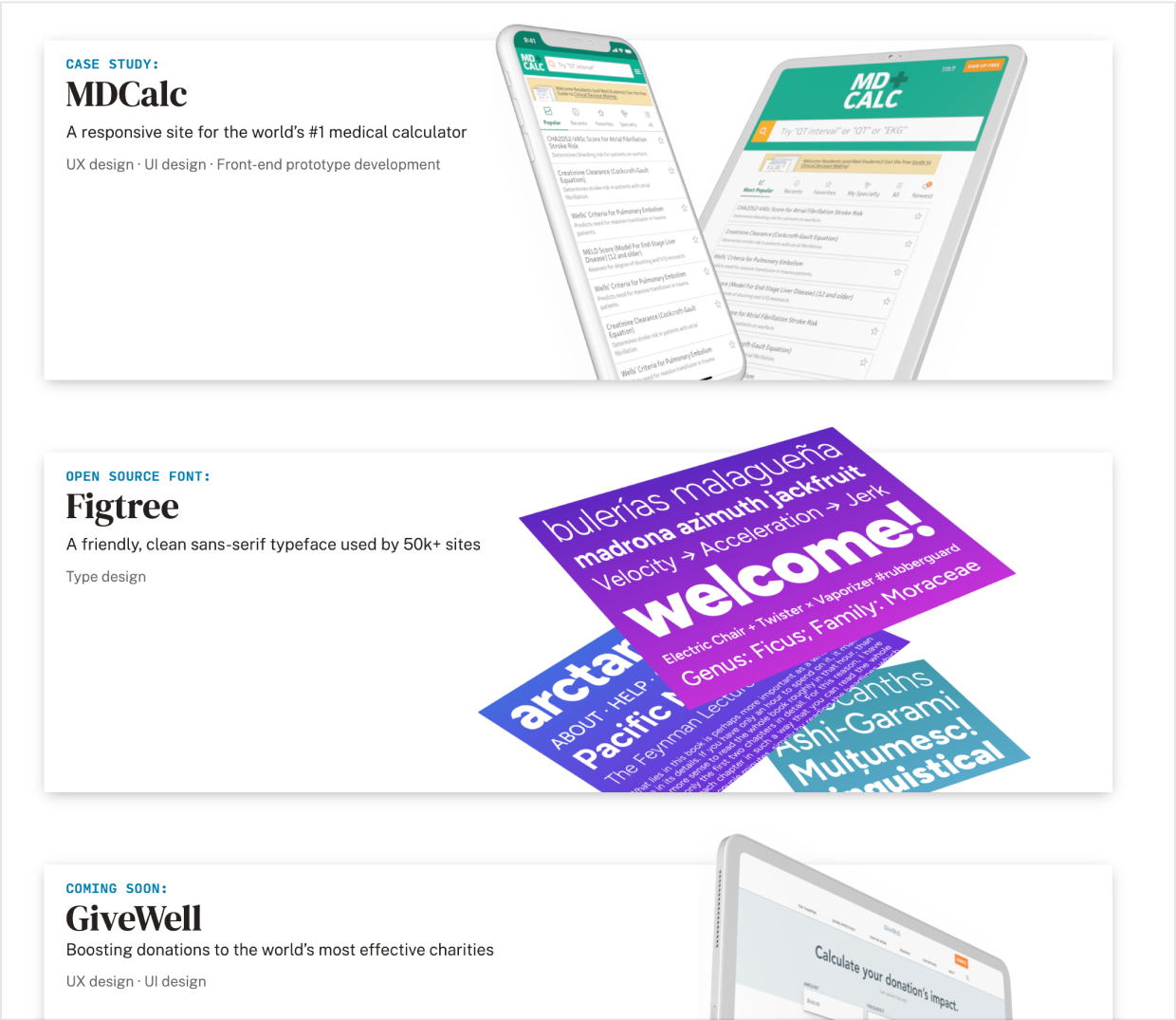
Compare:
❌ “A responsive medical calculator site”
vs…
✅ “A responsive site for the world’s #1 medical calculator”
and:
❌ “A font I designed”
vs…
✅ “A friendly, clean sans-serif typeface used by over 150k sites”
What makes you want to click more? What makes you want to hire me more?
Another example: Dan Tase has worked with GetYourGuide – who I’ve never heard of 🙃. But he leads with the fact that they’re “Europe’s largest travel platform”.
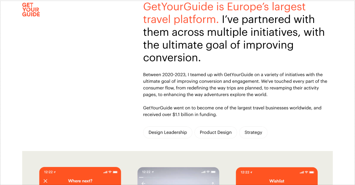
Europe’s largest travel platform can probably afford to be picky. If they’ve vetted him, that’s a strong signal to me 👍
Now let’s talk a bit about visual style for your project previews…
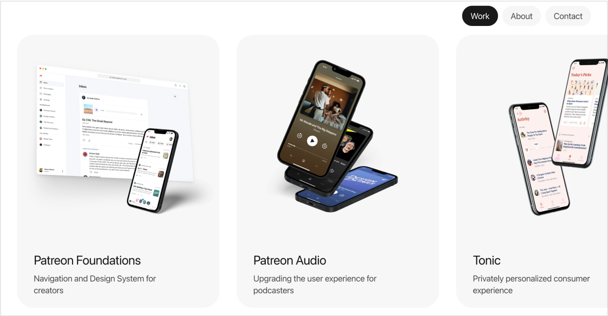
Avoid “the rectangle problem”
Devices are rectangles. Screens are rectangles. Designs are rectangles.
It’s so easy to just display your work as a series of rectangles.
Avoid that ☠️
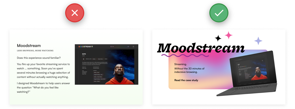
Instead, do basically anything else:
- Put the design in a device mockup
- Tilt or skew the design (in 2-D or 3-D)
- Put many designs together in a tastefully scattered layout
- Animate the designs (on hover, on scroll, continuously)
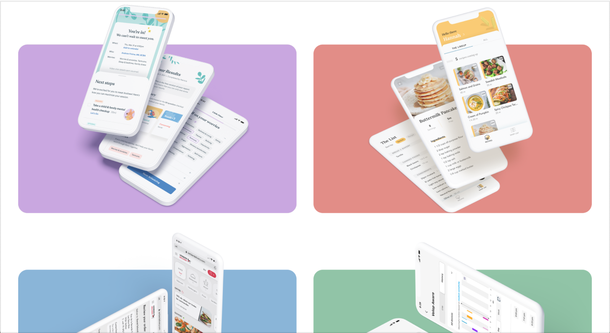
Learn UI Design student Bettina Bergendahl got 5 job offers (!) with an interesting and friendly, yet minimalist project preview display. Notice the frame breaks and 3-D mockups 😎
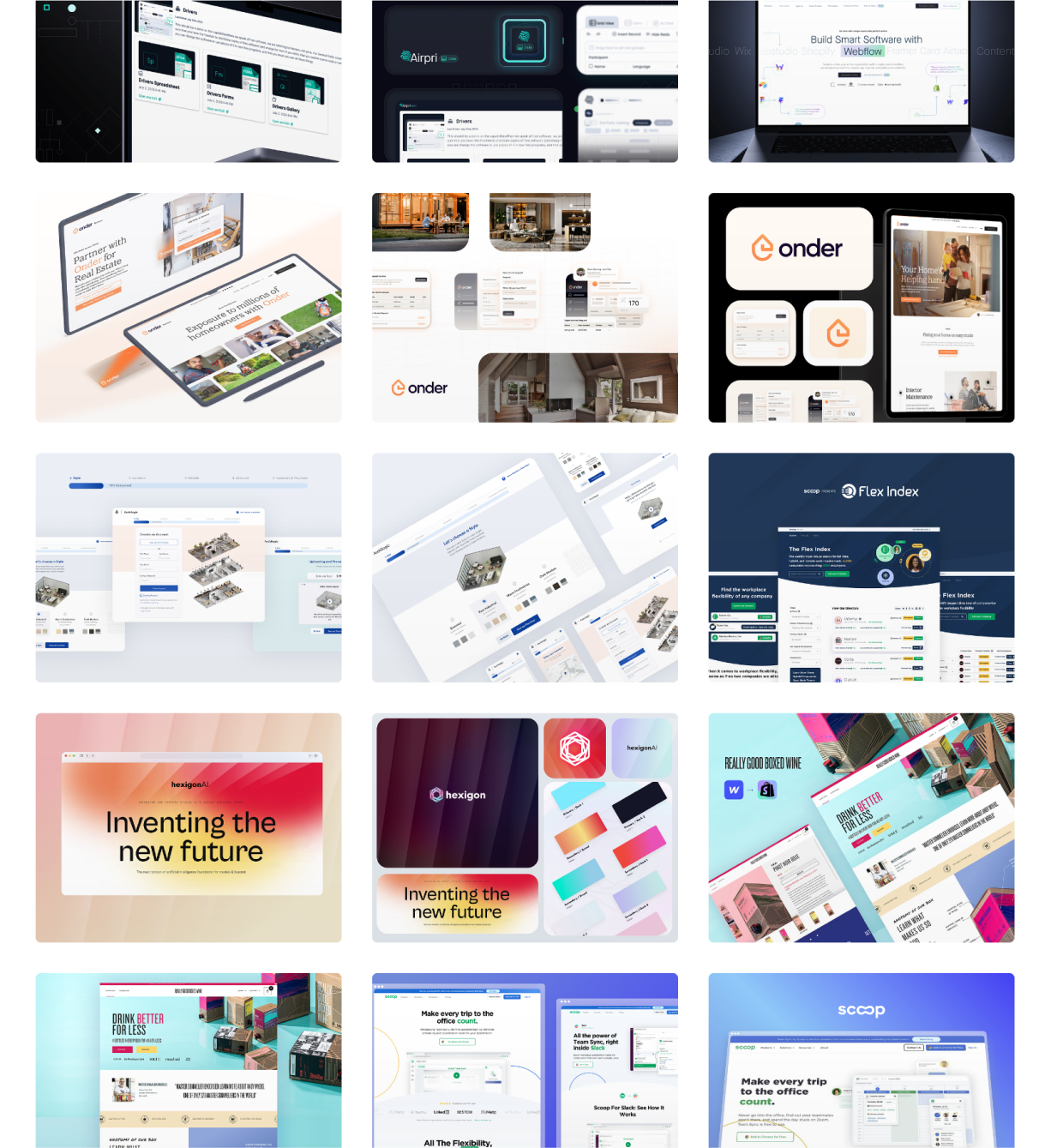
Radilson Gomes uses rich hover effects, skewed mockups, and a unique layout to show off the projects in his award-winning portfolio.
(Oh – and he uses a nice font too 😉)

For ideas on how to display projects in an interesting manner, dribbble can be a great source of layout inspiration. Just browse these shots from Tayler Freund and try not to be inspired 😀
Or scroll through Anthony Anderson’s single-page-of-images portfolio. The implementation may be quick and dirty, but the inspiration is 🔥🔥
Don’t cover on hover
One mistake I see a bunch in beginner portfolios is when you go to hover on a project, it makes the visuals impossible to see 😬
When a reader is thinking about clicking on a project, they’ll often start to hover on it – and then is NOT the time to make it harder for them to decide whether or not to click in.
Simple as that. Don’t cover on hover, folks 🫡
3/ Include social proof in your portfolio
“Social proof” is the marketing term for selling by letting OTHERS do the selling FOR you. And it’s highly effective 😎
In a design portfolio, there are 3 main types of social proof:
- Logos of companies you’ve worked for (especially name-brand companies)
- Testimonials from past bosses/co-workers
- Awards your work has won
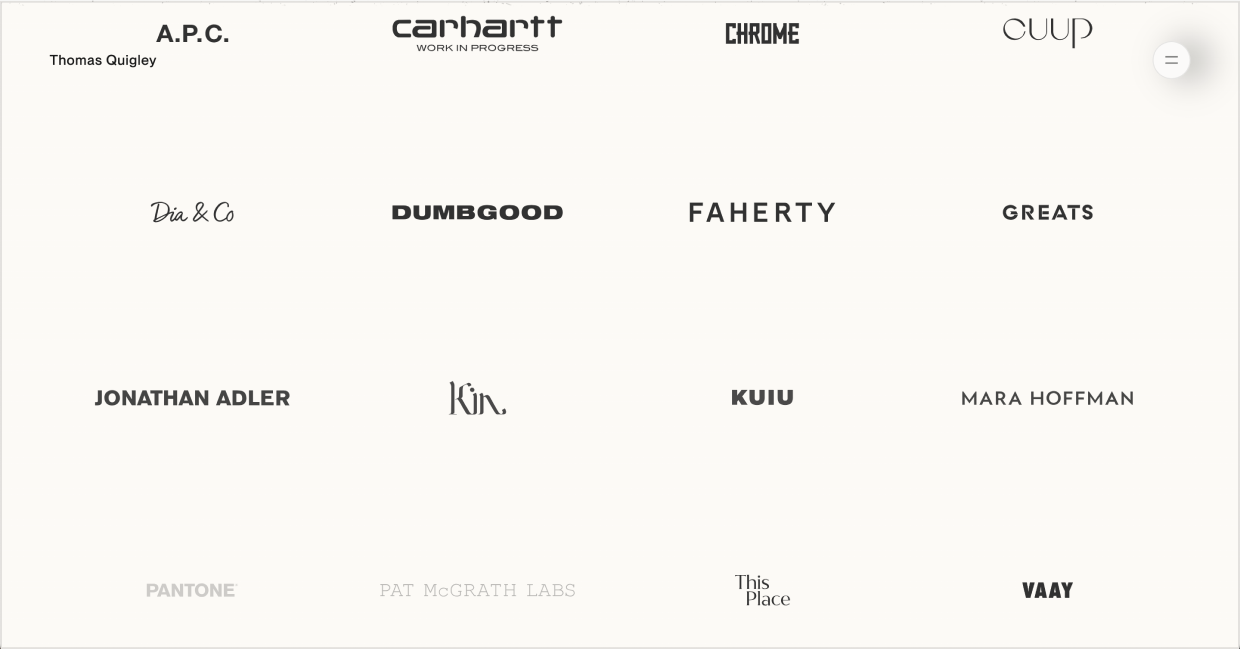
You know what makes you a shoe-in of a hire? Knowing you’ve done work for a bunch of reputable, name-brand companies in the past.
If you can solve their problems, you can solve mine – right? Here’s Thomas Quigley’s absolute wall of logos 😲
One-man design studio Kevin Twohy drops some absolutely powerful testimonials on his portfolio.
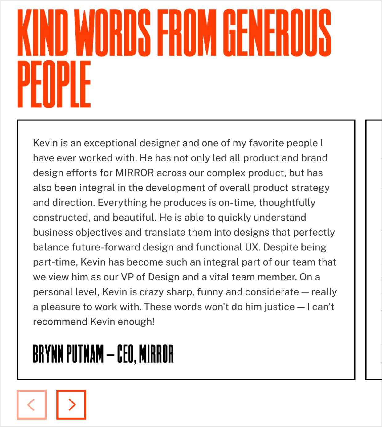
Notice how many of the statements above are superlatives?
“…one of my favorite people I have ever worked with… everything he produces is on time… I can’t recommend [him] enough!” – etc.
Look, if you’re browsing random designers, and then the CEO of a respected company chimes in with, “This is the best person I’ve ever worked with”, why would you even keep looking?
(If you want to go deep on writing to sell – including the best types of testimonials to use, check out Landing Page Academy. No pressure though; I know you’re just trying to read your article in peace 🙈)
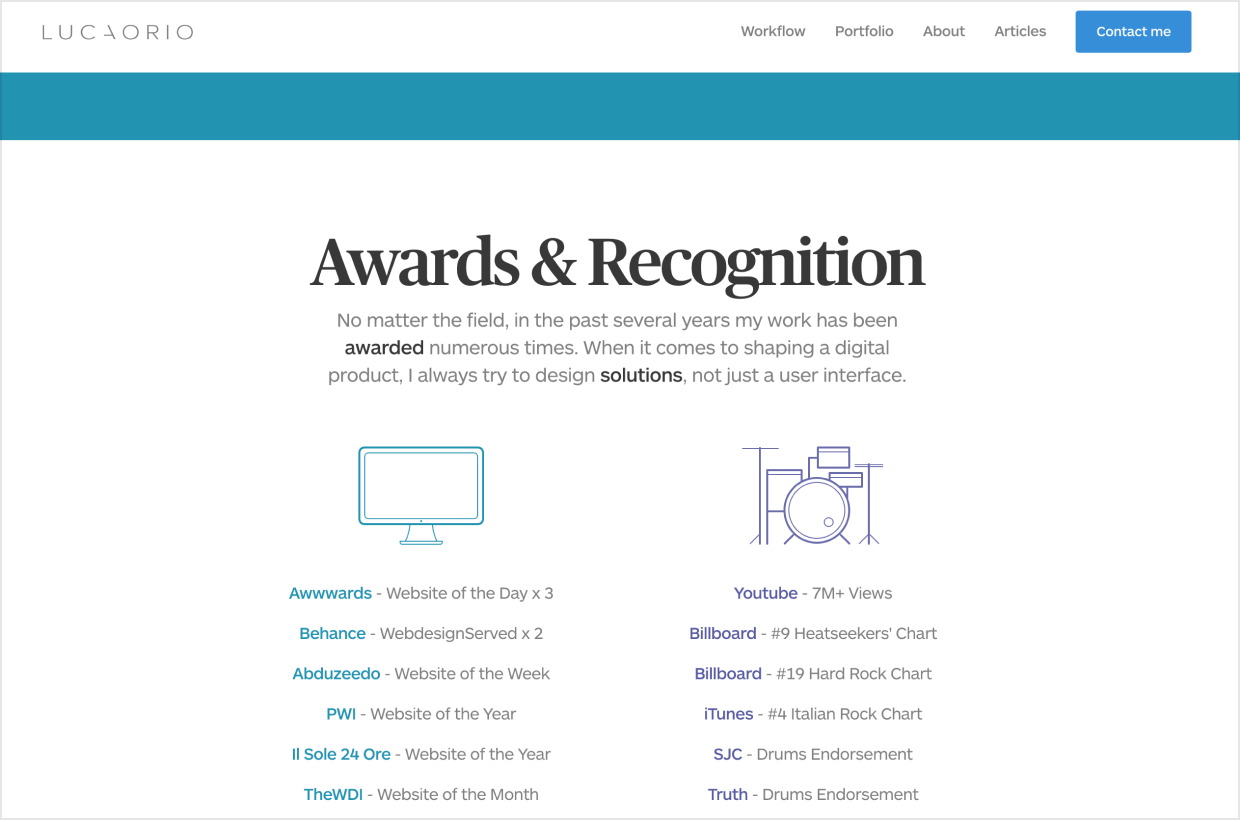
OK, and one last example of social proof: awards. Here’s one of my favs, from Learn UI Design student Luca Orio. A world-class designer.… and rocker 🤘
4/ Showcase your passion for design
One of most underrated things you can add to your portfolio is design “extracurriculars”. Does your love of design extend beyond your day job? Great, put it here.
- Speaking (conferences, meetups)
- Writing (blog posts, interviews, etc)
- Podcast appearances
- Side projects
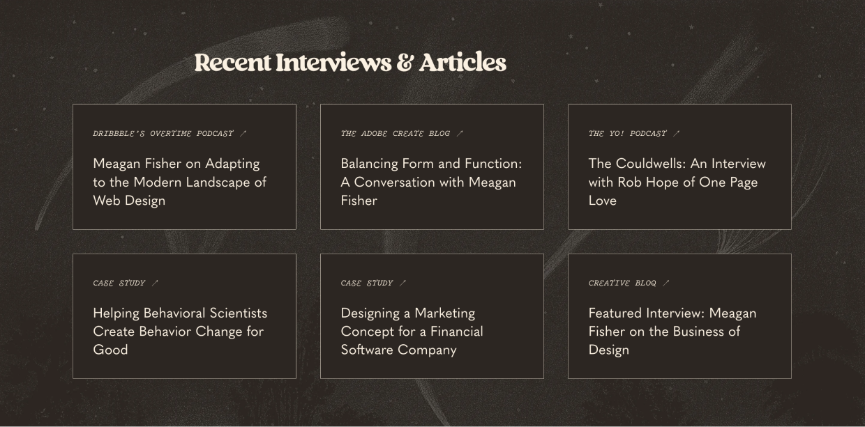
Here are Meagan Fisher’s recent design media appearances 🤩
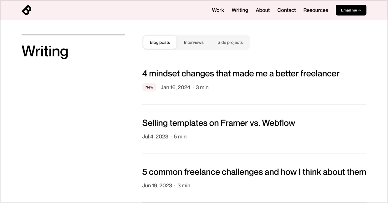
And below, Bryn lists his blog posts, interviews, and side projects. Whoa!
Again, consider this from an employer’s perspective. Who would you rather hire?
- Random designer who did some solid work
- Random designer who did some solid work, speaks at conferences, regularly publishes in-depth essays on design, and has appeared on a few podcasts
🤔🤔🤔
PS. Junior designers, don’t get overwhelmed here! If you’re just starting out, jot down a quick list of speaking/podcasts/blog posts/etc. you’d like to do one day, and then be cognizant as opportunities for those things start to appear. I’ve been doing this over a decade, and I still have a list of where I’d like to speak, etc.
5/ Make the next steps clear
Just about the very last thing you need to have on your homepage is how to get a hold of you.
(Sure, you could have it in a sticky top nav too, or whatever – that’s great 🙂)
But when someone reaches the bottom of the page, if they liked what they saw, it should be zero extra effort to reach out.
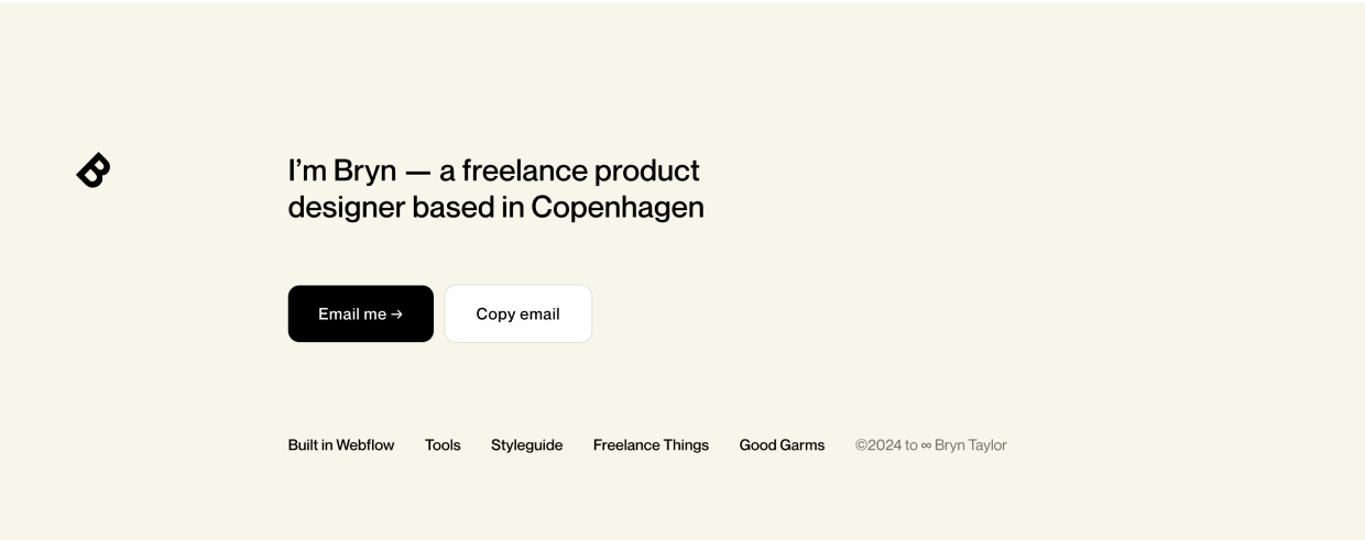
Perfect example, the bottom of Bryn Taylor’s portfolio has buttons to:
- Email him
- Copy his email address (useful since email links open the default email app, which can be obnoxious)
No need to belabor this section 🙂
Wrapping it up
So remember, when creating your portfolio homepage:
- Start with a splash (above-the-fold)
- Nail the projects preview
- Include social proof
- Showcase your passion for design
- Make the next steps clear
Next, we’ll dive into the project writeup page, one of the most daunting parts of any portfolio. Then we’ll look at some brilliant example portfolios and wrap up with my implementation recommendations.
See you in the next chapter ✌️
Continue to Chapter 3: Writing a Great Portfolio Case Study
Get 30 ways to add to your portfolio
From homepage to project case study, I'll send you 30 (illustrated) techniques for spicing up your portfolio.
Practical design tutorials. Over 60,000 subscribed. One-click unsubscribe.