The 3 Most Common Logo Design Mistakes (and How to Fix Them)
Whether you’re a freelance designer or you just have your own entrepreneurial side projects, face it: you’re going to be working with organizations that need logos. Maybe you’ll be the one designing the logo, and maybe not. Either way, it’s an important decision, and I’ve seen far too many young organizations botch their logos.
The weird thing is: most bad logos fail for 1 of 3 reasons.
That’s it. In some sense, it’s good news. If you can avoid three mistakes, there’s a decent chance you’ll end up with a pretty decent logo.
So, without further ado: the 3 most common logo design mistakes.
1. Don’t pick the most obvious symbol
The design firm with a brain logo. The environmental NGO with a tree logo. The yoga studio with a lotus logo. We can all think of a business that picked literally the most obvious and un-creative possible logo.
The problem with this is the most important job of a logo is to distinguish you from everyone else like you. That’s literally why they exist. So if you pick something that is HIGHLY likely to be similar to hundreds or thousands of your closest competitors, you’re shooting yourself in the foot right from the get-go.
The most important job of a logo is to distinguish you from everyone else like you.
So what do you do instead? My recommendation: pick a symbol that still makes sense, but is a step removed or less obvious. This leaves you an incredible amount of leeway. As long as you can come up with some other way of justifying the logo, it’s on the table.
❌ Bad Example

The Environmental Defense Fund features green swooshes shooting past a blue globe. If you’re an environmental group, it’s best to just take globes and trees off the table.
It’s just too obvious.
✅ Good Examples

The World Wildlife Foundation avoids the globe or some hodgepodge of animals, and instead goes with a stylized panda. Not only is it a striking logo, and pandas are known worldwide as a troubled species, but there’s a neat story behind the logo – it was designed by Sir Peter Scott, one of the founders of the WWF, and based off of Chi-Chi, a giant panda living in the London Zoo when the WWF back in 1961, when the organization was founded.

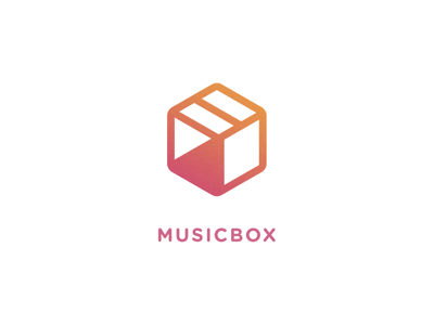
Anything music-related, on the other hand, risks displaying music notes as the Most Obvious Possible Symbol. So Igor Chebotarev’s MusicBox concept here is a breath of fresh air: a pause, play, and stop icon on the three visible sides of a box.
(Bonus: while you don’t need to recognize the three icons in the logo for it to be a nice logo, once you see it, it seems ingenious)
Well done!
2. Don’t pick the most obvious color
We get it. Social networks “must be” blue. Banks “must be” blue too. (Blue is the color of global, inoffensive, trustworthy brands). Apps for women “must be” pink. Anything remotely related to the environment “must be” green.
Nope. Stop. Again: logos are for distinguishing your business.
So, instead, go with a color for which you CAN make a justification of it. But, at the same time, it’s not the most obvious possible choice.
❌ Bad Example
You’re a chocolate company. You need to design a logo. You reach for… brown?
It seems so logical, and in isolation it may work fine.

But brown is a terrible color to work with. UI designers avoid it like the plague. Seriously – just try and find a major, professionally-designed app branded with brown.
(Also, as you’ll quickly learn, it’s the color of poop)

I’m not sure I could walk under this gate without giggling.
✅ Good Example
So what do you do instead? We already know the answer: literally anything else you can justify.
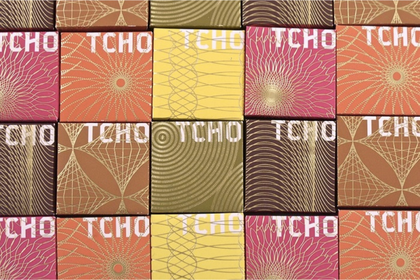
How about this: a good dark chocolate might have hints of berries, nuts, even citrus. What if we designed a flexible brand where different flavors were represented by different colors?

And for a logo color, we’ll use a warm hue somewhere in the middle of all that.

Ah. Do you see it? This is so much better.
3. Don’t make the logo too detailed for a website header
Ah, this is the classic mistake of a “designed-by-committee” logo.
Your logo should be striking enough to shine on Times Square billboards, but waaaaaay before that, it needs to work in your website’s 70px tall navigation bar on someone’s crappy old monitor.
Always opt towards simple. If there’s a lot of imagery or text you’d like to include in the logo, it can be veeeeery easy to avoid making the hard choice of prioritization, and just STUFF ALL THE THINGS INTO A TINY LITTLE LOGO.
Resist the urge. Keep it simple.
❌ Bad Example

The Interaction Design Foundation has a logo so detailed you CANNOT READ IT on their website. Like… where does one go to see what that text actually says? I have no idea.
✅ Good Example
In an attitude of putting my own skin in the game (rather than just bragging), Learn UI Design has a simple logo that works in a thin header at least as well as larger contexts.

(Oh, and in case you’re curious about the colors, I just wanted to use a gradient-as-theme-color motif. A firey ombré on a dark background seemed as good as anything, and most institutional teachers of design would shy away from something that aggressive)
Anyhow, over the years, I’ve worked with a lot of clients and students who are just at the point of needing a logo for the thing they’ve started. I find myself having these conversations over and over again, and so I wanted to jot it down for you to reference too.
So next time you need to design a logo – or are working with an organization designing their logo, remember:
The top 3 logo design best practices:
- Use a symbol that tells a unique story about you (don’t use the most obvious symbol)
- Use a color that you can justify, but isn’t the color your competitors all use
- Make it simple enough to appear clear on a 60-70px website header (but also a Times Square billboard)
And that’s it!
By the way, if you liked this article, you might want to sign up for Design Hacks, the mailing list which I originally sent this to.
Watch me do a UI project step-by-step
I’ll walk you through every part of a UI project — just like I’ve done for everyone from Fortune 100 companies to Y-Combinator startups.
Practical design tutorials. Over 60,000 subscribed. One-click unsubscribe.