6 Ways to Justify Font Choices in Your Designs
Today I want to talk about subtle ways to justify your font decisions. These are things that are not necessarily obvious to non-designers. If you think typography is subjective, read this article. If you still think it’s subjective after that, read it again. (My point is not that you can construct airtight proofs of certain fonts being best, but that there’s FAR MORE rationale behind font choices than meets the eye).
Let’s dive in.
1. It’s a Better Version of the Current Design
I want to set a baseline here. A non-subtle font decision is: “My website is fun, so I will use a fun font for the logo – like Comic Sans!”
(Sorry, easy example, but this raises the question: why do designers hate Comic Sans so? It is precisely because it is used so frequently as the blunt mallet of THIS-IS-A-FUN-FONT-ARE-YOU-HAVING-FUN-YET, and no one enjoys being hit over the head. So it’s NOT because the letterforms are aesthetically subpar. It’s because of usage inflation. I doubt I’d even notice it the font were used in a comic book!)
So here’s a barely mythical tea shop with its Comic Sans logo:

As it’s a tea shop, not a comic book, we have a problem. But we don’t need to scrap everything. There’s a sliver of brand here we can salvage. WHY did this tea shop go with Comic Sans? Is it because they wanted a hand-drawn, casual, personal feel? Warm and comforting, but hip and understated? Like tea?!?!
Yeah, probably. Listen, far be it from a designer to make assumptions, but come on. I’ve been around the block with clients. I know how this crap goes.
A responsible designer might think something like this.
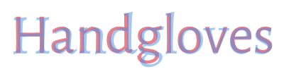
“OK, hand-drawn. Hmmm… That gives me a bunch of ideas of fonts. Fortunately, I’ve been categorizing screenshots/links/font files of every nice hand-drawn font I’ve seen in the last decade, so let me just run through these 50 and see if any might fit the brand of a tea shop.”
And, poof, we get:

Cool. That took almost 5 minutes.
I want to point out three things about this little turnaround:
- Bad design decisions can be made with the best rationale. The idea is to make a better decision, often using exactly the same – or a better-_defined_ – rationale.
- It helps to know a TON of fonts. To those ends, download the WhatFont Chrome extension, and use it to start identifying every font you like on any website you visit. When you download a new font, categorize it in FontBook or whatever the Windows equivalent is.
By the way, that font above is Espa from the wonderful Wild Type foundry. Available for a the low, low price of totally free!
With this example in mind, and more to come, let’s talk about other ways to justify your font choice.
2. It Matches Your Brand Adjectives
One nifty designer-trick I used above was to describe the brand I wanted with adjectives. That’s key. It’s ALWAYS worth writing down the adjectives that describe your brand at the beginning of a project. What do you want the user to feel? What do you want them to think of your company or your project? If you think this is a sappy exercise that won’t be worth your while….. tough cookies.
You don’t have to be this guy…

…but you will need to get in touch with the side of your brain that uses words to describe things. I hope that’s not asking too much.
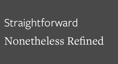
Let’s check out a few fonts and see what adjectives come to mind.


Why does Omnes feel soft? It’s because the corners are literally all rounded. Compare to DIN, which has everything squared-off. Even the rounded corners of the “D” look juuuuuust curved enough to make a “D” distinguishable from a rectangle.
You don’t need to know a ton about fonts to come up with these adjectives. It should be the first thing that pops into your head when you start playing with them.
Now what I love about these examples is NONE of them are crazy overdone fonts. There’s no Comic Sans/Papyrus/etc. in the bunch. They’re all pretty staid and normal, yet they say wildly different things.
If you have a tough and authoritative brand, like, say, Palantir, the security-focused software company, then DIN makes a lot of sense.

Design Facts has a bit more of a bookish vibe going on. Nerdy and crisp. For them, Crimson Text works great.
You get the idea. I want to keep moving along, so let’s call it.
3. Its History or Inspiration Match Your Brand
In the last section, I said you don’t need to know a ton about a font to start labelling it with brand adjectives. Now that changes. We’re getting into territory where it does help to have a bit more knowledge about how fonts have been used.
History can provide a bevy of great excuses to use a font.
For instance, some fonts just plain old IMPLY a certain time period. Not universally, per se, but strongly enough for it to be an under-the-surface conversation.
Futura is the unofficial font of the 60s, for instance.
So if you ever want to give something a bit of a vintage makeover, it’s a great choice.
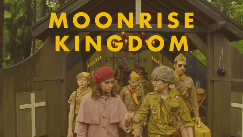
Wes Anderson uses Futura – along with vintage costumes and coloring – to convey the time period of his movies (which, IMO, is a sort of non-specific retro era).
In the case of Futura, the font was actually used heavily in the 60s. So it’s not so much a reference to typography of that era as it is an exact lift. But you can be sly about this too. Some newer fonts reference or are inspired by older typefaces, but aren’t full-on throwbacks.
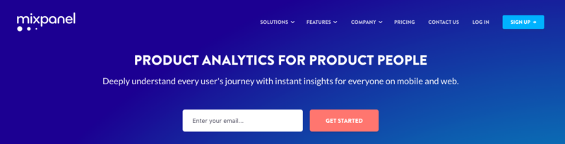
Check out Brandon Grotesque. Super popular right now. It’s definitely got a Roaring Twenties vibe going on.
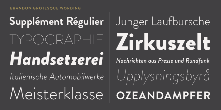
But again, this isn’t HIT-YOU-OVER-THE-HEAD 1920s throwback. It’s a lot more subtle. It’s subtle enough that some sites will use the font without the least bit of retro vibe. Here’s the always-on-point Mixpanel:
Anyhow, some of these associations are so subtle that when you’re starting out, it REALLY helps to read anything you can about fonts you like. Indeed, if we check out Fonts.com’s “Typeface Story” of Brandon Grotesque, they mention the 20’s and 30’s in the second sentence.
OK, one more example. The previous two examples – Futura and Brandon Grotesque – are referencing actual periods of time. But you can also reference usages.
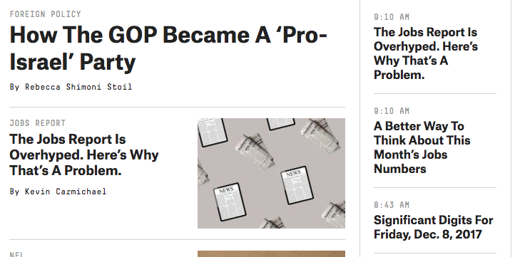
For instance, I mention this example in Learn UI Design, but a bunch of the early sans serif fonts that appeared in newspapers were called “grotesque” – which, yes, means ugly, seeing as though they stripped away all those beautiful serifs. Atlas Grotesk is a modern take in this field (released in 2012), but you could justify its use in headlines by knowing that it’s a modern twist on a classic choice.
And that’s exactly what FiveThirtyEight does:
So poke around in the “about this font” section on various sites. Typewolf and Fonts.com have great selections here; other sites have more limited selections. Is this a lot of work? Yeah, it is. But if you’re going to be designing for years to come, developing a working relationship with typefaces is a worthy investment of time.
4. It Has the Right Features
You may not think of fonts as having “features”, but who knows – you could be wrong about a lot of other things too!
Fonts have features, and the most basic feature is WEIGHTS. We’re talking like “bold”, “italic”, and so on.
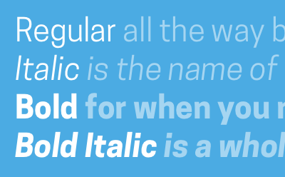
- Any body font will need normal, italics, bold, and bold italics – if it doesn’t have those four weights, DON’T use it as a body font.
- Any font being used as the ONLY font in your brand should have even more weights: light, thin, heavy, black, extrabold, etc. The names differ, but the points is: you want that flexibility available if everything from the website to the business cards to the corporate schwag is emblazoned with the same letterforms.
- The smaller your usage of a font, the less important weights are. Fonts used oooonly for headlines or oooonly for the bylines of articles or whatever? Cool. Even a single weight could be fine. But weights are not the only feature out there. Here’s a few others to consider when picking a font:
Tabular figures
In a monospace font, every character is the same width (by definition). So for all the rest of them, characters don’t necessarily line up vertically. This is well and good when you’re reading a paragraph, but what if you have a table, and the numbers in one row are directly comparable to numbers in the row below it? Gee, it sure would be swell if the numbers lined up.
That’s where tabular figures come in.
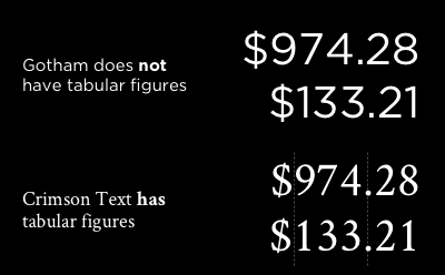
Some fonts have tabular figures right out of the gate. The numbers are all monospace, and if you so much as type “11110000”, you’ll know if that’s true. Other fonts, however, have tabular figures as an OpenType feature. At least on the web, using them is only a little-known CSS property away.
Small Caps
This one is getting pretty fancy, but it’s worth the mention. Here’s the issue. If you want to make some text look set apart or distinct from the text around it, you have a variety of ways of doing so – italics, bold, quotation marks, etc. You could also, for instance, write something IN ALL CAPITAL LETTERS. The issue though, is that this feels severely more intense than normal text. So type designers, fine folks that they are, invented small caps. All the emphasis, none of the stress.
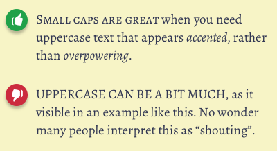
I find that small caps work best in “literary” settings. They definitely have an old-timey flourish to them.
Also, if you want to use small caps, but your font doesn’t have them (the vast majority do not), you can fake them. One part uppercase, one part letter-spacing, one part making the height at or just above the x-height of the text. The only problem? Your fake small caps letters will be thinner than the surrounding text. Awkward? Well, perhaps not if you have a medium weight you can use that’s just thicker than the normal weight!
Accented Characters
If you’re going to be writing foreign words with any regularity, check to make sure your font includes a good set of accented characters. This is not an issue with a professionally designed body font – it’s something that creeps in when you start using free fonts from odd sites around the web.

That font is KB Planet Earth, one of my go-to handwritten fonts. Yet clearly, it’s nowhere near robust enough to be used for anything more than decoration in unaccented Latin characters.
I don’t have anything more to add about this.
So, to wrap this up this bit about font features: don’t let your love affair with a particular typeface lead to bad decisions about where you use it. There’s a handful of times I would’ve LOVED to use one particular font, but ultimately chose something “lesser” because of the features I needed (FWIW, italics is the feature I find most often lacking).
5. It Pairs Nicely
This is a justification for picking a particular font that opens up a whole other can of worms. “It pairs nicely!? Define nicely! How can I determine that!?”
Listen, this is already a long post. Font pairing is not something we’re going to go into too much right now, but we can knock off some low-hanging fruit here. If you want more, by the way, I have a 50-minute long video on pairing fonts in Learn UI Design.
One easy case for fonts pairing nicely is if they’re part of a superfamily. That is, you’re already using Alegreya, then Alegreya Sans will basically always pair nicely. After all, the naming scheme is not a coincidence: they were designed by the same person, to be used together.
The same goes for Freight Sans and Freight Text.
And so on.
By the way, you can often get a decent idea of how fonts pair by overlaying them on top of each other, then adjusting the letter-spacing and font size until there is as much overlap as possible. With fonts that have a lot of overlap, the structures of their letterforms are very similar, and these fonts will often make a good pair, provided they are suitably different to begin with (the classic example of “suitably different” is: one is sans serif, the other serif).
6. It’s a Workhorse
Every once in a while, a famous designer will say they use the same 5 typefaces for 90% of their projects. This strikes me as the quintessential “git off my lawn!” comment from crotchety old designers, but whatever. Maybe I’ll be that way too one day.
But here’s the point: if you can use 1 typeface for 20% of your projects, it’s a workhorse.
Calling a font a “workhorse” is high praise. It means that a single typeface can play sweeper. It’s legible and staid when body text, yet interesting as a title; readable when tiny, yet decorous at scale. A workhorse will contain every feature you need. It’s never gonna’ give you up or let you down.
While many workhorses are fairly “neutral” in their presentation, they need not be totally boring.
In my branding of Learn UI Design, I use both Avenir and Freight Text. Both of these fonts are legit workhorses, yet they’re substantially different.
So when you see a typeface called a “workhorse”, just file that away. It’s an incredibly high indicator of quality, and when you find yourself totally open to whatever font may come your way, it’s not a bad idea to review a few of those to get the ball rolling.
OK, that wraps up this mega-post on justifying your font decisions. If you want to see examples of more workhorse fonts, check out The Top 5 Free Fonts for UI Design below. In it, I cover:
- My go-to free fonts that work in a wide variety of situations
- In-depth analysis of what situations the various weights could be useful in, plus an analysis of the uppercase of each font
- The most common free fonts you should avoid
Interested? Get on it.
The Top 10 for UI Design
Get a PDF of the 10 best free fonts for web/mobile app design (including which free fonts not to use).
Practical design tutorials. Over 60,000 subscribed. One-click unsubscribe.