Export Gradient
background: linear-gradient(90deg, #003f5b, #2b4b7d, #5f5195, #98509d, #cc4c91, #f25375, #ff6f4e, #ff9913);
background: linear-gradient(90deg, #003f5b, #2b4b7d, #5f5195, #98509d, #cc4c91, #f25375, #ff6f4e, #ff9913);

Your design tool is making your gradients look worse 😬. Whenever you try to create a gradient across a wide range of hues in Figma, Photoshop, etc, you often will see a gray dead zone in the middle of your gradient. Here's an example:
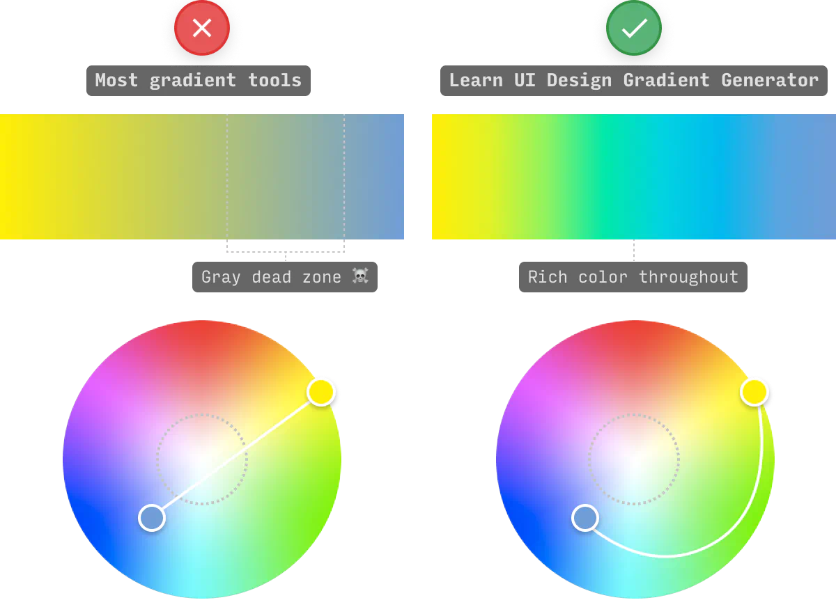
If you want your gradient to avoid the dreaded gray dead zone, you have to interpolate by drawing a biiiig curve from A to B (not a straight line).
This tool does that automatically.
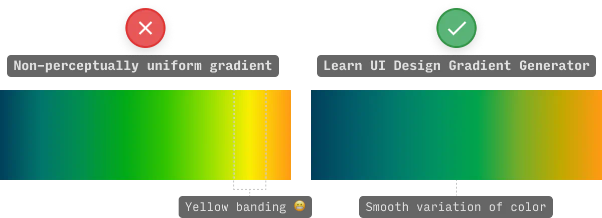
ANNND this tool does that in 8 different color spaces – 6 of which are “perceptually uniform”.
Why does perceptually uniform matter? It prevents your gradients from “banding”, i.e. having noticeably darker or brighter stripes along the length of the gradient. Here’s what that looks like:
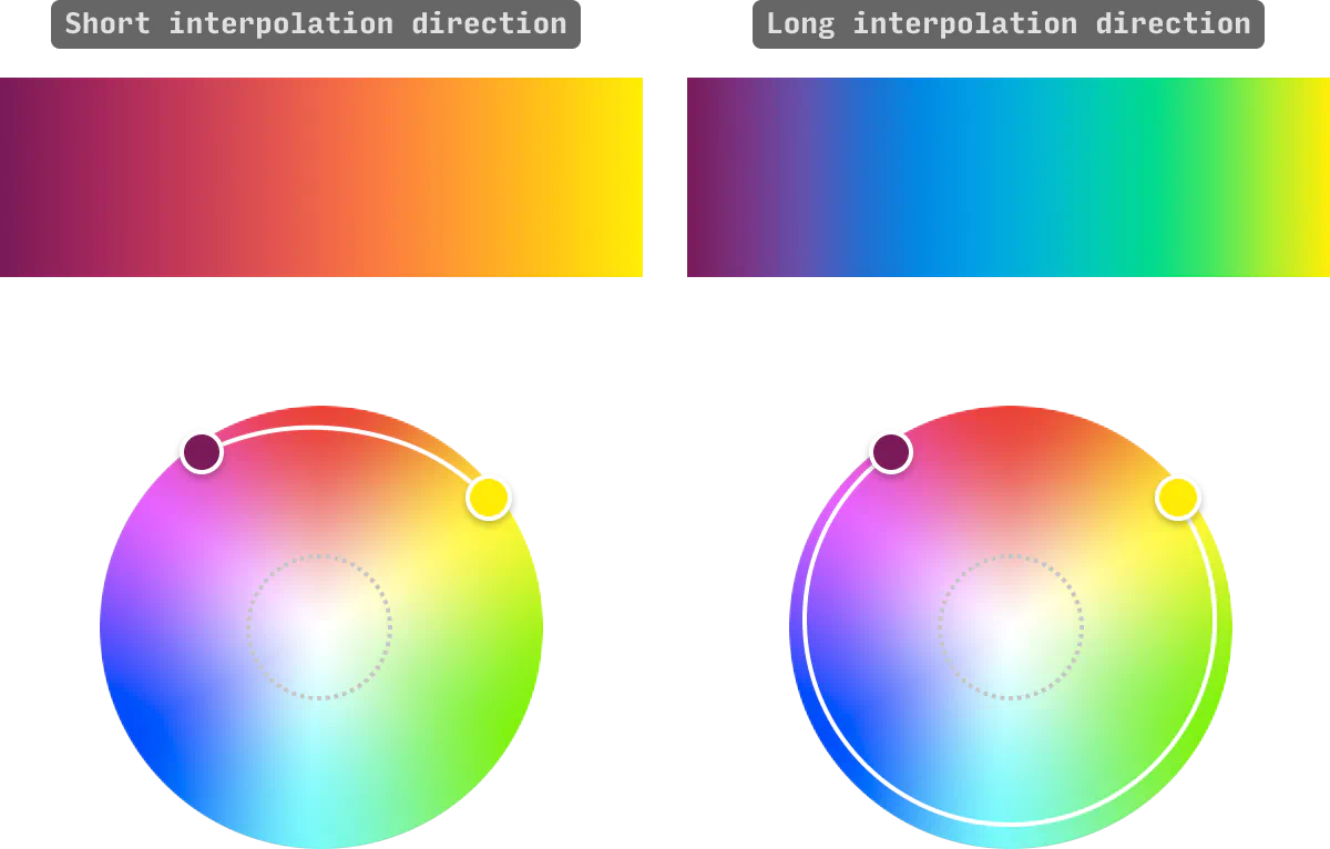
In addition, this tool allows you the option of interpolating the long way around the color wheel, which can generate much more interesting gradients in some cases:
All in all, you can choose between 8 different radial color spaces, all of which interpolate around the gray dead zone, and allow your gradients to maintain a rich, vivid swath of colors the whole way 👍
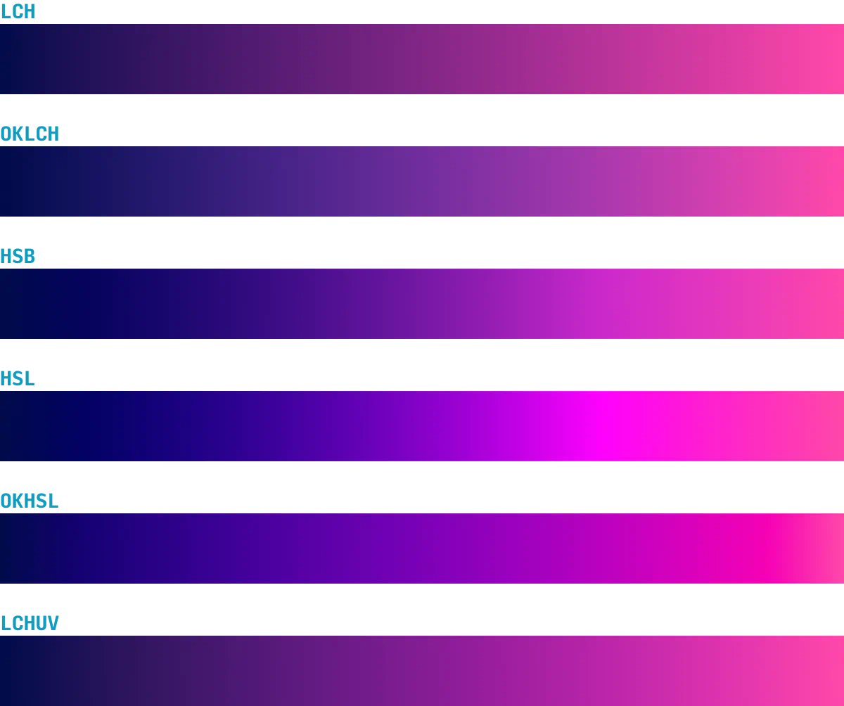
Currently, you can create gradients in 8 different color systems in this tool, which yield slightly different results. Here's a visual comparison of 6 (the other two yield very similar results):
This tool is designed for experimentation, but here are two neat workflows for generating alternative types of gradients – radial and conic.
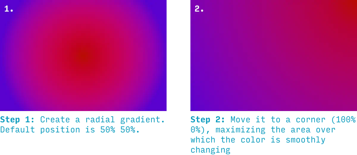
For radial gradients, the default position is the center (0% 0%). But by shifting them to a corner (e.g. 100% 0%), the area of which the color changes will stretch across the whole canvas.
For conic gradients, you can get a similar effect by moving them slightly offscreen. Note that the max x or y position for this tool is 120% – it's for exactly this reason 😉
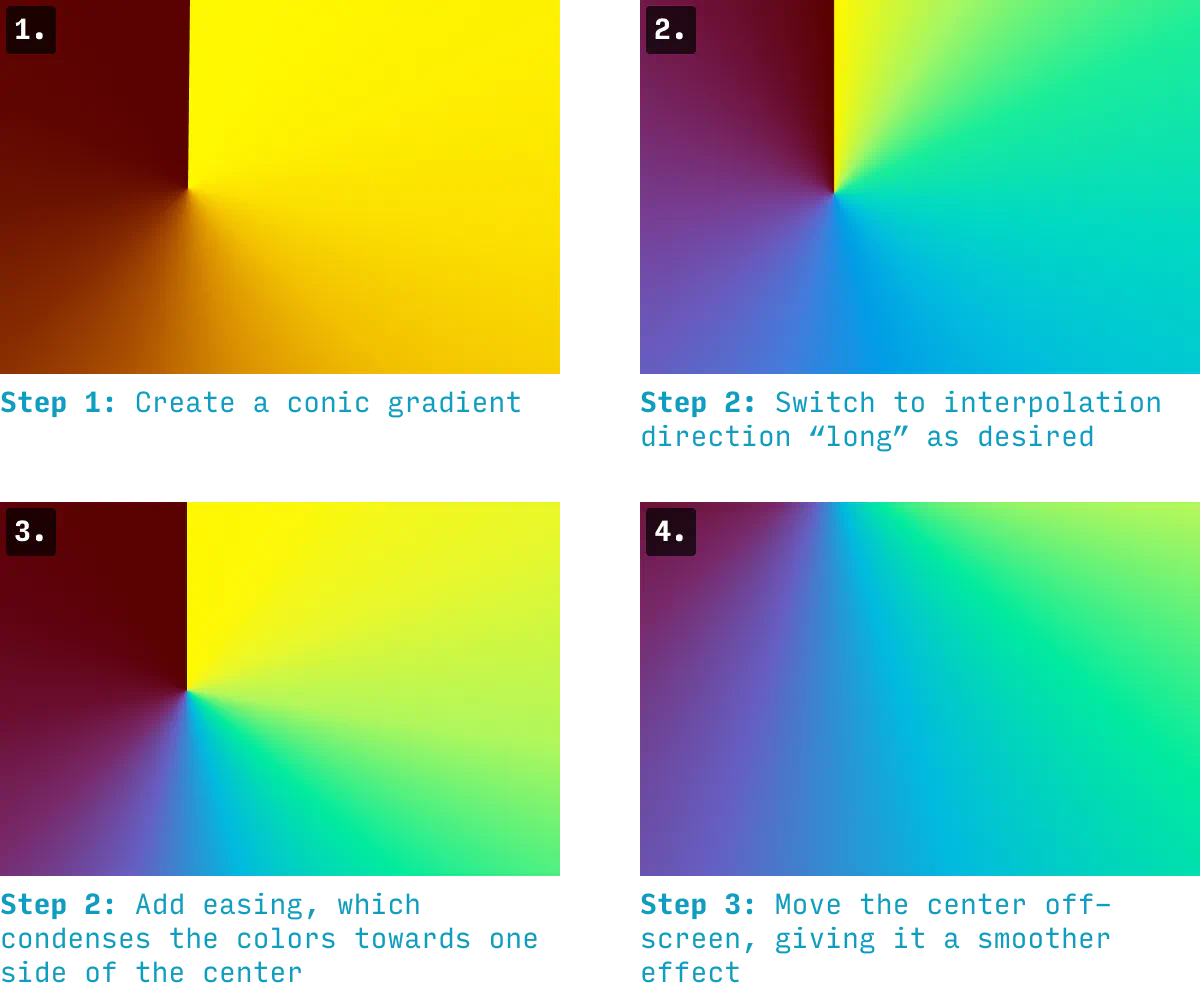
By combining this with the "ease" property, you can get the maximum swath of colors onscreen, without having a jarring point at which they all meet 👍
I loved coding up this tool, but I'm still first and foremost a designer. And so I want to play around with gradients in Figma (but by all means, use Sketch, Canva, etc).
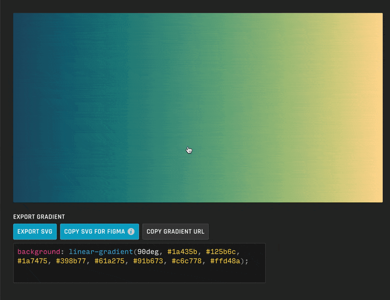
It's super easy to use these gradients in your design app.
Just press “Copy SVG for Figma” and paste directly into Figma, etc 🙂
It's dead simple to get the gradient CSS for any of the 3 types of gradients (linear, radial, or conic).
Simply press "Copy CSS" and add the code to the element you need it.
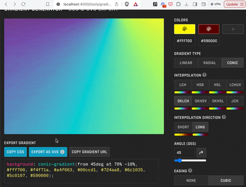
Note: if you have other background properties set for the element in question, you can change the property from background to background-image 👍
For more color tools and articles on using color in UI design, check out:
And, as always, send me feedback and feature requests. I aim for this to be the very best gradient tool on the web – so what do you want to see? 😎
PS. Yes, there’s also a Figma plugin version of this tool now 🙂