An Interactive Type Tutorial
In this 5-minute tutorial, you’ll learn:
Ready to get started?
Just scroll down 👇👇👇
First, rotate your device to landscape orientation 👍
(Or view on desktop for the best experience. Here’s the link)
Get StartedChapter 1:
Konishi polis, Earth
23 389 025 000 000 CST
15 May 2975, 11:03:17.154 UTC
abcdefghijklmnopqrstuvwxyzabcdefghijklmnopqrstuvwxyzabcdefghijklmnopqrstuvwxyz
The conceptory was non-sentient software, as ancient as Konishi polis itself.
Its main purpose was to enable the citizens of the polis to create offspring: a child of one parent, or two, or twenty – formed partly in their own image, partly according to their wishes, and partly by chance. Sporadically, though, every teratau or so, the conceptory created a citizen with no parents at all.
In Konishi, every home-born citizen was grown from a mind seed, a string of instruction codes like a digital genome. The first mind seeds had been translated from DNA nine centuries before, when the polis founders had invented the Shaper programming language to recreate the essential processes of neuroembryology in software. But any such translation was necessarily imperfect, glossing over biochemical details in favor of broad, functional equivalence, and the full diversity of the flesher genome could not be brought through intact. Starting from a diminished trait pool, with the old DNA-based maps rendered obsolete, it was crucial for the conceptory to chart the consequences of the new variations to the mind seed. To eschew all change would be to risk stagnation; to embrace it recklessly would be to endanger the sanity of every child.
Chapter 1:
Konishi polis, Earth
23 389 025 000 000 CST
15 May 2975, 11:03:17.154 UTC
The conceptory was non-sentient software, as ancient as Konishi polis itself.
Its main purpose was to enable the citizens of the polis to create offspring: a child of one parent, or two, or twenty – formed partly in their own image, partly according to their wishes, and partly by chance. Sporadically, though, every teratau or so, the conceptory created a citizen with no parents at all.
In Konishi, every home-born citizen was grown from a mind seed, a string of instruction codes like a digital genome. The first mind seeds had been translated from DNA nine centuries before, when the polis founders had invented the Shaper programming language to recreate the essential processes of neuroembryology in software. But any such translation was necessarily imperfect, glossing over biochemical details in favor of broad, functional equivalence, and the full diversity of the flesher genome could not be brought through intact. Starting from a diminished trait pool, with the old DNA-based maps rendered obsolete, it was crucial for the conceptory to chart the consequences of the new variations to the mind seed. To eschew all change would be to risk stagnation; to embrace it recklessly would be to endanger the sanity of every child.
Chapter 1:
Konishi polis, Earth
23 389 025 000 000 CST
15 May 2975, 11:03:17.154 UTC
The conceptory was non-sentient software, as ancient as Konishi polis itself.
Its main purpose was to enable the citizens of the polis to create offspring: a child of one parent, or two, or twenty – formed partly in their own image, partly according to their wishes, and partly by chance. Sporadically, though, every teratau or so, the conceptory created a citizen with no parents at all.
In Konishi, every home-born citizen was grown from a mind seed, a string of instruction codes like a digital genome. The first mind seeds had been translated from DNA nine centuries before, when the polis founders had invented the Shaper programming language to recreate the essential processes of neuroembryology in software. But any such translation was necessarily imperfect, glossing over biochemical details in favor of broad, functional equivalence, and the full diversity of the flesher genome could not be brought through intact. Starting from a diminished trait pool, with the old DNA-based maps rendered obsolete, it was crucial for the conceptory to chart the consequences of the new variations to the mind seed. To eschew all change would be to risk stagnation; to embrace it recklessly would be to endanger the sanity of every child.
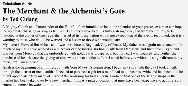
Your restyling looks a ton better than the original – and in the process, you’ve learned about:
For a cheatsheet version of the lessons we've covered, sign up below:
No spam. Over 60,000 subscribed. Unsubscribe anytime.
And for the full online course featuring every strategy in this tutorial – plus hundreds of others – check out Learn UI Design, my online video course, which features:
And thousands of students!
(And if you don’t want to learn more, but still thought this was cool, please share this interactive tutorial on social media – I’ll be forever indebted to you 😉)
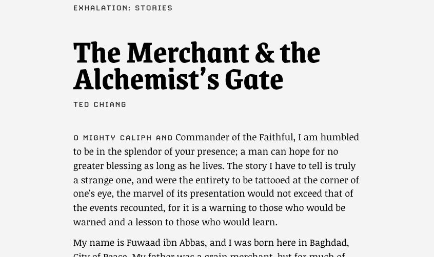
Some folks might use Source Sans here, but it’s not the best fit for something super technical and sci-fi feeling.
One hint: I find that squared-off letterforms work better for techie brands such as this 😉
Pick Another FontEB Garamond has a very classic, formal appearance. We want something that has a modern edge.
One hint: I find that squared-off letterforms work better for techie brands such as this 😉
Pick Another FontInter is a fantastic, legible font, but it feels very neutral and clean. Instead, we want to find something with a bit more personality.
One hint: I find that squared-off letterforms work better for techie brands such as this 😉
Pick Another FontThe angular, geometric Abolition works great with the brand – and with our slightly squared-off body serif. Nice 👍
ContinueKarla has this sort of quirky friendliness, which works for things that are more casual. But for a sci-fi story taking place in the year 2975, we want something a little… less casual.
Pick Another FontThe rounded Nunito is playful and fun, but our far-future sci-fi book demands something that feels more technical and mechanical.
Pick Another FontPlayfair Display is formal and classic, but neither of these qualities make sense for our sci-fi setting. Instead, we want something that feels like the future — not the past.
Pick Another FontBebas Neue is a great font – and the punchiness of it certainy matches Abolition. But it’s simply no good for small sizes. It’s too compact, and its details too small.
Pick Another FontDM Serif Display is a great font, but would feel more at home as, say, a newspaper headline (the "Display" in its name means it's great for titles). In addition, let's pick something with a bit more of a sci-fi vibe.
Pick Another FontVarela Round has its place – potentially even in a futuristic brand too. But its soft friendliness conflicts too much with the angular, precise title font. What would complement it instead?
Pick Another Font