Font Sizes in UI Design: Principles & Resources
You’re reading Font Sizes in UI Design: The Complete Guide. Quickly navigate to other chapters: Intro · iOS · Android · Web · Principles
Principles of Typography
If you’ve made it this far, congrats. Everything above is the easy answers. Now we spend some time on the background ideas that apply not only to the platforms above, but also to posters, slideshows, and everything else a greater design career might include.
Angular Size
Like many things in UI design, something that appears random and subjective (like font sizes) is actually depending on remarkably sensible principle: we like to read paragraphs whose letters are about the same subjective size – namely, something like 0.3° tall, from baseline to cap height, in our field of vision.
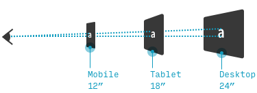
First, why are we measuring font sizes in degrees? Frankly, it’s the most sensible way to do it when comparing across devices. What else you got – inches? If you talk about trying to make your type half an inch tall, well, great, but half an inch text is crazy big on a phone (one foot from your face), and pretty dang small on a TV screen (10 feet from your face). The simple truth is: when a font is twice as far away, it needs to be twice as big to compensate.
Now this is great in theory, but in practice, it’s incredibly arduous to calculate:
- Not everyone views their phone or monitor from the same distance
- Not all devices have the same size pixels
- Not all fonts are the same readability – even at the same font size, pixel-density, and viewing distance!
So while you will probably never be calculating this out by hand, I think there are two general lessons that are worth bearing in mind.
The 1/16” Rule
Across a wide variety of viewing distances, you can size your body text according to the following formula:
Font size (in inches) = 1/16" x (the number of feet between the user’s eyeballs and the device)*
*Measuring baseline to cap height, and presuming a fairly readable body font
I don’t expect you to whip out a ruler the next time you make an Android app, but this could come in handy when you take your digital design knowledge to a medium you’ve never worked with: presentation posters, TV apps, slideshows for viewing in an auditorium hall, etc.
The Pixel Density-Viewing Distance Offset
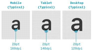
In general, smaller devices have smaller pixels*.
*By “pixel”, I mean not physical pixels, but the concept alternatingly referred to as “CSS pixels” (web), “density-indepent pixels” (Android), or “points” (iOS) – in-depth explanation here.
That means smaller devices have more pixels per inch. And that means the same font size appears physically smaller on phones than tablets, and physically smaller on tablets than desktops (and so on for TVs as well, by the way).
That’s not the end of the world, since we hold phones closer to our face. But if the average phone is twice as close to our eyeballs as the average desktop, is the pixel density decrease enough on desktop to make the desktop font twice as big? Short answer: no. Longer answer: as of writing, the typical desktop now has about 33% smaller pixels than your typical mobile device. This means that it’s not stupid to make any desktop text about 33% larger than its mobile equivalent, at least on a page optimized for longform reading (on pages that aren’t? Well, read the Interaction-Heavy Pages section in the web chapter).
That’s all. Just another rule of thumb to keep in mind as you design responsive web sites.
Further Reading & Resources
iOS:
- The iOS Design Guidelines: An Illustrated Guide. Think of this complete guide to iOS design like Apple’s own “Human Interface Guidelines” – but actually usable! More examples, more illustrations, and a couple helpful downloads that I use in my own iOS design work.
- Human Interface Guidelines – Typography by Apple. I hate every time I have to wade through these, but you can’t live without ‘em. Here’s what Apple has to say about designing for its devices.
Material Design:
- iOS vs. Android App UI Design: The Complete Guide. My in-depth guide to the differences between iOS and Android/Material Design, covering UI elements, navigation, system defaults, and more.
- Material Design Typography Guidelines by Google. Google’s official page on typography, although you should check out pages on various components (buttons, modals, etc.) for a more complete picture.
TV design:
- Designing for Television by Molly Lafferty.
- Android TV typography guidelines by Google.
- Amazon Fire TV user experience guidelines by Amazon.
If there’s anything I should add to this list, drop me a line!
The Top 10 for UI Design
Get a PDF of the 10 best free fonts for web/mobile app design (including which free fonts not to use).
Practical design tutorials. Over 60,000 subscribed. One-click unsubscribe.