The iOS App Font Size Guidelines (iOS 17 update)
You’re reading Font Sizes in UI Design: The Complete Guide. Quickly navigate to other chapters: Intro · iOS · Android · Web · Principles
Designing an iPhone or iPad app and not sure what font sizes to use? Here’s the quick and dirty summary of font sizes assuming (a) you’re using Apple’s default font, SF Pro (or similar) and (b) you want to match iOS conventions.
iPhone Typography Guidelines
Here’s a quick summary of styles. See below for visual reference and more in-depth guidelines.
| Element | Sizing | Notes |
|---|---|---|
|
Titles (of pages or modals) |
17pt |
Medium font weight Page titles are 34pt before scrolling, 17pt once scrolled |
|
Paragraph text, Links |
17pt | |
| Secondary text | 15pt | Lighter color as well |
|
Tertiary text, Captions, Segmented buttons |
13pt | Skip a font size between secondary and tertiary text |
|
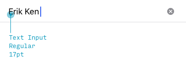
Form controls (Buttons, Text inputs) |
17pt | Highlight important buttons & active segment of segmented buttons with medium font weight |
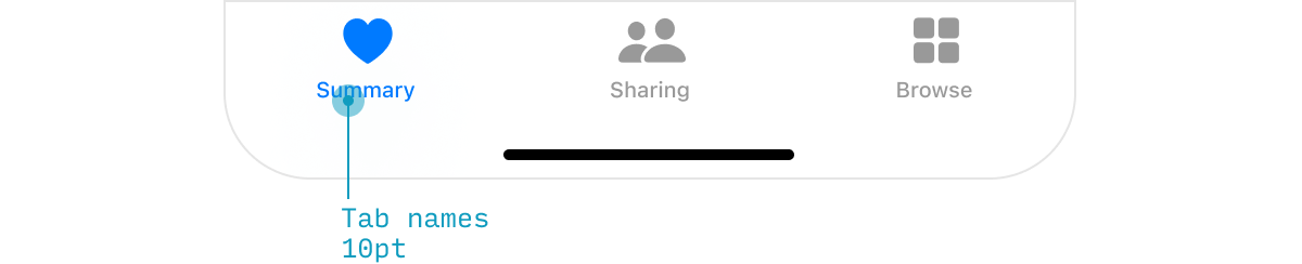
| Tab bar | 10pt | Don't go smaller than this |
Let’s break this down element-by-element and look at illustrated examples. We’ll cover not just the actual font sizes, but also how Apple thinks about text styles.
Titles
iOS has some big chunky titles, like “Inbox” below – at 34pt, it’s about the biggest text you’ll see on an iPhone.
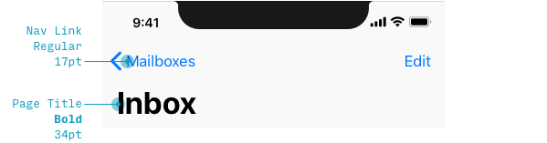
But once you scroll, titles morph to 17pt, the default size for text-based actions as well.
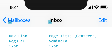
Note that the title shrinks to the same size as default text – but they use a heavier weight and top-and-center placement to distinguish it as a title. This was a bit of a revelation to beginning-designer-Erik, as I always expected that titles would be bigger than normal text (not simply bolder).
List Views
Lists are the bread and butter of phone apps. You never knew how many things were actually lists until you started displaying them on a tall, thin screen. Let’s look at those next.
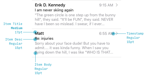
In a list view – in this particular example, emails – iOS treats the sender’s name as normal-sized text (17pt), and the subject and preview as secondary, smaller text (15pt). I think this is worth noting, because again, starting out as a designer, my instinct was to do the opposite: make the body the default size and make the sender’s name even bigger. Notice a trend here? iOS doesn’t style font sizes the way you might naively expect.
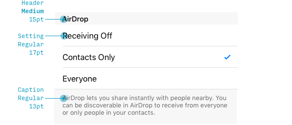
On the settings page, the options themselves are written out in the default text style, even though the section titles (e.g. “Sytem Sound & Haptics”) are smaller (whoa!). But notice that even though the title is smaller, it’s uppercase, meaning you can still recognize it as a title. This balance of emphasizing and deemphasizing styles is crucial.
The notes below the settings (“Play haptics for…”) are written in 13pt font, which is the smallest we’ve seen in any of these UI examples.
Form Controls
Let’s look at a few controls real quick.

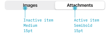
This should be starting to feel pretty straightforward now. The only surprise is the segmented button at 13pt size (doesn’t match the other 17pt controls). My hunch is that, since Apple knew some of these buttons would have many options, they just defaulted to a smaller text size for the control, even if there are only two options.
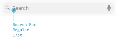
Search uses the default size and weight, though the color is a bit lighter before you start typing in.
Modals
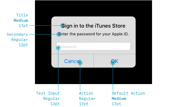
This little popup is a super illustrative example of how Apple styles text.
- The title is the default size. Which you would think would not be enough, but what have we seen before? A thicker font weight to make up for it not being any bigger.
- The explanatory text is 13pt. I would’ve guessed it would be 15pt, like the email body text, but perhaps they just wanted it to fit on one line?
- The password input is 17pt, which checks out – it’s the default size 🙂.
- “OK” and “Cancel” are the default size, but since “OK” is hopefully what you will press, Apple draws a little more attention to it by making it a thicker weight.
These font sizes follow a clear pattern, and they illustrate some nice text-styling tricks, but there are some odd inconsistencies for sure.
Tab Bar
Finally we’ve got the tab bar at the bottom of the screen. This is the smallest text in the whole iOS interace – 10pt. Don’t go any smaller than this!
iPad Typography Guidelines
iPad font sizes are nearly identical to iPhone font sizes.
This is for 2 reasons:
- iPads have lower pixel densities (pixels per square inch) than iPhones. So anything that’s sized in “pixels” or “points” will be slightly larger on an iPad. However, because we hold iPads slightly farther away from our eyes than iPhones, this balances out nicely, and you can keep basically all of the same font sizes on iPad and iPhone.
- Apple has made the two more consistent over the years
So start any iPad typography work by reading the iPhone section above.
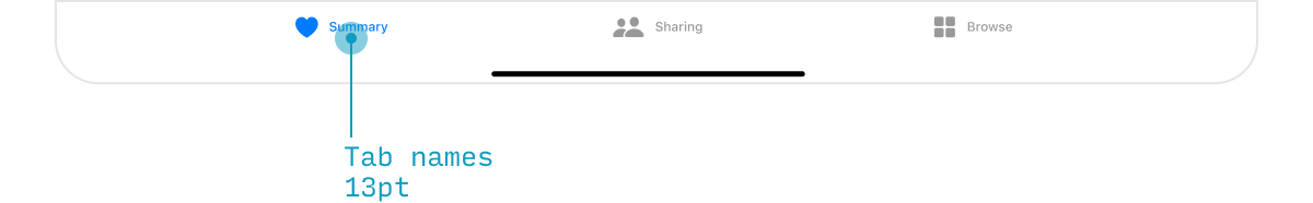
That being said, the tab bar on iPad is different – a distinctly horizontal layout, with larger labels (13pt instead of the iPhone’s 10pt):
SF Typography Guidelines
The default iOS font is SF, or San Francisco. You can download SF Pro for free. It’s not necessary to use SF when creating an iOS app, but if you want it to have that default iOS look, then SF is your new best friend.
Apple would like you to be a doll and follow a few extra rules when using San Francisco.
First, use SF Pro Display at font sizes 20 or higher. Only use SF Pro Text for body text and smaller.
| Font Size | Font Family |
|---|---|
| 19 or smaller | SF Pro Text |
| 20 or larger | SF Pro Display |
Second, San Francisco is designed to have different character spacing at different sizes. So if you want to perfectly mimic the “default iOS” look, have a few options:
- Hand-adjust the character spacing depending on your font size according to the table below
- Use text styles directly from the Figma iOS library or Apple’s iOS UI Design library (for Sketch, Photoshop, or XD)
- Use this handy Figma plugin or Sketch plugin to automatically have SF’s character spacing set correctly, depending on its font size
Or just ignore the fact that Apple tells you to change character spacing down to the hundredth of a pixel? Live free or die! 🤘
| Font Style | Font Size | Character Spacing (px) | Character Spacing (%) |
|---|---|---|---|
| Bold title | 34pt | 0.40 | 1.1% |
| Body text | 17pt | -0.43 | -2.5% |
| Secondary text | 15pt | -0.24 | -1.6% |
| Tertiary text | 13pt | -0.08 | -0.61% |
| Smallest text | 10pt | 0.12 | 1.2% |
San Francisco is the default font for iPhone and iPad. So if you’re using it, best to know about these restrictions. However, you can, of course, design iOS apps in any font you want. Be careful that others might appear bigger or smaller, or less legible, even at the same size.
Continue to Chapter 2: Android/Material Design Font Size Guidelines
The Top 10 for UI Design
Get a PDF of the 10 best free fonts for web/mobile app design (including which free fonts not to use).
Practical design tutorials. Over 60,000 subscribed. One-click unsubscribe.