The iOS 26 Design Guidelines: An Illustrated Guide
In this article, we’re going to cover basically everything you need to know to design an iPhone app following standard iOS 26 conventions and style. If you understand how to design for the mobile web, but want to design an iPhone app, this guide’s for you.
Maybe you’ve never designed an iPhone app, and have no idea where to begin. Maybe you’ve designed a dozen, but still want one place to reference best practices. Ironically, I’ve found Apple’s Human Interface Guidelines very difficult to read. So I wrote the guide I always wanted 🤗
Here’s what we’ll cover today:
- What’s new in iOS 26 / Liquid Glass
- iPhone screen sizes
- Page layout
- Navigation
- UI elements
- Typography
- App icons
- Other iOS conventions
- Downloads
- Further reading & resources
iOS 26 & Liquid Glass
Normally, a diff with the previous version would be pretty boring. But iOS 26 (released in 2025) is the single biggest update to Apple’s design system since iOS 7 in 2013.
So here’s a quick overview of what’s changed (with links to where I talk about each item more):
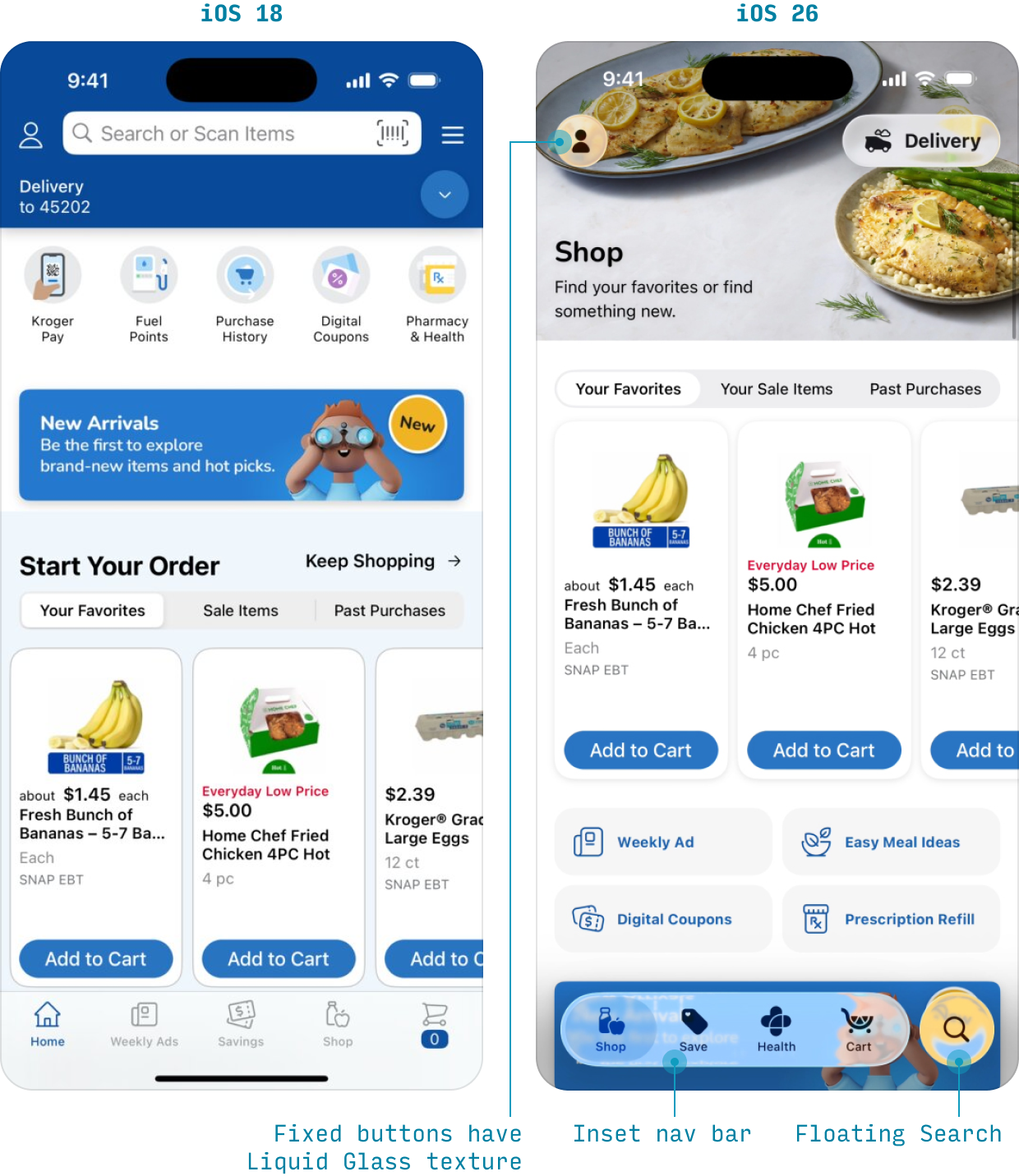
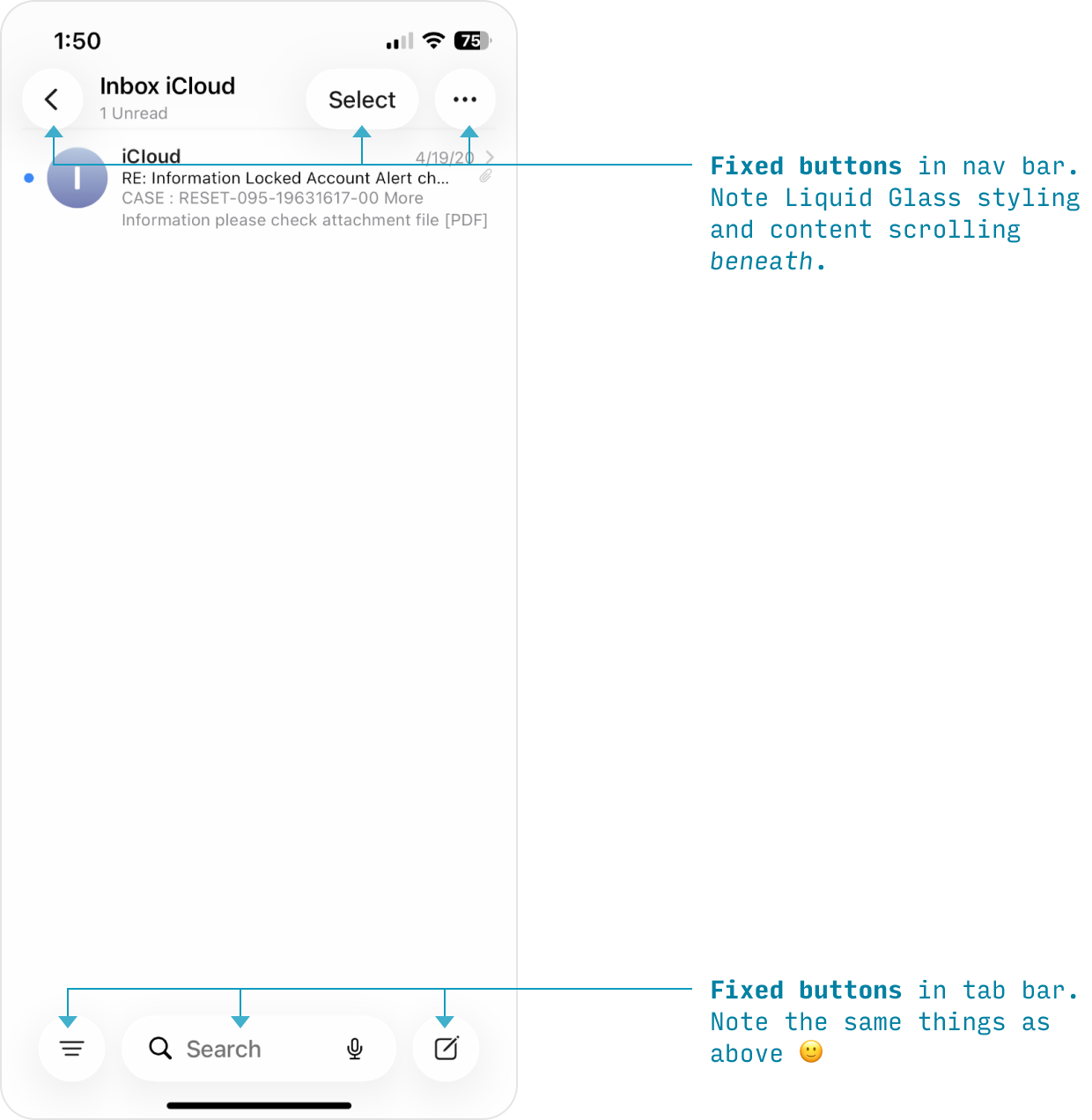
- Liquid Glass material: Many elements – but most notably, important buttons and navs – are rendered in a reflective, refractive, beautiful glass texture Apple is calling Liquid Glass.
- Controls float above content: Liquid Glass buttons in the nav bar and both top & bottom toolbars are fixed, and page content scrolls below them.
- Inset tab bar: The bottom nav, AKA “tab bar”, is now inset from the page, appearing in a horizontal Liquid Glass capsule. Notably, search is always a little circular “island” of Liquid Glass to the right of the other items. This puts it within better reach for one-handed or quick usage. (Note the search bar, once expanded, also appears lower than before)
Also, while not pictured above:
- Icon Composer: It’s recommended you create app icons via Icon Composer, a Mac app created by Apple. Doing so allows your icons to take on system-level lighting effects (light mode, dark mode, lit edges, Liquid Glass layers) and exhibit a subtle parallax as the phone is tilted.
But in general, the biggest change is simply the emphasis on this new material, Liquid Glass. It’s likely Apple will keep this material for years to come, and designers working in their ecosystem should learn to use it.
iPhone Screen Sizes
First things first, what size screens are you working with? Well, these!
Here’s a full list of iPhone screen sizes for reference (drag this link 👉iPhone Sizes👈 to your bookmark bar to save it)
| Device | Frame Size (e.g. for Figma) |
Export Scaling |
|---|---|---|
| 17 Pro Max, 16 Pro Max | 440 x 956 | @3x |
| iPhone Air | 420 x 912 | @3x |
| 16 Plus, 15 Plus, 15 Pro Max, 14 Pro Max | 430 x 932 | @3x |
| 14 Plus, 13 Pro Max, 12 Pro Max | 428 x 926 | @3x |
| 11 Pro Max, XS Max | 414 x 896 | @3x |
| 11, XR | 414 x 896 | @2x |
| 8+, 7+, 6+, 6S+ | 414 x 736 | @3x* |
| 17, 17 Pro, 16 Pro | 402 x 874 | @3x |
| 16, 15 Pro, 15, 14 Pro | 393 x 852 | @3x |
| 16e, 14, 13, 13 Pro, 12, 12 Pro | 390 x 844 | @3x |
| 13 Mini, 12 Mini, 11 Pro, X, XS | 375 x 812 | @3x |
| SE (gen 3), SE (gen 2), 7, 6, 6s | 375 x 667 | @2x |
| 5, 5s, 5c, SE | 320 x 568 | @2x |
| 4, 4s | 320 x 480 | @2x |
| 1, 2, 3 | 320 x 480 | @1x |
*display on phone is technically 2.61x
Some of these terms take a bit of explaining…
- Frame size. This is the “point size” or “@1x” size of a given device. I strongly recommend designing on frames of this size for a given device. (Here’s an explanation of points vs. pixels)
- Export scaling. This is how much bigger to make a raster image (PNG, JPG) when exporting to take maximum advantage of the higher resolution of some devices.
What size frame should I use for iPhone design?
There are a few things to keep in mind here:
- Preference smaller screens. A design that works well on a narrower screen (390pt) will almost certainly work well on a slightly wider screen (440pt) – but the reverse is not true. So it’s always better to design for narrower screens first, then double-check and adjust for larger screens. Since almost all sites/apps scroll vertically, height is irrelevant 👍
- Check your analytics. What screen size is most common for your audience? To check this in Google Analytics, search “Tech Details”, then scroll to the table and change “Browser” to “Screen resolution”.
- Absent anything else, start with 390x844. This is the most common width for iPhones still in wide use (iPhone 12 through 16e). But if you have a tech-savvy audience with newer iPhones, definitely get a glance at 440, the effective max value (16 & 17 Pro Max models).
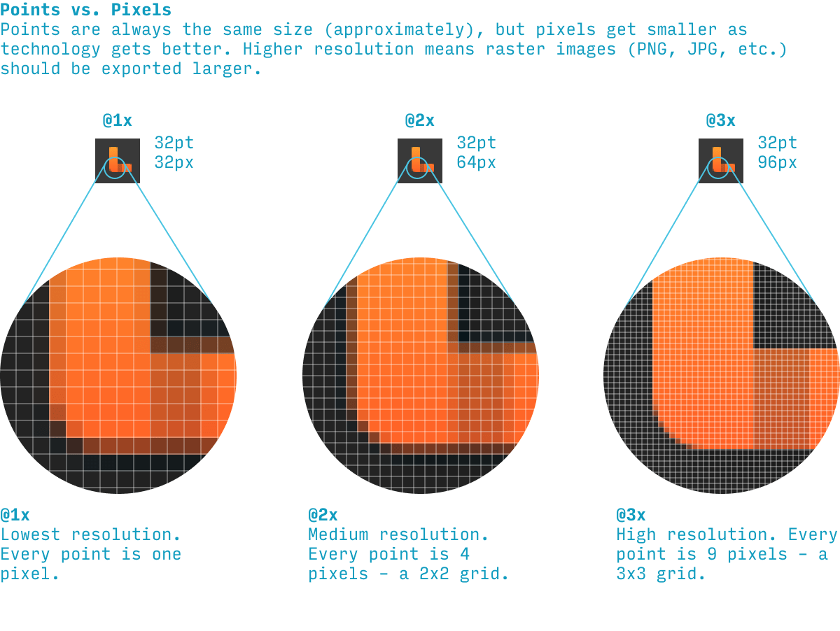
iOS Points vs. Pixels
A “point” is a measure for designers to compare the sizes of fonts and UI elements across iOS devices. A “pixel” is a tiny square of light that your iPhone screen is made up of. Smaller pixels mean a clearer image, which is great. But if you merely make your pixels smaller, everything on the screen would get smaller too! To balance this, designers measure the size of elements on the screen in points. Once technology was good enough such that pixels were roughly half as tall/wide as they started, we could just use a 2x2 square of pixels for every point (this is called @2x). And once pixels were roughly a third as tall/wide as they started, we could use a 3x3 square of pixels for every point.
Points is the unit that allows us to have higher resolution screens without all the elements on the page just shrinking. Yay, points! That being said, occasionally designers use the terms interchangeably, and you’ll just have to know from context which they mean. Boo, designers.
iPhone Page Layout
While different iOS apps have different layouts, many standard pages will have a layout something like the following:
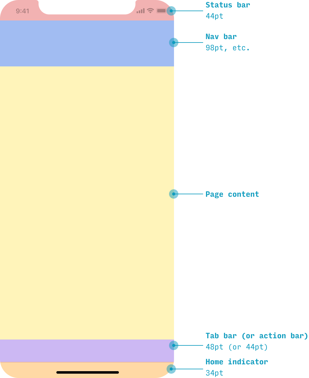
Note: in the downloads section below, I have an iPhone Figma template that has rulers dividing these page areas, plus the status bar and home indicator. It allows you to start filling in this framework of the page very quickly.
If you’re interested in a specific section of the page, you can skip ahead to that section:
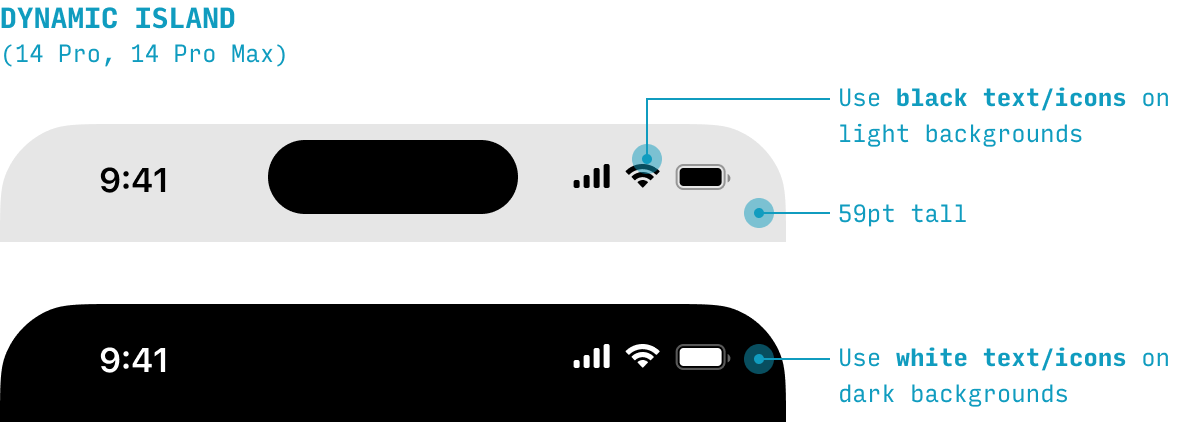
iOS Status Bar
The status bar contains the time, signal, wifi, and battery indicators.
It can be either black or white.
If content scrolls underneath the status bar, the content should do one of the following things to ensure maximum legibility for the status bar:
- Fade out and blur
- Fade out (only)
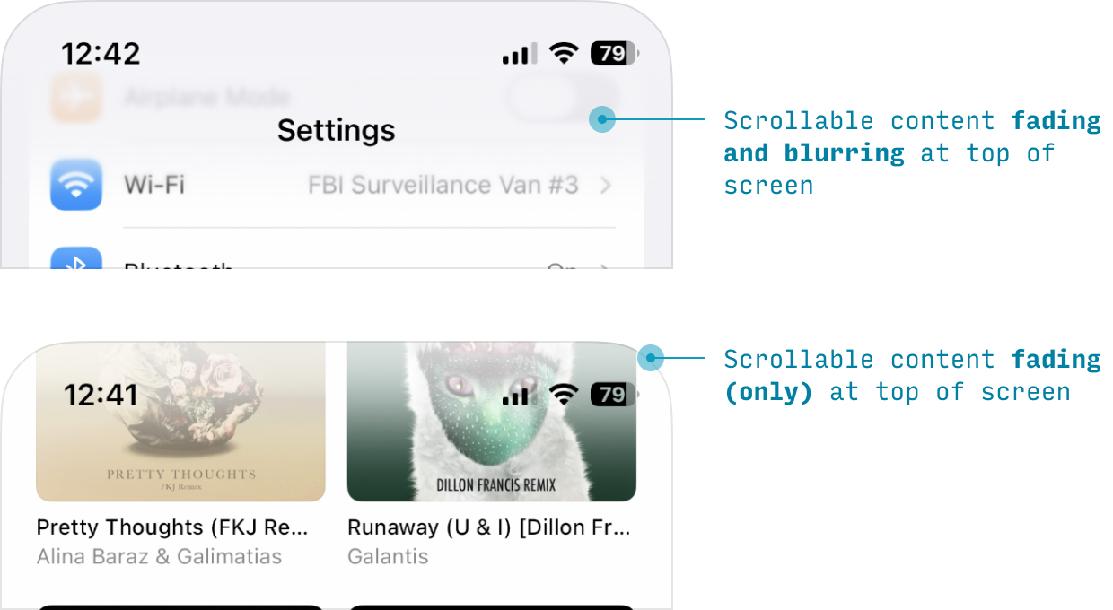
Apple calls these “scroll edge effects”, and they ensure maximum legibility against a wide range of backgrounds. We’ll cover the bottom of the screen’s scroll edge effect under Tab bar.
(Note: the status bar should appear at the top of basically every page – unless you’re showing full-screen images, videos, or media. But think about it: if someone needs to leave your app to check the time, that’s kinda silly, no?)
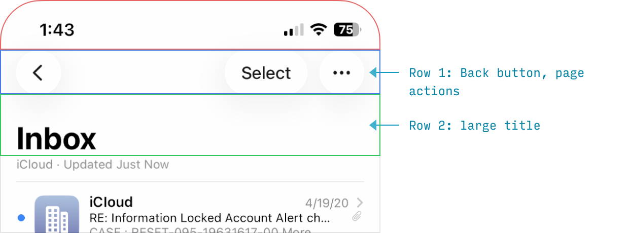
iOS Nav Bar
The nav bar is where the app displays:
- The page title
- A back button
- Primary page actions
You can think of the nav bar as being comprised of 2 “rows”:
- Back button, small page title (if present), page actions
- Large page title (if present)
(In my iPhone UI Figma Template, I include guides demarcating where these rows typically sit)
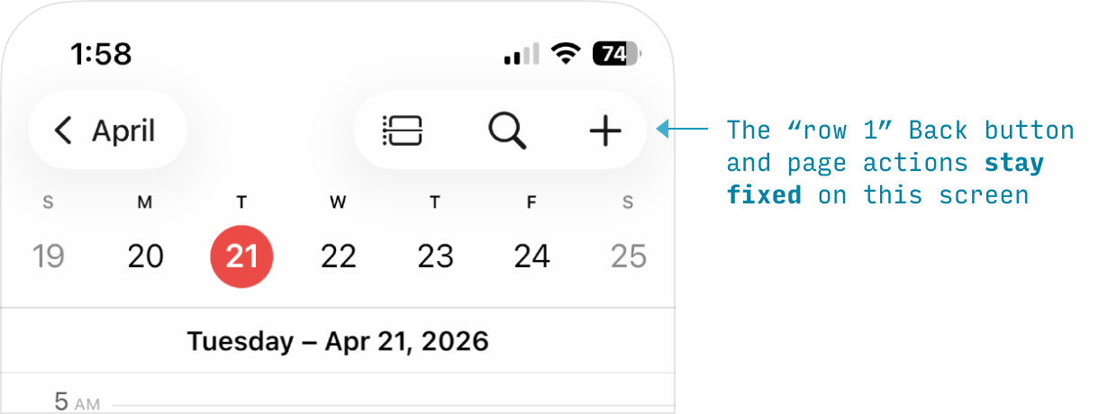
Depending on how the title is displayed, there are two main configurations of the nav bar. First, when the page is unscrolled:
Second, once the page has been scrolled:
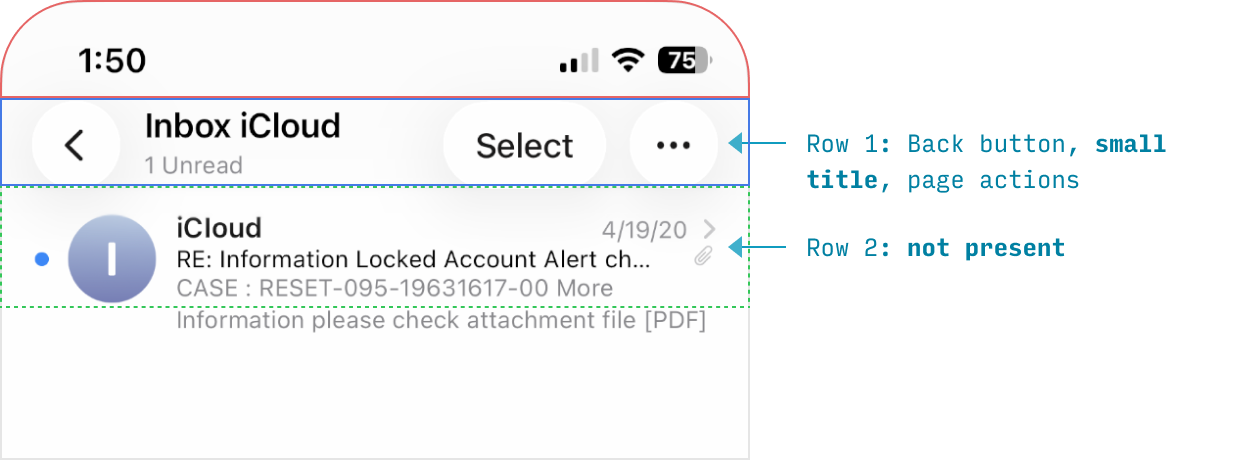
The second configuration can also be used by default – in other words, the page never has a large-format title. This is most useful when you need a compact header with lots of content visible below it.
When both states are present, the transition between them is smooth. Here’s a video:
Note that the blur + fade-out “scroll edge effect” extends as far as the bottom of the nav bar. Again, this allows for maximum legibility of the small title despite content moving below it.
iOS Tab Bar
On iOS apps, primary destinations in the app are listed as tabs across the bottom.
🆕 In iOS 26, the tab bar – for the first time ever – is not full-width. Instead, it’s a floating, centered, pill-shaped container of the primary destinations.
Notably, search is a little island off to the right – if it’s present at all.
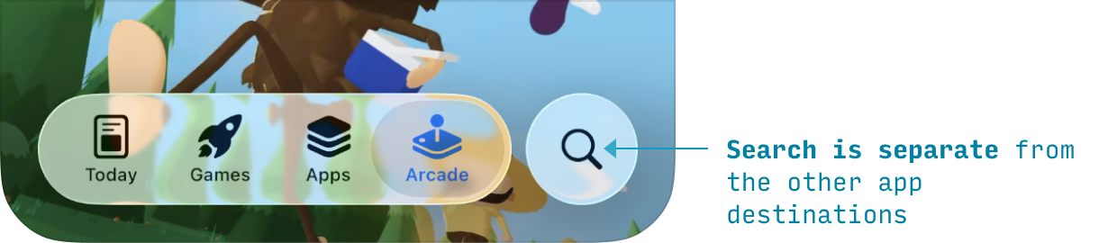
If the user taps the search button, it goes to a search screen experience, detailed here.
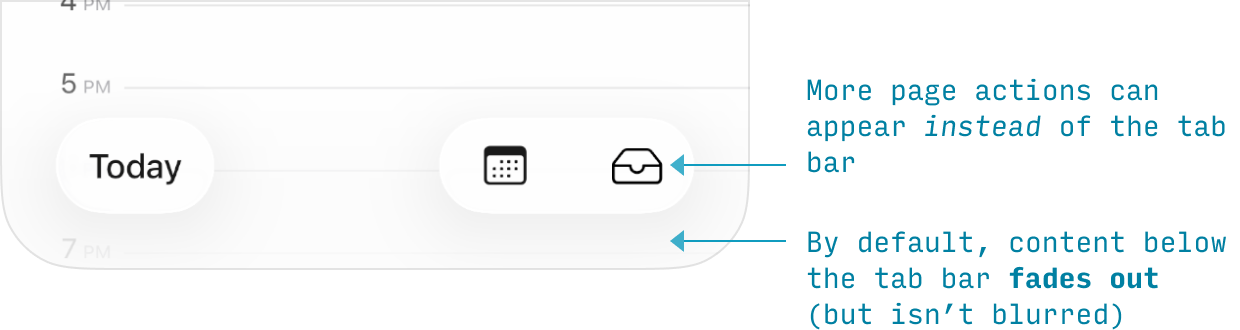
The next image shows two things worth noting:
- The content below the tab bar is typically faded-out, but not blurred (as opposed to the top edge, where the default behavior is both effects are applied)
- In place of the tab bar, more floating page actions can also be present
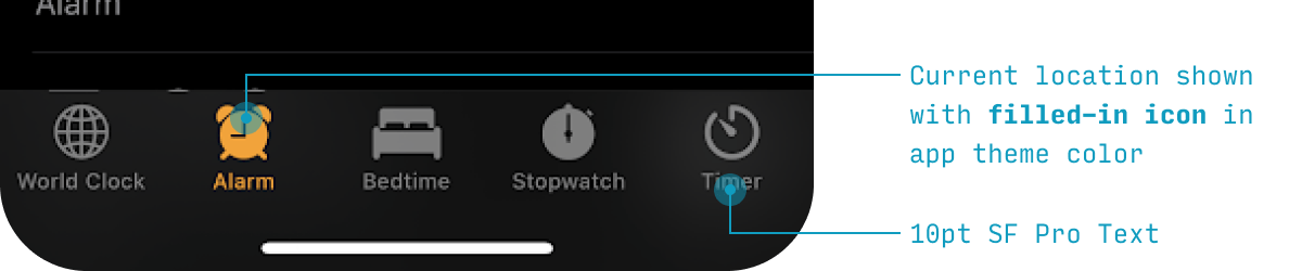
Now, let’s note a few things about the styling of the tab bar:
- The selected destination is shown in the app’s brand color
- The labels are 11pt text in SF, the default font
- The background is Liquid Glass – a translucent, light-refracting effect that lets content show through faintly while keeping the bar readable
- The bar is inset from the screen edges (21pt on left, right, and bottom)
- Content below the tab bar is faded out progressively as it reaches the bottom edge of the screen
And a few notes on the behavior of the tab bar:
- Different tabs remember their state. If you travel to a certain destination in one tab, switch to another tab, then switch back to the first tab, you’ll be where you left off in that tab – not the “main screen” for that tab
- If you tap the active tab, you’ll return to the “main screen” for that tab
- The tab bar is always visible within the app, except:
- When a keyboard is shown
- When a modal is open (during critical tasks, the user should focus on the task at hand rather than navigate to other parts of the app)
There should be 2-5 tabs in total. If you need to display more than 5, one option is that the fifth icon should be a “More” catch-all that shows other destinations on a quasi-picker screen.
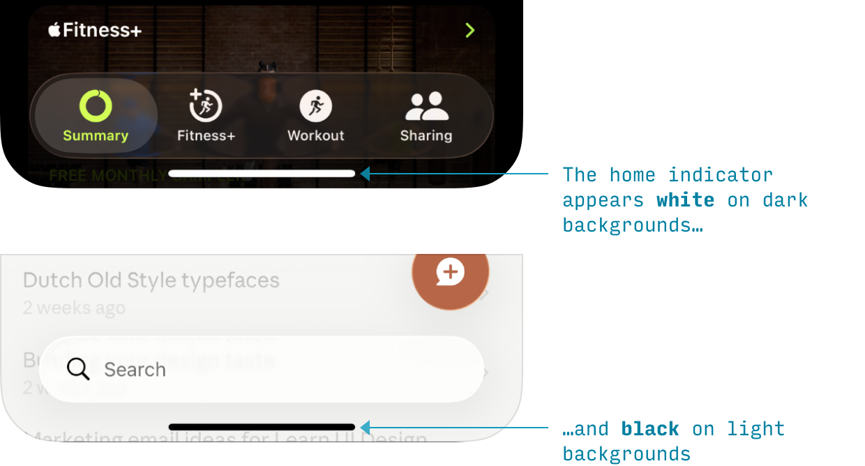
iOS Home Indicator
The final primary layout item is the home indicator – a thin, centered bar at the bottom of the screen visible only at two times:
- When you first open the app
- When you swipe up from the bottom to navigate between apps
It is black when appearing on a light background, and white on dark backgrounds.
And by dragging it up some amount, you can navigate between apps and to the home screen:
- Drag a short ways up: go to app switcher screen
- Drag a long ways up: go to home screen
The home indicator “owns” its own 21pt tall “box” that no other fixed elements can be shown in. That tap area is permanently reserved 🫡
Navigation in iOS Apps
Primary App Destinations
Navigating between the main areas of the app is covered in the Tab Bar section.
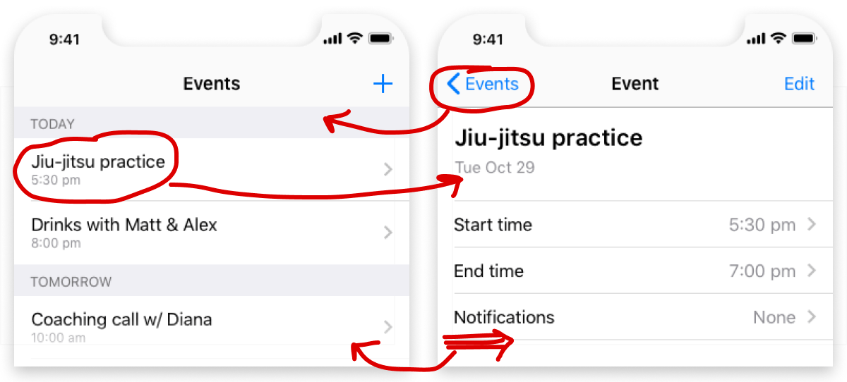
Navigating Back
On iOS, you can navigate backwards in 4 different ways, depending on the context.
| Method of Navigating Back | Context in Which it Works |
|---|---|
| Tap "Back" action on top-left of screen | Any screen on which a "Back" action appears |
| Swipe right from left edge of screen | Any screen on which a "Back" action appears |
| Tap "X" or "✔️" buttons on top of screen | Modal views |
| Swipe down on screen content | Modal or fullscreen (e.g. photos, other media) views |
The top 2 ways usually apply to the same screens.
The bottom 2 ways apply to modal views. See Modals for more.
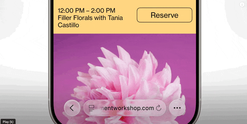
iOS Search
There are 2 primary entry points to search in iPhone apps:
- The main option: via a search button in the tab bar (bottom of screen)
- The rarer option: via a search button in an “action bar” (top or bottom of the screen – when at the top, it’s in the nav bar… Lots of bars, I know 😬)
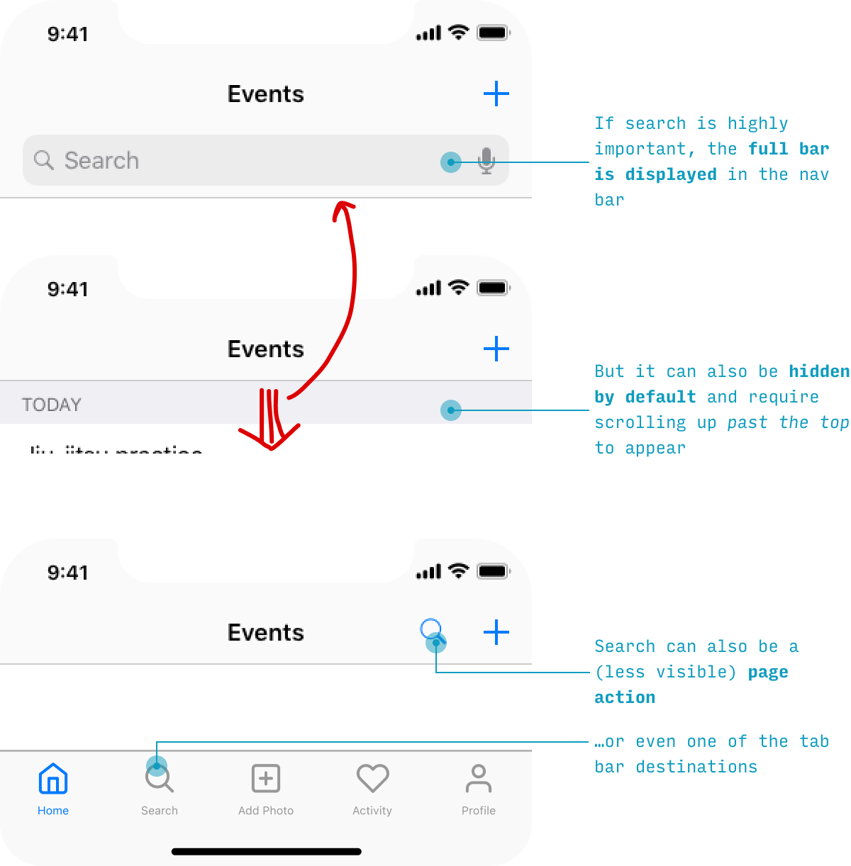
🆕 The search button being on the bottom of the screen is a newer emphasis of Apple’s. In previous iOS versions, search was just as often found at the top of the screen – however, up there, it is more difficult to reach when using the phone one-handed.
However, no matter where the search entry point is, the search experience looks fairly similar:
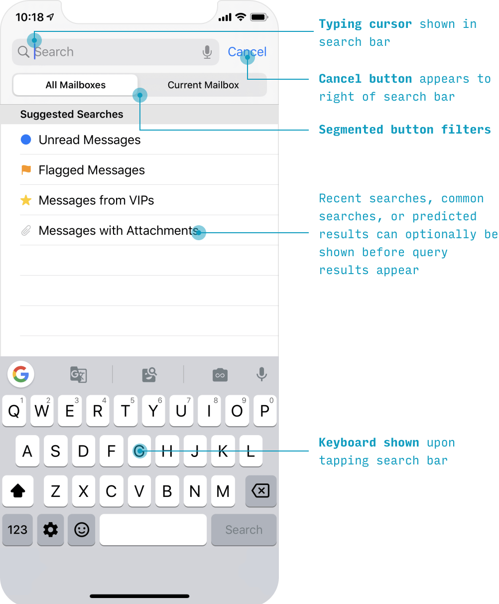
Optionally, you can show popular or recent searches below the search box. I cover some of the best practices for search experiences in my course on designing intuitive, easy-to-use apps, Learn UX Design.
iOS Modal Sheets
Some tasks involve a single screen – or a linear series of screens – that you want users to complete without totally leaving the context they were in.
In iOS-land, that’s the perfect time to use a modal sheet.
A modal sheet is a normal page that (a) slides up from the bottom covering almost all of the previous page, but (b) leaves the previous page visible, yet darkened, in the background.
Modals can be dismissed by:
- Pressing the “X” button at the top-left
- Swiping down on the modal itself
UI Elements & Controls
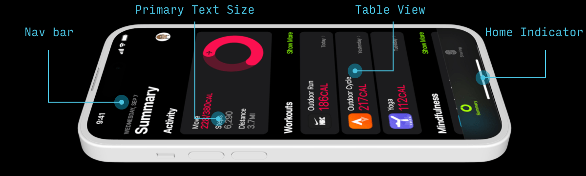
iOS Lists (AKA “Table Views”)
Remember: “90% of mobile design is list design”. If you want to get good at designing iPhone apps, learn how Apple thinks about its lists (or, as they say “Table Views”).
One important note for iOS 26: Liquid Glass is not applied to content layers like lists. Lists look largely the same as they have for many years. The glass material is reserved for the navigation layer (nav bars, tab bars, buttons) that floats above your content.
Any time you’re making a list on iPhone, you need to ask yourself three questions:
- What text do I want to display?
- Do I also want an icon/image?
- What goes in the right half of the cell?
Let’s cover each of these in turn.
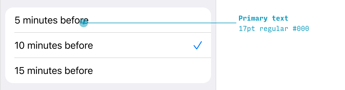
What text do you want to display on each list item? You can choose:
- Only primary text (17pt regular)
- Primary text (17pt regular) with secondary text (15pt or 12pt regular, depending on emphasis needed)
- Custom layout – e.g. primary text (17pt regular), secondary text (15pt regular BUT LIGHTER) and tertiary text (15 regular BUT LIGHTER STILL)
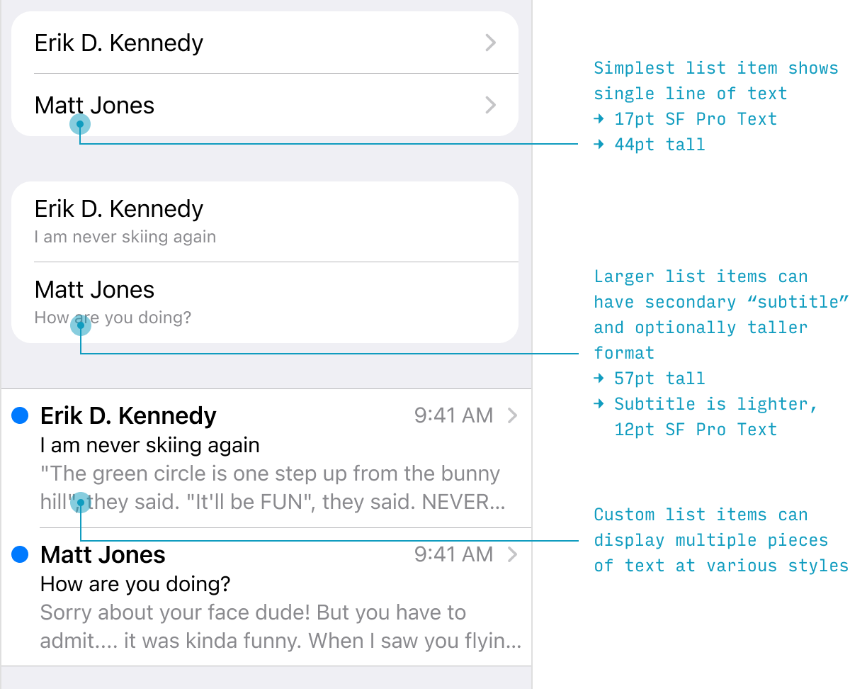
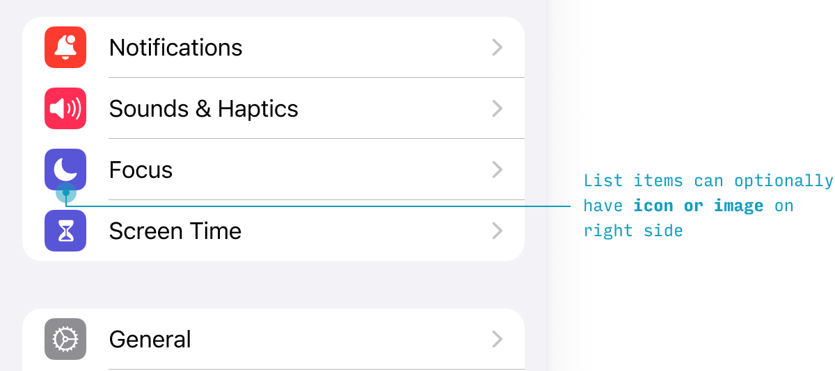
To the left of the text, you can optionally display an icon or image.
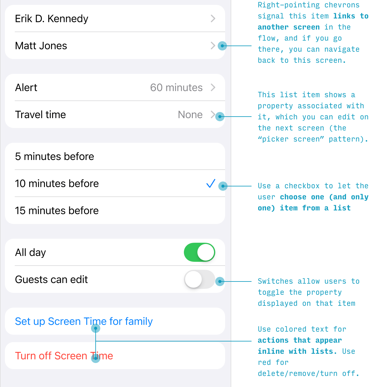
Finally, there are a handful of options for the right-hand side of a list item:
- A (right-pointing) chevron. Almost the default, this lets users know they’ll be navigating to another screen
- Text and a chevron. This means the user can navigate to another screen to choose the value to be shown here
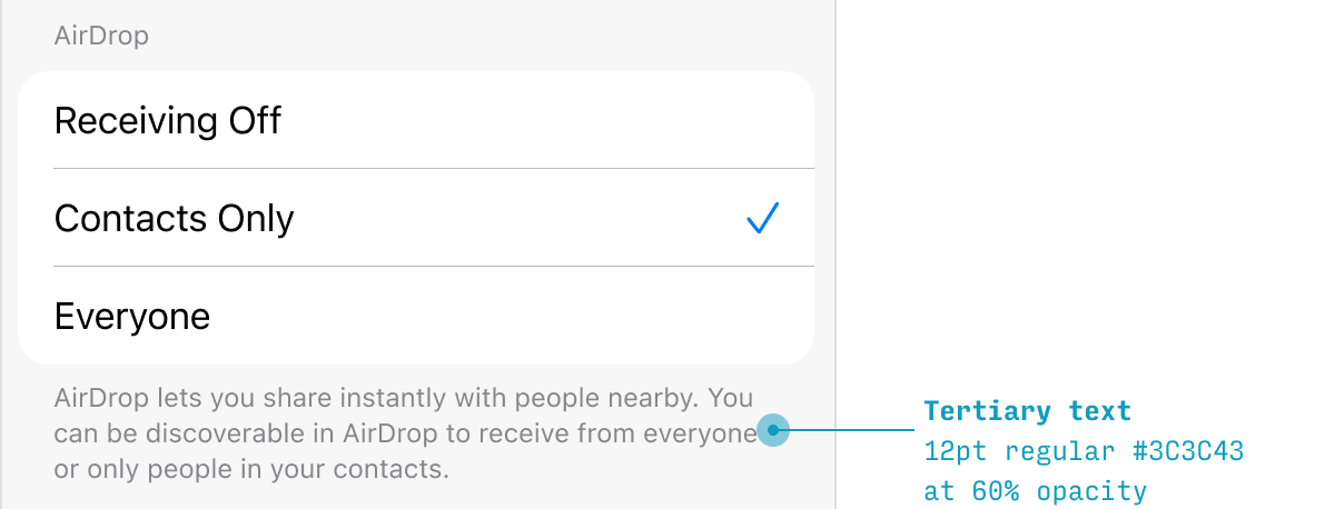
- A checkmark. Allows the user to choose between one of the list items in that group (Note: not multi-choice, as web checkbox lists are)
- Switch. Allows the user to toggle the property that list item refers to on or off.
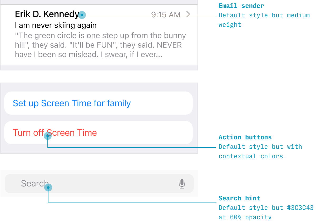
- Text buttons. Use a system color to link to another page or flow. Use red text to represent a “destructive action” – turning something off, deleting it, removing it, etc.
There are more iOS paradigms for what you can do with lists not covered here – but this is an overview of some of the most common ways of using lists. For more, check out input controls.
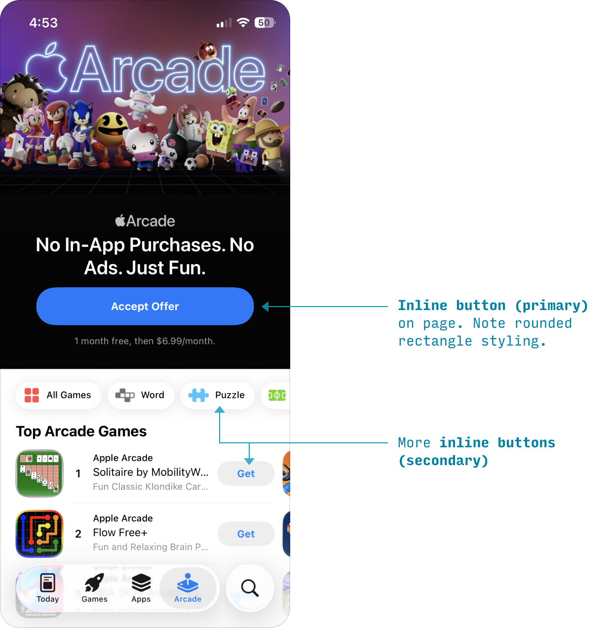
iOS Buttons
Buttons in iOS take 2 forms:
- Fixed buttons, styled as Liquid Glass circles, which contain icons. They appear in the nav bar or tab bar, initiate page-level actions, and page content scrolls beneath them.
- Inline buttons, styled as rounded rectangles or circles, which contain icons, text, or both, and initiate more local actions. They appear anywhere in the page content.
These Liquid Glass-style buttons are a new iOS 26 emphasis of Apple’s.
Inline buttons are your more “traditional” buttons. They can be (1) filled with an accent color (primary), (2) filled with gray while the icon/text are in the accent color (secondary), or (3) black on gray (tertiary).
Input Controls on iOS
One non-obvious thing about how iOS apps do input controls is they’re almost all styled as list items.
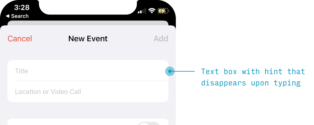
iOS Text Boxes
Text inputs appear like a list item with a hint that disappears on typing.
iOS Switches
Switches appear within a list item with the label on the left and the binary choice switch on the right.
iOS Date and/or Time Pickers
Dates and times have a special light gray button treatment to signify that they’re special.
Tap one, and you’ll see a date (or time) picker control appear immediately below the date label.
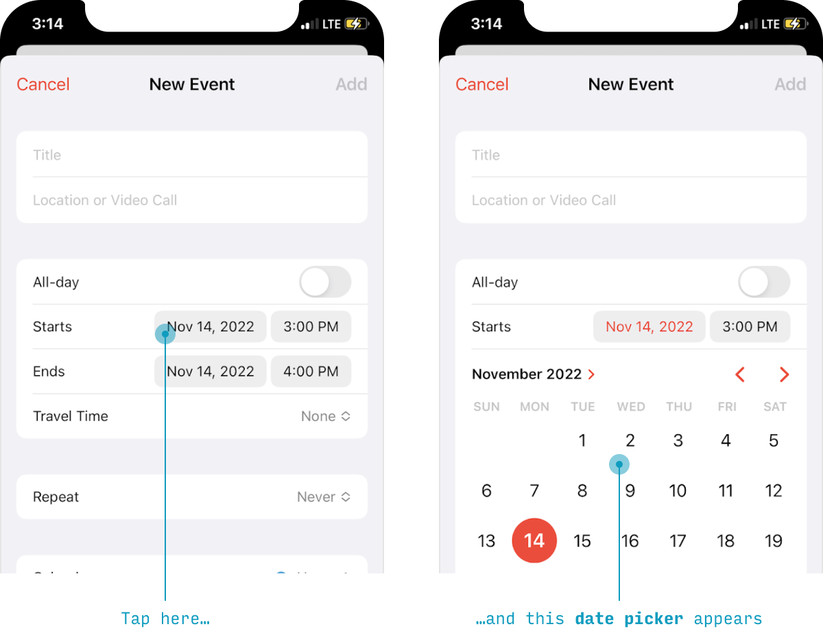
These controls can pick (a) just a time, (b) just a date, (c) both a time and a date, or (d) some other custom value. And there’s also a “spinner” style layout you can use (not pictured).
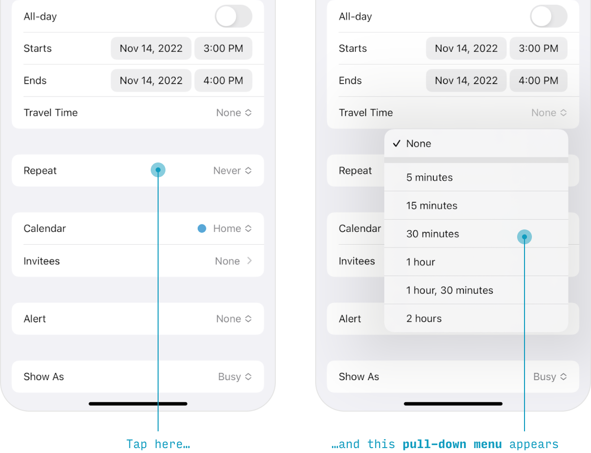
Menus
Pull-down menus show some extra options/actions without navigating to a different screen – much like a dropdown control on web browsers.
In iOS 26, pull-down menus use the Liquid Glass treatment – they appear as translucent, glassy panels floating above the content.
iOS Picker screens
The pull-down menu (above) is useful if you need to display a fairly short list of text-labelled options, but for anything more complex, try the picker screen pattern.
The whole idea is that you have something resembling a list item, but it actually leads to a separate page where you pick the value.
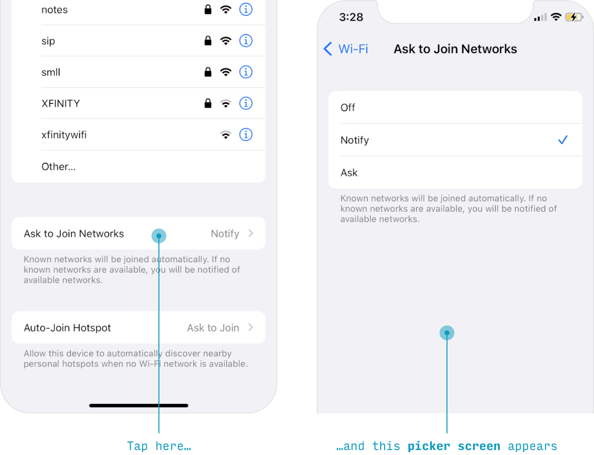
So, the ingredients:
(1) A single list item with a label, value, and chevron leads to (2) a page with many options in a list, one of which can be selected, and will show this state with a checkmark.
Once you’ve made your selection, you can navigate back with a swipe or by pressing the button in the upper-left.
ℹ️ The example above is about the simplest case for wanting to use a picker screen. It’s only the explainer text that necessitates this pattern. Nonetheless, iOS apps should focus on “one thing per screen”, and to the degree that a choice is complex enough to be considered “its own thing”, a picker screen is a great way to go.
Typography in iOS Apps
For more on iOS typography (and, in particular, font sizes), see my full article on it here.
iOS has a mildly opinionated typographical language – it tends to style text with weight or color, rather than size or case. (To be clear, there are many size variations available in their design system, they just tend to use them less)
Here’s a quick reference for text styles. The default font is SF Pro, which ships with Mac, but can be downloaded here.
| Element Type | Style | On light | On dark |
|---|---|---|---|
| Page title (large) | 34pt bold | #000 | #FFF |
| Page title (small) | 17pt semibold | #000 | #FFF |
| Paragraph text, List item titles, Input text |
17pt regular | #000 | #FFF |
| Input hint text | 17pt regular | #BFBFBF | #404040 |
| Secondary text | 15pt regular | #3C3C43 60% opacity |
#EBEBF5 70% opacity |
| Tertiary text, Captions |
13pt regular | #3C3C43 30% or 60% opacity |
#EBEBF5 30% or 70% opacity |
| Buttons (primary) | 17pt regular | #FFF or accent color | #FFF or accent color |
| Buttons (secondary) | 15pt regular | #FFF, #000, or accent color | #FFF, #000, or accent color |
| Tab bar labels (unselected) |
11pt regular | #1A1A1A | #F5F5F5 |
| Tab bar label (selected) |
11pt regular | Brand or accent color | Brand or accent color |
| Tool bar labels | 17pt medium | #1A1A1A | #F5F5F5 |
Title Text Styling for iPhone Apps
Page titles are written in two distinct ways on iPhone apps.
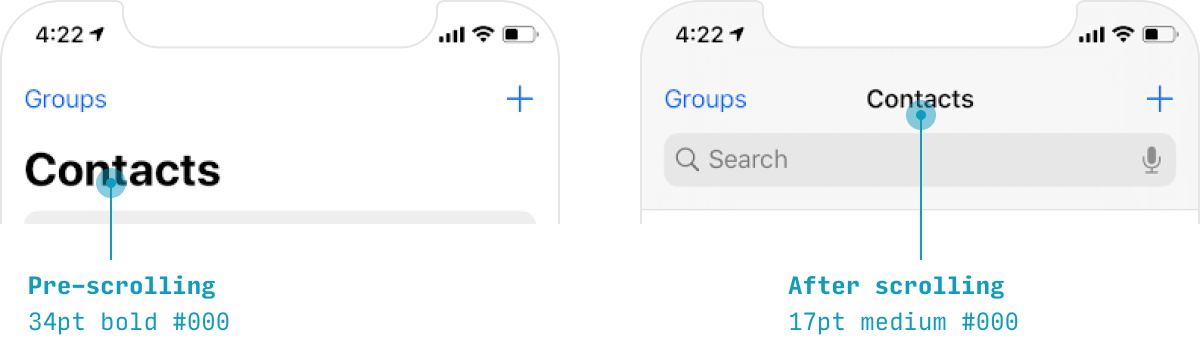
When the user hasn’t scrolled yet (or has scrolled, but then scrolled back to the top):
- Size: 34pt
- Font weight: bold
- Color: #000
- Dark mode color: #FFF
- Alignment: left
When the user has scrolled down:
- Size: 17pt
- Font weight: semibold
- Color: #000
- Dark mode color: #FFF
- Alignment: center (usually, despite left being pictured above)
Default Text Styling for iPhone Apps
The “default style” for text on iPhone apps is:
- Size: 17pt
- Font weight: normal
- Color: #000
- Dark mode color: #FFF
You can get a lot of mileage by making slight tweaks to this basic style.
Notice that in the examples above, size remains a constant 17pt – it’s weight and color that change.
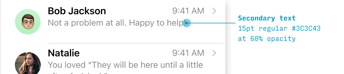
Secondary Text Styling for iPhone Apps
iOS apps have a standardized style for any supporting “secondary” text.
- Size: 15pt
- Font weight: normal
- Color: #3C3C43 at 60% opacity
- Dark mode color: #EBEBF5 at 70% opacity
Tertiary Text & Captions Styling for iPhone Apps
Any explanatory “captions” are given an even smaller, lighter treatment than secondary text.
- Size: 13pt
- Font weight: normal
- Color: #3C3C43 at 60% opacity
- Dark mode color: #EBEBF5 at 60% opacity
Minimum Text Size on iPhone Apps
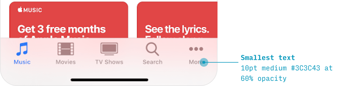
With any design system, it can save you a lot of headache to just define a minimum size. For iPhone apps, that’s the tab bar labels, at 11pt:
- Size: 11pt
- Font weight: normal
- Color: #1A1A1A (selected item is accent color)
- Dark mode color: #F5F5F5 (selected item is accent color)
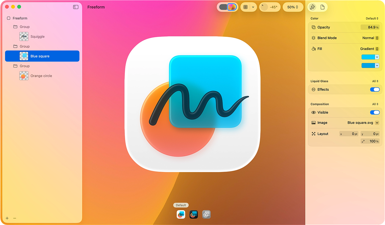
iOS App Icons
As of iOS 26, Apple has gotten pretty precious about app icons, and you now have to use an Apple design tool called Icon Composer in order to create layered icons that work across view modes and have special lighting effects.
Similar size and shape as before – but with specified layers that can piggyback on Liquid Glass textures 👍. Here’s Apple’s slick marketing demo:
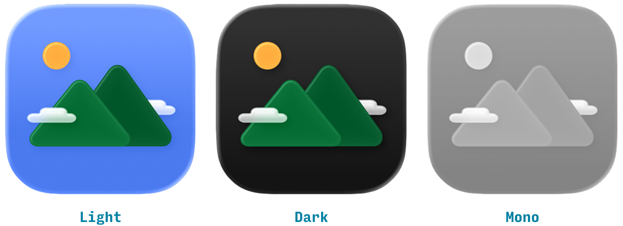
There are 3 versions of layered icons you need to account for:
- Light mode
- Dark mode
- Mono mode
When done, your icon will pick up lighting effects from the system, as well as exhibit a very subtle parallax when you tilt the phone.
Other iOS Conventions
There are a couple other things you should probably know about if you’re designing an iPhone app. I will just go ahead and list them here:
iOS Tap Target Size
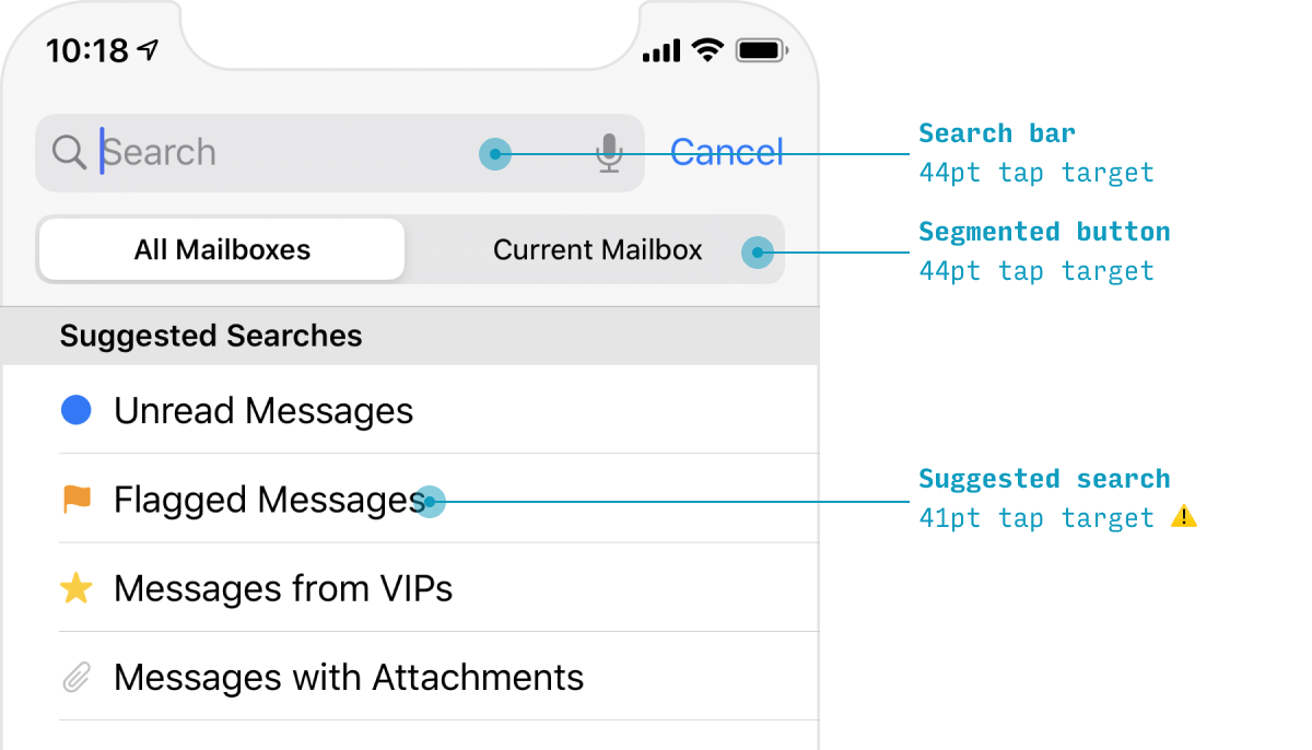
Everything the user should be able to tap on – every button, every slider, every input control – should be at least 44x44 pts in size.
The most common exception is links that appear inline in text. In paragraph text, each line of text will likely be quite a bit shorter than 44pt. That means that (a) your links will have a tap target of less than 44pt size and (b) if there are links in the same position in two consecutive lines of text, it will be pretty difficult for users to tap them accurately. While this can’t always be avoided, it’s worth knowing about this as something to minimize.
Dark Mode iOS Design Guidelines
iOS has an OS-level “dark mode” setting, where participating apps have (generally) dark backgrounds and light text, instead of light backgrounds and dark text.
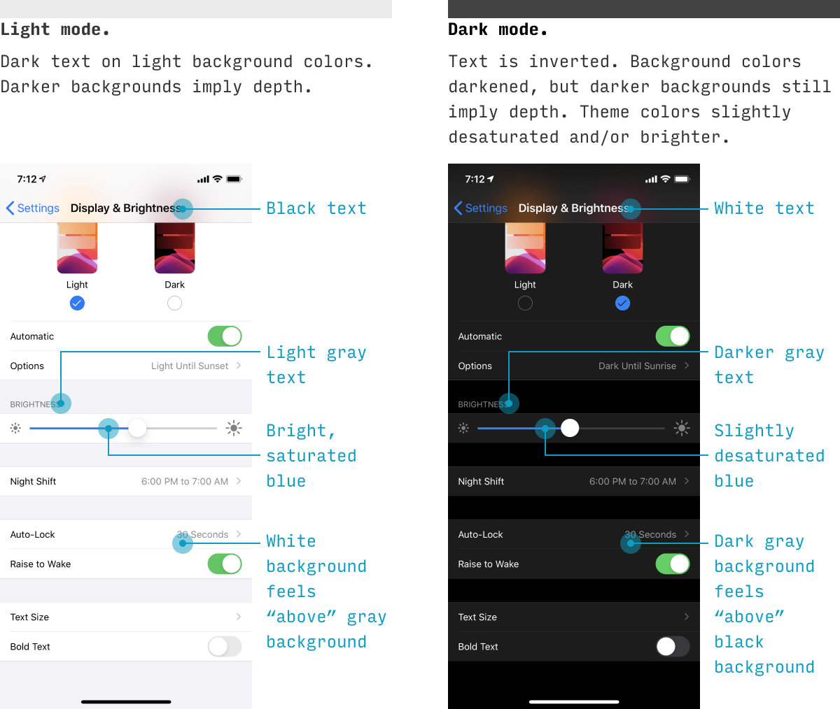
While iOS will automatically transition to the dark version if you’re using native controls and colors, you should understand the general principles of dark mode for any custom UI you do. Here are a few simple guidelines:
- Text colors are inverted. It’s a bit of an oversimplification, but black text becomes white, dark gray text becomes light gray text, and middle gray text stays basically the same.
- Background colors are shifted. Unlike text, where darker colors become lighter, the background colors are all just shifted darker. Darker backgrounds become darker still. If a background color was lighter in light mode, it’s still lighter in dark mode. Why? Because light comes from the sky. If you understand that, you’ll understand we’re relying on background color for depth cues (unlike text). And so it works in a totally different way.
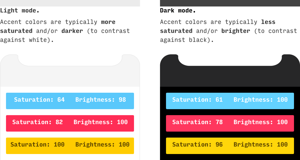
- Theme colors are translated to pop against dark. Any accent colors that you were previously using on light backgrounds now need to pop similarly against dark backgrounds. As I detail in my blog post on color adjustments, this means you’ll be doing any of 3 things to increase luminosity:
- Increasing brightness
- Reducing saturation
- Shifting the hue closer to yellow (60°), cyan (180°), or magenta (300°) – whichever is closest
Creating dark UI is its own topic, deserving of its own guide – and it’s one of the things I cover in a lot more depth in Learn UI Design.
Downloads
OK, I’ve just got one right now – but it’s good, I promise! 😎
iPhone Design Template
This Figma file includes frames for all recent iPhone models with (a) rulers to mark off common sections of the screen, (b) a mask with the Dynamic Island and rounded corners, and (c) an easy-to-recolor, single-layer status bar. It’s been used by over 90,000 designers 👍
Further Resources for iPhone App Design
iOS 26 Figma Library by Apple. Presuming you’re designing in Figma, this file is hugely useful for allowing you to design with iOS system default components. Yes, their design system is complex enough where you’re playing some crazy component tetris, but it’s kinda the only game in town.
Apple’s Human Interface Guidelines for iOS. Apple’s own standards are pretty difficult to read through, in my opinion. Fortunately, they have a search, so as long as you know the right term, you’ll eventually find what you need. Anyhow, gotta include this link. If you’re designing an iPhone app, you’re going to be here anyways!
iOS vs. Android App UI Design: The Complete Guide. OK, let’s say you think you’re going to be making an Android version of your iPhone app at some point. Best to start thinking about some of the design differences now. Who knows – you may end up stealing some great ideas from Android design principles. This article actually covers a few iOS design paradigms that I didn’t get to here. Worth the read!
The iOS Font Size Guidelines. One of the most unexpected parts of getting good at UI design is developing an intuitive sense of what font sizes to use. So, to help with that, I wrote the world’s most comprehensive guide to font sizes. One part is on iOS apps, and if you’ve gotten this far, you should probably read that too 😜
Wrapping It Up
Did I miss anything? Something look wrong? Give me a shout at erik@learnui.design. I’ll be continually updating this guide to be the most accurate and human-readable guide on the web for creating iPhone apps.
One Final Note 😎
If this is your first time here, you might also be interested in:
- Design Hacks, a 60,000+ person newsletter with original design articles aimed at giving you tactical advice to improve your UX/UI skills.
- Learn UI Design, my full-length online video course on user interface design
Some people have some really nice stuff to say about the newsletter.
Thank you for your newsletter. It’s possibly the best newsletter I’ve received since 1999, when I started freelancing.
Tricia Littlefield
Founder, TheSimpleWeb
Each time I receive an email from you, I'm like ‘Damn, this is a long email! No way will I read all of this’, then I began to read and I'm like ‘Damn, this is so freaking brillant’ and read it all.
Jean-Philippe
UX Strategist, Freelance
Design Hacks
Over 60,000 subscribed. No spam. Unsubscribe anytime.