iOS vs. Android App UI Design: The Complete Guide
If you’re designing both an iOS and an Android (Material Design) version of an app, this guide is your new best friend 😎.
We’re going to cover the most relevant differences between iOS and Android for UX/UI designers. If you’ve created an app on one platform, this is most of what you need to know to “translate” it for the other platform. But! – these are guidelines, and basically everything I’ll say is contradicted somewhere, even by Apple/Google themselves. This is about translating “iOS thinking” to “Android thinking” and vice versa.
Here’s what we’ll cover. Skip ahead, or read it straight through – like a freak. It’s your call.
iOS vs. Android UI Design: The Main Differences
Here are the most important differences that UX/UI designers need to take into account when “translating” an app from iOS to Android or vice versa:
| Design element | iOS | Android |
|---|---|---|
| Minimum tap target size | 44x44 pt | 48x48 dp (What's a dp?) |
| Main app navigation | Bottom nav | Tabs at top of screen |
| Secondary app navigation | Bottom nav “More” OR on-page UI | Bottom nav OR "hamburger button" side menu |
| Primary button/action | Top nav, right side | Floating action button |
| Secondary actions | On-page UI | Top nav, right side |
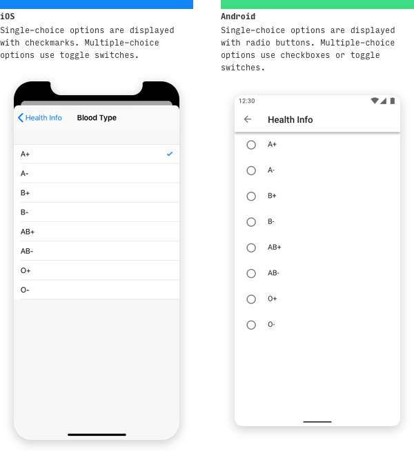
| Single-choice lists | List with checkmark for selected item | Radio button list |
| Multiple-choice lists | List with switches OR list with checkmarks for selected items | Checkbox list OR list with switches |
| Confirm or allow undo of destructive actions | Modal dialog to confirm choice | Allow Undo via temporary on-screen notifications |
Oh, and before we really dive in, let’s answer one important question that will frame everything else here…
Do I have to make my Android and iOS apps different?
Long story short: no.
Apple and Google are both very smart companies with a zillion users each. They will make UX mistakes like anyone else, but in general, when they define a design language for the default way in which their system should work, they’re not going to be making incredibly glaring mistakes. So while I present two ways of doing everything below (the iOS way and the Android way), neither is wrong. If your users are able to confidently navigate and use the app you’re creating, then no one can tell you not to use tabs on iOS or modal views on Android.
This article is written in the spirit of learning to “think in iOS” or “think in Android” – and if your goal is to make an app for both platforms, but have each feel native to the system it’s on, then this guide will be a huge help.
With that being said, let’s dive in.
iOS vs. Android Navigation
Top-of-screen navigation
We’ll start from the top – literally. Each platform has different standards for what appears at the top of most screens.
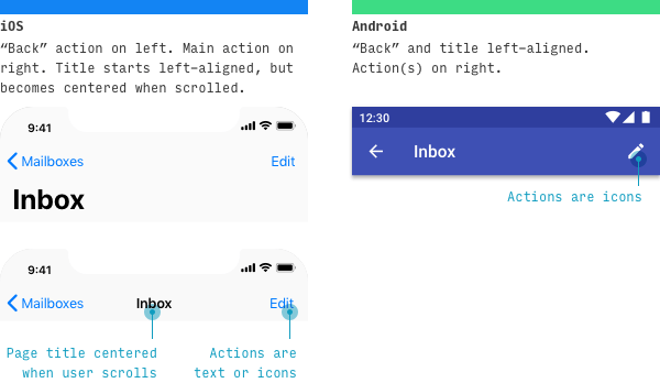
On iOS, the (optional) left action is almost always some sort of “back” – whether to the previous screen sequentially (“Step 2” goes back to “Step “1), or the parent screen hierarchically (“Inbox” goes up to “Mailboxes”). Alternatively, a non-related destination can be linked here. The page title is virtually always present, and starts large, but shrinks with the header as the user scrolls. The optional right page action(s) can be displayed as a single text action or multiple icon actions.
On Android, the page title is left-aligned. There doesn’t need to be anything to the left of the page title, but (a) if the page is a top-level page and there’s a hamburger button in the app, it appears there, or (b) if this page follows another sequentially, you can optionally add a back button.
Resources: iOS navigation bars; Material Design top app bar
Primary Navigation Destinations
The main parts or “destinations” in the app are laid out in different ways.
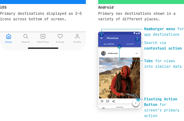
On iOS apps, primary destinations in the app are listed as tabs across the bottom.
- There are 2-5 tabs total
- They are labelled in size 10 font
- They represent the main destinations or “nouns” of the application
For what it’s worth, many popular third-party iOS apps also conform to a few additional guidelines:
- Any tab that represents the primary action of the app – for instance, adding a new photo in a photo-based app – is centered
- Any profile- or settings-related tab appears last
- Search appears second
iOS default apps, on the other hand, (1) discourage actions being in the tab bar, (2) don’t have profile- or settings-related tabs, and (3) make search appear last.
The biggest difference on Android apps is that the same primary destinations are more spread out throughout the interface – often between (a) a hamburger button, (b) a search bar, (c) tabs, or (d) a floating action button. We’ll talk about all 4 in later sections. Oh, and note: Android does use bottom navigation more recently, similar to iOS – so you may not have that big of a difference at all.
Resources: iOS tab bars; Material Design understanding navigation (note: this is a little more theoretical)
Secondary Navigation Destinations
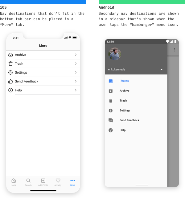
On iOS, navigation destinations that can’t fit in the bottom tab bar can (a) be shunted into a catch-all “More” tab or (b) appear as actions in the top-left or top-right of other destinations.
On Android, secondary nav destinations are listed in a side menu accessible by pressing a hamburger button.
Note: while Apple doesn’t specifically encourage use of the hamburger button (or use it in their default apps), a lot of third-party iOS apps do have one, and it’s simply one more choice to make if you want to use it or not. A best practice is to avoid anything that hides important stuff, because obvious always wins.
Resources: Material Design nav drawer
“Back” Pattern on iOS vs. Android
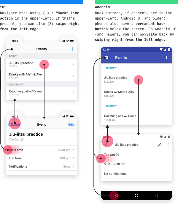
On iOS, you can navigate backwards in 4 different ways, depending on the context.
| Method of navigating back (iOS) | Context in which it works |
|---|---|
| Press “Back” action on top-left of screen | Any screen on which a “Back" action appears |
| Swipe right from left edge of screen | Any screen on which a “Back” action appears in the upper-left |
| Press “Done” action on top-right of screen | Non-editing modal views |
| Swipe down on screen content | Modal or fullscreen views |
What are modal and fullscreen views? Glad you asked.
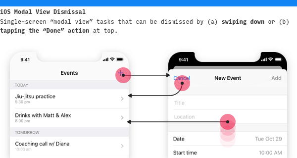
Modal views are single-screen tasks that appear by sliding up in the foreground, while allowing the previous screen to peek through at the top, receded into the background. You can dismiss them by swiping down or tapping a “Back” action at the top.
Fullscreen views are media like photos or videos that take up the entire screen. They’re dismissed by swiping down on both iOS and Android.
On Android, navigating back is much simpler: for Android 10 and newer, simply swipe from either side of the screen in – this will always navigate back. For Android 9, use the omnipresent “Back” button the bottom-left of the screen.
iOS vs. Android Control Design
Primary call-to-action buttons
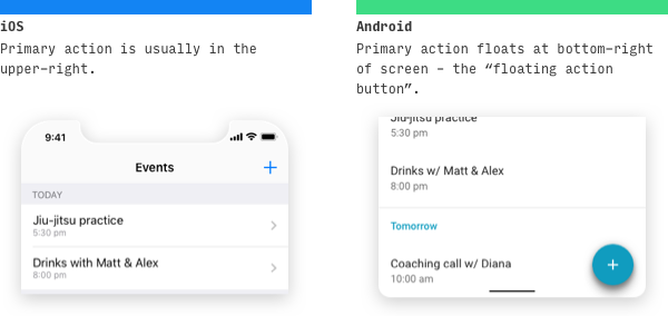
On iOS, the page’s primary button will usually be on the upper-right.
On Android, however, the page’s primary button will often appear in the bottom-right as a floating action button, or FAB for short.
It’s worth noting that each platform will still have exceptions. Let’s take a look.
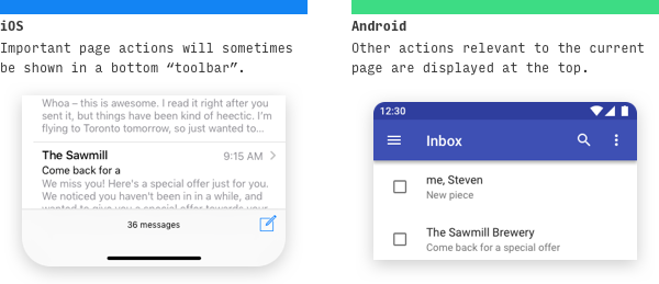
Occasionally on iOS, important page actions will appear on a bottom toolbar. Apple likes to stress this is reeeeally different from a tab bar, but come on now.
Likewise, occasionally on Android, important actions will appear at the top of the screen.
Resources: iOS buttons; Material Design floating action button
Search on iOS vs. Android
On both iOS and Android, search is a common yet highly flexible control. Sometimes it’s the primary point of the app, other times it’s basically an edge use-case, and most of the time, it’s in between the two. As you might expect, each platform allows for some flexibility here. Let’s look at common paradigms.
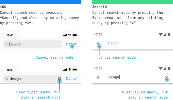
One difference between iOS- and Android-style search:
- To cancel the search, press “Cancel” on iOS or “←” on Android
- To clear the current query, but remain on the search screen, press “X” on iOS or “X” on Android
When search is a highly important functionality, iOS and Android will display the search bar right away. As always on these platforms, tapping the search bar will bring up a totally separate screen.
When search isn’t as critical or common, you can access it via other places.
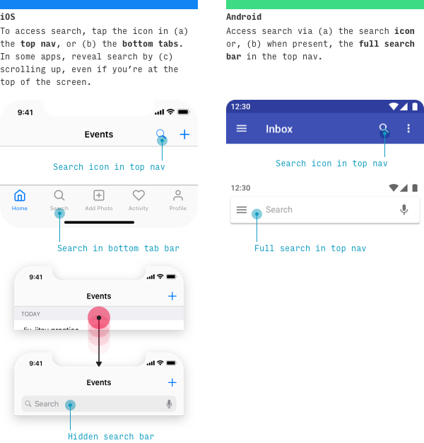
On iOS, it’s common to see search as one of the tabs in the primary tabs, or an action in the top nav bar.
On Android, you’ll also see it in the contextual actions on the top bar as well.
Resources: iOS search bars; Material Design search pattern
iOS & Android Action Menus
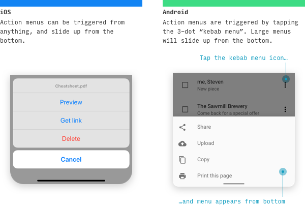
On iOS, action menus can be triggered by any button or attempting to take any action. They slide up from the bottom, where they’re easily within thumb’s reach.
On Android, however, bottom sheets only appear when you tap a three-dot “kebab menu” icon (which is the Android icon for “more options”). And appearing from the bottom typically only happens when there’s a lot of possible actions.
Both platforms have standards for on-action menus.
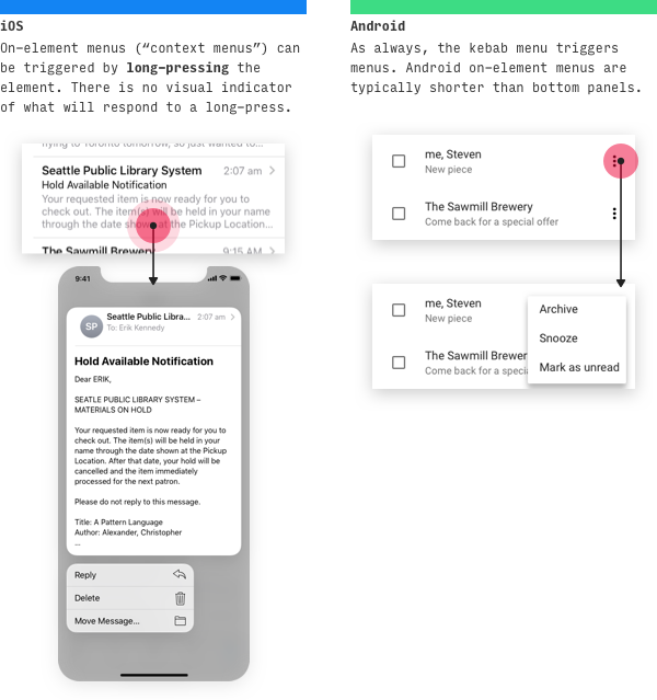
A newer (iOS 13) iOS feature called “context menus” shows related actions when you tap and hold an element. When the context menu is shown, the background is blurred out.
And on Android, many menus will appear in-place directly on the element. In newer versions of Android, the menu will cover the kebab icon itself.
Resources: iOS action sheets, context menus; Android menus, bottom sheets
Selection controls
On mobile, it’s smart to handle choices among few options differently from choices among many options.
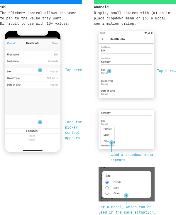
For choices among relatively few options, use a picker control on iOS. Pickers can appear anchored at the bottom (shown above), or inline with the content (see “Date Pickers” below for an example).
For choices among few options on Android, it’s typical to use a dropdown menu (which appears in-place) or a modal dialog (which appears centered and darkens the app background) listing the options.
For longer lists of options, or when multi-selection is possible, it’s common to see a dedicated “picker screen” on both iOS and Android. One of the biggest beginning designer mistakes in mobile design is not dedicating a full screen to the picking of a single choice with many options.
Resources: iOS pickers; Android dropdown menus, dialogs
Date pickers on iOS vs. Android
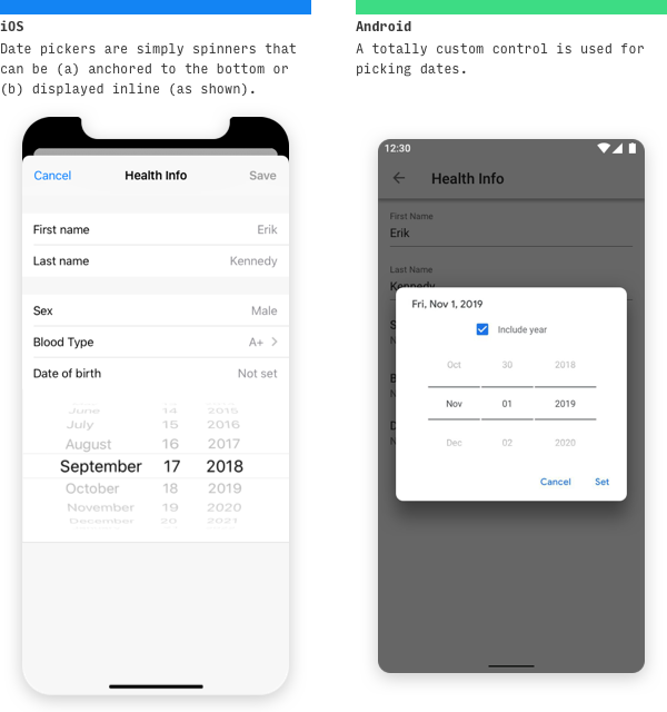
On iOS, date pickers take the appearance of any other picker control, but with a column for day, month, and optionally year.
Android has its own custom date picker control. You can choose to include year, not include it, or allow the user to choose whether or not they want to include it.
Resources: iOS picker; Android date picker (notice the differences in the Material Design spec)
iOS and Android Tabs
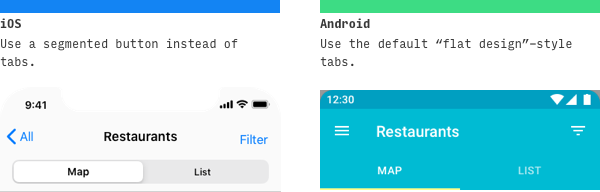
It’s worth noting that iOS doesn’t have a control that visually resembles “tabs”. Instead, Apple calls for you to use a segmented button to navigate between sister views.
On Android, a “flat design” style tab is used for the same display.
Resources: iOS segmented controls; Material Design tabs
“Undo” Pattern on iOS and Android
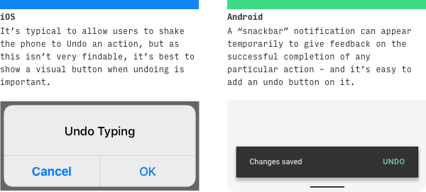
On iOS, alerts appear in the center of the screen, but you’ll also see alerts slide up from the bottom of the screen (technically called “action panels” in iOS lingo). Destructive actions (like deleting something) are red.
On Android, some alerts appear in the center of the screen. However, for alerts that don’t require user input and should disappear after a few seconds, you can use “snackbars”. Snackbars are fantastic, because (a) they give you a way to tell the user that their action was a success, and (b) you can add an action or two on them – which makes them the ideal place for “Undo”. And when it comes down to it, I’d rather give my users the option to undo a mistake then ask them twice every single time they try to make an important decision.
Resources: iOS Undo; Material Design snackbars
iOS vs. Android Typography
Default Font
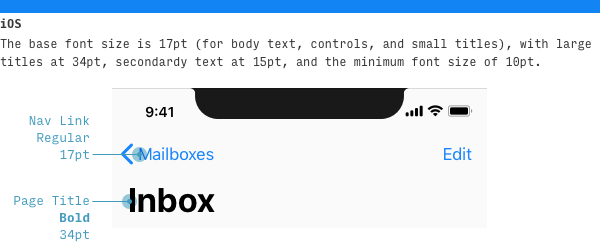
While it’s not necessary to set an iPhone app in the default iPhone font, or likewise for Android, it’s good to know what the system fonts are, just in case you want to imitate the style of a native app.
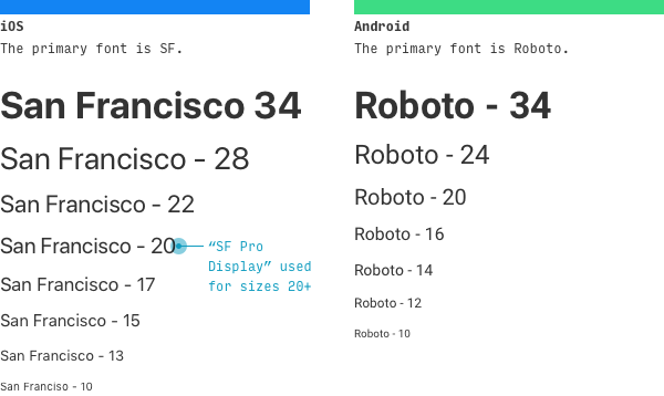
The iOS system font is called SF. It’s a compact font designed for legibility at small sizes. You can download SF here.
The Android system font is called Roboto. While it’s a very similar font to SF overall, it has taller letterforms and a bit more breathing room. You can download Roboto here.
Also, a lot of the Android OS is set in a proprietary Google font called Product Sans, which is not available for third-party use.
Text styles
In another multi-part article, I’ve compiled an in-depth breakdown of how to style text on iPhone app and how to style text on an Android app.
Resources: iOS typography guidelines; Material Design typography guidelines
iOS vs. Android Other Platform Standards
App Icon Size & Shape
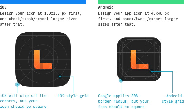
You should design the following sizes of icons for iPhone apps:
| Icon Size | Where it’s used |
|---|---|
| 180x180 px | iPhone Home screen for @3x phones (e.g. all iPhone 12 models, 11 Pro, X, Xs, 8+) |
| 120x120 px | iPhone Home screen for @2x phones (e.g. 11, XR, 8) |
| 1024x1024 px | App Store |
Ultimately, your icon may be used at other sizes as well, but if design it at 60px, then verify it looks good at 120x120, 180x180 and 1024x1024px, you’re golden.
Design the following sizes of icons for Android apps:
| Icon Size | Where it’s used | Multiple of 48x48 px |
|---|---|---|
| 48x48 px | Home screen (medium DPI phones) | 1x |
| 72x72 px | Home screen (high DPI phones) | 1.5x |
| 96x96 px | Home screen (xhdpi phones) | 2x |
| 144x144 px | Home screen (xxhdpi phones) | 3x |
| 192x192 px | Home screen (xxxhdpi phones) | 4x |
| 512x512 px | Large version for Google Play store (all devices) | N/A |
So if you (1) design a beautiful vector icon at 48x48px, (2) zoom in to 400% to make sure it still looks great, and (3) create a separate version at 512x512 px, you’re golden.
When you first look at the tables of icons you need for either iPhone or Android, it can seem pretty daunting. But as long as you know the base size, and can check and export at various larger multiples, it’s really not that hard at all.
Resources: iOS app icons guidelines; Material Design app icon guidelines (unfortunately this says nothing about icon sizes)
iOS vs. Android Tap Target Minimum Size
| Platform | Minimum tap target size |
|---|---|
| iOS | 44x44pt |
| Android | 48x48dp |
Note that Apple’s points (“pt”) and Android’s device-independent pixels (“dp”) are functionally equivalent. They simply refer to a baseline size (the same as the CSS unit “pixels”) that measures independent of whether the screen is normal definition, high definition, ultra-high definition, or whatever else screen people are making these days!
Between Android’s larger tap target size and smaller numbers of pixels-per-screen, Android apps tend to have a slightly more clean, airy appearance than their iOS brethren.
Design Language in Material Design vs. iOS
In trying to show off differences between the two design languages and philosophies, this guide breezes over large parts of the the iOS and Material Design language that are similar. For more on those, you’ll want to dive into the official documentation of each design system.
To learn more about designing for iOS, read Apple’s Human Interface Guidelines.
To learn more about designing in the Material Design style, read the Material Design site.
Wrapping it up
Did I miss anything? Something out of date? Give me a shout at erik@learnui.design. I’ll be continually updating this guide to be the most accurate and up-to-date guide on the web for translating between iPhone and Android mobile apps.
One Final Note 😎
If this is your first time here, you might also be interested in:
- Design Hacks, a 60,000+ person newsletter with original design articles aimed at giving you tactical advice to improve your UX/UI skills.
- Learn UI Design, my full-length online video course on user interface design
Some people have some really nice stuff to say about the newsletter.
Thank you for your newsletter. It’s possibly the best newsletter I’ve received since 1999, when I started freelancing.
Tricia Littlefield
Founder, TheSimpleWeb
Each time I receive an email from you, I'm like ‘Damn, this is a long email! No way will I read all of this’, then I began to read and I'm like ‘Damn, this is so freaking brillant’ and read it all.
Jean-Philippe
UX Strategist, Freelance
Design Hacks
Over 60,000 subscribed. No spam. Unsubscribe anytime.