The Step-by-Step Guide for Pairing Fonts
If you google for how to pair fonts, you’re going to get a lot of awful results. A first-page result recommends pairings no experienced designer would touch with a 10-foot pole. Google Fonts hilariously recommends you pair literally everything with Open Sans and Roboto 🙄
In the article, I’m going to cut through the crap and give you a step-by-step plan for creating beautiful, professional-quality font pairings. Here’s the skinny (feel free to skip ahead):
- Determine your brand
- Brainstorm fonts that subtly convey your brand
- Choose a body font by legibility
- Add an additional font to fill out another aspect of the brand
- Define your new font’s rules of usage
- Repeat steps 4 and 5 as necessary
Let’s get started.
1. Determine your brand (because brand drives typography)
A font pairing that works great on one site may look ridiculous on another.
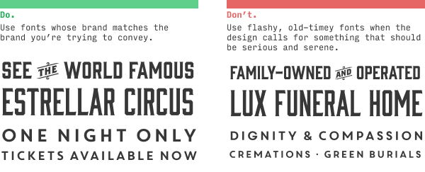
The reason is because different sites and apps have different brands.
Simply put, your brand is just a list of adjectives (or short phrases) that describe what you want your users to think of you.
Some sites need a brand that’s “clean, simple, and modern”, others want to be “luxurious, modern, and classy”.
But whatever your brand is, being able to list specific adjectives and phrases will make the process of choosing fonts easier.
I’ve released a video on YouTube that goes over brand adjectives – how to find them, and how they influence a design.
In particular, in this video, I talk about the 5 most common brands that beginning UI designers should learn how to design for:
- Clean/simple – modern, minimalist
- Classy – luxurious, erudite, classic
- Friendly – casual, informal
- Quirky – design-forward, creative
- Techie – futuristic, geeky
(You can watch the video to see some examples of each)
We’ll use those terms regularly as examples throughout this lesson.
But whatever your design is, take the time to think of a few adjectives or short phrases that describe them. Actually writing them out will make the rest of this process much easier.
2. Brainstorm fonts that subtly convey your brand
Two of the biggest beginner mistakes in choosing typefaces are:
- Choosing a font that doesn’t match your brand
- Choosing a font that matches your brand in an over-the-top way (i.e. a novelty font)
The key to picking good fonts is to find something that conveys your brand – but subtly.
I’m big on examples, so here’s one. Let’s say you’re designing a small site/app about Egyptian history. We want a brand that’s professional, clean, and informative, but about a topic that’s ancient, grand, and a bit mysterious. (Did you catch those? Those are our brand adjectives)
Here are 3 takes:
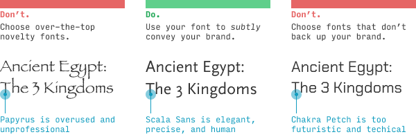
If you’ve piddled around with your computer’s font list, you may know there is a tragically popular font called Papyrus that, in some sense, feels perfect to finally be used in an actual honest-to-goodness Egypt-related site (versus some suburban Tae Kwan-Do school whose sensei dabbled in graphic design for 15 minutes too long… or Avatar).
Alas, this sort of novelty font rarely makes for good design. Avoid it – at least until you’re a good enough designer to not be reading this article 😉
Likewise, the third font – Chakra Petch – while pretty awesome, is entirely inappropriate for the brand we’re trying to convey. It’s angular, techie vibe would be better for “Outer Space: The 3 Kingdoms”, ya know?
We’ve found a good middle ground with Scala Sans, which feels like it’s straight out of a museum placard. It’s what’s called a “humanist” sans-serif, meaning its letterforms are more inspired by human handwriting than, say, geometric shapes. And, like many humanist fonts, it feels precise and fine, like perfect handwriting would.
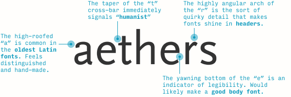
Now I wouldn’t expect every new designer to notice all of these details. In fact, I specifically recommend the newest designers simply stick to using fonts they already know to be great. But as you expand your typographical horizons, you’ll start to pick up on these little details. And even before you know the names or categorizations of things, you’ll develop a gut instinct for what looks good.
What other fonts subtly convey the brand of professional, clean, and informative, yet ancient, grand, and mysterious?
Well, Scala is much more on the “professional, clean, and informative” side. For “ancient, grand, and mysterious”, we’ll almost certainly be looking for a serif font.
(To be clear, we’re not looking for a font that is grand and mysterious – we’re looking for a font that subtly gives off grand and mysterious vibes. We have to take our brand and tone it back a bit)
Let’s keep brainstorming. Here’s what I’ve found after a few minutes:
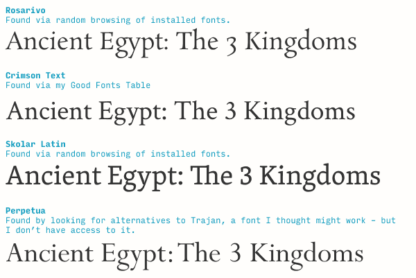
In under 10 minutes, I ended up looking at over 100 fonts, but only picked 4 as contenders. I came up with 2 of them through randomly browsing my font directory, one through my Good Fonts Table (a resource for all Learn UI Design students), and one via knowing the engraved Trajan might be worth trying (even though I don’t own it and had to Google for similar fonts instead). Will one of these be my final choice? No idea! – but this is how the brainstorm starts.
Switching gears: at a broader level, this step is all about translating brand adjectives to letterform shapes.
For instance, one of the 5 most common brands is “quirky”. What fonts do you use on a quirky site? Let’s take a look at the Sante Fe Institute website, a great example of a quirky/creative site (though as a technical institute, it will also have some “techie” elements to its brand). Go ahead and open it in a new tab – we’ll be referencing it throughout.
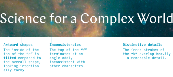
This font is called Chap, and all of its intentional inconsistencies, memorable details, and embraced awkwardness are the things that make it really shine on a quirky/design-forward site. It’s a solid pick here.
Also, none of things I call out in the image above take much design knowledge to notice. Anyone can see the “e” is weirdly misaligned, or the “f”’s top terminal got lopped off peculiarly. As for the “W”, pay attention – it’s a fairly common detail to include (usually in serif fonts), but it certainly does stick out a little bit when seen repeatedly in body text.
Even though typography gets a reputation as something highly subjective and artistic, a shocking amount of choosing the right fonts comes down to analyzing the shape of letterforms. Ultimately, your goal in this step is to connect (a) details about the shapes of letterforms in your chosen font to (b) your particular brand adjectives, and (c) just generate a lot of possible ideas.
Awesome. Let’s move on.
3. Choose a body font by legibility
When you have a handful of fonts on your shortlist, you’ll usually want to pick the body font first. Why? Because it has the tighter constraints – it needs to be legible at a smaller size, and be easy on the eyes if you read it for a longer time.
For beginning designers, the easiest way to check if a font works as a body font is read a dang description of it! For instance, the description of Scala Sans on MyFonts.com says it’s good for “book text” and “small text” – which is synonymous with it being a good body font 😎
But it’s always nice to be able to identify good text typefaces on your own. The main indicator, at least from the perspective of a non-designer or beginning designer is… it’s boring! (I might be the only designer on the internet to admit to that 😛)
Seriously, though, a good body font will never call attention to itself – it lets the content, the words, have center stage. A good body font’s goal is legibility, so if you see a font that’s trying to achieve anything else – character, interestingness, equal-width characters – it’s probably not a good body font.
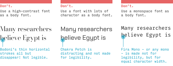
Instead, you’re looking for a plain serif or sans-serif font with – to use the typographical lingo – a high x-height and open counters.

The x-height is the height of the lowercase “x”. But it’s not so much measured absolutely as it is relative to uppercase letters (or tall lowercase ones, like “h”). Why does this matter? Because a tall x-height means the lowercase letters are, relative to other fonts the same size, larger – and therefore easier to read.

“Open counters” (or “large apertures”) means the gaps in letters like “a”, “c”, and “e” are relatively wide. Helvetica’s “c” doesn’t look that far from an “o” – while Proxima Nova’s “c” and “o” are much easier to distinguish.
These may not seem like particularly big deals (and you’ll see plenty of exceptions!), but imagine you had to read something very quickly, or on a phone that’s farther away than you’d like, or when it’s really sunny out. All of these will generally push you towards fonts with high x-heights and open counters.
In the Ancient Egypt example, I’ve brainstormed a few serif fonts, and quickly landed on a highly legible sans-serif I like (Scala Sans). Since these serif fonts would largely make great body fonts too, I have an extra decision – which font to use as my body font: (a) Scala Sans or (b) one of the serifs.
Taking a look at the serifs, I notice I can disqualify some from body usage based on having extremely thin horizontal strokes – something that would make them a bit more difficult to read at smaller sizes, and perhaps appear “wispy”.
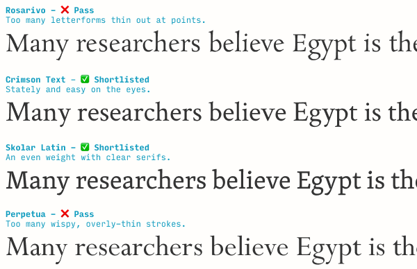
But a couple of these would work fantastically well. At this point, I don’t have a strong opinion on which to use. But as we move through the font-pairing process, one will emerge a winner.
4. Add an additional font to fill out another aspect of the brand
One fairly common mistake I see with my Learn UI Design students is they pair fonts that are quite similar.
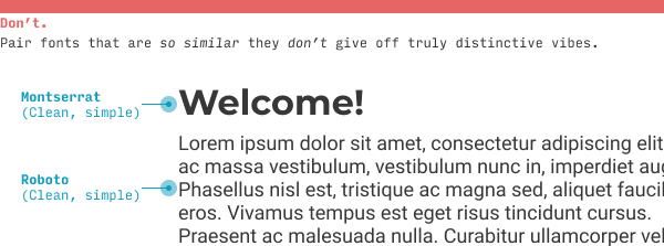
Instead, use the addition of other fonts to fill out your brand in ways one font cannot.
(By the way, 95% of the time, this means you’ll be pairing a serif with a sans serif)
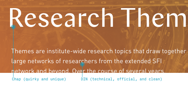
On the Sante Fe Institute website, their headline font Chap is pretty distinctive and quirky. But they’re a technical institution – ideally some part of their brand should say techie as well.
In the “brand chart” format that I show in the Brand & Goals lesson from Learn UI Design, the Santa Fe Institute website would be here:
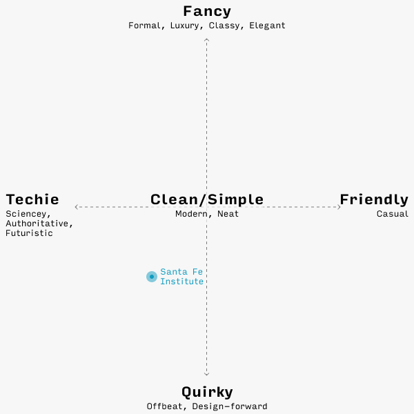
Typographically speaking, their header font, Chap, nails quirky, but not techie. So the next font they use should cover the techie angle a little more.
Pro tip ☝️: most fonts that feel technical/sciencey/futuristic are kind of squared off. But a body font needs to be simple and legible, which, as we saw with Chakra Petch, is sometimes at odds with being angular and geometric.
If you had asked me what font displays a perfect balance between (a) technical/geometric and (b) highly legible, I’d have suggested the wonderful DIN.
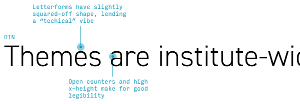
And you know what? The Santa Fe Institute thought the same thing! (And a lot of other designers would’ve too – ask them. I promise you this typography stuff is not as wild and subjective as it looks 🙂)
The net effect is great – definitely quirky and creative, but the angular DIN, backed up by photography of complex systems (like nebulae and traffic flows), adds a technical vibe.
For our Ancient Egypt example, I’m looking for something that feels a little older and more mysterious (but remember: subtly so) compared to Scala Sans. It will definitely be a serif font.
I’ve narrowed down my choice to Skolar and another serif called Minion.
How did I pick Minion? 🤔 Well, I noticed Crimson Text is what’s called an “Old Style” serif – one of the earliest styles of design, based on calligraphic forms, and quite legible (not to mention perfect for something with historical vibes). I decided to browse through a few other Old Style serifs I had remembered – but, if you don’t know any off the top of your head, you can always google “old style serif site:typewolf.com” and you’re two clicks away from learning about Minion.
Now it’s just a matter of figuring out what should be body and what should be header. Let’s just pick a couple and try.
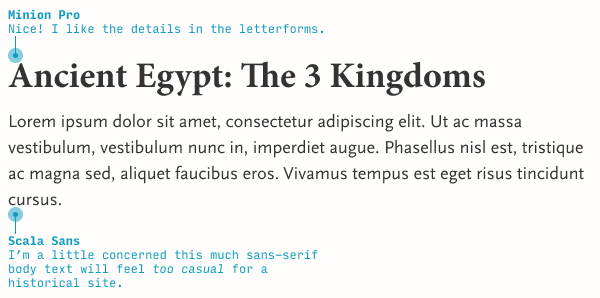
We could do much worse than this – but we might also be able to do a little better. Let’s switch the typefaces and see what that looks like.
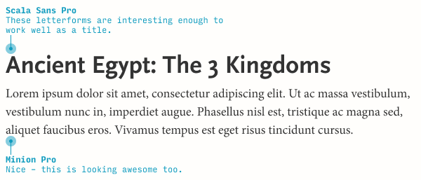
Awesome! But since we have two possible serifs fonts, we should see what Skolar looks like as a body font as well.
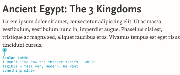
Honestly, the serifs in Skolar feel too big and thick. I like how they were more delicate and precise feeling in Minion.
(Knowing a bit more about typography, this is perfectly reasonable. Skolar is a modern serif font, and many modern serif fonts have larger serifs that make for better legibility at very small sizes!)
So now we have a font pairing – Scala Sans and Minion. What do we do with it?
5. Define your new font’s rules of usage
As we add more fonts, it becomes more and more important to be clear about which is used when.
With just two fonts, you’d think this is pretty simple, right?
- Headers: Scala Sans
- Text: Minion
Not so fast! Even in a fairly straightforward text-based site, there are plenty of other places we will need to pick a font:
- Bylines
- Subheaders
- Navigation menus
- Contact forms (labels, text inputs, buttons)
- Footers
The naive solution is just to (a) use the header fonts for all titles and subhead and (b) use the text font for everything else. Guess how great of an idea that is…
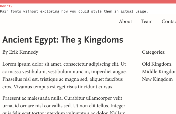
But in reality, picking fonts is only a small fraction of the battle. The vast majority of typography in day-to-day UI design is styling fonts you’ve already chosen.
And even at the font-pairing stage, we want to start styling fonts to see how they could work.
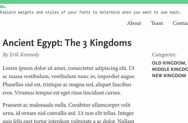
We’ve started to define some more rules for how we use our fonts now:
- Menus: Minion
- Byline: lighter-gray Minion italic
- Labels: lighter-gray Minion italic
- Categories and tags: smaller uppercase Scala Sans bold
But even these are subject to change. For instance, the italicized lighter-gray label would look weird next to text input. Do I therefore use a different style for both labels, or is there a compelling rationale to have two label styles (one for categories and one for form controls)?
As you add more fonts to your design, it becomes more and more essential to be crystal clear about when and how you use each.
For instance, on the Learn UI Design site, I regularly use 3 different typefaces – Avenir Next, Rajdhani, and Freight Text. But, in a sense, I’ve defined “rules” around how I use each:
- Avenir Next: Used as body text. Can italicize or bold as needed.
- Rajdhani: Used for subhead and as an accent font. Only used uppercase and bold.
- Freight Text: Used for the parts of the page that represent someone speaking – e.g. the questions in the FAQs, the testimonials from students, and the “About Me” section. Only used in heavier weights.
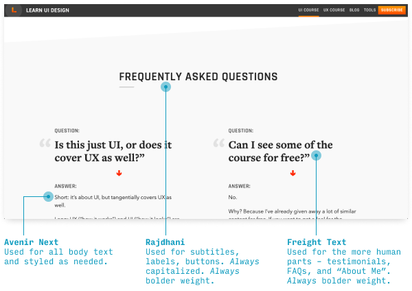
So despite technically having 2 sans-serif fonts, each font is used in different enough ways that the design never feels inconsistent, messy, or overloaded – or does it? 😉 Technically, you’re the judge here!
Anyhow, pick an additional font, then define it’s rules of usage. It’s that simple.
6. Repeat steps 4 and 5 as necessary
In starting to define different styles for your fonts, you may notice that (a) you’re still not hitting some important part of your brand or (b) in your experimental usage of the fonts you’ve picked out, none of them can solve a typographical problem you have.
In that case, the answer is simple: repeat steps 4 (choose an accent font) and 5 (define your usage) as many times as needed.
And that’s all there is to it… sort of.
In all honesty, this is just the beginning. Even in the limited topic of pairing fonts, we still could talk more about…
- What types of fonts give off different types of brand vibes
- Strategies for pairing clean/simple/modern fonts that don’t have a strong brand
- How the heavy-handedness of the brand affects what fonts you’ll pair
And that’s all covered in Learn UI Design, my video course with 24+ hours of content on designing beautiful, pro-quality user interfaces.
It’s a paid course, but if you’re looking for more free material, I suggest reading up on 6 ways to justify font decisions in your designs, how to style text in responsive websites, and my top font recommendations for beginning designers.
Any questions or comments on pairing fonts? Leave ‘em below! I’ll be responding to every question 😎
The Top 10 for UI Design
Get a PDF of the 10 best free fonts for web/mobile app design (including which free fonts not to use).
Practical design tutorials. Over 60,000 subscribed. One-click unsubscribe.