The 3 Laws of Locality
One of the most efficient ways to get better at design fast is through learning heuristics: that is, short rules of thumb that come up in a wide variety of situations.
I’m a big believer of this. In Learn UX Design, my online video course on usability and user experience design, the entire second unit is based around the most important heuristics I’ve used in my own UX career – heuristics like “The best interaction is no interaction at all” or “Show what’s actionable” or “Mind your nouns” (see ‘em all)
Today, though, we’re talking about a different heuristic – one of the most-used and most-useful that I know: the laws of locality. These are three ideas that explain where in your UI you should put certain controls. Why “should” you put a certain control somewhere? Well, the simple answer is: because that’s where your users expect it to be. The laws of locality tell you where users expect certain controls to be, and, taken together, you will see examples of them in basically every digital interface you will ever use – this one included, of course.
Big talk, eh? Let’s dive in. We’re basically going to do this whole thing with just a single example: Gmail.
Ever heard of it? 😁
1. Put the control where it effects change
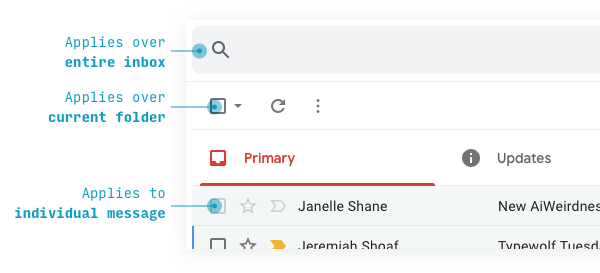
If you’re ever wondering where you should put a control (meaning: a button, a dropdown, an icon, a search bar – whatever!), the answer is almost always: where it effects change.
For instance, if you’re designing an email inbox, you’ll have certain actions a user will need to be able to take:
- Delete
- Mark as read
- Flag as important
All of those actions affect an individual email thread. So you should put those actions on the thread they affect.
And this is exactly what Gmail does.
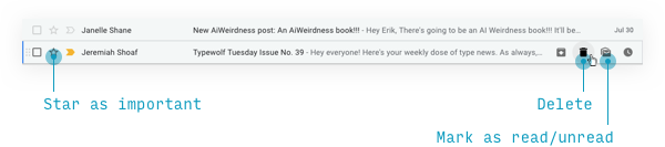
You have to hover on an individual message to see the actions – that just keeps the interface clean. But hover, and it all appears.
Likewise, consider what actions you might take on a totally different thing in an inbox: a folder.
- Rename it
- Delete it
- Change the rules that direct a message to it
Let’s check it out.
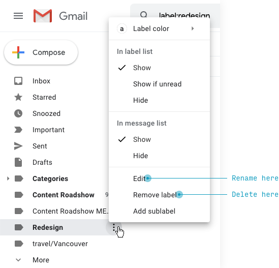
Hover on a folder, a small icon appears indicating further click ability, and sure enough, a menu of options opens up!
So Google thought of a few extra things. But, notably, there’s NOT a way to see all the rules directing messages into this particular folder. And, as I write this, I realize I’ve actually looked here trying to find a way to modify my folder rules. It turns out they’re buried in some inscrutable settings menu. I can’t imagine I’m the only one to look for them here.
Now these examples are about things that have clear, straightforward representations on screen, but the law of locality also applies to things that are a bit more conceptual.
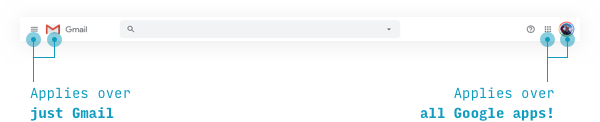
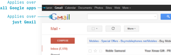
Take, for instance, the idea of an account. Gmail is actually part of a larger suite of apps, which a user has access to via one account. The sorts of actions that apply at an account/suite level – switching between apps, changing my name, logging out – are all accessed via a small grid icon (the thing that represents the suite) and a picture of myself (the thing that represents my account).
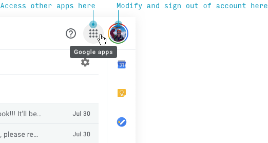
This may not seem particularly insightful. Like, OF COURSE we put “Sign out” in a menu accessed via an account button. And that’s true. This is not the place to innovate, folks.
But I want to stress the first law of locality applies both to more concrete “objects” in your interface (e.g. I’m sure Google has a “threads” table in some database) as well as conceptual groupings of functionality. “Sign out”, “Switch users”, and “Modify Profile” aren’t records in a “Profile” database – yet they’re conceptually related, and therefore the actions are placed near a representation of the thing that unites them all.
By the way, the positioning of the account actions is worth mentioning. They’re tucked away in a corner – the upper corner. And that brings us to the second law of locality.
2. If a control effects change across an entire area, put it above that area
Some actions act on a group of messages. Think “Mark all as read”, “Select all messages”, or even refreshing your inbox to see if new messages have arrived. It doesn’t make any sense to put those actions on an individual message, obviously.
The second law of locality says if a control acts on a larger area of elements (like a list of email threads), put it above that area.
And that’s exactly where we find these controls – above the message threads.
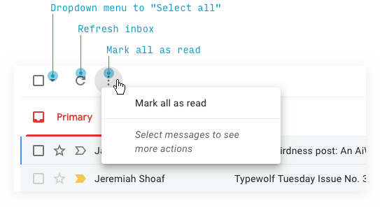
One of the most important facets of the second law of locality is that it’s recursive: areas can be nested in each other.
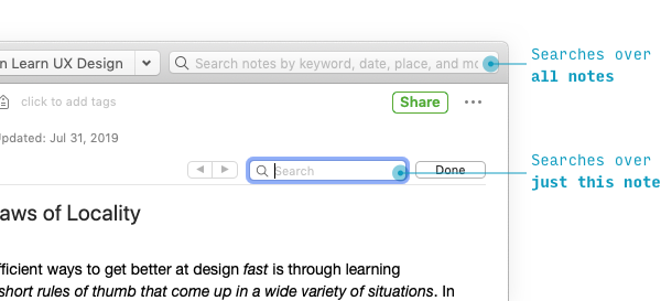
For instance, where’s the search bar?
It’s above the actions we just talked about.
Why is the search bar higher? Because it applies over a greater conceptual area (your entire inbox, rather than just the currently displayed thread).
For proof of this, consider that when you have an app-wide search bar and a page-wide search on the same screen, the app-wide search will always be higher.
And buddy, let me tell ya. It’s law of locality all the way up.
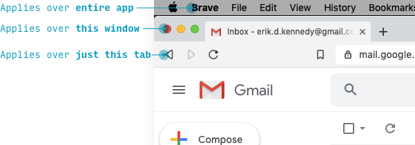
If you’re quick, you may’ve noticed there’s a bit of an exception here. The Apple menu is OS-level, while “Brave”, “File”, etc. are application-level.
You often will have exceptions to the second law of locality at higher levels. If you’re going to knowingly violate the second law, one good idea is: separate the controls left from right.
That’s actually what Gmail does here.
But I find it veeeery telling that an older version of Gmail did obey the second law of locality. And yeah, I pulled this example from memory. It’s part of the job, I guess.
Speaking of exceptions, the third law of locality deals with the times where we can’t follow the first two.
3. The farther a control is from where it effects change, the more it should pop
Let’s talk about “Compose” – i.e. writing a new email – on mobile (which simplifies this example a bit).
The first law of locality says the best place for an “Add
Yet having a “New email” button where that thread would appear (at least when someone replies) might seem a bit silly.
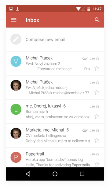
It make sense enough in theory, but one crazy fact about reality is that we have thumbs, people. This feels pretty high up the screen for something that would be used so frequently.
Gmail actually solves this pretty brilliantly with their floating action button (FAB) pattern.
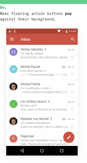
The third law of locality says that whenever you move an action away from where it effects change, you need to make that action pop.
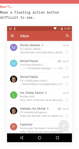
Want proof? Just look. A floating action button that’s as light as the inline-compose I mocked up above is basically impossible to see!
Another big offender against the third law of locality – again on mobile – is iOS actions in the upper-right corner.
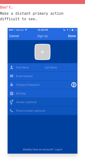
Even though this is an official iOS paradigm, it’s a huge doozy for usability. You fill out the form fields one by one and then… magically decide to glance in the upper-right corner of the screen?
If you’re going to put your primary action up there – and I don’t recommend you do – but if you do, then definitely make it pop.
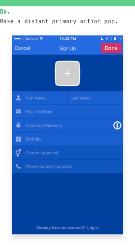
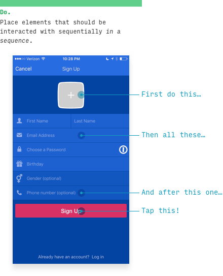
But overall, the best solution is to put it where users expect: in a row (er, column?) with the other things the user needs to do in this form.
Maybe that should be the fourth law of locality? You decide.
Anyhow, that wraps it up.
For more…
One of the things I try to drill into the heads of my UX design students is: your users WANT you to follow the laws of locality.
(By “want”, I really mean “expect” – but considering that 99% of surprises in interfaces are bad surprises, “want” and “expect” are pretty much the same thing. This is known as the Principle of Least Surprise, by the way)
In Learn UX Design, the online video course I teach on creating usable and delightful digital experiences, the laws of locality come up tons. Why? Well, I’ve designed the course so that you’re watching over my shoulder as I design real-world projects, all the while narrating my thought process, ideas, questions, etc.
It’s like having a UX designer break down their art for 15 hours straight right in front of you – as well as having skill-based homework assignments so you can practice what you’ve learned (and a friendly student community where you can get feedback).
But in particular, there’s a 21-minute video just on the laws of locality, which, in addition to what you’ve already read, covers:
- A simple heuristic for how to apply the laws of locality in usability testing
- Advice on a certain type of interface that is difficult to apply the laws of locality to – and how the most well-designed apps in this category tackle the challenge
- Even more examples from web, mobile, and desktop apps
And the laws of locality are just one of the heuristics I cover in Learn UX Design. There’s over 4 hours of video content just on the heuristics of interaction design. That’s not including the stuff on design process, best practices and design patterns, user research, and more.
If you’re interested in hearing when the course is launched, you should join Design Hacks. I send out in-depth, original articles on UI and UX design, as well as the early-bird notification of when the course opens for new enrollments.
Design Hacks
Over 60,000 subscribed. No spam. Unsubscribe anytime.