The King vs. Pawn Game of UI Design
This article originally appeared on A List Apart.
If you want to improve your UI design skills, have you tried looking at chess? I know it sounds contrived, but hear me out. I’m going to take a concept from chess and use it to build a toolkit of UI design strategies. By the end, we’ll have covered color, typography, lighting and shadows, and more.
But it all starts with rooks and pawns.
I want you to think back to the first time you ever played chess (if you’ve never played chess, humor me for a second—and no biggie; you will still understand this article). If your experience was anything like mine, your friend set up the board like this:
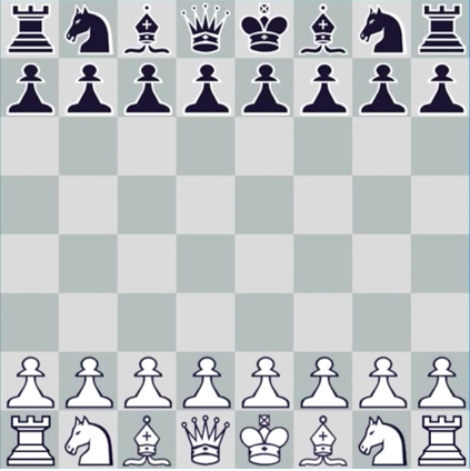
And you got your explanation of all the pieces. This one’s a pawn and it moves like this, and this one is a rook and it moves like this, but the knight goes like this or this—still with me?—and the bishop moves diagonally, and the king can only do this, but the queen is your best piece, like a combo of the rook and the bishop. OK, want to play?
This is probably the most common way of explaining chess, and it’s enough to make me hate board games forever. I don’t want to sit through an arbitrary lecture. I want to play.
One particular chess player happens to agree with me. His name is Josh Waitzkin, and he’s actually pretty good. Not only at chess (where he’s a grandmaster), but also at Tai Chi Push Hands (he’s a world champion) and Brazilian Jiu Jitsu (he’s the first black belt under 5x world champion Marcelo Garcia). Now he trains financiers to go from the top 1% to the top .01% in their profession.
Point is: this dude knows a lot about getting good at stuff.
Now here’s the crazy part. When Josh teaches you chess, the board looks like this:
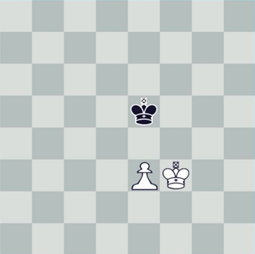
Whoa.
Compared to what we saw above, this is stupidly simple.
And, if you know how to play chess, it’s even more mind-blowing that someone would start teaching with this board. In the actual game of chess, you never see a board like this. Someone would have won long ago. This is the chess equivalent of a street fight where both guys break every bone in their body, dislocate both their arms, can hardly see out of their swollen eyes, yet continue to fight for another half-hour.
What gives?
Here’s Josh’s thinking: when you strip the game down to its core, everything you learn is a universal principle.
That sounds pretty lofty, but I think it makes sense when you consider it. There are lots of things to distract a beginning chess player by a fully-loaded board, but everything you start learning in a king-pawn situation is fundamentally important to chess:
- using two pieces to apply pressure together;
- which spaces are “hot”;
- and the difference between driving for a checkmate and a draw. Are you wondering if I’m ever going to start talking about design? Glad you asked.
The simplest possible scenario
What if, instead of trying to design an entire page with dozens of elements (nav, text, input controls, a logo, etc.), we consciously started by designing the simplest thing possible? We deliberately limit the playing field to one, tiny thing and see what we learn? Let’s try.
What is the simplest possible element? I vote that it’s a button.
This is the most basic, default button I could muster. It’s Helvetica (default font) with a 16px font size (pretty default) on a plain blue rectangle. It’s 40px tall (nice, round number) and has 20px of horizontal padding on each side.
So yeah, I’ve already made a bunch of design decisions, but can we agree I basically just used default values instead of making decisions for principled, design-related reasons?
Now let’s start playing with this button. What properties are modifiable here?
- the font (and text styling)
- the color
- the border radius
- the border
- the shadows
These are just the first things that come to my mind. There are even more, of course.
Typography
Playing with the font is a pretty easy place to start.

Now I’ve changed the font to Moon (available for free on Behance for personal use). It’s rounded and soft, unlike Helvetica, which felt a little more squared-off—or at least not as overtly friendly.
The funny thing is: do you see how the perfectly square edges now look a tad awkward with the rounded font?
Let’s round the corners a bit.

Bam. Nice. That’s a 3px border radius.
But that’s kind of weird, isn’t it? We adjusted the border radius of a button because of the shape of the letterforms in our font. I wouldn’t want you thinking fonts are just loosey-goosey works of art that only work when you say the right incantations.
No, fonts are shapes. Shapes have connotations. It’s not rocket science.
Here’s another popular font, DIN.
Specifically, this is a version called DIN 2014 (available for cheap on Typekit). It’s the epitome of a squared-off-but-still-readable font. A bit harsh and no-nonsense, but in a bureaucratic way.
It’s the official font of the German government, and it looks the part.
So let’s test our working hypothesis with DIN.

How does DIN look with those rounded corners?
Well, we need to compare it to square corners now, don’t we?

Ahhh, the squared-off corners are better here. It’s a much more consistent feel.
Now look at our two buttons with their separate fonts. Which is more readable? I think Moon has a slight advantage here. DIN’s letters just look too cramped by comparison. Let’s add a bit of letter-spacing.

When we add some letter-spacing, it’s far more relaxed.
This is a key law of typography: always letter-space your uppercase text. Why? Because unless a font doesn’t have lowercase characters, it was designed for sentence-case reading, and characters in uppercase words will ALWAYS appear too cramped. (Moon is the special exception here—it only has uppercase characters, and notice how the letter-spacing is built into the font.)
We’ll review later, but so far we’ve noticed two things that apply not just to buttons, but to all elements:
- Rounded fonts go better with rounded shapes; squared-off fonts with squared-off shapes.
- Fonts designed for sentence case should be letter-spaced when used in words that are all uppercase. Let’s keep moving for now.
Color
Seeing the plain default Sketch blue is annoying me. It’s begging to be changed into something that matches the typefaces we’re using.
How can a color match a font? Well, I’ll hand it to you. This one is a bit more loosey-goosey.
For our Moon button, we want something a bit more friendly. To me, a staid blue says default, unstyled, trustworthy, takes-no-risks, design-by-committee. How do you inject some fun into it?
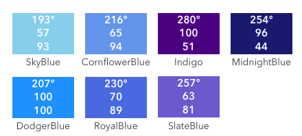
Well, like all problems of modifying color, it helps to think in the HSB color system (hue, saturation, and brightness). When we boil color down to three intuitive numbers, we give ourselves levers to pull.
For instance, let’s look at hue. We have two directions we can push hue: down to aqua or up to indigo. Which sounds more in line with Moon? To me, aqua does. A bit less staid, a bit more Caribbean sea. Let’s try it. We’ll move the hue to 180° or so.

Ah, Moon Button, now you’ve got a beach vibe going on. You’re a vibrant sea foam!
This is a critical lesson about color. “Blue” is not a monolith; it’s a starting point. I’ve taught hundreds of students UI design, and this comes up again and again: just because blue was one color in kindergarten doesn’t mean that we can’t find interesting variations around it as designers.
Aqua is a great variation with a much cooler feel, but it’s also much harder to read that white text. So now we have another problem to fix.
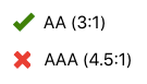
“Hard to read” is actually a numerically-specific property. The World Wide Web Consortium has published guidelines for contrast between text and background, and if we use a tool to test those, we find we’re lacking in a couple departments.
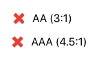
According to Stark (which is my preferred plugin for checking contrast—check out Lea Verou’s Contrast Ratio for a similar web-based tool), we’ve failed our contrast guidelines across the board!
How do you make the white text more legible against the aqua button? Let’s think of our HSB properties again.
- Brightness. Let’s decrease it. That much should be obvious.
- Saturation. We’re going to increase it. Why? Because we’re contrasting with white text, and white has a saturation of zero. So a higher saturation will naturally stand out more.
- Hue. We’ll leave this alone since we like its vibe. But if the contrast continued to be too low, you could lower the aqua’s luminosity by shifting its hue up toward blue. So now, we’ve got a teal button:

Much better?
Much better.
For what it’s worth, I’m not particularly concerned about missing the AAA standard here. WCAG developed the levels as relative descriptors of how much contrast there is, not as an absolute benchmark of, say, some particular percentage of people to being able to read the text. The gold standard is—as always—to test with real people. AAA is best to hit, but at times, AA may be as good as you’re going to get with the colors you have to work with.
Some of the ideas we’ve used to make a button’s blue a bit more fun and legible against white are actually deeper lessons about color that apply to almost everything else you design:
- Think in HSB, as it gives you intuitive levers to pull when modifying color.
- If you like the general feel of a color, shifting the hue in either direction can be a baseline for getting interesting variations on it (e.g., we wanted to spice up the default blue, but not by, say, changing it to red).
- Modify saturation and brightness at the same time (but always in opposite directions) to increase or decrease contrast. OK, now let’s switch over to our DIN button. What color goes with its harsh edges and squared-off feel?
The first thing that comes to mind is black.

But let’s keep brainstorming. Maybe a stark red would also work.

Or even a construction-grade orange.

(But not the red and orange together. Yikes! In general, two adjacent hues with high saturations will not look great next to each other.)
Now, ignoring that the text of this is “Learn More” and a button like this probably doesn’t need to be blaze orange, I want you to pay attention to the colors I’m picking. We’re trying to maintain consistency with the official-y, squared-off DIN. So the colors we go to naturally have some of the same connotations: engineered, decisive, no funny business.
Sure, this match-a-color-and-a-font business is more subjective, but there’s something solid to it: note that the words I used to describe the colors (“stark” and “construction-grade”) apply equally well to DIN—a fact I am only noticing now, not something done intentionally.
Want to match a color with a font? This is another lesson applicable to all of branding. It’s best to start with adjectives/emotions, then match everything to those. Practically by accident, we’ve uncovered something fundamental in the branding design process.
Shadows
Let’s shift gears to work with shadows for a bit.
There are a couple directions we could go with shadows, but the two main categories are (for lack of better terms):
- realistic shadows;
- and cartoon-y shadows. Here’s an example of each:
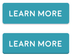
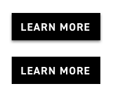
The top button’s shadow is more photorealistic. It behaves like a shadow in the real world.
The bottom button’s shadow is a bit lower-fidelity. It shows that the button is raised up, but it’s a cartoon version, with a slightly unrealistic, idealized bottom edge—and without a normal shadow, which would be present in the real world.
The bottom works better for the button we’re crafting. The smoothness, the friendliness, the cartoon fidelity—it all goes together.
As for our DIN button?
I’m more ambivalent here. Maybe the shadow is for a hover state, à la Material Design?
In any case, with a black background, a darkened bottom edge is impossible—you can’t get any darker than black.
By the way, you may not have noticed it above, but the black button has a much stronger shadow. Compare:
The teal button’s shadow is 30%-opacity black, shifted 1 pixel down on the y-axis, with a 2-pixel blur (0 1px 2px). The black button’s is 50%-opacity black, shifted 2 pixels down on the y-axis, with a 4-pixel blur (0 2px 4px). What’s more, the stronger shadow looks awful on the teal button.

Why is that? The answer, like so many questions that involve color, is in luminosity. When we put the button’s background in luminosity blend mode, converting it to a gray of equal natural lightness, we see something interesting.
The shadow, at its darkest, is basically as dark as the button itself. Or, at least, the rate of change of luminosity is steady between each row of pixels.

The top row is the button itself, not shadow.
Shadows that are too close to the luminosity of their element’s backgrounds will appear too strong. And while this may sound like an overly specific lesson, it’s actually broadly applicable across elements. You know where else you see it?
Borders
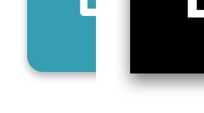
Let’s put a border on our teal button.

Now the way I’ve added this border is something that a bunch of people have thought of: make the border translucent black so that it works on any background color. In this case, I’ve used a single-pixel-wide border of 20%-opacity black.
However, if I switch the background color to a more standard blue, which is naturally a lot less luminous, that border all but disappears.

In fact, to see it on blue just as much as you can see it on teal, you’ve got to crank up black’s opacity to something like 50%.

This is a generalizable rule: when you want to layer black on another color, it needs to be a more opaque black to show up the same amount on less luminous background colors. Where else would you apply this idea?
Spoiler alert: shadows!
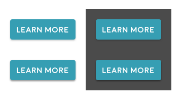
Each of these buttons has the same shadow (0 2px 3px) except for different opacities. The top two buttons’ shadows have opacity 20%, and the bottom two have opacity 40%. Note how what’s fine on a white background (top left) is hardly noticeable on a dark background (top right). And what’s too dark on a white background (lower left) works fine on a dark background (lower right).
Icons
I want to change gears one more time and talk about icons.
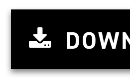
Here’s the download icon from Font Awesome, my least favorite icon set of all time.
I dislike it, not only because it’s completely overused, but also because the icons are really bubbly and soft. Yet most of the time, they’re used in clean, crisp websites. They just don’t fit.
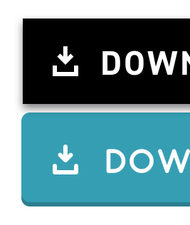
You can see it works better with a soft, rounded font. I’m less opposed to this sort of thing.
But there’s still a problem: the icon has these insanely small details! The dots are never going to show up at size, and even the space between the arrow and the disk is a fraction of a pixel in practice. Compared to the letterforms, it doesn’t look like quite the same style.
But what good is my complaining if I don’t offer a solution?
Let’s create a new take on the “download” icon, but with some different guiding principles:
- We’ll use a stroke weight that’s equivalent (or basically equivalent) to the text weight.
- We’ll use corner radii that are similar to the corner radii of our font: squared off for DIN, rounded for Moon.
- We’ll use a simpler icon shape so the differences are easy to see. Let’s see how it looks:
I call this “drawing with the same pen.” Each of these icons looks like it could basically be a character in the font used in the button. And that’s the point here. I’m not saying all icons will appear this way, but for an icon that appears inline with text like this, it’s a fantastic rule of thumb.
Wrapping it up
Now this is just the beginning. Buttons can take all kinds of styles.
But we’ve got a good start here considering we designed just two buttons. In doing so, we covered a bunch of the things that are focal points of my day-to-day work as a UI designer:
- lighting and shadows;
- color;
- typography;
- consistency;
- and brand.
And the lessons we’ve learned in those areas are fundamental to the entirety of UI design, not just one element. Recall:
- Letterforms are shapes. You can analyze fonts as sets of shapes, not simply as works of art.
- You should letter-space uppercase text, since most fonts were designed for sentence case.
- Think in HSB to modify colors.
- You can find more interesting variations on a “basic” color (like a CSS default shade of blue or red) by tweaking the hue in either direction.
- Saturation and brightness are levers that you can move in opposite directions to control luminosity.
- Find colors that match the same descriptors that you would give your typeface and your overall brand.
- Use darker shadows or black borders on darker backgrounds—and vice versa.
- For inline icons, choose or design them to appear as though they were drawn with the same pen as the font you’re using.
You can thank Josh Waitzkin for making me a pedant. I know, you just read an entire essay on buttons. But next time you’re struggling with a redesign or even something you’re designing from scratch, try stripping out all the elements that you think you should be including already, and just mess around with the simplest players on the board. Get a feel for the fundamentals, and go from there.
Weird? Sure. But if it’s good enough for a grandmaster, I’ll take it.
This article originally appeared on A List Apart.
Watch me do a UI project step-by-step
I’ll walk you through every part of a UI project — just like I’ve done for everyone from Fortune 100 companies to Y-Combinator startups.
Practical design tutorials. Over 60,000 subscribed. One-click unsubscribe.