DIN: Free Alternatives & Similar Fonts
If you’re looking for free alternatives to DIN, here are 6 of the highest-quality look-alikes and similar fonts.
- D-DIN (closest match)
- Gidole
- Barlow (best overall)
- Golos Text
- Clear Sans (underused alternative)
- Bai Jamjuree (more stylized option)
For each, I’ll mention the advantages, disadvantages, and why you might choose it. Ready? Let’s get started.
You’re reading Free Font Alternatives: The Ultimate Guide. Quickly navigate to other fonts: Intro · Apercu · Avenir · Circular · DIN · Futura · Gotham · Helvetica · Proxima Nova · Times New Roman
1. D-DIN
The free D-DIN is a fantastic match, though of somewhat limited practical use.
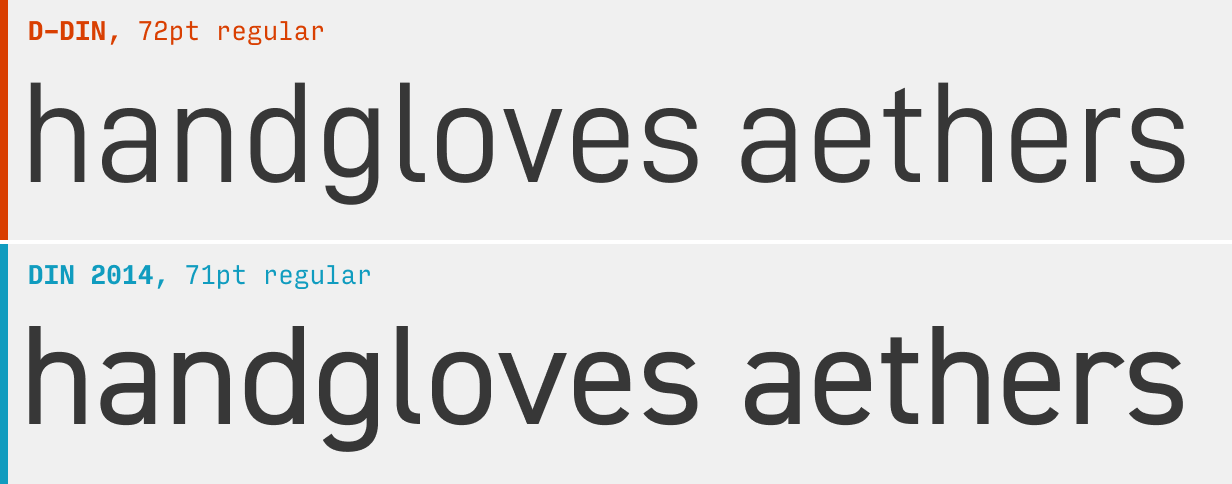
It all boils down to D-DIN only shipping with 2 weights (and one italic weight). That’s open source fonts for ya! Nonetheless, if you need a spot-on match for DIN in nothing but regular and bold, look no further.
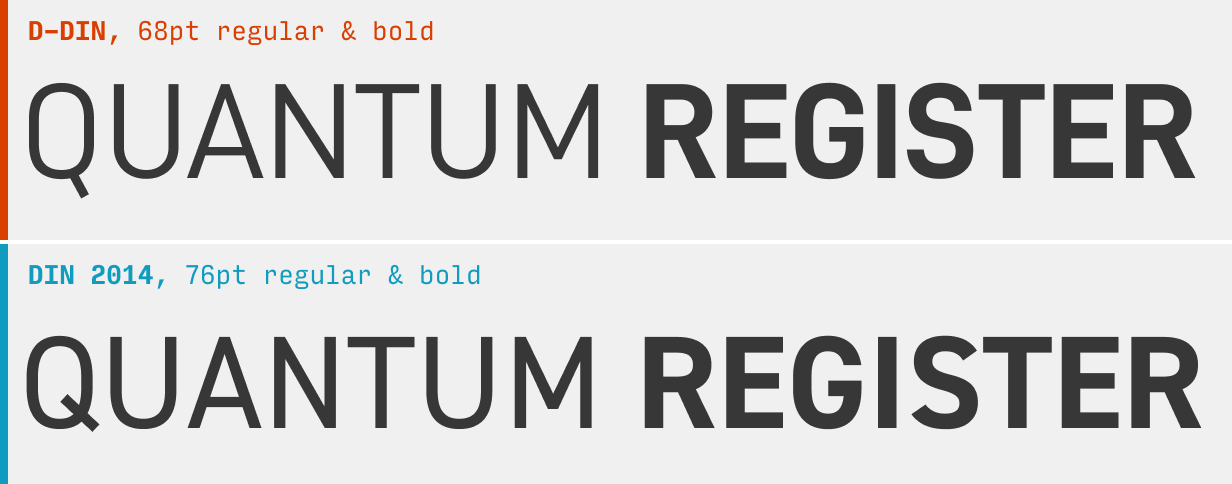
DIN shines in uppercase, and it’s worth directly comparing some free alternatives in that setting. Here you can see D-DIN continues to be a fantastic alternative.
What it’s got: 2 weights + 1 italic weight
Get it at: D-DIN at Font Squirrel
2. Gidole
The single-weight Gidole at Github was a nice side-project, but is tough to use in the real world.
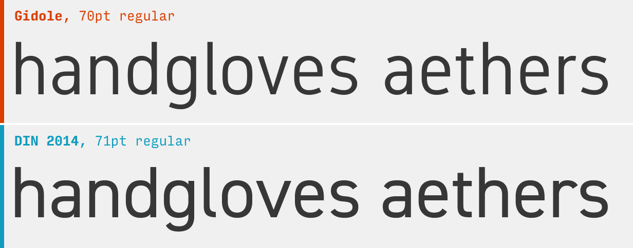
Hopefully the type designer will flesh this one out a bit. Gidole is a nice DIN-like open source font, but having only a single weight (and no italics) renders it somewhat impractical.
What it’s got: 1 weight, no italics
Get it at: Gidole at Github
3. Barlow
The more versatile Barlow at Google Fonts is closest Google Font to DIN, and perhaps the all-around best free alternative.
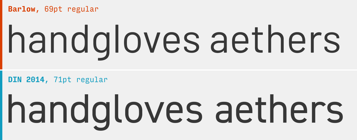
While the “g” is perhaps a bit too distinctive for my tastes, there’s no real reason why Barlow isn’t the best all-around free alternative to DIN.
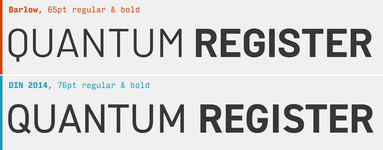
One gripe is that the cross-bar of the capital “A” sits very low, which ultimately feels a bit too distinctive for my taste. It’s tough to see here, but pay attention as you use it. Overall, Barlow is still solid!
What it’s got: 9 weights + italics
Get it at: Barlow at Google Fonts
4. Golos Text
Golos Text is a fairly solid alternative to DIN.
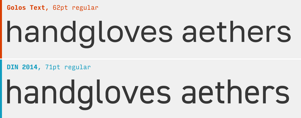
At smaller sizes, it’s pretty convincing. At larger ones (pictured), the differences are more apparent: it’s not always as squared off; the joins are pretty thinned out (cf. the two fonts’ “d” or “g”).
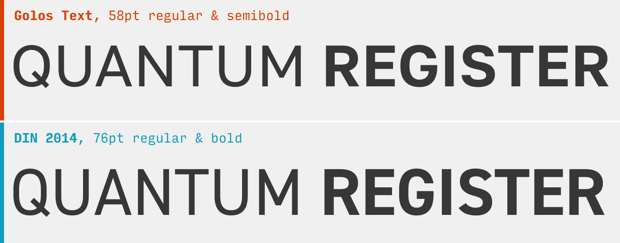
Golos isn’t quite as compact in uppercase, but does have a very similar feel overall!
What it’s got: 6 weights + italics; also available as a variable font
Get it at: Golos Text at Google Fonts
5. Clear Sans
Less a DIN-lookalike than an interesting alternative, Clear Sans remains completely underused.
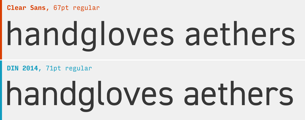
No one is going to mistake Clear Sans for DIN, but everyone can understand it’s got the same overall vibe – squared-off, punchy, and technical. Add to this the fact that you’ll basically never see it in the wild, and this makes a quite decent option for a free DIN alternative.
What it’s got: 5 weights + 3 italic weights
Get it at: Clear Sans at Font Squirrel
6. Bai Jamjuree
The Google Font Bai Jamjuree is even more squared-off and technical than DIN.
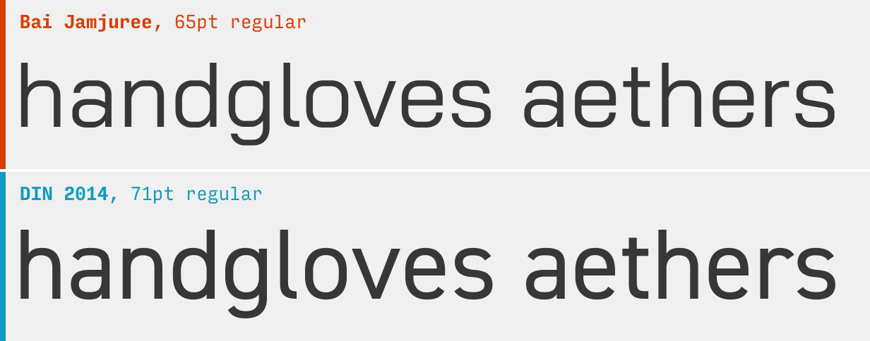
This one is a bit like DIN, but with the brand amped up until it feels like it almost belongs in a video game. Nonetheless, for being a very high-quality Google Font, you’ll almost never see this one in the wild. This is one I recommend to all my students.
What it’s got: 6 weights + italics
Get it at: Bai Jamjuree at Google Fonts
Other DIN Alternatives
If you’re looking to branch out from DIN, it’s worth checking out some of the other alternatives in this guide. For instance, the Futura alternatives also have a punchy uppercase, and work in many of the same contexts as DIN. Likewise, the Helvetica alternatives are clean, simple, and neutral.
You’re reading Free Font Alternatives: The Ultimate Guide. Quickly navigate to other fonts: Intro · Apercu · Avenir · Circular · DIN · Futura · Gotham · Helvetica · Proxima Nova · Times New Roman
The Top 10 for UI Design
Get a PDF of the 10 best free fonts for web/mobile app design (including which free fonts not to use).
Practical design tutorials. Over 60,000 subscribed. One-click unsubscribe.