The HSB Color System: A Practitioner's Primer
Search Google for “HSB”. There are 2.5 million results, and none of them seem to be written by anyone who’s actually used the system. What gives?
On the bright side, now I have something to do while finishing this beer 🍻
We’re going to cover what H, S, and B are, and then I’m going to tell you about why this is the single-best color system in wide usage (plus some intricacies of using it in day-to-day digital design).
If you’re already familiar with what H, S, and B are, you can skip to the 201 material on down the page.
Let’s Take This One Letter at a Time
The inside of your computer is all 1s and 0s, which means that, to your computer, color is just bits. If you think color is a mysterious woo-woo rainbow of ethereal magic, you’ll be disheartened to find out that every computer on the face of the planet represents every possible color with just 3 numbers (OK, sometimes a fourth number for opacity too 🙃).
Now, just what those 3 numbers are differs quite a bit.
If you’ve ever coded HTML and CSS, you’re probably familiar with RGB, in which a particular color is represented by three numbers:
- How red it is (R)
- How green it is (G)
- How blue it is (B)
And while this legit sounds like something someone made up while they were high, it’s actually straightforward and solid enough that it’s the default way computers talk about color 🤷♂️
But just because it’s easy for computers doesn’t mean it’s easy for humans. That’s where HSB comes in.
HSB stands for hue-saturation-brightness, and is a far more human-friendly way of describing color. Why is it so great? Because it uses ideas that we already naturally think of when describing color, like… OK, you know what? I’ll just show you.
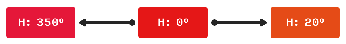
Hue = “Color of the Rainbow”
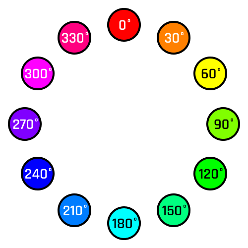
Hue is a number between 0 and 360. It’s measured in degrees, like degrees of a circle (because whoa, spoiler, circles also have 360°). Remember the color wheel? Hue is just where you are on the color wheel.
Now this ignores how dark or bright or rich or pale the color is. We’ll get there. For now, just know that to find the hue, think of whatever color it’s closest to on the color wheel.
(“But what about black? White? Gray?” – pump the brakes, champ. I said we’ll get there)
If you want to develop an intuitive understand of HSB, you should have a couple anchor points in mind. I use red, green, and blue, since they’re equidistant around the circle:
- Red is 0°
- Green is 120°
- Blue is 240°
- Red is also 360°, which is the exact same as 0°
So when I’m thinking of what color to add in, I can quickly just type a number that will get me pretty close to the right hue, just by thinking about where those three points are.
Saturation = “Richness”
Saturation is a number between 0 and 100. So, no matter what hue you’ve picked, a saturation of 100% will be the richest possible version of that color and a saturation of 0% will be the gray version of that color (i.e. if the color is light, it’ll be a light gray; if the color is dark, it’ll be a dark gray).
Wanna see?
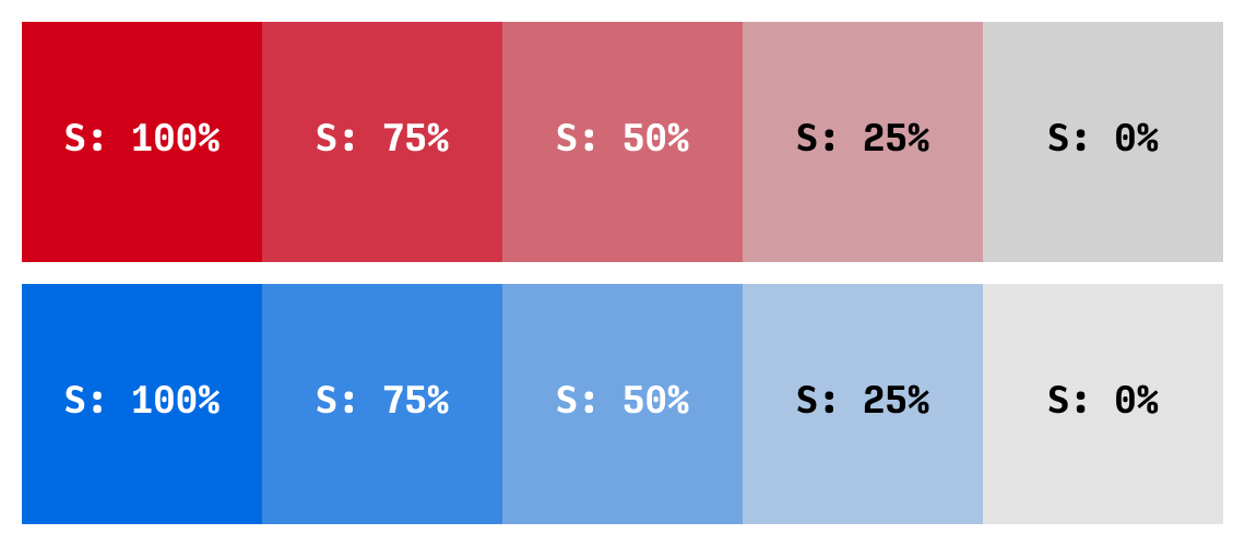
Saturation is pretty simple. I sometimes think about it as the amount of color injected into the gray. So 0% is a flat gray, but 100% is the most colorful color your monitor can make.
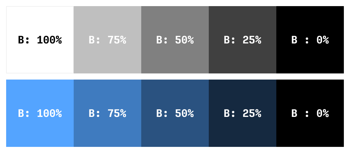
Brightness = Brightness, Duh.
Brightness is a number between 0 and 100. Like saturation, it’s sometimes written as a percentage. This one is fairly obvious as to what it means, but there’s a quick catch.
- 0% brightness is black, no matter the hue, no matter the saturation.
- 100% brightness is white only if saturation is also 0%. Otherwise, 100% brightness is just a… very bright color.
Sound confusing? Think of it this way. Imagine Brightness is a lightbulb. 0% means the lightbulb is off (pitch black in the room). 100% means the light is on full strength. So maybe 100% brightness is a bright color, or, if the light is already white, then 100% brightness is pure white.
Alright, so to review, we can describe a color with three sensible numbers:
- Hue: the color it most resembles on the color wheel, from 0° to 360°
- Saturation: how injected with color it is, from 0% to 100%
- Brightness: how much the “lightbulb” is turned on, from 0% to 100%
We good? Great.
HSB in Practice
If you’re still with me, I want to start getting into the practicalities of using this system. If you’ve never used HSB, don’t freak out too much about the details coming up… Give the system a try first. Mess around a bit, and come back – it’ll make more sense after some use.
Color Variations with Hue
First, hue is a fantastic way of creating variations on color. Because you have so many choices from 0° to 360°, rather than blue simply being “blue”, you can push the hue slightly down or up, and get nice variations pretty easily.
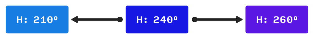
Here we start with a very default blue, centered smack dab on 240°. But rather than choosing the most boring possible color ever, we decide to spice things up a bit.
Even shifting the hue down 30° to 210° gives a cool vibe. Lighter, more fun, more casual.
And bumping the hue up to 260° gives me an indigo. A mere 20° shift, and it’s got a totally different feel – something cooler, might work well with neon colors or dark backgrounds. Could lend a subtle feminine vibe to something. Etc – you get it.
Likewise, red. Tough color to work with right out of the gate. It’s super bold, super strong. But depending on what we want to do – let’s say this is our error message or something – we can make it friendlier by injecting the slightest amount of pink (moving the hue down 10°). Or we can get a more staid variation by adding some orange.
So working with hue gives you a lot of options. Do yourself a favor: don’t restrict your palettes to the colors you learned in Kindergarten. Play around with it.
(I’ve written a lot more on color variation, by the way)
Adjust Visibility with Saturation
There’s plenty of techniques and tricks that involve adjusting saturation, but one I keep coming back to is adjusting visibility.
If you have a color that’s really overpowering everything in your UI, a quick go-to way of fixing it is to reduce the saturation.
For instance, take a look at this variation on the Google logo. I’ve saturated the blue to 100%, and you’ll see it sticks out like a sore thumb.

Notice how much the blue sticks out. If you’re having trouble seeing it, try relaxing your eyes and just staring at the logo for a few seconds. Almost immediately, you’ll start to see the “G” and the “g” popping out from the other colors.
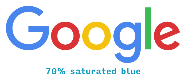
In the normal Google logo, there’s much better balance between the different colors.
You’ll come to use saturation for all kinds of things, including fixing clashing colors and enriching your darker shades, but I just wanted to give a quick example here. Now let’s move on to one of the more intriguing facts of HSB – and what it means.
Black is Not the Opposite of White
In HSB, here’s how we make black and white:
- Black: set the brightness to 0%. Hue and saturation can be anything.
- White: set the brightness to 100% and the saturation to 0%. Hue can still be anything.
This means, intriguingly enough, that (in the HSB system) black is not the opposite of white.
Another way of proving this to yourself is to think about what it means to add black or white to a color.
To add white, you must move your color towards white on your color picker. White is in the upper-left corner, and sure enough, adding white involves decreasing saturation (moving left) and increasing brightness (moving up).
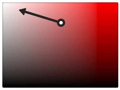
Adding white looks like this:
But adding black? Well, since black is the whole bottom side of the color picker rectangle, adding black is just decreasing brightness. Saturation doesn’t matter.
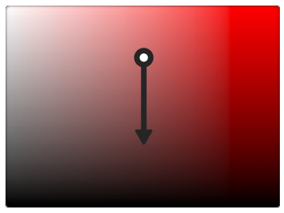
Those two arrows don’t cancel each other out! Black and white are not opposites in HSB.
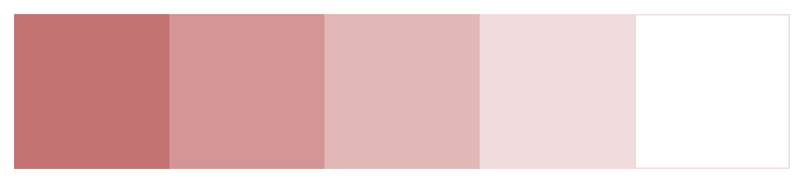
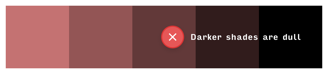
On a practical level, the darker shades you get by adding black are really dull compared to the lighter versions:
Here’s the big kicker. Instead of adding black, I want you to remove white. In other words, simultaneously:
- Increase saturation
- Decrease brightness
Or, if you prefer the diagram:
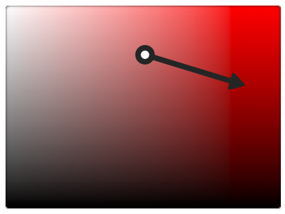
This will give you much richer dark shades:

Removing white – that is, making your darker shades richer – is the “correct” way to generate darker variations of a color 95%+ of the time.
Bonus Explanation: What’s the Difference between HSL and HSB?
The front-end devs among you might know that CSS uses a color system HSL (hue, saturation, lightness). Wow. That sounds vaguely familiar. Are HSB and HSL the same thing?
Short answer: no. But they’re very similar.
Now that you’re an expert in HSB, I can explain this really simply: HSL is exactly like HSB, except black and white are actually opposites.
So, in HSL:
- To get black, set lightness to 0% (doesn’t matter what hue or saturation are)
- To get white, set lightness to 100% (doesn’t matter what hue or saturation are)
Now that’s well and good, but as soon as you try and describe intuitively how to translate between the two systems, things get messy.
- Adding HSL lightness above 50% is the same as adding white (meaning the equivalent HSB saturation goes down and HSB brightness goes up)
- Subtracting HSL lightness below 50% is the same as adding black (no effect on HSB saturation, but HSB brightness goes down).
Or another way to think of it:
- In HSB, the opposite of adding white is removing white
- In HSL, the opposite of adding white is adding black
Since color variations in the real world involve removing white (not simply adding black), HSB is a slightly more intuitive system to work with for UI design.
The downside is, as of 2024, CSS doesn’t take HSB values directly. So you’ll have to copy and paste a HEX code – which is less accessible than either color system!
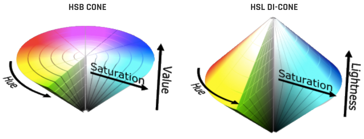
If you’re interested in learning more about color systems, this diagram contains the seeds of your demise. It should make clear the subtle but critical difference between HSB and HSL. But the rabbit hole goes deep. Once you notice certain hues are brighter (even at the same HSB brightness), then you have to create color spaces that adjust for that (like HCL, which I use for my gradient generator 😎).
But whipping out color spaces like this is where we leave practice and enter theory, so I’ll let someone else take the reigns here.
Get the (Free & Updated)
UI Color Cheatsheet
Learn how to use color effectively in UI design, even if you aren’t “artsy” & have no design experience. The same strategies I use for my clients – from Fortune 100 to Y-Combinator startups.
Practical design tutorials. Over 60,000 subscribed. One-click unsubscribe.