Futura: Free Alternatives & Similar Fonts
If you’re looking for free alternatives to Futura, here are 2 of the highest-quality look-alikes and similar fonts.
For each, I’ll mention the advantages, disadvantages, and why you might choose it. Ready? Let’s get started.
You’re reading Free Font Alternatives: The Ultimate Guide. Quickly navigate to other fonts: Intro · Apercu · Avenir · Circular · DIN · Futura · Gotham · Helvetica · Proxima Nova · Times New Roman
1. Jost
The Google Fonts-distributed Jost is all-around the best modern, free, cross-platform alternative to Futura.
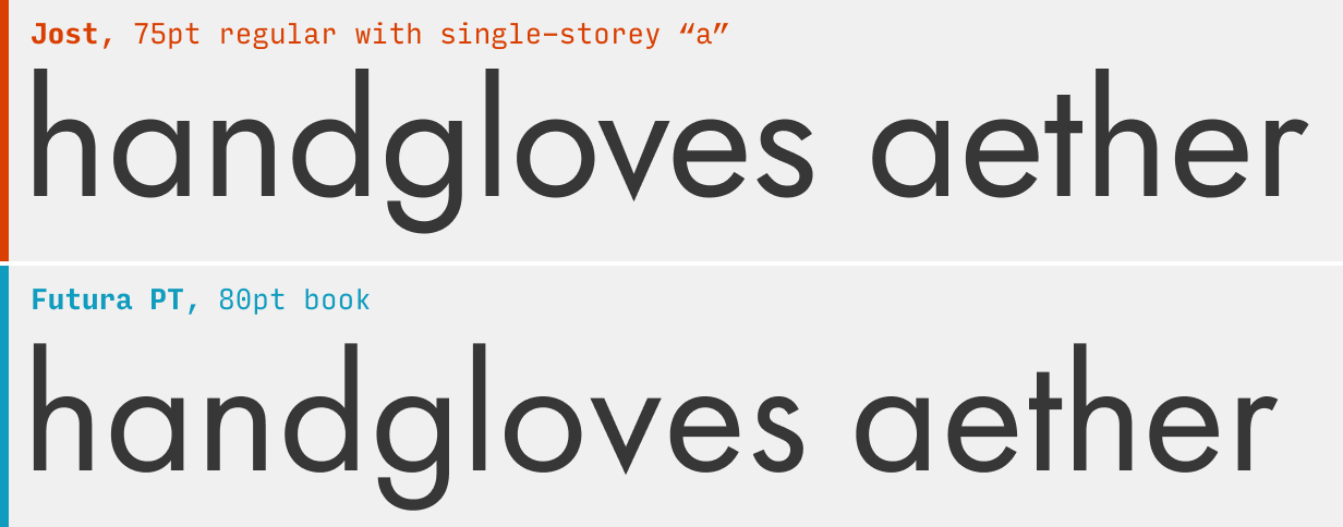
Despite being a near-deadringer for the century-old Futura, Jost ships out-of-the-box with a double-storey “a”. To get the full Futura feel, make sure to use the single-storey “a” alternate character with font-feature-settings: "ss01" 1; (here’s more on how to do alternate character styles in Figma and CSS)
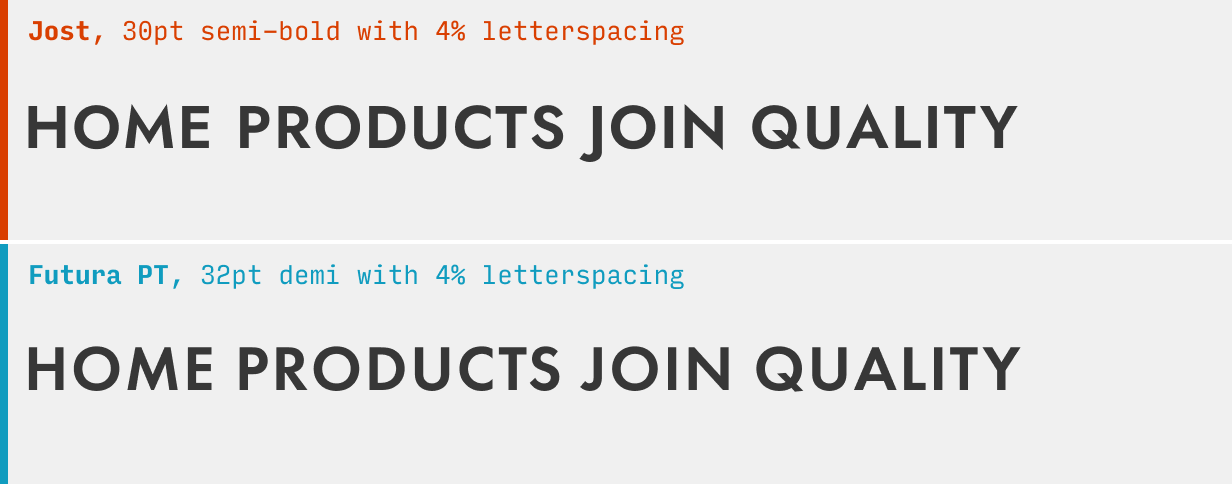
Since Futura is so often used in uppercase (and for good reason – it looks very crisp and punchy!), it’s worth doing a comparison in that setting. In my opinion, Jost has some slightly more awkward uppercase forms – the “M” and “N”, and “J” with descender, for instance. But it’s nothing that would keep me from using this as a free, cross-platform Futura alternative.
What it’s got: 9 weights + italics; also available as a variable font
Get it at: Jost at Google Fonts
2. Spartan
The free Spartan is a good – though italics-less – similar font to Futura.
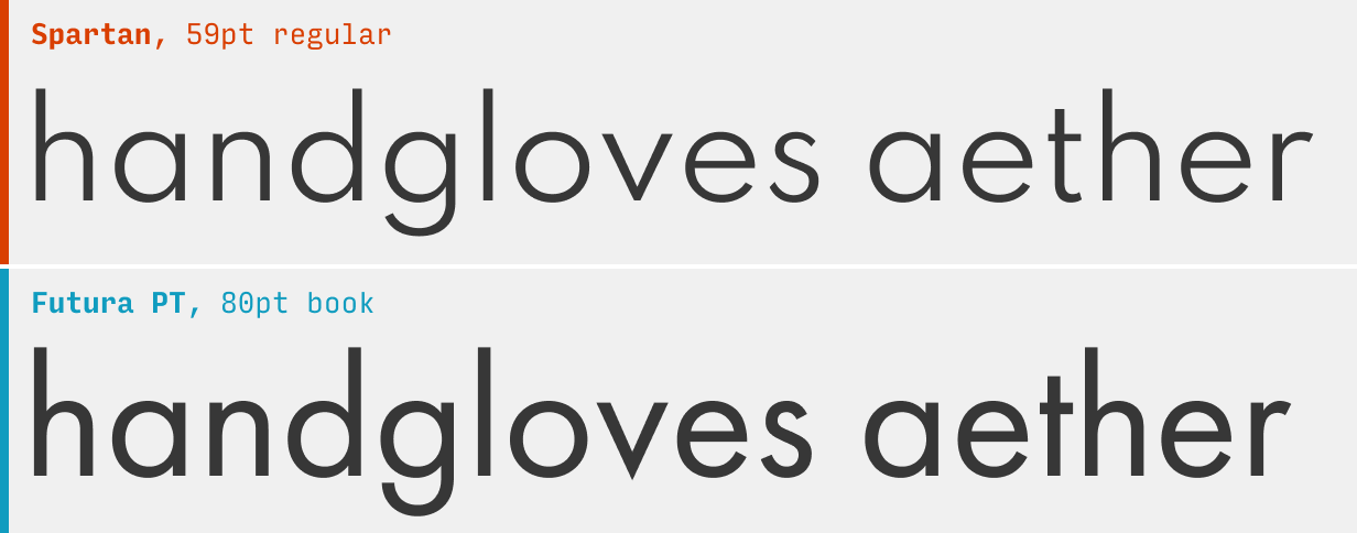
Spartan has been a bit touched-up from the original Futura for the purposes of readability. The more generous spacing, lighter color (meaning the letterforms are slightly thinner), and more open counters (the gaps in letters like “a”, “c”, and “e”) – it’s all for the purposes of making it easier to read. Which is great…
…But there are no italics. And that’s a bit of a dealbreaker unless you’re planning on using this as an accent font, say, just uppercase and bold (which is a setting that Futura shines in).
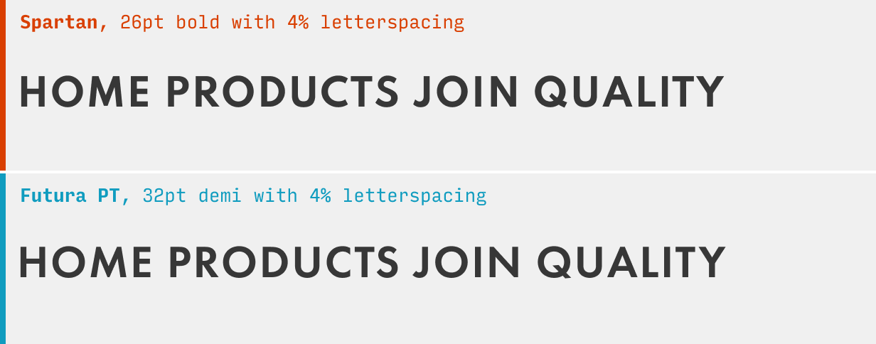
In uppercase, Spartan might actually be the best free alternative to Futura. The letterforms feel evenly weighted and well spaced (even Futura feels the slightest bit awkward in this regard). Well worth your consideration 👍.
What it’s got: 9 weights, no italics; also available as a variable font
Get it at: Spartan at Google Fonts
Other Futura Alternatives
If you’re looking to branch out from Futura, it’s worth checking out some of the other alternatives in this guide. For instance, the Apercu alternatives are even quirkier than Futura’s slightly idiosyncratic letterforms, whereas the DIN alternative are a bit more punchy and solid (just as Futura works in uppercase).
You’re reading Free Font Alternatives: The Ultimate Guide. Quickly navigate to other fonts: Intro · Apercu · Avenir · Circular · DIN · Futura · Gotham · Helvetica · Proxima Nova · Times New Roman
The Top 10 for UI Design
Get a PDF of the 10 best free fonts for web/mobile app design (including which free fonts not to use).
Practical design tutorials. Over 60,000 subscribed. One-click unsubscribe.