Dark Interfaces Homework: Common Mistakes
Here are some of the most common mistakes students make when submitting the Dark Interfaces homework. Check your submission for these before posting to the student community!
1/ Dividing lines are too visible
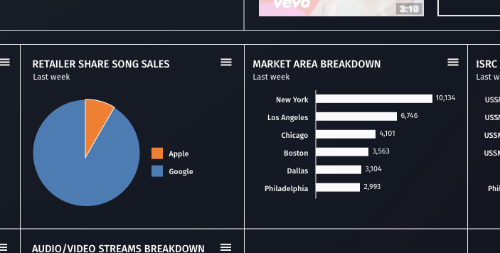
Divider lines, especially if they’re being used frequently to demark content boundaries, are often some of the least important elements on the page. They play a role, but it’s a support role, not the lead role.
Just as you wouldn’t have pitch black divider lines criss-crossing content on a white background, you want to really bring back the emphasis given to divider lines on a dark background.
2/ Tab controls don’t follow styles implied by other controls
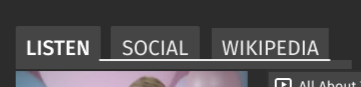
I’ve seen some pretty odd ideas about what a dark tab control should look like.
Why is there a bright, white, thick line under the two unselected tabs? Why a slightly longer white rectangle immediately below it?
When creating dark versions of more complex controls, it might help to think about what the inverse of the lighter version is. There’d be no reason to have light gray tabs with a thick black line below them! Fortunately, it’s not too hard to find inspiration for single controls.
3/ List box control is too light
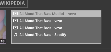
What color would a list box be on a light background? Very likely, it would also be very light – perhaps identical to the broader background color. That’s no problem – we can use borders and inner shadows to separate content as needed.
Likewise, you should lean away from adjusting the brightness of the list box too much. Perform a squint test, and make sure the list box isn’t one of the most noticeable things on the page – because it certainly shouldn’t be.