Picking Colors for Your Data Visualizations
Check out the Data Color Picker for an interactive version of this article
In my experience, there are basically three types of data visualization color schemes that you’ll see – and that you’ll want to learn to craft as a UI designer. Those are:
Let’s dive into each.
Multi-Hue Palettes
For data visualizations where the data fit into categories that aren’t based on the value of a single number, you’ll often turn to multi-hue palettes.
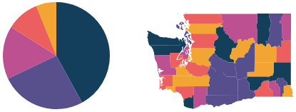
For instance, many pie charts and maps fit into this category.
This kind of color scheme works well if you have a particular brand color or two that you want to include in your color scheme. However, there are some things to look out for:
- Visual equidistance. The main pitfall with this type of color scheme is when two of the colors are too similar. This can make it tough for the user to determine what falls into what category. If it’s not immediatedly clear which data point is in which category, you should focus on making your colors more visually spread out. More on this below.
- Hue range. A palette like this is going to work better when there are a wide range of colors. I personally try to think of including both warm and cool colors spanning dark and light values.
“Visual equidistance” is a fancy way of saying that any two adjacent colors are equally different to our eyes. This is a pretty simple concept, though it’s made much tougher to get right because color systems (like RGB and HSB) are based on how COMPUTERS “see” color, not how humans see color.
Fortunately, there are some color systems based on human perception, the most sensible being HCL – hue, chroma, luminosity which is most similar to HSB, but made for humans over computers. Do Figma or Sketch or Photoshop use HCL? No – of course not. But the Data Color Picker tool uses it in the background, so you don’t have to think about it.
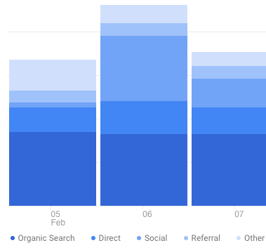
Google Analytics is a site that could benefit from a wider range of visually equidistant colors. Just trying to use the key at the bottom of this image proves difficult – you have to look twice or thrice to make sure you’re looking at the correct data point.
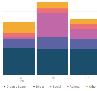
A wider range of visually equidstant hues makes it much easier to use this chart.
To try out creating multi-hue palettes, check out the Data Color Picker.
Single-Hue Color Scales
Whenever you’re interested in the value of one numeric variable, you should consider using a single-hue color scale.
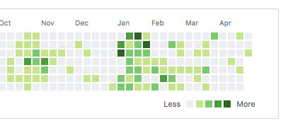
Github uses a single-hue color scale (which ranges from a very light gray to a dark green) to show the number of commits a user made on a particular day. Single-hue scales work best when one end of the range of the value is effectively “neutral” – in this case, “0 commits” is neutral.
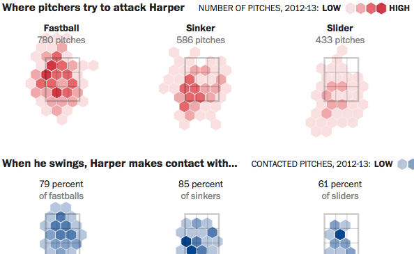
Here’s an example from the Washington Post with single-hue scales. While the scale doesn’t explicitly start at zero, the visualization is still a measure of one variable – number of pitches – that goes from (basically) zero on up.
Visual equidstance is still a concern in single-hue scales. However, it’s much easier to achieve when you’re not varying hue, as you would be for a multi-hue palette. If you’re interested in creating these palettes by hand, you’ll want to understand the brightness-saturation tradeoff, which I talk about here.
To try out creating single-hue color scales, check out the Data Color Picker.
Divergent (Two-Hue) Color Scales
The Divergent Color Scale generator is most useful for visualizations where you’re showing a transition from (a) one extreme, through a (b) neutral middle, and finally to a (c) opposite extreme.
Perhaps the most common example of this is the “how Democrat/Republican is each state in the US” chart.
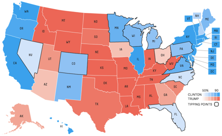
The example above shows a flat gray for the middle value, but it’s worth pointing out that this sort of chart remains intuitive even with a more colorful neutral swatch. However, you’re best sticking with something that is still pretty bright and not terribly saturated. If the two ends of the scale are hues that are, say, 120° or less apart, you can often use the hue between them for a neutral value.
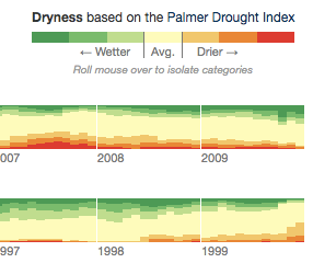
In this custom visualization by the New York Times, green (centered at 120°) and red (centered at 0°) are the two endpoints, while yellow (centered at 60°) represents the neutral middle value. Looks great!
As you may have guessed by now, visual equidistance still matters for divergent color scales. In this case, you also need to pick the two endpoints such that they’re roughly the same “visual distance” from the midpoint – lest you end up with one half of your scale made up of indistinguishable colors.
To try out creating divergent color scales, check out the Data Color Picker.
That about wraps it up. If you see of other data visualizations following another pattern, give me a shout. But as far as I’ve seen, this is it! Learning to recognize the usefulness of and create these three palette types will give you a huge advantage in creating beautiful data visualizations. Good luck out there.
Get the (Free & Updated)
UI Color Cheatsheet
Learn how to use color effectively in UI design, even if you aren’t “artsy” & have no design experience. The same strategies I use for my clients – from Fortune 100 to Y-Combinator startups.
Practical design tutorials. Over 60,000 subscribed. One-click unsubscribe.