Alignment Homework: Common Mistakes
Here are some of the most common mistakes students make when submitting the Alignment homework. Check your submission for these before posting to the student community!
1/ The logo looks like a nav item
The logo is very different than the nav items in the list – and should be styled as such. I would personally make the logo centered – and I would certainly try making it noticeably bigger than the nav list items.
2/ The nav list items are indented too far
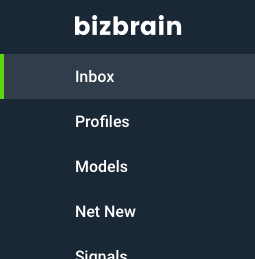
Many students have attempted to indent the nav list items – often so that they align with the logo. That’s unneccessary. Here is a case where it is simply better to follow convention: don’t indent your nav list items by more than, say, 30px.
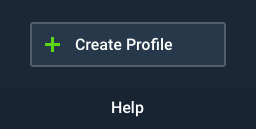
3/ The “Create Profile” button is not aligned well
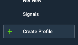
This is ostensibly the hardest task in the whole assignment. There are enough possible solutions that I talk about it in another blog post.
4/ The “Create Profile” button is not prominent enough
There’s no need to move the Create Profile button to the bottom of the sidebar. It’s an important destination in the app, and should not be hidden.
5/ “Help” is not centered
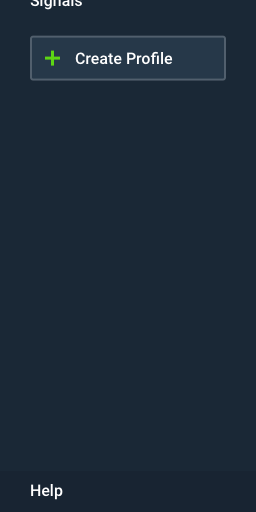
“Help” is far enough away from the other items in the sidebar that there’s no reason to align it (left) with them – it actually looks awkward to do so. Instead, simply center it.
6/ The green triangles are aligned poorly
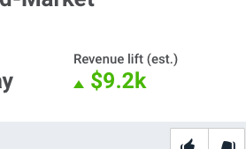
Don’t simply align the green triangles left with the labels above them. There are two markedly better solutions:
- Hanging “punctuation”. Have the green triangles float in the margin to the left, so that “Revenue” and “$9.2k” align left. This is called hanging punctuation, and you can read more about it here.
- Add arrows after value. Instead of the arrows being before the values, simply add them afterwards instead.
Note: don’t align the bottom of the arrows with the baseline of the text. Instead, align the arrows with the text by center of pixel mass, as talked about in the lesson video.