The Reframe Technique
Sometimes you’re working on a design problem and trying to get something to feel right, and yet you’re just banging your head against a wall. Nothing you try is actually achieving the look you want.
Ever get that feeling?
So I want to talk about a couple situations like that, and how to get around them. And I mean that literally. We’re going to sidestep the problem instead of trying to force something that’s not working. I call it the “Reframe Technique”, which, let’s face it, is not incredibly subtle.
Example Time!
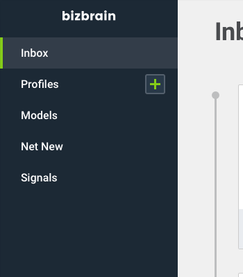
So here’s an example for you. This screen is based off an AI-generated “inbox” of business issues.
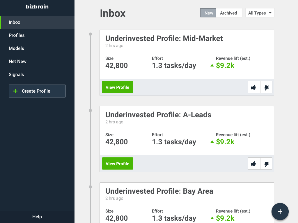
But let’s look at the left nav bar. That’s where we’re going to focus today.
This is how I might lay out the elements in an initial design from a wireframe. If you’ll notice, the “Create Profile” button looks really funky. The alignment feels off compared to the other items in this sidebar.
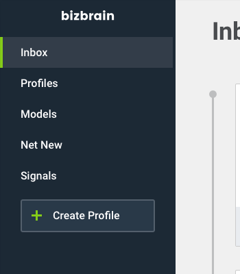
So what’s a designer to do? My first thought: “Hm, maybe instead of aligning the edge of the button with the other list items, I should align the plus icon with the other list items”. Perhaps I just aligned the wrong thing!
But after looking at that? Nope. Not cuttin’ it. The button looks aaaaawkardly long, and the “Create Profile” text is just screaming “I AM UNALIGNED”.
“I WAS DESIGNED BY SOMEONE WITH NO TALENT”
“LAUGHT AT HIM”
OK, shut up, button.
Let’s try something else. What if we aligned the text (because that’s our big issue), but moved the plus icon to the right? That would do double-duty in not making the right side of the button look so awful, right?
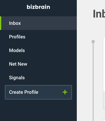
Hm, sorta. This is the best so far. But the button does still look awkwardly wide.
OK, now pause for a second.
What’s the problem?
It’s alignment. We can’t get this button to align well with the elements around it.
What’s the common denominator in all of these solutions? What are we doing the same in everything we’ve tried? I’m going to actually write this down, which makes it really clear.
- We’re using a button with a lighter-but-still-dark blue background, white text, a green plus icon, and these oh-so-gently rounded corners
- It’s placed immediately underneath the last item in the nav list
Those are our assumptions. They’re our working model of what we need to create, based on whatever – maybe the wireframes, maybe just a notion in our head.
But what if we stepped outside them for a second. Could we break these and STILL HAVE A SENSIBLE INTERFACE? It’s time to reframe the problem.
Let’s try. What if we said, “OK, even though this is a button, maybe it doesn’t need to have all the trappings of a normal button”. What could we generate then?
Boom. We’re exploring new ground now. By thinking outside the box (PUN INTENDED), we can make some headway on this alignment issue.
Now, to be fair, this is a pretty simple change. I just extended the width and ditched the rounded corners. I basically just said, “What if we reframe ‘align a button with the menu items’ as ‘align a clickable area that performs a labelled action with the menu items’”. And you know what? This is progress! It does look an awful lot like our selected state above (see “Inbox”), which could be an issue. But we’re starting to break out of the mold.
Can we go further? How about position? Where else on the screen COULD this button go and still make sense?
I call this the “Edit-in-Place” rule. If a control EDITS something, put it near where the editing actually happens! It’s a dead-simple UX heuristic, and even though there are some sensible times to violate it, it’s a good one to mentally run through. In this case, the “+” stands for creating a new Profile, so why not put it by the “Profiles” menu item?
This is my new favorite. Of course, we’ll have to think through a couple issues before we commit (Will users think this merely expands the Profiles list? Will users click an unlabelled button as much?), but by breaking a few assumptions, we’ve ended up in a much better place.
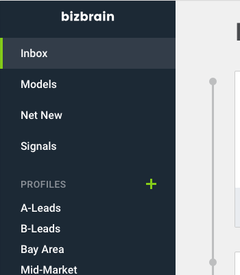
Maybe we could break another assumption – that “Profiles” is merely a list item – and blow up our Profiles display. Who remembers Rdio? Look familiar? (hint: p-l-a-y-l-i-s-t-s)
Also notice that the uppercase “PROFILES” title is made LESS visible with less contrast and a smaller font size. You remember this from the uppercase email, right? (If you haven’t gotten it yet, you will… one of these months).
The screen is our oyster, boys and girls. Where else can we put this button?
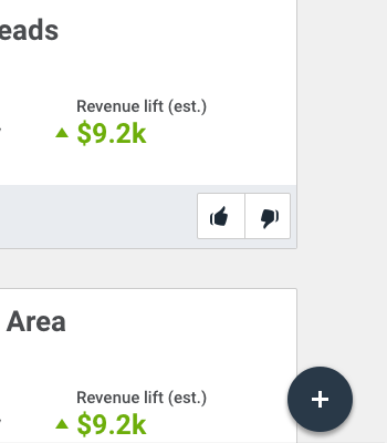
One option worth considering – if only for like, IDK, 0.2 seconds – is a floating action button.
Google’s Material Design has popularized this idea, and it works great in the particular situations where it works at all. In this case, I get the feeling that a “+” would feel like it was “Add a new inbox alert” or something, rather than “Add a new Profile” – so we’ll skip it for now. But this is the sort of ideation we want to be doing.
Reframing, Round 2
I want to talk about another example here.
One of my readers wrote in asking about this interface and how to tweak it to be better. It’s a results screen showing your BMI, and it’s in kilograms, which I find way harder to convert in my head that makes sense (so I won’t try – forgive me if the example weights would actually be gorillas, not people).
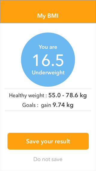
Now there’s a lot we could tackle – for instance, the header, which is smacking our eyes with 24,000 pixels of citrus overload. But instead, I want to casually adjust our focus to the healthy weight and goals stats.
If we approached this problem directly, we might assume – there’s that key word there – that the BEST solution will take the form of the CURRENT solution, just with a bit of shuffling around. For instance:
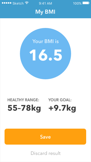
What’s our assumption? It’s that these statistics need to be displayed as such. Numbers and labels. Just text.
So yeah, we’ve just restructured the statistics into a more trendy way of showing them. And it looks nice, no doubt (sayonara, citrus header!). But can we do better?
Sure. Look – these stats show a few different things: a.) your weight, b.) the minimum healthy weight, c.) the maximum healthy weight, and d.) the distance between your weight and the healthy weight range.
Hey, notice how many times I said the word “weight” above? All of these stats are something that can be measured in kilograms. Maybe the best way to show them ISN’T to simply list them out. But you knew that.
Problem: The UX of reading a bunch of numbers is pretty poor.
Assumption: Stats are best shown as text labels and text numbers.
I bet you know where this reframe is going. A data visualization is worth a thousand numbers.
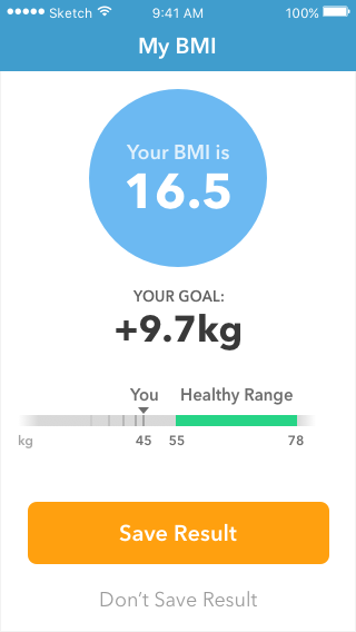
Look at this. A visual summary of your weight, the healthy range, and your past progress (those are the gradually fading tick-marks to the left of your current weight). Nice, right? And the weight-change goal – that’s the key piece of data here – is much easier to pick out of the elements.
Now there’s still a ways to go. BMI is taking up a lot of real estate on this page – is it important enough to warrant it? And what’s the deal with saving results? But we’re making progress.
Local Maxima vs. Global Maximum
I want you to remember back to high school math. Sorry.
Finding an ideal solution to a problem is sometimes like finding the top of a hill. You know you’re at the top of a hill when you look in every direction, and all you see is DOWN. You’re at a “maximum”, as your math teacher would say.
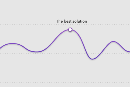
These design problems are similar. When every adjustment you make is worse than the solution you’re considering, you may be tempted to think you’ve found the best possible solution. And if the solution you’re considering isn’t satisfactory, you may give up entirely. “DESIGN JUST SUCKS. I CAN’T DO IT.”
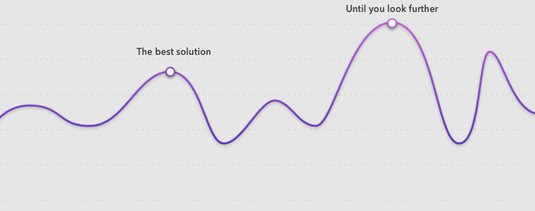
Look farther afield, my friends. Sometimes the best solution requires moving away from the current solution.
That’s the Reframe Technique. In a nutshell:
- Identify what you’re assuming (those are the constants in all the iterations you’re trying)
- Sensibly break those assumptions
Ideally, we always find the “global maximum” for our designs – the best possible solution. Of course, who’s to say we’ll ever hit that? Who’s to say such a thing even exists? But in principle, at least, this is what we chase.
So next time you’re stuck on a gnarly design problem, write down your assumptions. What form are all your current solutions taking? And how can you break those to find something even better?
Watch me do a UI project step-by-step
I’ll walk you through every part of a UI project — just like I’ve done for everyone from Fortune 100 companies to Y-Combinator startups.
Practical design tutorials. Over 60,000 subscribed. One-click unsubscribe.