Spacing Homework: Common Mistakes
Here are some of the most common mistakes students make when submitting the Spacing homework. Check your submission for these before posting to the student community!!
Too many unnecessary separators (e.g. lines, background colors, etc)
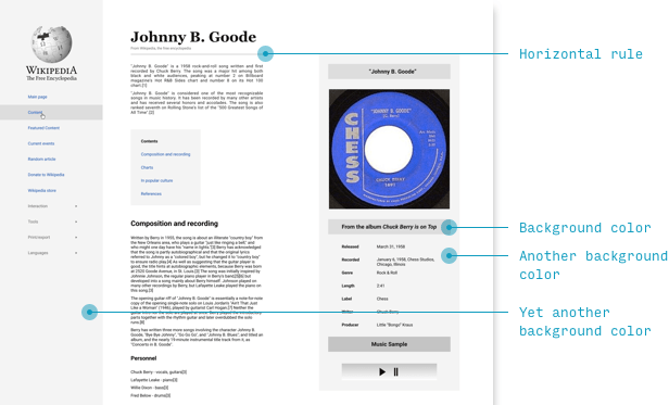
The most relevant mistake that many students make with this assingment is to rely too much on indicators of difference that aren’t spacing.
In a sense, the point of this lesson is that spacing is the only element that conveys information without being an element at all!
So if spacing can convey “these two things are related” or “these two things are not related”, then why use other ways of conveying those? I’m referring to things like divider lines, sections grouped or separated by background color, etc.
In day-to-day design, you will use background colors, divider lines, and more – but for this assignment, pay special attention to using spacing to convey what is related and what is not.
Hamburger menu is too big
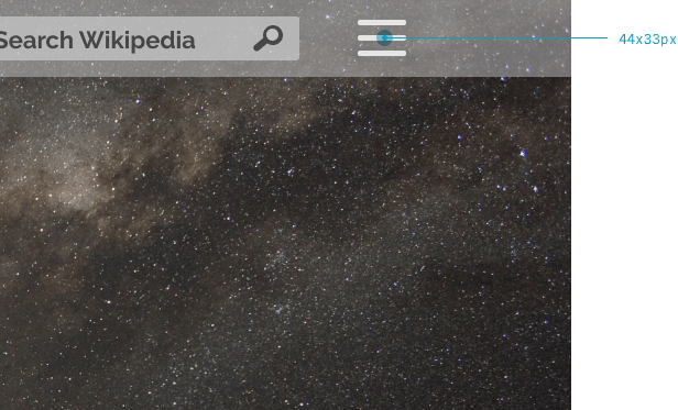
While not related to spacing, it’s a curious mistake that many students assume “hamburger menu” icons are much bigger than professional designers ever make them. Above is one that is a full 44px wide. It’s much safer to start at half that size – 20px long, and not even that high.
Whenever you have a moment, check out the size of hamburger menus in the apps you use day-to-day. You will almost always find they are just as compact as any other icon you’d see in the interface.
Too much font size inconsistency
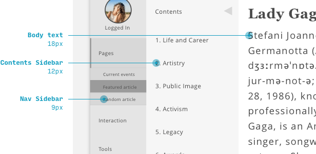
We’ll get to this more in the Typography unit, but it’s worth mentioning now that professionally-designed apps rarely have such a wide range in font sizes among “normal” elements (like body text, navigation links, and buttons).
I’ve written extensively about font sizes in UI design, and you can read more on the linked page, but as a rule of thumb, you typically won’t vary a “normal” font size by more than about 2 points.
So, for example:
- A body text size of 18px
- Nav menus, buttons, and other components have a size of 16px
- Very small, tertiary details (like captions or footnotes) are 14px
Headers are an obvious exception to this rule and can be quite a bit bigger than the next-smallest elements.