Lighting & Shadows Homework: Common Mistakes
Here are some of the most common mistakes students make when submitting the Lighting & Shadows homework. Check your submission for these before posting to the student community!
1/ Difficult to see which button segment is active
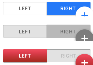
By far, the biggest mistake in this assignment is mixing metaphors on the segmented button.
There are a lot of solutions that don’t work, and perhaps only a few that do.
- The active segment should be the most eye-catching and visible
- If a segmented is pressed into the screen, it’s the active segment (akin to real life in this regard)
- Segments that are pushed in should be darker than those that are raised up or level with the screen
- The non-selected segment(s) should still look active (as opposed to disabled)
Material Design and Apple (both pre- and post-iOS 7) have done these controls in different, but logical ways. I recommend looking for inspiration if you’re feeling stuck.
2/ Switch has non-sensical or blurry shadows

Switches are composed of two parts:
- The circular “button”
- The oblong “track”
For skeumorphic switches, the button should be outset from the track, which itself should be inset into the screen (Material Design has a variation with a flat track, but the button could still be shadow-casting). Shadows on switches should represent this architecture.
In addition, the shadows on tracks can be particularly tricky to get right if you have a bright but non-white background. Opt for lighter shadows if the shadow “fuzzes” the border of the background and the track (as it does with the white control above).
As with segmented buttons above, Material Design and Apple have different (yet logical) ways of representing switches. By default, this assignment pushes you towards Apple’s style, but you’re welcome to try Material’s as well. Either way, best to do some research and inspiration-hunting if yours feels a little off (colored buttons on iOS-style switches are a warning sign!).
3/ Card shadows are too dark
Consistency is shadow size/color is a good thing to default to (for elements that are the same “height” off the screen) – but when some elements have particularly strong and dark shadows, it’s best not to apply those across the board.
From a squint test perspective, the shadow around a card only plays the role of distinguishing it from its background – which a background color change is also likely helping.
In summary, take it easy on the less critical shadows.