Adjustment Homework: Common Mistakes
Here are some of the most common mistakes students make when submitting the Adjustment homework. Check your submission for these before posting to the student community!
1/ Search bar has bad contrast
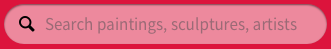
There are a few possible solutions here, but I would either make the search bar background white, or make it a darker shade, but the text translucent white.
Notice in the image above how the dark search icon looks bad against the light red background and how the hint text is difficult to read. Either (a) a white background or (b) white elements on a colored background will solve both at once.
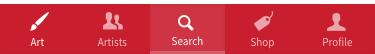
2/ The top nav area has a mess of background colors
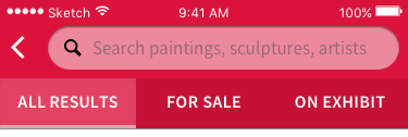
You can count five different background colors here, if you include the active tab’s “underline” bar. All in all, this looks like a mess. It’s always best to simplify as much as possible.
3/ “No results” background is too dark/saturated
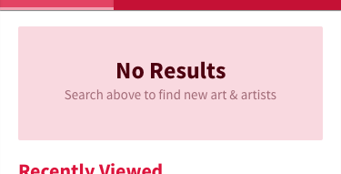
This is not an element that needs to attract attention (it really only exists to take up the space of where normal results would appear), so saturation doesn’t make sense. Plus, since the brightness is already so high, this rectangle is especially delicate to saturation. Best to keep it extremely low – flat gray or just a couple points saturated.
Note that red is an especially egregious color to saturate with here. If you’re doing this assignment with blue (the color of “info” boxes), then it’s a little more forgivable of a sin.
4/ The text looks like a link
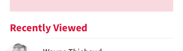
Just because this assignment says to saturate in only one hue doesn’t mean everything needs to be highly saturated. You want normal text to be saturated to a level where it appears basically gray to the casual observer.
Link text is another story – saturate away! - but keep in mind that the recently viewed items aren’t so much links as tappable areas, which on mobile, are not denoted with link colors, but simply by context.
5/ “Search” in bottom nav isn’t selected enough
The rule of thumb for selected states is that it should always be dead simple to see what is selected and what is not. Do a quick squint test to make sure that’s the case for your design.