7 Rules for Creating Gorgeous UI (2024 update)
Introduction
OK, first things first. This guide is not for everyone. Who is this guide for?
- Developers who want to be able to design their own good-looking UI in a pinch.
- UX designers who want their portfolio to look better than a Pentagon PowerPoint. Or UX designers who know they can sell an awesome UX better in a pretty UI package.
If you went to art school or consider yourself a UI designer already, you will likely find this guide some combination of a.) boring, b.) wrong, and c.) irritating. That’s fine. All your criticisms are right. Close the tab, move along.
Let me tell you what you’ll find in this guide.
First, I was a UX designer with no UI skills. I love designing UX, but I wasn’t doing it for long before I realized there were a bunch of good reasons to learn how to make an interface look nice:
- My portfolio looked like crap, reflecting poorly on my work and thought process
- My UX consulting clients would rather buy someone’s skills if their expertise extended to more than just sketching boxes and arrows
- Did I want to work for an early-stage startup at some point? Best to be a sweeper
I had my excuses. I don’t know crap about aesthetics. I majored in engineering– it’s almost a badge of pride to build something that looks awful.
In the end, I learned the aesthetics of apps the same way I’ve learned any creative endeavor: cold, hard analysis. And shameless copying of what works. I’ve worked 10 hours on a UI project and billed for 1. The other 9 were the wild flailing of learning. Desperately searching Google and Pinterest and Dribbble for something to copy from.
These “rules” are the lessons from those hours.
So word to the nerds: if I’m any good at designing UI now, it’s because I’ve analyzed stuff — not because I came out the chute with an intuitive understanding of beauty and balance.
This article is not theory. This article is pure application. You won’t see anything about golden ratios. I don’t even mention color theory. Only what I’ve learned from being bad and then deliberately practicing.
Think of it this way: Judo was developed based on centuries of Japanese martial and philosophical traditions. You take judo lessons, and in addition to fighting, you’ll hear a lot about energy and flow and harmony. That sort of stuff.
Krav Maga, on the other hand, was invented by some tough Jews who were fighting Nazis in the streets of 1930s Czechoslovakia. There is no art to it. In Krav Maga lessons, you learn how to stab someone’s eye with a pen and book it.
This is the Krav Maga of screens.
The Rules
Here they are:
- Light comes from the sky
- Black and white first
- Double your whitespace
- Learn the methods of overlaying text on images (in Part 2)
- Make text pop — and un-pop (in Part 2)
- Use only good fonts (in Part 2)
- Steal like an artist (in Part 2)
Let’s get to it.
Rule 1: Light Comes From the Sky
Shadows are invaluable cues in telling the human brain what user interface elements we’re looking at.
This is perhaps the most important non-obvious thing to learn about UI design: light comes from the sky. Light comes from the sky so frequently and consistently that for it to come from below actually looks freaky.

When light comes from the sky, it illuminates the tops of things and casts shadows below them. The tops of stuff are lighter, the bottoms are darker.
You wouldn’t think of people’s lower eyelids as being particularly shaded, but shine some light on those suckers and all of a sudden it’s demon girl at your front door.
Well, the same is true for UI. Just as we have little shadows on all the undersides of all our facial features, there are shadows on the undersides of just about every UI element you can find. Our screens are flat, but we’ve invested a great amount of art into making just about everything on them appear be 3-D.
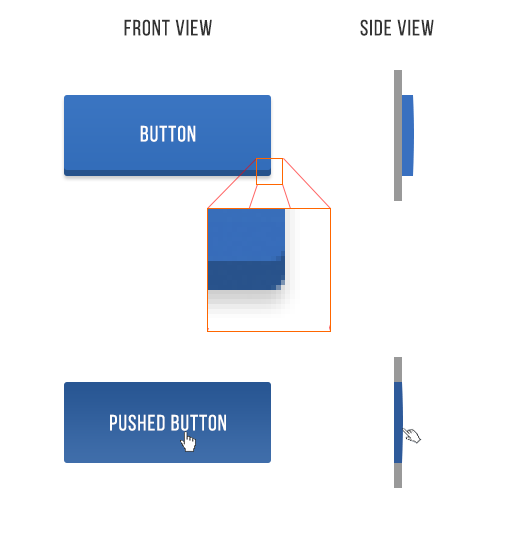
Take buttons. Even with this relatively “flat” button, there are still a handful of light-related details:
- The unpushed button (top) has a dark bottom edge. Sun don’t shine there, son.
- The unpushed button is slightly brighter at the top than at the bottom. This is because it imitates a slightly curved surface. Just as how you’d need to tilt a mirror held in front of you up to see the sun in it, surfaces that are tilted up reflect a biiiiit more of the sun’s light towards you.
- The unpushed button casts a subtle shadow – perhaps easier to see in the magnified section.
- The pushed button, while still darker at the bottom than at the top, is overall darker – this is because it’s at the plane of the screen and the sun can’t hit it as easily. One could argue that all the pushed buttons we see in real life are darker too, because our hands are blocking the light.
That was just a button, and yet there are these 4 little light effects present. That’s the lesson here. Now we just apply it to everything.
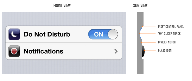
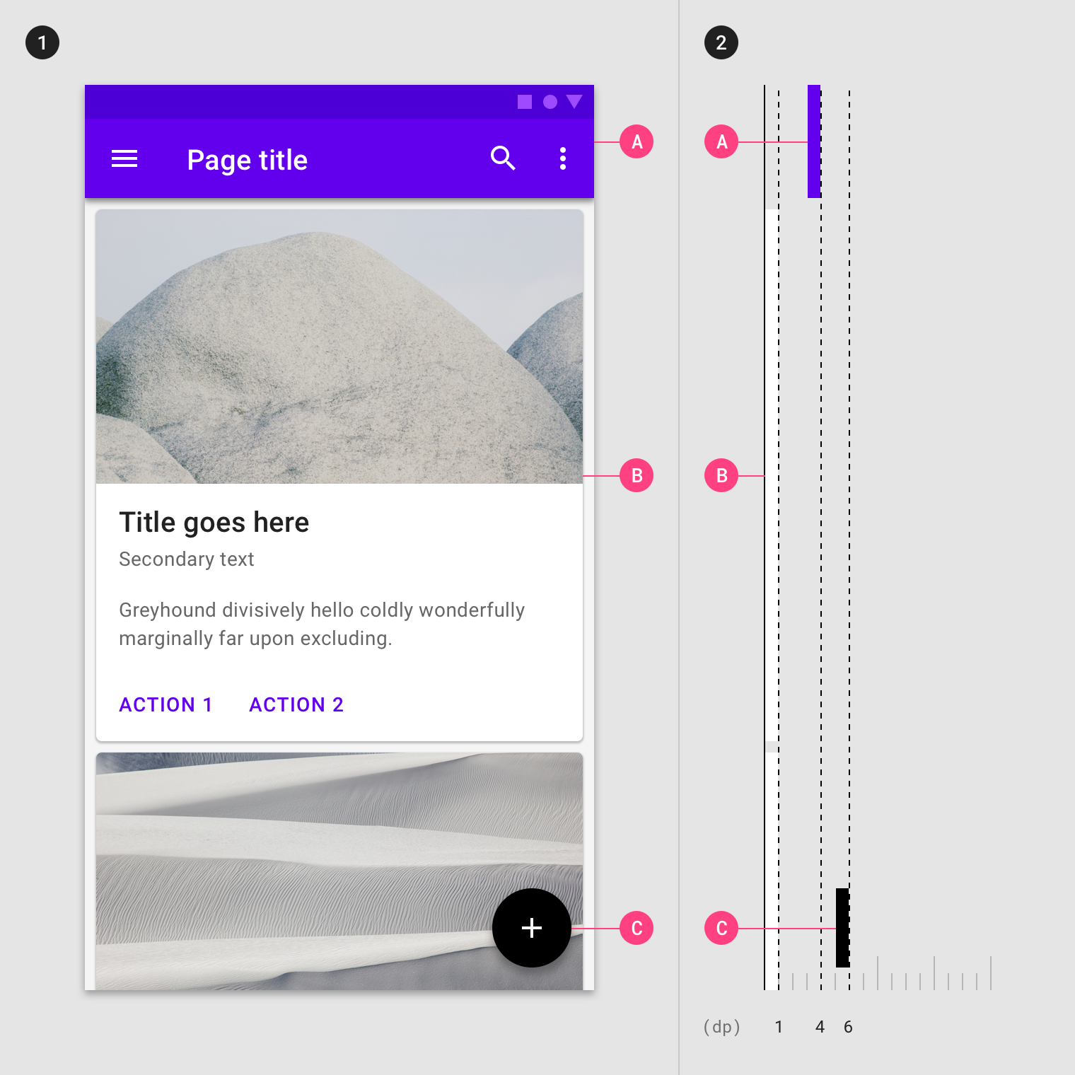
Here is a pair of iOS 6 settings— “Do Not Disturb” and “Notifications”. NBD, right? But look how many light effects are going on with them.
- The top lip of the inset control panel casts a small shadow
- The “ON” slider track is also immediately set in a bit
- The “ON” slider track is concave and the bottom reflects more light
- The icons are set out a bit. See the bright border around the top of them? This represents a surface perpendicular to the light source, hence receiving a lot of light, hence bouncing a lot of light into your eyes.
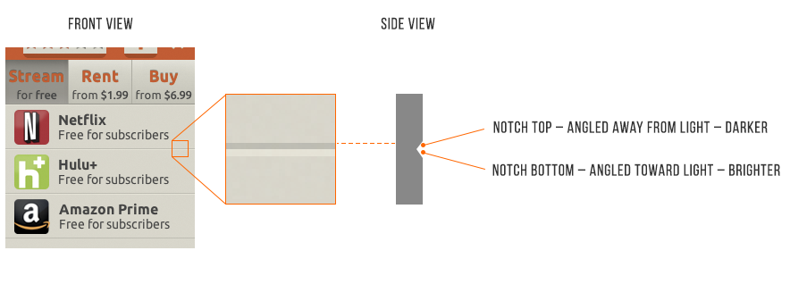
- The divider notch is shadowed where angled away from the sun and vice versa
Elements that are generally inset:
- Text input fields
- Pressed buttons
- Slider tracks
- Radio button (unselected)
- Checkboxes
Elements that are generally outset:
- Buttons (unpressed)
- Slider buttons
- Dropdown controls
- Cards
- The button part of a selected radio button
- Popups
Now that you know, you’ll notice it everywhere. You’re welcome, kid.
Wait, what about flat design, Erik?
The level of lighting/shadow effects in interfaces shifts somewhat over time.
In particular, Apple launched an era of ”flat design” in 2014. And that is, well, exactly what it sounds like. Flat design is a visual style in which the elements lack simulated indentations or protrusions. They’re just lines and shapes of solid color.
However, giving up all lighting and shadow effects seriously hobbles your UI’s style and ability to convey information!
So, in 2014, I predicted we’d ultimately see a rise of “flatty design” – elements of flat’s clean appearance, with a dusting of shadows to help us figure out what we’re looking at. And a decade on, guess what? – we’re largely still here. In the middle.
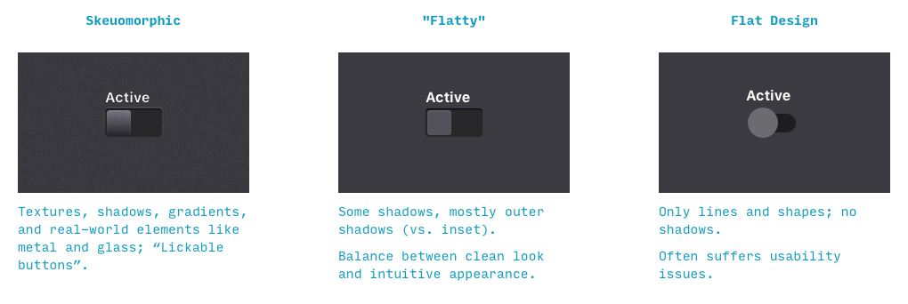
We live in a golden age, here in this happy medium between difficult-to-get-right skeuomorphism and usability-challenged flat design. Flatty is still clean, still simple, but you’ll have some shadows and cues for what to tap/slide/click.
Google’s flatty Material Design language embodies these principles perfectly. Beyond the minimal shadows, do you see what else they’re doing to convey height?
It’s color. Higher surfaces are brighter – because they catch more of the sun’s rays.
That’s the name of the game. Subtle real-world cues to convey information. Key word, subtle.
Flatty is the way of the future.
Rule 2: Black and White First
Designing in grayscale before adding color simplifies the most complex element of visual design– and forces you to focus on spacing and laying out elements.
UX designers are really into designing “mobile-first” these days. That means you think about how pages and interactions work on a phone before imagining them on your zillion-pixel $6000 pro monitor.
That sort of constraint is great. It clarifies thinking. You start with the harder problem (usable app on a teeny-weeny screen), then adopt the solution to the easier problem (usable app on a large screen).
Well here’s another similar constraint: design black and white first. Start with the harder problem of making the app beautiful and usable in every way, but without the aid of color. Add color last, and even then, only with purpose.

This is a reliable and easy way to keep apps looking “clean” and “simple”. Having too many colors in too many places is a really easy way to screw up clean/simple. B&WF forces you to focus on things like spacing, sizes, and layout first. And those are the primary concerns of a clean and simple design.

There are some cases where B&WF isn’t as useful. Designs that have a strong specific attitude— “sporty”, “flashy”, “cartoony”, etc. — need a designer who can use color extremely well. But most apps don’t have a specific attitude except clean and simple. Those that do are admittedly much harder to design.
For all the rest, there’s B&WF.
Step 2: How to add color
The simplest color to add is one color.

Adding one color to a grayscale site draws the eye simply and effectively.

You can also take it one step up. Grayscale + two colors, or grayscale + multiple colors of a single hue.
Color codes in practice — i.e. wait, what’s a hue?
The web by and large talks about color as RGB hex codes. It’s most useful to ignore those. RGB is great for computers, but not good for how humans think/talk about color. Instead, use HSB (which is synonymous with HSV, and similar to HSL).
HSB is better than RGB because it fits with the way we think about color naturally, and you can predict how changes to the HSB values will affect the color you’re looking at.
If this is news to you, here’s a good primer on HSB colors.


By modifying the saturation and brightness of a single hue, you can generate multiple colors— darks, lights, backgrounds, accents, eye-catchers— but it’s not overwhelming on the eye.
Using multiple colors from one or two base hues is the most reliable way to accentuate and neutralize elements without making the design messy.
A few other notes on color
Color is the most complicated area of visual design. And while a lot of stuff on color is obtuse and not practical for finishing the design in front of you, here’s a small toolbox of resources:
- Color in UI Design: A (Practical) Framework. If you liked this section, but want to hear more about color (as opposed to just black and white), this is your article. And guess who wrote it!
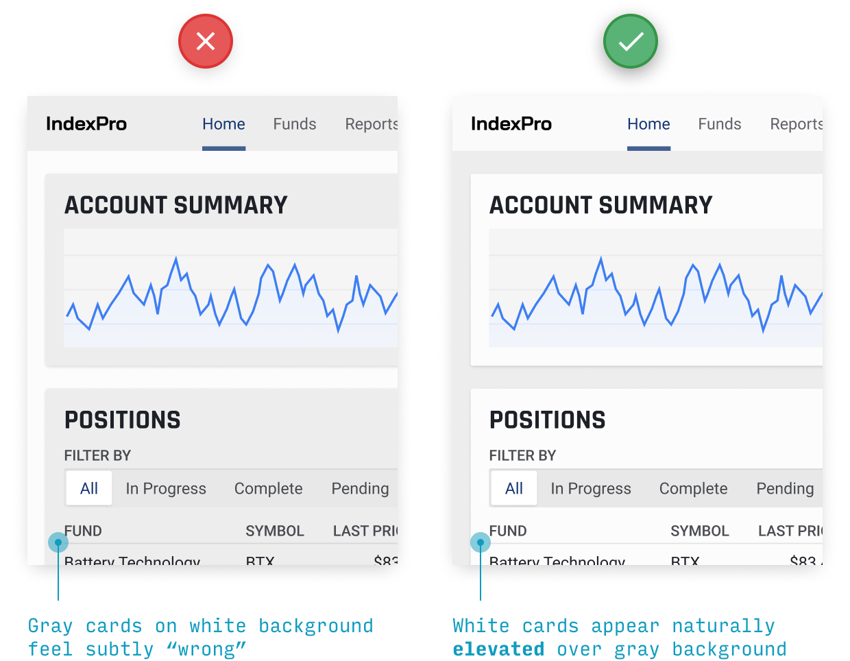
- Never Use Black, by Ian Storm Taylor. Talks about how totally flat grays almost never appear in the real-world, and how saturating your shades of gray– especially your darker shades– adds a visual richness to your designs. Plus, saturated grays more closely mimic the real-world, which is its own virtue.
- Dribbble search-by-color. Another awesome way to find what works with a particular color. Talk about practical. If you already have one color decided, come look at what the world’s best designers are doing/matching with that color.
- Gradient Generator. Gradients are a whole other can of (color-related) worms, but this tool creates more brilliant gradients via radial interpolation – something Figma, etc. have yet to catch on to 😉
Rule 3: Double your whitespace
To make UI that looks designed, add a lot of breathing room.
In Rule 2, I said that B&WF forces designers to think about spacing and layout before considering color, and how that’s a good thing. Well, it’s time we talk about spacing and layout.
If you’ve coded HTML from scratch, you’re probably familiar with the way HTML is, by default, laid out on the page.
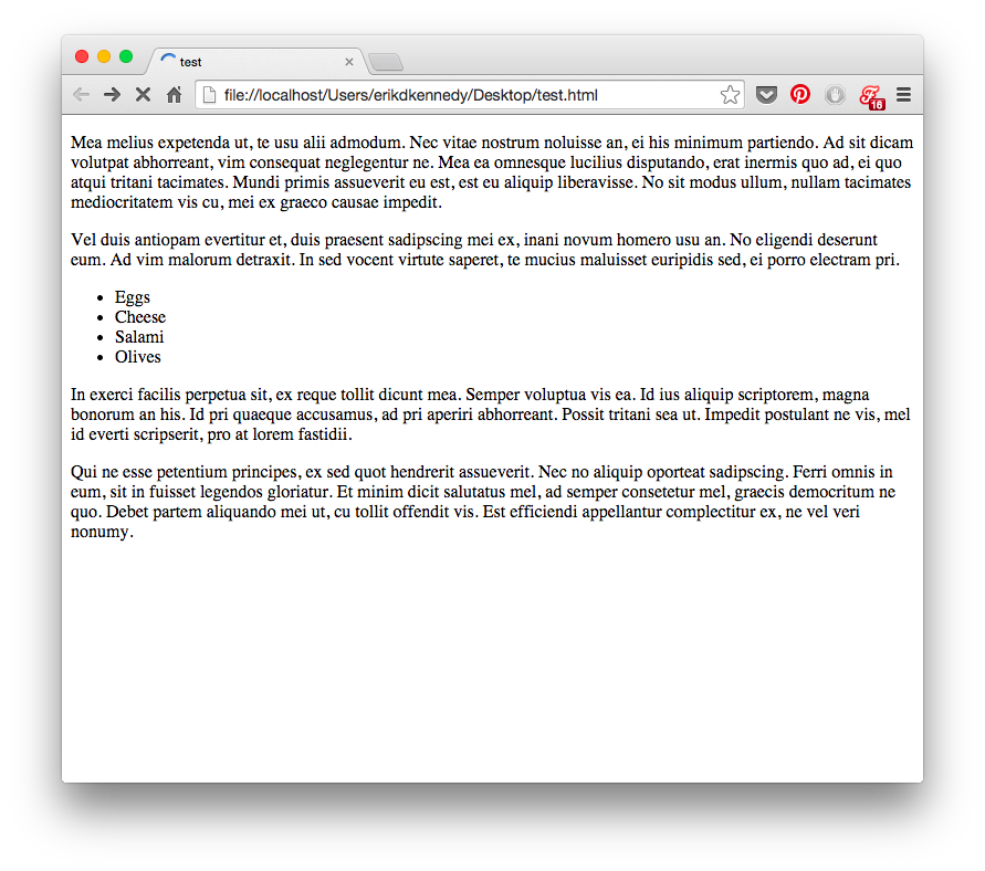
Basically, everything is smashed towards the top of the screen. The fonts are small; there’s absolutely no space between lines. There’s a biiit of space between paragraphs, but it isn’t much. The paragraphs just stretch on to the end of the page, whether that’s 100px or 10,000px.
Aesthetically speaking, that’s awful. If you want to make UI that looks designed, you need to add in a lot of breathing room.
Sometimes a ridiculous amount.
A note on CSS and whitespace: If you, like me, are used to formatting with CSS, where the default is no whitespace, it’s time to untrain yourself of those bad habits. Start thinking of whitespace as the default— everything starts as whitespace, until you take it away by adding a page element.
Sound zen? I think it’s a big reason people still sketch this stuff.
Starting with a bunch of unstyled HTML means starting with content. Spacing is the afterthought. It has to be explicitly stated.
Anyhow, here’s an illustrative music player concept by Piotr Kwiatkowski.
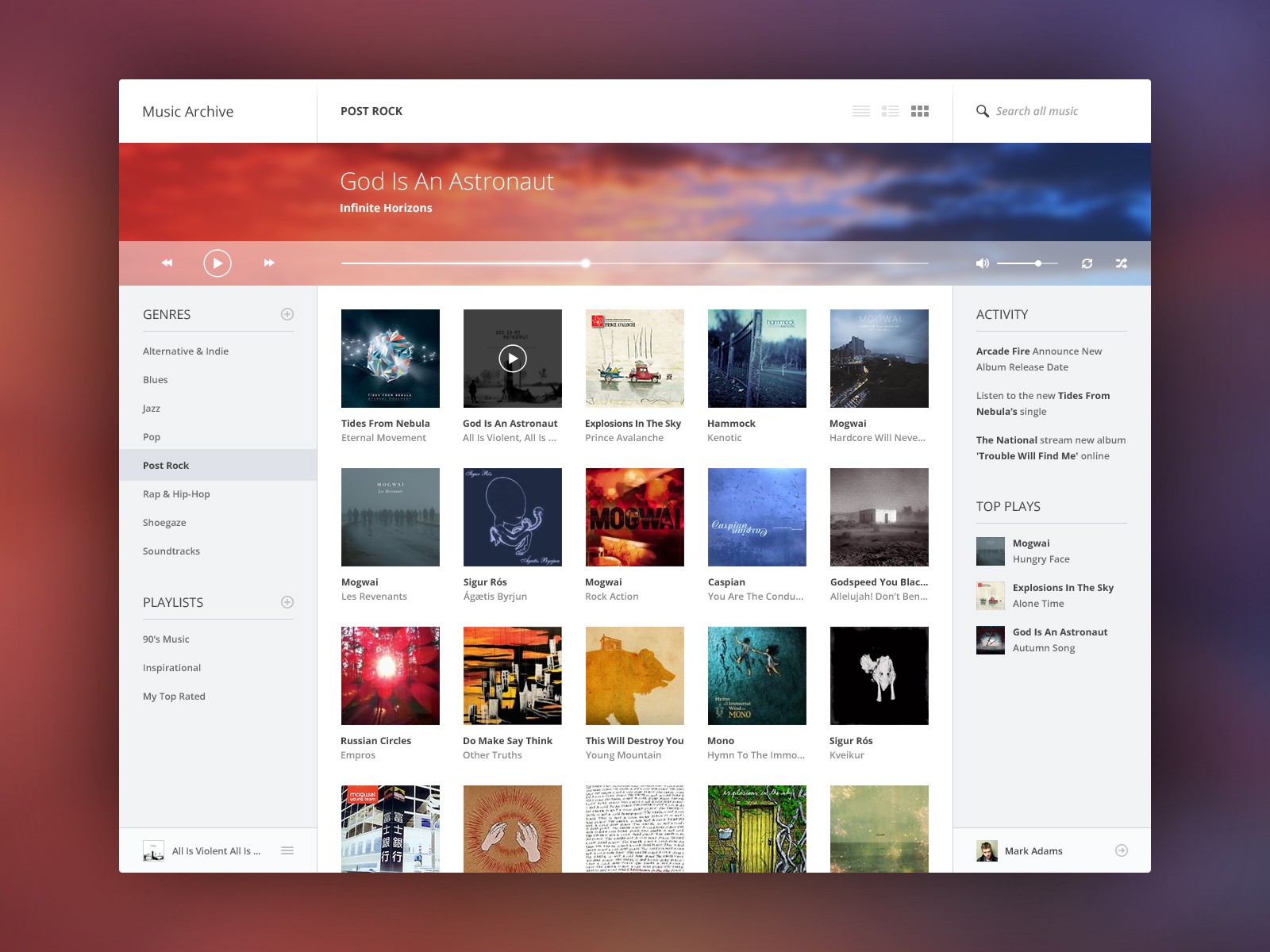
Pay particular attention to the menu on the left.
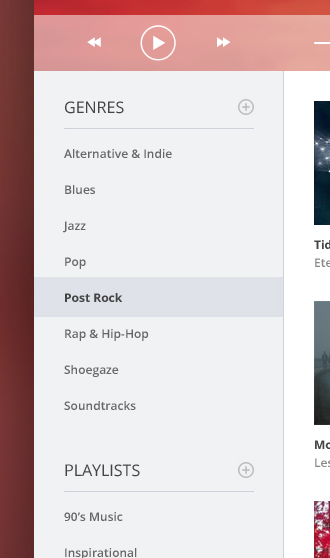
The vertical space between the menu items is fully twice the height of the text itself. You’re looking at 12px font with just as much padding above and below it.
Or take a look at the list titles. There’s a 15px space between the word “PLAYLISTS” and its own underline. That’s more than the cap height of the font itself! And that’s to say nothing of the 25 pixels between the lists.
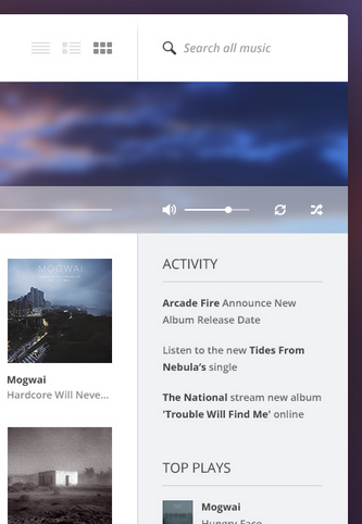
More space in the top nav bar. The text “Search all music” is 20% of the height of the bar. The icons are similarly proportioned.
Piotr was conscientious about putting in extra space here, and it paid off. While this is just a concept he put together for the fun of it (as far as I know), as far as aesthetics go, it’s beautiful enough to compete with the best music UIs out there.
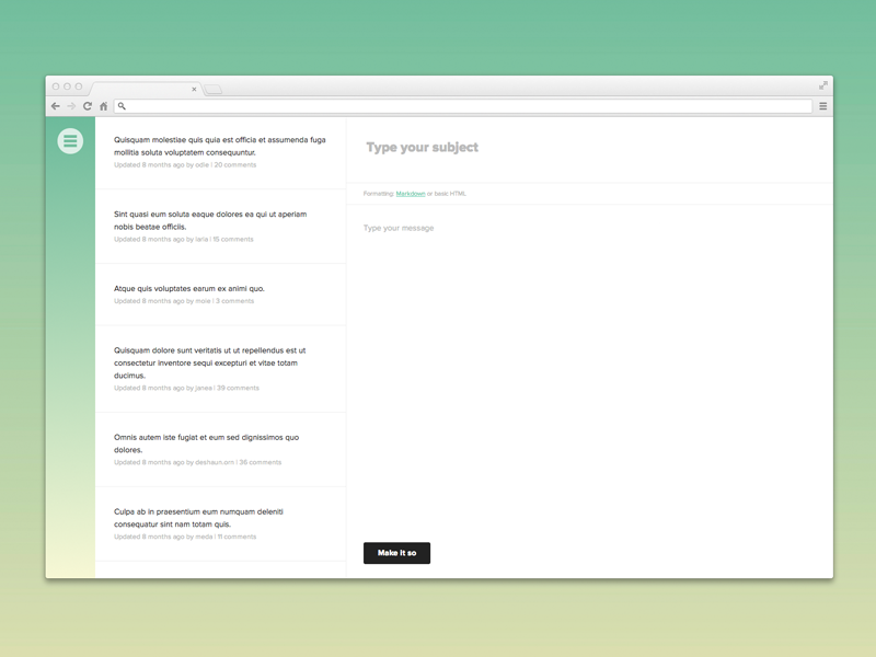
Good, generous whitespace can make some of the messiest interfaces look inviting and simple — like forums.
Or Wikipedia.
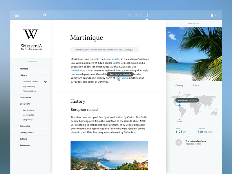
You can find plenty of argument that, say, the Wikipedia redesign leaves out key functionality to using the site. But you can’t say it’s not a good way to learn!
Put space between your lines.
Put space between your elements.
Put space between your groups of elements.
Analyze what works.
OK, that wraps up Part 1. Thanks for sticking around!
In Part 2, I’ll be talking about the last 4 rules:
- Learn the methods of overlaying text on images
- Make text pop— and un-pop
- Only use good fonts
- Steal like an artist
If you learned something useful in Part 1, read Part 2.
Watch me do a UI project step-by-step
I’ll walk you through every part of a UI project — just like I’ve done for everyone from Fortune 100 companies to Y-Combinator startups.
Practical design tutorials. Over 60,000 subscribed. One-click unsubscribe.