Circular: Free Alternatives & Similar Fonts
If you’re looking for free alternatives to Circular, here are 5 of the highest-quality look-alikes and similar fonts.
- +Jakarta Text (best overall)
- Figtree (closest on Google Fonts)
- DM Sans (actually has italics)
- Manrope
- Satoshi (underused option)
For each, I’ll mention the advantages, disadvantages, and why you might choose it. Ready? Let’s get started.
You’re reading Free Font Alternatives: The Ultimate Guide. Quickly navigate to other fonts: Intro · Apercu · Avenir · Circular · DIN · Futura · Gotham · Helvetica · Proxima Nova · Times New Roman
1. +Jakarta Text
The virtually unknown +Jakarta Text is the overall best free alternative for Circular.
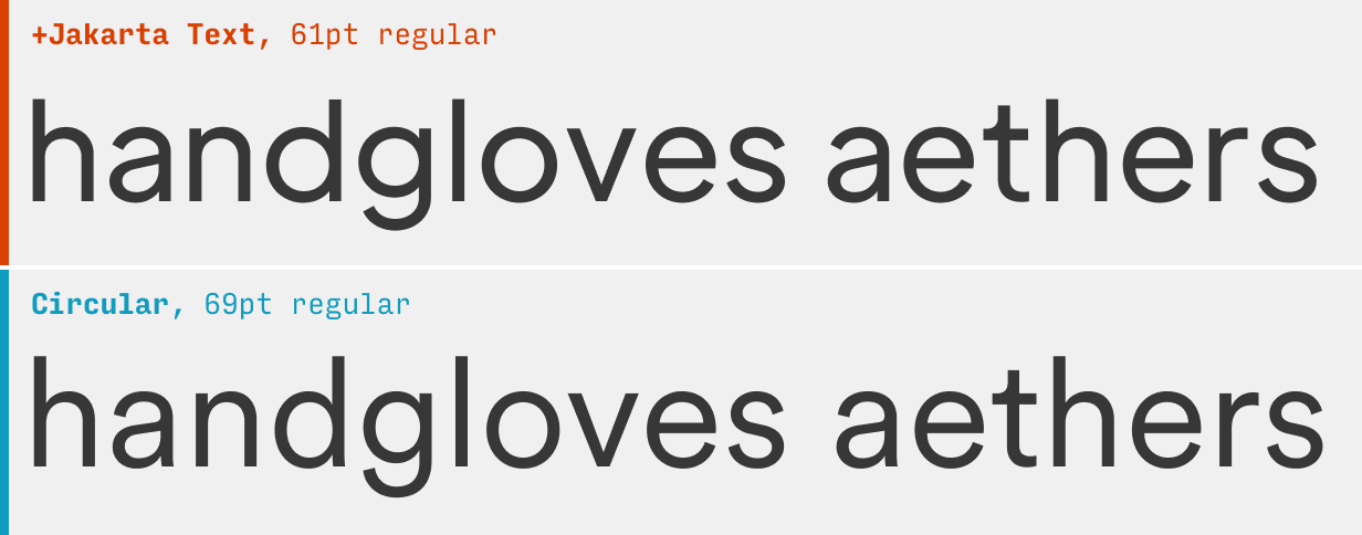
And let’s face it – it’s all about that “t”. Circular’s most distinctive letterform looks basically identical in +Jakarta. Honestly, the lack of differences is a bit disconcerting, but close inspection shows +Jakarta features a slightly taller x-height, more open counters (e.g. the gaps in “a”, “c”, and “e” – which are good for readability), and generally wider round letterforms.
What it’s got: 3 weights + italics
Get it at: +Jakarta Text at Github.io
2. Figtree
Figtree – a free font designed by yours truly – shares a lot of DNA with Circular. In fact, the extraordinary quality of Circular (combined with its high price tag) is one of the things that made me want to create Figtree.
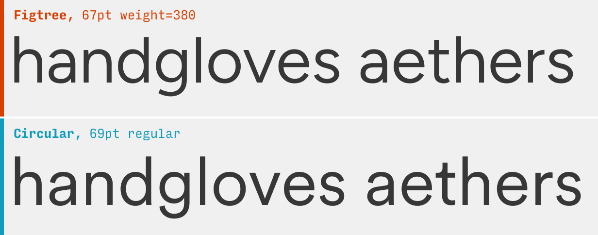
Figtree certainly won’t confuse any typophiles. It doesn’t have the curved “t” so characteristic of Circular – nor the rising bowl of Circular’s “a”. Figtree’s “g” has a shorter descender, etc.
As far as usage goes, please note Figtree lacks italics… for now!
What it’s got: 7 weights, no italics; also available as a variable font
Get it at: Figtree at Google Fonts
3. DM Sans
With one small modification, DM Sans is an amazing stand-in for Circular.
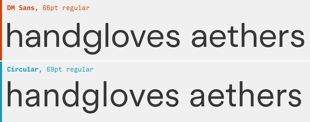
DM Sans comes with a very distinctive “g” when you use it out-of-the-box. However, by using the alternate “g” character with font-feature-settings: "ss03" 1; (here’s more on how to do alternate character styles in Figma and CSS), DM Sans makes a much better free alternative to Circular.
What it’s got: 3 weights + italics
Get it at: DM Sans at Google Fonts
4. Manrope
The underused Manrope is quite similar to Circular.
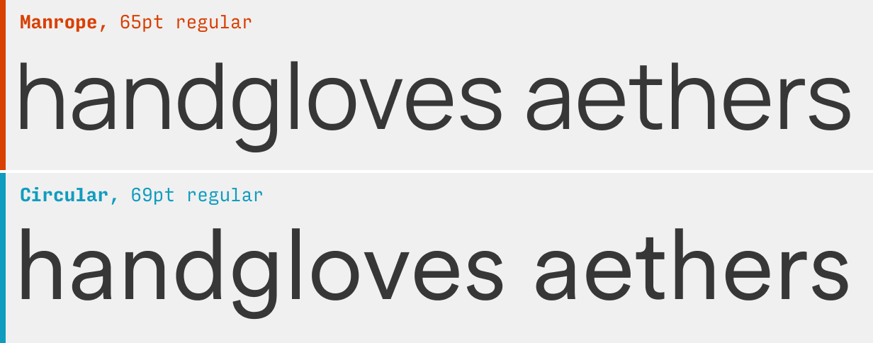
Both are geometric sans serifs with sliiightly closed-off counters. Unfortunately, Manrope lacks an italics, so it won’t be topping this list any time soon. Nonethless, quite underused and perhaps worth checking out.
What it’s got: 7 weights, no italics; also available as a variable font
Get it at: Manrope at Google Fonts
5. Satoshi
The free Satoshi is another good, though italics-less, similar font to Circular.
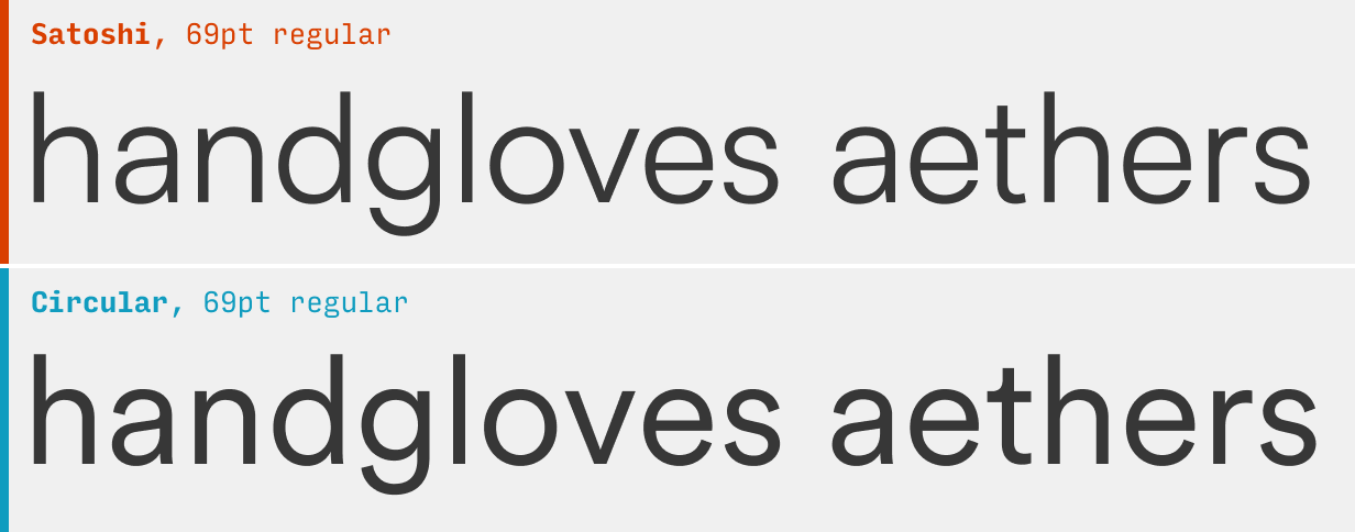
If the lack of italics isn’t a deal-breaker, Satoshi also has a noteably clean, simple vibe, and uses those ever-so-slightly closed counters present in Circular. If you use it, make sure to use the alternate “t” with the rounded base (CSS code is font-feature-settings: "ss03" 1;, here’s more on alternate characters).
What it’s got: 5 weights, no italics
Get it at: Satoshi at Fontshare
Other Circular Alternatives
If you’re looking to branch out from Circular, it’s worth checking out some of the other alternatives in this guide. For instance, the Apercu alternatives have a similarly friendly, but even quirkier vibe, and the Gotham alternatives will feel likewise simple and clean.
You’re reading Free Font Alternatives: The Ultimate Guide. Quickly navigate to other fonts: Intro · Apercu · Avenir · Circular · DIN · Futura · Gotham · Helvetica · Proxima Nova · Times New Roman
One Final Note 😎
If this is your first time here, you might also be interested in:
- Learn UI Design, my full-length online video course on user interface design
- Design Hacks, a 50,000+ person newsletter with original design articles aimed at giving you tactical advice to improve your UX/UI skills.
Some people have some really nice stuff to say about the newsletter.
Thank you for your newsletter. It’s possibly the best newsletter I’ve received since 1999, when I started freelancing.
Tricia Littlefield
Founder, TheSimpleWeb
Each time I receive an email from you, I'm like ‘Damn, this is a long email! No way will I read all of this’, then I began to read and I'm like ‘Damn, this is so freaking brillant’ and read it all.
Jean-Philippe
UX Strategist, Freelance
Design Hacks
Over 50,000 subscribed.
No spam. Unsubscribe anytime.