The Android/Material Design Font Size Guidelines
You’re reading Font Sizes in UI Design: The Complete Guide. Quickly navigate to other chapters: Intro · iOS · Android · Web · Principles
So you’re designing an app in the Material Design style and want to know (roughly) what font size to use? Great. You’ve come to the right place.
All font sizes listed below refer to Roboto. Other fonts may appear bigger or smaller, even using the same size. The units I use in this section are “sp”. It’s pronounced “sips”, and it stands for scaleable pixels. But, as a designer, all you need to know is it’s the number you type into the font size box when you’re designing (for the nitty-gritty on “px”, “pt”, “sp”, and “dp”, see here).
Android Mobile Typography Guidelines
Here’s a quick summary of styles. See below for visual reference and more in-depth guidelines.
| Element | Sizing | Notes |
|---|---|---|
| Page titles | 22sp | |
| Paragraph text | 14sp | |
| List titles | 14sp | Show importance using medium weight |
|
List item titles, Important text snippets |
16sp | |
|
Secondary text, Captions |
14sp | Use lighter color to show lowered importance |
|
Buttons, Tabs |
14sp | Medium weight |
| Text inputs | 16sp |
Now let’s go through element-by-element with (a) visuals and (b) notes on how Google deftly wields these font styles. No joke, folks. I hope you read this section and think “Whoever came up with the Material Design font sizes is one smart cookie” – I sure think so, anyhow.
Titles
Titles on mobile Material Design apps are 20sp.

Body Text
The body text size in Material Design is 14sp. You should think of this as the normal font size, and basically everything else a variation on it.
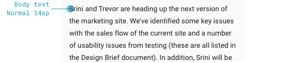
For instance, while 14sp is the default text size when the text can be quite long, when there’s only a small modal with a bit of text, it’s 16sp!
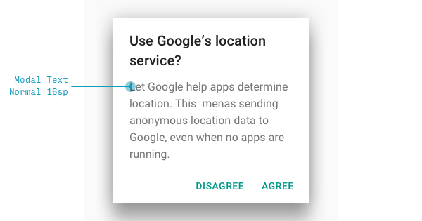
Notice that it’s a bit lighter to make up for this size boost. This will be a recurring theme in Material Design styles.
List Items
Many simple lists will show each item at 16sp.
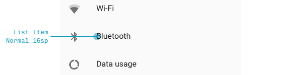
In fact, this is the default “list item” size in Material Design.
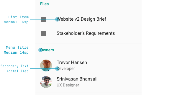
This was a surprise to me – after all, a list of simple items feels a lot like body text. Why would it be bigger? I think of it like this: the importance per word is much higher than body text. Therefore, it should be larger.
Also notice that having larger list item names means you can have a clear contrast between the list item title and a secondary description, which is both smaller and lighter.
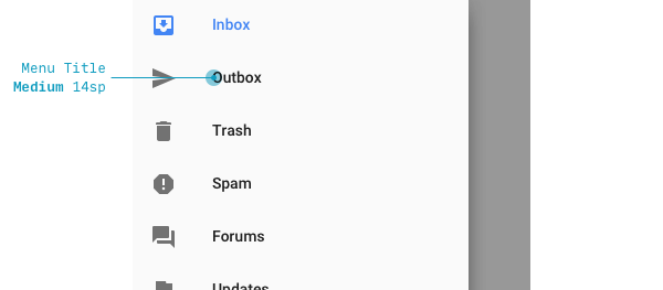
But denser lists, like those on sidebars, are 14sp – and one weight bolder to compensate (this is a bit like the larger modal font size also being lighter to compensate.
Form Controls
Let’s look at buttons and inputs now.
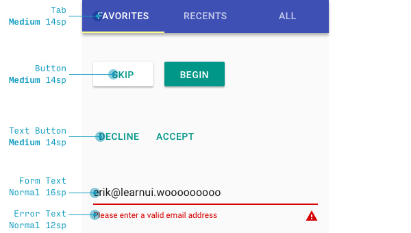
The only surprise here, in my opinion, is that text inputs are size 16sp. Why not the default body size? Because the importance per word is higher than default body text, and unlike the button (which does have 14sp text), it’s weird to have a textbox with medium or bold-weight text.
For more, check out the Material Design typography guidelines by Google.
Desktop Material Design Typography Guidelines
Even though all examples I’ve shown above are from mobile apps, the font sizes vary only a little on tablet and desktop apps. Here is a summary of the typographic changes, again, as provided by Google:
| Style | Mobile/tablet Properties | Desktop Properties |
|---|---|---|
|
Subheader List item title |
Regular 16sp | Regular 15sp |
| Body | Regular 14sp | Regular 13sp |
| “Body 2” Menu items List titles |
Medium 14sp | Medium 13sp |
If you’re designing a Material app for large screens, it also might be worth reviewing the desktop web section of the next chapter.
Continue to Chapter 3: Mobile & Desktop Web Font Size Guidelines
The Top 10 for UI Design
Get a PDF of the 10 best free fonts for web/mobile app design (including which free fonts not to use).
Practical design tutorials. Over 60,000 subscribed. One-click unsubscribe.