The #1 Way to Spice Up Your Designs (And Create a More Cohesive Brand)
Note: this post was initially sent to Design Hacks. If you like this sort of in-depth design analysis, consider signing up.
Most of the newsletters I send are pretty 101-level design tips. How to justify font choices, how to use alignment, and so on.
Today, I want to talk about a 201-level design tip, so to speak. If you’re just getting started with design, you might want to file this idea for later – everything I’m about to say won’t save a bad design. But it will make a “pretty good” design look a lot better.
If you’re at the point where you can create a fairly neat, clean site/app that just lacks pizzazz, this one’s for you 🥂
Laying the foundation
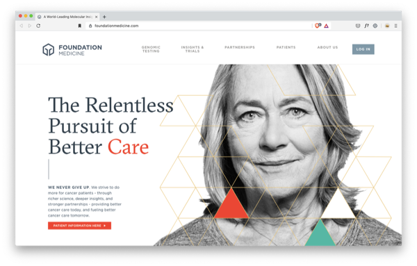
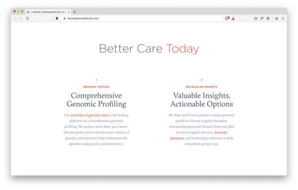
First, I want you to check out the site foundationmedicine.com and spend a minute scrolling around.
(Shoutout to Learn UI Design student Satoko Tokoro for finding this beautiful site!)
I recommend doing this on desktop. If you’re on a mobile device, no worries – I’ll post screenshots of the most important parts.
There’s no doubt that every aspect of Foundation Medicine’s site is carefully considered and beautifully presented. Even just above the fold, we’ve got:
- Clean, generous white-space around all elements
- Interesting, oddly-geometric serif headline font
- Humanizing, in-focus, high-quality photography
- Unique – but not garish – pops of color (orange-red plus teal is not a common combo)
But there’s more to it than that.
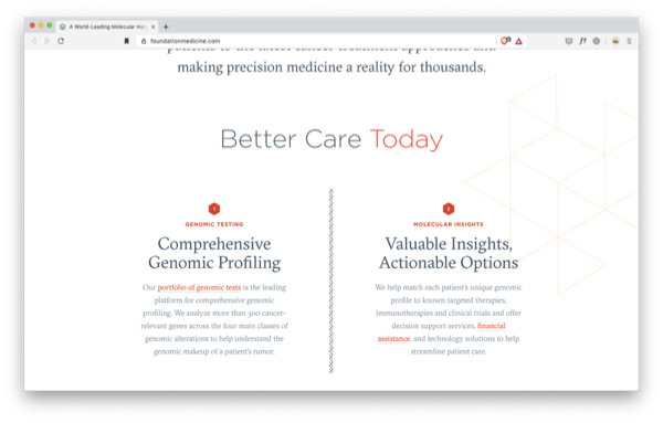
There’s a few small visual decorations you can see on this screen.
If I strip them all out, the screenshot just looks like this:
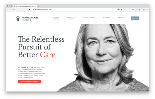
Still quite good, but not as powerful, right?
But I’m not about to recommend “small visual decorations” as the thing that you need to be doing. Nope – the trick is a little more complicated than that.
Did you notice what the small visual decorations were?
“Lines?”
Close. But not quite it.
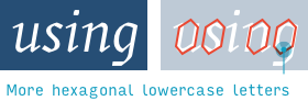
Here, look at the logo.
What is it? Fifth-grade Erik knows it’s a Boba Fett mask. Grown-up Erik has no clue… except for one thing: it’s a hexagon.
Which is also what the visual decorations are!
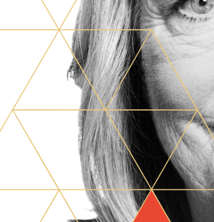
Triangles that fit together to make hexagons.
Speaking of hexagons, that’s also what the text is. No, seriously. Look.
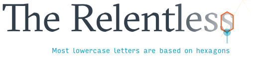
An even better example is the italicized text at the bottom.
This font – GT Sectra – has it’s own hexagonal vibe going on.
Do you get it?
“Yeah – use hexagons!”
No. Use motifs.
Introducing… Motifs
A motif is a visual idea that recurs in multiple formats and ties the design together.
We saw above how Foundation Medicine uses a motif of hexagons.
- The logo is abstract, yet suggests a hexagonal shape
- The font has hexagonally-inspired letterforms
- The visual decoration above the fold is a honeycomb of hexagons
For those of you interested in recreating this effect, these are actually three of the key places where you can use motifs.
- Logo
- Typography
- Empty space filler
But there are a couple other places I often find motifs echoing around. I’ll just tell you – and then you get the quiz 🤓
- Horizontal/vertical rules (for those of you who don’t habla HTML, “horizontal rules” is dev speak for “divider lines”)
- Special text elements – such as quotation marks, dashes, arrows, list-enumerating bullets and numbers, etc. OK. So here’s the quiz.
Say you’re working on the Foundation Medicine site and the junior designer hands you this.
It’s clean; it’s got plenty of whitespace; the fonts are nice. It’s already good, but it’s not great.
So what do you say?
We know the solution already: more motif.
Where could you spice up this design with motif placement? Remember, the main ways to integrate them are…
- Logo
- ✅
Typography(we already have this one covered) - Empty space filler
- Divider lines
- Special text elements (quotation marks, dashes, arrows, list-enumerating bullets and numbers, etc.) Take a look, guess what you’d add for yourself. And then we’ll look at what the designers did.
Ready?
Whoa. Zoom. Enhance that.

Awesome. We’ve got the motif repeated as…
- Empty-space filler on the right side
- The “1” and “2” numerals listing their main services
- The vertical divider between the two sections
Let’s look at some other examples.
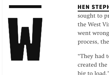
Classified document chic?
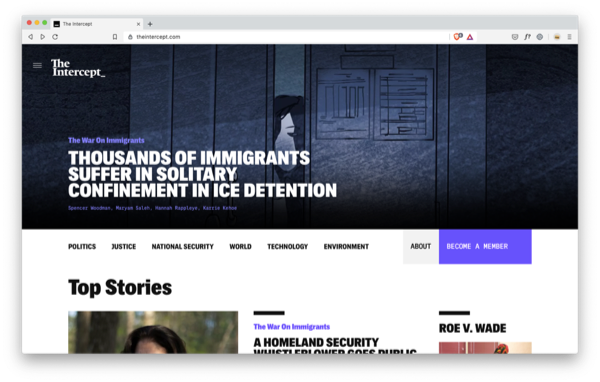
The Intercept is a news site that focuses on privacy, civil rights, technology, and whistleblower-related issues.
Do they have a motif? You better believe it.
Let’s start at the logo – where all good motifs start.
Everything checks out, totally normal – except for an oddly-placed underscore.
What else has underscores at the end of something typed?
Oh yeah – command lines. (At least the Windows one)
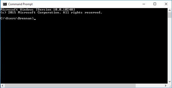
That’s a subtle tech reference right there, which makes perfect sense from a savvy news site that focuses so heavily on privacy-related tech issues.
From today’s headlines:
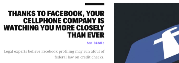
Notice how the author’s name is written in a monospace font? What else is written in monospace fonts?
Oh yeah – command lines again.
Now monospace fonts aren’t just the domain of command prompts. I think they’re most heavily associated with old typewritten documents. The kind you imagine the government keeping secret for decades, and whistleblowers risking life and limb to leak. The kind The Intercept would just love to report on.
Take something like this…
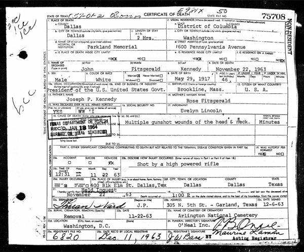
…and then spice it up for a modern media site.
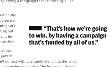
The Intercept’s motif is command line meets classified document chic.
Oh, and that underscore from the logo? It doesn’t go away.
It’s here in the drop cap:
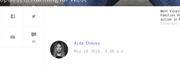
And over there in the pull quotes:
And down there, in the “Related Articles” widget:
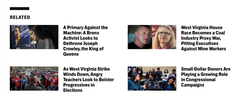
- ✅ Logo – Underscore present!
- ✅ Typography – Monospace fonts abound!
- ❌ Empty space filler – Honestly, no motif is used to fill whitespace
- ✅ Divider lines – Yup, the “underscore” motif frequently serves as divider of sorts
- ✅ Special text elements – Small bits of text are written in monspace; the underscore appears near particularly highlighted text
Cool, huh?
While we’re on the subject of “underscores” of sorts, “tiny underlines” are a great mini-motif to add the smallest bit of flair to some text.
“Tiny underlines” are a dead-simple detail to spice up text that might otherwise look boring. pic.twitter.com/t87FP0wuqB
— Erik D. Kennedy (@erikdkennedy) November 17, 2020
Alright, let’s move on.
Think outside the shape
So far, we’ve only really looked at shapes and text as motifs. But one of the very best places to add motifs is color.
Earlier this year, I had the honor of talking to Chris Coyier on the Shoptalk podcast. I ended up raving about the then-hot-off-the-IDE redesign of CSS-tricks.com, Chris’s uber resource for all things front-end development.
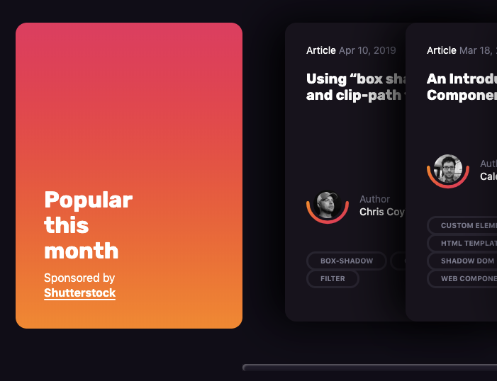
Anyhow, the site has an extremely consistent and thoughtful color motif. Check it out.
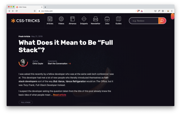
It’s the gradient. There’s a pervasive orange-red-pink gradient used to highlight so many little important bits and bobs.
Like buttons.
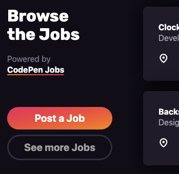
And links.
And section headers and author images.
Even the scrollbar. What!?
Duuuude. I haven’t styled a scrollbar since middle school.
Picking a theme color is basic. Everyone can pick a theme color. But can you pick a theme gradient?
The whole site is peppered with this wonderful little gradient. Everything except.…
- ❌ Logo – Nope. It’s just plain orange.
- ✅ Typography – The Gradient is used to highlight link text and code snippets.
- ✅ Empty space filler – Occasionally big splotches of The Gradient will spice up otherwise emptier areas of the site.
- ✅ Divider lines – Yes. Just scroll to the bottom of any page. You’ll see it.
- ✅ Special text elements – Like I mentioned above, links and code snippets are both highlighted with The Gradient.
Yeah, so the logo is just the old flat orange.
I think I ribbed him about this during the interview, so I won’t give him too hard a time now.. But knowing that motifs often flow out from the logo, this is a little sticky spot to look for in your own designs.
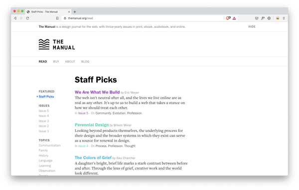
If you want to explore one more unique take on a color motif, check out The Manual, a site where designers write articles about the touchy-feely parts of design. SOMEONE HAS TO DO IT. But it’s just not me, that’s all.
Anyhow, see if you can figure out how they use color as a motif. It’s pretty brilliant.
OK, so this has turned out to be longer than I intended, just like everything I’ve ever written. So we’ll call it here.
I’ve got just one favor to ask. If you’ve liked this, consider subscribing to Design Hacks. It’s got all kinds of in-depth original writing on design that – unlike this article – is not posted anywhere else.
Watch me do a UI project
step-by-step
I’ll walk you through every part of a UI project — just like I’ve done for everyone from Fortune 100 companies to Y-Combinator startups.
Exclusive design tutorials. Over 50,000 subscribed. One-click unsubscribe.