UI Tutorial: Redesigning a Mobile Login Screen in 4 Steps
Let’s do something a little different here. If you’re reading this, you’ve likely read my design hacks, perhaps my take on color theory, maybe even my 3,000 word article in which I design a single button. Today, I want to get even more in the weeds (what is WITH this guy?).
We’re going to take an awful design and make it look good. At each step, I’m going to explain exactly why I’m doing what I’m doing. I’m going to give you techniques you can put into your design toolkit.
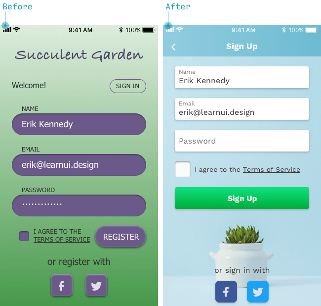
- The Before: from a homework assignment submitted by a student in Learn UI Design, my course on user interface design. With all due respect, it’s pretty nasty (the design, jury’s out on the course).
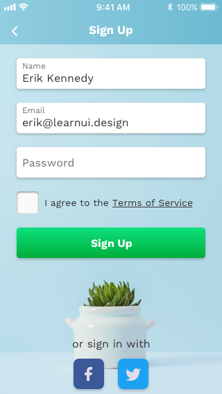
- The After: What we’re going to build today.
Ready? Let’s dive right in.
To answer the question some of you might be asking: why on Earth are you designing on an iPhone SE-sized screen!? I get it. iPhone X is huuuuge compared to the 320x568 screen here. But that’s exactly the point. It’s harder to make everything fit on a smaller screen, therefore, we’re going to start designing on a smaller screen. Scaling it up is easy, and scaling it down? Well, we don’t have to.
Web Design is 90%…
If this was your job to redesign, where would you look first? Ten bucks says you shout “color!”, but that’s $10 you just lost, my friend, because the biggest problem here is typgraphy.
Fixing the color is easy. Just take it all away (“black and white first”, remember?). But does it actually look nice now?
Better, but not by all that much. So while fixing the colors is simple, fixing the typography is… not so simple. We’re going to need a little more work here.
Now when I’m redesigning something like this, I’m going to be doing some analysis of the text styles in my head. But I’ll make it explicit for you. Watch what happens when I replace each piece of text with a description of its style.
What do you notice? Specifically, what styles seems weird or could be improved? Actually try and come up with an answer before reading on.
(I know you didn’t… It’s OK, cheater, I wouldn’t have either)
Here’s what I’ve got.
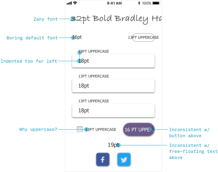
A note on fonts: our title is a bit garish, sure. And the rest is set in Tahoma, a default web font that has a sort of “default, unstyled” look. But while the complaint about bad fonts is the easiest to see, it’s also the easiest to fix. It’s much better to get good at recognizing how to style text.
With that in mind, let’s add the elements in from scratch, one by one, keeping things neat as we go, and not adding the next element until the current screen looks good. Note: that’s actually a method that I’ll use to design many screens. I don’t stick by it 100%, but it can be a useful way to think of design process.
The Title
So first: the title. On a splash page, this might be the app title (“Succulent Garden”), but this page seems like it would after come afterwards, once you’ve tapped “Sign Up”. Therefore, the title will be “Sign Up”. See what I did there?
So what style should we put it in?
Well, this is an iOS app, so we’d want to follow – or at least be “heavily inspired by” – the iOS guidelines. What size are titles on iOS apps? Fortunately, I just published Font Sizes in UI Design: The Complete Guide to answer questions like that. If you select iPhone, you’ll see that titles on iPhone apps are sometimes 34px before scrolling, but after scrolling, most centered titles are 17pt – and a slightly heavier font weight to boot.
So let’s do that. We’ll use Work Sans, a clean yet friendly (and underused!) Google font. I highly recommend installing a tool like WhatFont and starting to notice what fonts you like around the web. Building your mental repository of good fonts is the best way to generate ideas when the time comes to pick one.
I’m going to omit the “Welcome!” text, because we’re going to add the bare minimum first, then see what else feels necessary.
And the “SIGN IN” button will likely be a link below the form – that’s more typical for this sort of thing. So we’ll skip adding it for right now.
The Form Controls
Alright, the form controls. Let’s cook up the meat of the page here.
What size is a form control? Let’s refer to our Font Sizes Guide to see that on iPhone, the typical value is 17pt, normal weight.
Just to keep things simple, we’ll use Matt D. Smith’s ingenious “Float Label” pattern, where the label of the input is inside the textbox, even once it’s filled out.
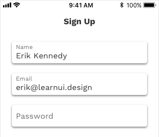
The savants among you may notice I actually used 16pt text, not 17pt – why?
- Because Work Sans is a pretty wide font with a nice, high x-height, making it highly legible compared to other fonts of its size. Seriously, 16pt Work Sans is closer to 17pt San Francisco than if they’re equally sized. Try it at home, kids. Don’t just take my word for it.
- I want to fit the form control labels and the values into the text boxes, just to keep things a bit cleaner. Easier to do with a slightly smaller font size.
As for the labels (“Name”, “Email”), those are 12pt and 70% opacity. The lowered opacity helps me distinguish label text (always 70% opacity) from user-inputted text (always 100% opacity). The size allows me to have tiny details at 12pt, normal paragraphs/dense text at 14pt, and more important snippets at 16pt. By skipping every other font size for smaller text, I make it crystal clear to my users what role the text plays as soon as they see it. If you’re making a design system (buzzword bolded for the skimmers), you’ll want to do the same: skip a size between smaller styles.
OK, so far so good.
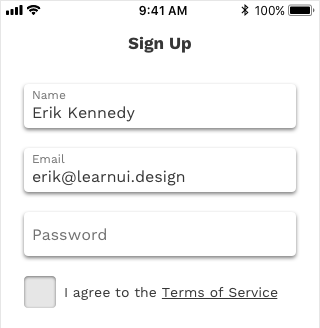
The next step is to add in the terms-of-service checkbox.
For this, my first hunch is to make height of the checkbox the exact same as the height of the textboxes. Consistency always wins. I’ll also slightly darken the background (in HSB, a flat gray with 90% brightness), a good indicator that something is depressed into the screen.
What font size do we use? In this case, I like the think of the relative importance of elements. We could use the 16pt we saw in the text inputs, but “I agree to the blah blah blah” feels a little less important than a user-fillable text box. A little more fine print than front and center. So let’s bump it down a notch (remember: skipping 2 font sizes) to 14pt.
Golden. Next is the “Sign Up” button, which I can do by simply duplicating the text box, adding some colored background, and (a) centering and (b) bolding the text.
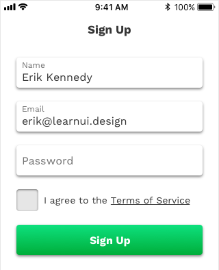
Cool. We’ve got the bulk of the page elements onscreen and everything looks good so far.
Footer Content
Adding the “or sign up with” text is next – there my two options are already set for me:
- Use the “important snippet” size of 16pt
- Use the “body text” size of 14pt
I will try both and go with whatever I like better, since this seems to play sweeper between those two cases.
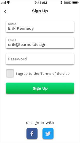
We went with the 16pt size.
(I also added a back button, as that’s a pretty default iOS way of navigating to where you can sign in with an existing account. This means we can remove the “Sign In” button entirely.)
Finishing Touches
I’m going to spice things up with a background image, which will also help give this app more of a unique feel.
The best place to get free images? Unsplash, without a doubt. (I hear some of you sighing – freakin’ hipster. Hey! Designers will be designers…)
The only simplistic succulent image I can find (in keeping with our theme) doesn’t fit very well on the screen.
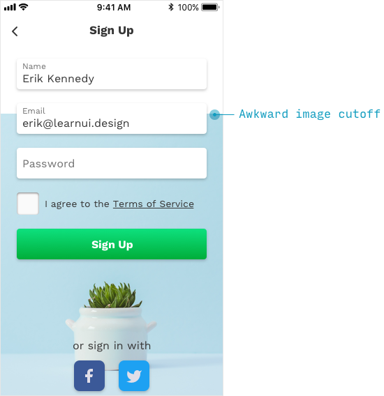
One little trick is to sample the image colors at the top-left and top-right corners, them create a rectangular gradient to interpolate in the whitespace.
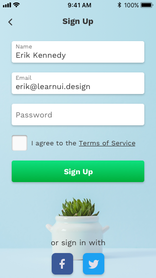
This is already looking really good, but I’ll add a transparent rectangle on top of this border and give it a background blur, so as to make the difference between the image and the gradient unnoticeable.
But it’s not perfect yet. The black header text appears messy on the image background. When in doubt, always go with white text on colored backgrounds. So let’s change that too.
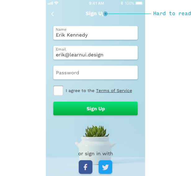
Whoa. Not very legible, is it? One way to fix this, while still keeping the mood of the app, is to add a background for the header that’s a darker shade of the same blue.
In this case, the fill is 100%-opacity black, yet the layer itself is given a blend mode of Overlay with 90% opacity. This means we’ll get a nice, slightly darker variation on the blue behind it.
Alright, bam. Done. No sense prolonging this any more than we need to.
We’ve just completed a major facelift on this screen, and determined a couple of styles that we can bring over to other screens from the same app. In the process, we’ve covered a whole bunch of great heuristics for designing UI, like:
- Add elements one at a time, keeping things simple and clean at every step of the way. At any point, did our design look bad? No. Start good, stay good.
- Consistency always wins. Adding a new piece of text? Start by styling it like an existing piece of text, and adjust – if necessary – from there.
- Design small, then scale up. It’s easier than the reverse.
What do you want to see designed next? Give me a shout (via the email address listed in the images throughout this article), or hop on the Design Hacks newsletter and reply to the warm and welcoming email I’ll be sending you the moment you do.
Loved this email!!! This deserves to be in a ‘how-to content’ hall of fame!
Steven Young
Freelance SEO
This is the first time in my life that I truly, completely, incomparably appreciated a newsletter… I (platonically) love you! Seriously, you have the best content ever.
Marika
Designer, Head of Branding/Graphics
Design Hacks
Over 50,000 subscribed.
No spam. Unsubscribe anytime.