How to Create Your UX/UI Portfolio (Without Much Experience)
There’s a real chicken-and-egg problem with getting hired as a designer these days:
- It’s hard to get a job without a good portfolio
- It’s hard to create a good portfolio without first having good jobs
(This is true of freelance work, agency work, and full-time work at a startup or larger tech company)
In some ways, this seems like an insurmountable obstacle. Abandon all hope! The spiral of pessimism will win! You can never transition careers!
Or can you?
Folks, we live in an absolutely amazing time. You can create a portfolio worthy enough to get hired as a designer without ever having done a single paid project in your life. With very few UX Design programs offered at traditional universities – and basically no UI design programs – the industry is forced to judge you on your abilities, rather than a piece of paper hanging on your wall that cost you tens of thousands of dollars.
Pretty sweet deal, eh?
Here’s what we’re going to cover today:
- Where to find projects if you haven’t done (much or any) paid, professional UX/UI work
- How to tell the story of your projects in your portfolio
- The 5 projects you should NOT share in your portfolio
- Practical ways to build your portfolio quickly and easily
- The best UX/UI portfolios for inspiration
- Finding the confidence to show your portfolio
This article is written specifically for beginning designers, but more experienced designers might still get something out of how to write about your projects.
OK, let’s do this.
Portfolio Projects Before You’ve Been Hired
There are fundamentally 3 types of projects to feature in your portfolio before you’ve ever been hired as a designer:
- Unsolicited redesigns of existing apps/sites
- Apps that you, yourself, design or build (side projects, etc.)
- Design you do on a volunteer basis for non-profits
Unsolicited Redesigns
These have earned a pretty bad rap in design the last few years. Yet I keep reading about people who get hired (sometimes by their dream company) because of their unsolicited redesigns. So what gives?
The answer is simple: do your unsolicited redesign in the same manner you would do your very best professional work.
That means:
- Do the research
- Talk to users
- Come up with multiple concepts
- Figure out the trade-offs of various solutions
- Oh yeah – and make it look incredible
That alone will put you in the top tier of redesigns. The blowback against unsolicited redesigns comes from designers being lazy, and treating these things as glorified make-a-pretty-picture-in-Figma exercises.
That would be fine – if designers were artists. But designers are not artists. Designers are solving a problem; artists are… oh, who knows what artists are. Never mind that. The point is: designers solve business problems using software. If you’re going to do an incredible redesign, keep in mind it has to be solving those same business problems. Don’t just make a pretty picture.
Here are a couple amazing redesigns I’ve stumbled across:
Kim Thuy Tu’s Instagram Redesign
If you haven’t seen it, go and look. If I was hiring designers, I would email her in a heartbeat, just because of this one write-up.
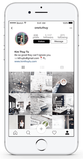
The first thing that should strike you is this chick is motivated:
- She interviewed 40 people about their Instagram usage (I’m not sure I’ve ever interviewed 40 users about one feature)
- She constructed two personas based on those interviews
- She generated a handful of new features and modifications based on her research, giving extensive justification for why she added each feature
- She did everything matching Instagram’s current (as of 2017) visual style
- She did this all as a side project, simply to push her skills further
As a daily Instagram user, I am impressed: a bunch of the features she’s thought of are things that would immediately improve my Instagram experience. I didn’t even know how many little things with Instagram could be improved until I saw it before my eyes. And then it felt obvious (which is, in my opinion, basically the definition of good design).
As far as I’m concerned, Kim’s work is the gold standard in unsolicited redesigns. Is it perfect? No (is Instagram?). But at some point, your unsolicited redesign becomes so good that design hiring managers cannot ignore you. And if you look at the mockup of Kim’s Instagram profile above, you’ll see that this is, indeed, her strategy.
The last thing I want to mention about Kim’s redesign is a little note at the top of it that says (more or less) “Hey, I’m not Instagram, I’m not privy to their data, their internal goals, and so on. I did the best I can, but this isn’t supposed to trample all over their work. Hats off to them”. A little humility in these unsolicited redesigns can go a long way. Unasked-for advice can range from (a) “Your sense of style sucks and you should probably be ashamed” to (b) so brilliant a world-famous company wants to hire you. Let’s err towards (B), shall we?
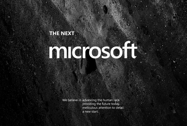
Andrew Kim’s Microsoft Redesign
Another stunning redesign, Andrew Kim’s take on re-branding Microsoft makes him a shoe-in, as far as I’m concerned.

And, go figure, he did this work as a student. Microsoft picked him up out of college, then Tesla sniped him, and now he works at Apple.
So.
Take a look, and then let’s talk.
Andrew’s redesign is focused on branding, so it’s a bit different than UI/UX stuff. There’s no research, for instance. He was running with his gut instinct. But (a) his gut instinct seems about as sharp as a straight razor, and (b) there’s all kinds of justifications presented throughout:
- What competitors are doing and how Microsoft could fit into its own niche
- What makes Microsoft’s current logo awkward
- What the biggest issue is with Microsoft’s current marketing
Like I said, shoe-in. Even though the UI designs presented here lack the sharpness of the branding and ads. Even though there’s no research whatsoever. Even though he built a webpage by stitching together a bunch of freakin’ image files.
Yeah, it’s not perfect, but it’s still so incredibly good that you have to look twice.
These unsolicited redesigns by Kim and Andrew should start to put into context the bad ones you see on dribbble and wherever. When you’re just trying to make a pretty picture and call it a day, that’s lazy. You have to make a really pretty picture to get hired. But when you can expose your thought process, justify your decisions, and come out the other end with an amazing concept – that’s incredible.
It’s way more work, but the only one who’s going to stop you from doing it is yourself.
Side Projects & I-Wish-It-Existed Apps
Everyone knows Microsoft. Everyone knows Instagram. It’s admittedly pretty impressive if you can redesign their stuff better than they can.
But there’s a whole another avenue worth exploring when it comes to non-professional projects: your own ideas for apps or websites.
I’m going to talk about two general categories here:
- I-wish-it-existed apps
- Your own side projects
I-Wish-It-Existed Apps
Let’s say you’re honing your chops as a budding designer. You have an idea for an app that would be a great portfolio piece, but (a) you can’t develop it yourself, (b) you don’t have the money to hire a developer, and (c) you can’t find any developers who are as excited as you are about developing it for free. What do you do?
You design it anyways.
Remember how I said we live in an amazing world in that you can get a pro designer job just by your own free and unsolicited portfolio projects? Well, here’s another blessing to count: you don’t need a developer to do the design work.
Much in the same way that Kim and Andrew redesigned big brands without needing a dev, you can do the design work for an app you just thought of without needing a developer to make it a reality.
I actually did this early on in my own design career. Before I could fill a portfolio with paid projects, I made up an app I wish existed, designed it, and posted it in my portfolio. Behold, in all it’s skeuomorphic, ancient-iPhone-sized, horribly web 2.0 glory, Giftr:
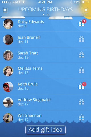
See, I have this issue where whenever I think of a gift idea for someone, I (a) forget to write it down, and therefore (b) forget to get it for them when their birthday rolls around. I wanted an app that would allow me in AS FEW TAPS AS POSSIBLE to write down any old gift idea for a friend the moment I thought of it (and maybe remind me a week before their birthday).
So I designed it. It got me more comments than any other projects in my portfolio: “Hey! That’s pretty cool! I wish I had that!”
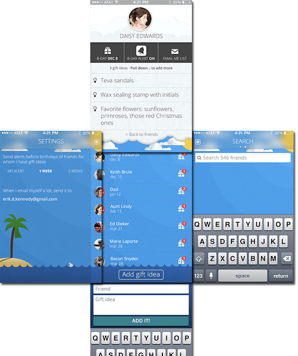
One detail that I feel is important: I justified the crap out of every decision I made. I explained why the critical user flows were easy, I made a little illustration to show how the app navigation corresponded to spatial navigation around a background image, and so on. Of course, I still made mistakes: search is basically impossible to locate, for instance. But overall, it was a cute and fun addition to my portfolio that showed a bit more than the typical flat business apps that everyone wants.
Side Projects
Of course, sometimes you can develop your own project. Or find someone to do it for you. And in that case, all the better. You will have a real app or website with real users, real-world constraints, and real feedback.
Side projects make the perfect additions to your portfolio because you have complete creative control. You can freelance for years, work for awesome clients, and still find yourself stuck with stupid constraints born of business politics (ask me how I know this). Not so with your side projects. When you have the power, run with it.
But here’s the real kicker: side projects are risky. If you make something that’s genuinely bad (or even genuinely mediocre), you’re not going to want to show it off. When your portfolio includes a link for someone to download your app or visit your site, you’re putting your skills on the line. Your work better be good. When you create something with a large team, we get it. Lots of other people, some of whom might make dumb decisions. But for your own side project? It’s all you.
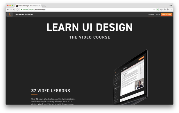
While Learn UI Design hardly counts as a side project for me anymore, it did start that way. And one thing I thought very early on was: if I’m going to sell a course on user interface design, it has to look AMAZING. If I can’t make my own website look good, who would trust that I can teach anyone else to make beautiful software?
So you be the judge of me.
When your skills are honed enough, post your own side projects. Put your reputation on the line, and let others be the judge of you. Because if you’re good enough, you won’t be ignored.
Non-Profit Projects
Another great option is to use a site like catchafire.org to find non-profits to do volunteer design work for. Since there’s no money on the line, you can focus on the task at hand as you build up your skills.
How to Write About a Project
I want to switch gears here. Because even once you’ve completed a couple projects, you’re not done. You still have to present them in a compelling way that makes people want to hand over thousands of dollars so you can do the same for them. But how exactly do you do that?
I’m glad you asked. My advice for you is simple: you write a story.
The single biggest problem that most designers have with their portfolio write-ups is that they’re not a story. They don’t speak in a way that human readers can understand and remember.
It’s the difference between this…
- Here are some pretty pictures I made
- You can tell they’re good, right?
- I used these color swatches… I’ll even print out the HEX values for you!
- I am 87% proficient in jQuery. Here’s a data visualization in case you don’t know how percentages work.
…and this…
- My client reached out to me because…
- I was excited about the project because…
- Initially, the biggest challenges were…
- Our research revealed some surprising stuff, like…
- So we came up with these concepts…
- And picked this one, because…
- Six months later, my client said their sales had doubled, and…
- Press this button to hire me.
My own portfolio has a pretty abbreviated version of this, where I focus a bit on why ever design decision makes sense given the constaints – and that the project was beneficial for the client.
Anyhow:
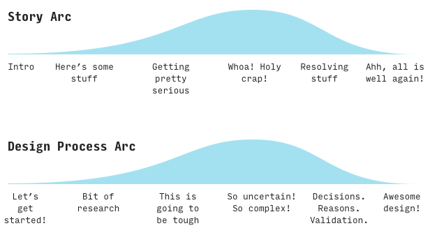
In case this is escaping you, I’ll spell it out: the general arc of a story and the general arc of the design process mirror each other. Fortunately, human brains are story-remembering machines, and if you can loosely format your portfolio writeup as a story, you will be doing (a) a huge service to your readers in them easily comprehending what’s going on, and (b) a huge favor to yourself, because your readers will remember you, and not all those other chumps.
You know all the stuff that makes stories interesting and worth telling?
- Conflict
- Seemingly unsolvable problems
- A ruthless and cunning villain
- A motley band who all but saves the world due to pluck, luck, and some good old-fashioned teamwork
- Gal Gadot as lead
Those are veeeery similar to the elements that make for a good design writeup:
- The constraints
- The problems
- The tradeoffs
- The options
- The final design matching the problem and constraints so well it feels all but obvious in retrospect
(Alright, mildly similar)
Honestly, the exposition part of the story is pretty simple to write – this is who hired me, this is why, this is our goal, this is the role that I played to get there. Same with the ending. Here are the designs, and here’s why they work. The harder part to think of is the middle. The juicy conflict.
When in doubt, write about:
- Tough Decisions. Your clients don’t hire your past work; they hire your thought process. You can’t just copy and paste last project’s work for this project. Instead, you have to think through things from the beginning to make the best decisions. Your clients want to see your thought process on tough decisions, since it’s the best indicator of what you’re going to bring to them.
- Tradeoffs. If you’re not aware the tradeoffs you’re making a designer, you’re only going to pick the best solution on accident. Write about the advantages and disadvantages of different solutions you considered.
- The Surprises. A classic narrative device that also pops up in user research! What surprised you when you started trying to deeply understand who you were designing for? What surprised you when you ran usability testing or got user feedback? Clients want to know you can roll with the punches – and it’s also nice to know you actually do your research.
Anyways, I think you get the point. In the MVP version of a portfolio, even a few captions can paint the overall arc of the story, bringing us from a gentle introduction to the problem, through the wild landscape of crazy possibilities, and eventually to a final, beautiful design that fits like a glove.
I will only say that writing these narratives takes a long time. It’s best done as soon after the project finishes as possible, it’s not fun at all, and you will totally hate it. But your future self will thank you, because by going through this hard work, you’re setting yourself apart from the rest of the pack.
The 5 Projects You Should Never Put In Your Portfolio
This article is aimed at beginning designers. You might think “Ah, I don’t have enough projects to leave anything out!” I’m here to tell you that some beginning designers have definitely made the mistake of including things that would be better left out. You don’t want to be that designer, do you?
Here, we’ll keep it short:
1. School projects
You took a design class, they had you design some household doodad, and now you’re trying to convince me you can make me a nice Android app because you 3-D modeled a stupid chair? These are evident a mile away. Maybe makes a nice conversation over beers (seriously, ask me about how much Boston firefighters love “brainstorming and ideation”), but it’s simply irrelevant to being evaluated as a UX/UI designer.
2. Full-time work (that wasn’t design)
I get it. You want to start freelancing as a designer, yet your job wasn’t exactly design, and you don’t have anything else to put in your portfolio. I was a PM at Microsoft for 3 years before becoming a designer. It was during that job I became convinced I would love being a designer, but the actual design work I got to do was few and far between. It was tough trying to shove that into a portfolio, and you shouldn’t try. You might think your portfolio’s sparse, but it’s better than the design recruiter thinking you’re desperate!
3. “This will be great for your portfolio” projects
Ah, the classic archetype of first-year-of-freelancing clients. This guy doesn’t want to pay you, so he pitches work as “great for your portfolio”. Unfortunately, if someone doesn’t respect your skills enough to give you any money for them, they will likely have so many other unreasonable demands, feedback, modifications, and clarifications that your design is doomed before it even gets off the ground. They will, in essence, get what they paid for – despite your best efforts. And you will not want to put it in your portfolio. And if you have to, then you will want to remove it as soon as you can.
4. Projects that ended poorly
If your ex-client never wants to see you again, maybe don’t put his project in your portfolio. If you quit halfway through because you weren’t getting paid, just leave it be. Fortunately, I only had one project that fit the bill here. In retrospect, there were warning signs. For instance, whenever my invoices came up due, my client would drive me out to his storage shed and pay me in hundred-dollar bills he kept there. Story for another time – on the Design Hacks newsletter, no doubt.
5. Projects you wouldn’t do again
If you didn’t like a project’s style or content or industry or whatever, don’t put it in your portfolio. Your portfolio is basically an advertisement that says “Hey, if you have a project that’s really similar to one of these, I will do precisely this good at it”.
Cool? Let’s move on.
How To Build Your Portfolio
In Learn UI Design’s lesson on creating a portfolio, I talk a bunch about making your portfolio visually unique and avoiding some common aesthetic issues I’ve seen. We’re going to ignore all that for right now. For your first go at a portfolio, you’re going to get more bang for your buck putting the time into (a) your craft as a designer and (b) your project writeup than (c) trying to learn CSS and how-to-host-a-website from square one.
There are a couple portfolio-builders I would recommend right out of the gate.
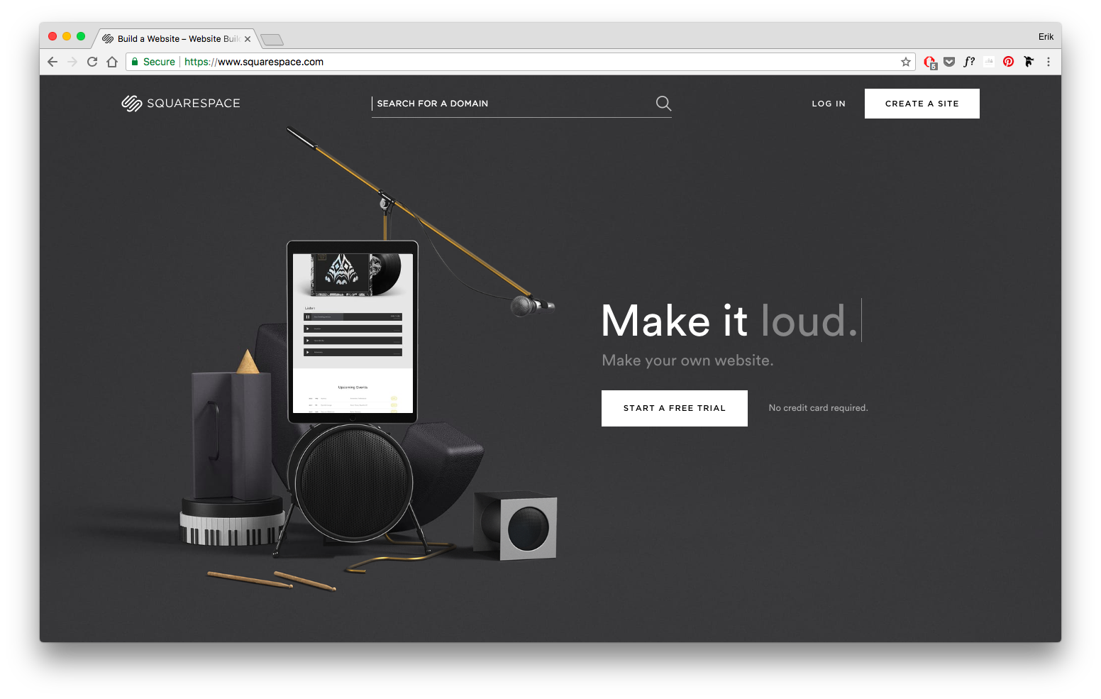
Squarespace
A great all-purpose website builder that excels at portfolios. I found their editor to be intuitive and fast to use.
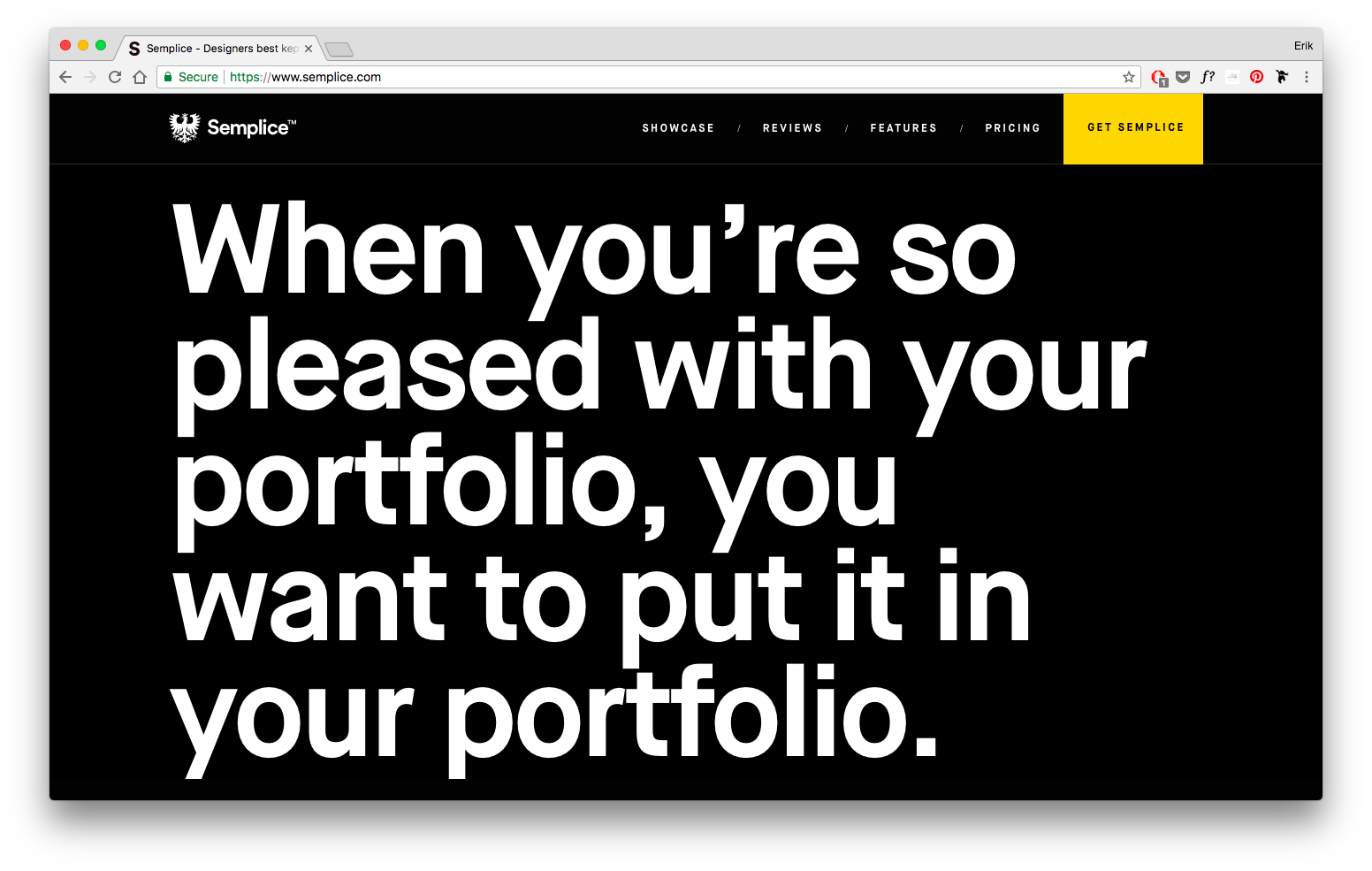
Semplice
The portfolio creation tool “for designers, by designers”; nice pay-once-own-it-forever pricing model.
Note: If there’s a simple portfolio-builder solution that you already love, let me know. I’m happy to investigate and recommend other options I hear a lot of praise for.
The Best UX/UI Portfolio Examples
There are a lot of portfolios out there – and there are even plenty of lists of “best portfolios” (which, unfortunately, contain BOATLOADS of mediocre portfolios). I’m going to be an absolute stickler and post a select few portfolios here that meet the following criteria:
- Great visual design
- Well-articulated rationales and explanations for design decisions
- Overall in the top 1% of UX/UI portfolios
There won’t be very many. Obviously. Here’s what I’ve got so far:
Luca Orio
Not only does Luca ace his project writeups, showcase incredible visual design, and apparently look the part (tattoo sleeve and gray hipster beanie? Hellooo, designer!), he also demonstrates the power of specialization. From front page to project writeups, he talks about his unique process, always working in quick sprints validated by real user testing. Simply top-notch.
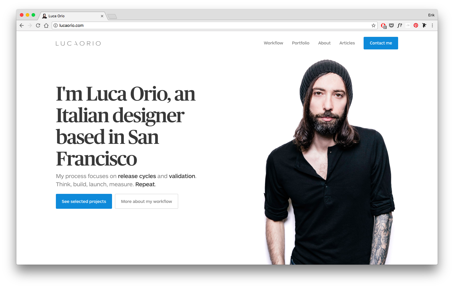
(Oh, and did I mention Luca is a Learn UI Design student? This suave Italian has a fantastic portfolio and great taste in design courses!)
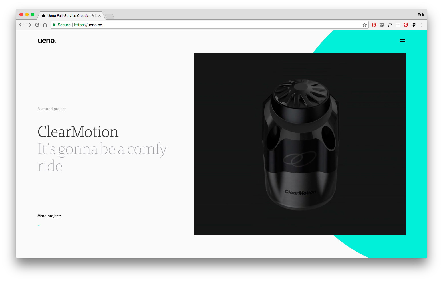
UENO
One of the most popular up-and-coming design firms, UENO knocks it out of the park with their portfolio. Tons of beautiful visuals, a very clear brand, great articulation of design decisions… what more can you ask for?
Did I miss another top 1% portfolio? Let me know.
Gaining the Skills and Confidence to Share Your Portfolio
Does this feel insurmountable yet? I’ve just inundated you with best practices, showed you some of my favorite redesigns I’ve ever seen, shoved a couple resources your way, and then dumped on you some links to the world’s very best design portfolios. If you feel a bit intimidated, I don’t blame you one bit.
As a beginning designer, a great portfolio can feel a long way off. My advice (and most designer’s might hate me for saying this): don’t shoot for perfect – yet. Get a passable portfolio first.
- Instead of creating in-depth writeups, take your best and most illustrative wireframes/mockups and simply caption them with relevant bits of a story
- Instead of hand-coding your portfolio from scratch, use template software, such as those recommended above
- Instead of trying to fit every project you’ve ever done, pick the 2-3 you’d most want to repeat, and write up those
And, most fundamental of all, do good work. As good as you can. Improve constantly. That will be the biggest factor in the long-run.
For more writing like this, check out Design Hacks. The goal of Design Hacks is to be the most practical design writing on the planet, so if you’ve read about all these beautiful redesigns and portfolios and thought “I need to step up my design game”, well, have I got the thing for you.
Watch me do a UI project
step-by-step
I’ll walk you through every part of a UI project — just like I’ve done for everyone from Fortune 100 companies to Y-Combinator startups.
Exclusive design tutorials. Over 50,000 subscribed. One-click unsubscribe.