5 Practical Exercises to Learn UI Design (For Free)
One of the biggest problems with trying to learn design is INFORMATION OVERLOAD. There are tons of design articles and tutorials on any of thousands of different sites. But most are pretty short – they touch on one particular topic, and that’s it.
Trying to get a design education from design articles is like trying to eat a meal of crumbs.
Now, I teach a paid course on user interface design – titled Learn UI Design, appropriately enough – but (A) it’s not free, meaning it’s not a good fit for some learners, and (B) it’s not always open for new enrollments. In fact, it’s rarely open for new enrollments (you can sign up for the Design Hacks newsletter to hear when it next will be).
So if you want to get a free, immediate start to learning UI design, where do you look?
I’m glad you asked. You look here – at this article.
Think of this article like the central hub in a wheel of resources, tools, links, and ideas that will kickstart your path to learning UI design. I’ve assembled here what I wish I could’ve seen when I first started learning interface design. But I’m going to focus in a specific direction with this article – one that I encourage all students to do.
You need to create.
90% Production, 10% Consumption
A couple years ago, I undertook the dubiously useful task of building a floor-to-ceiling climbing wall in my garage. I would say “Don’t tell my homeowner’s association!”, but the thing is so over-engineered it probably makes my house more sturdy. The grade of the lumber, the gauge and size of the screws – everything is a couple notches stronger than it needs to be, and consequently, I’m pretty sure a silverback could boulder on it with no ill effect.
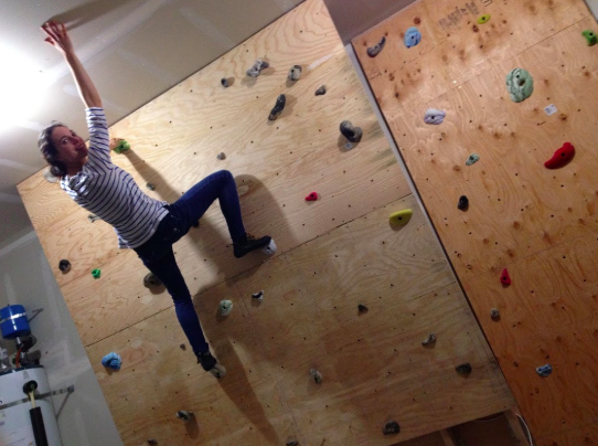
Anyhow, while building this monstrosity, I noticed I had a bad habit. Every time I drilled in a screw, I would step back and admire my work. Not just that one screw, but I would admire the whole wall, at whatever stage of completion it was at. It was like 10 seconds of drilling followed by a minute and a half of looking at the remaining markers I still needed to drill, planning how much I could finish tonight if I worked X more hours, dreaming how awesome it will be to have everything finished, etc.
Now, I’m all for “measure twice, cut once”, but this was absurd. Why wasn’t I just hustling through the menial work to get to the fun part – the climbing?
Uh, obvious? Because work is hard, and it’s easier to sit there and dream.
In the same way, it’s tempting to read/talk/browse/consume endlessly about the things we want to do. Ever have a friend who starts a new martial art, and you’re pretty sure they talk about it more than they actually go to practice? Or know someone who’s talked for years about quitting his job and becoming an entrepreneur, yet he hasn’t made a dime during any of the thousands of hours of nights/weekends/holidays in that time?
If you’re going to learn UI design, you have to be wary of this trap. It’s 10x easier to read random design articles than it is to actually design. But the latter is far more important to your skills.
Let me put it this way. For every minute you spend reading design articles, spend 10 minutes actually designing.
Does that seem absurd? It’s not. What’s absurd is the idea that you can get better by passively browsing whatever happens to be the most recently tweeted article by your tech friends. You don’t want to read what’s hottest right now, you want to read the best. But is there one place that’s compiled all the best articles into a comprehensive curriculum? You get what you pay for there.
So rather than recommend a bunch of other articles, I’m going to recommend exercises. These will be things that you do to get better at design. You will be CREATING things. Not just designs though; you will also be creating lists and resources for yourself to refer to down the road, effectively earning you compound interest on your time.
Exercises are also awesome because they tell you what question to ask. Part of the struggle of learning by reading is not knowing what’s useful and what’s useless. You actually have to immerse yourself in the activity before you know where you’re really going to struggle. This was something I noticed when I first started design. I could read all I wanted about color theory – useless. What it turned out was useful was the answer to questions like “I have a button that looks too plain – what options do I really have to make it look cooler?”
So I will give you the exercises, but it’s up to you do figure out the questions. Once you have the questions, ask me. Seriously. I will tell you to stop when I get too many questions, but I’ve had this offer out for years and haven’t rescinded it yet!
Alright – let’s get on to the exercises. Here is what we’re going to talk about:
Exercise 1: Build Your Gut Instinct Through Analysis
Like any open-ended creative endeavor, successful UI designers have a strong “gut instinct” for what will look good. One of the most common worries I hear from beginning designers is they don’t have this strong gut instinct yet.
Well guess what. If you’re just starting out, that’s to be expected.
Sure, there are some designer savants who make beautiful software from day 1, but that wasn’t me.
Now that I’ve been designing for years, I have a strong design gut instinct. Every time I start a new project, my mind is brimming with possibilities – ideas of what fonts to try out, which colors might work well, what websites would be good inspiration, what layouts to use, etc. Some of these may be things I’ve never done, but I just have a hunch they’ll work – maybe because I did something similar on a project a year ago, or saw something similar on an app I used last week.
Describing gut instinct like this makes it seem more attainable. It’s knowing which options are out there, and having a decent hunch as to which will work better than others.
Gut instinct is nothing more than your unconscious mind having a good map of the territory.
Now, we’re talking about your unconscious mind having a good “map of the territory” (i.e. knowledge of options available to get from here to where you want to go), but all that filters down from you consciously think about. And in this case, we want to start mapping out our options.
Or, to say it more clearly, we want to analyze what works in UI design – and what doesn’t.
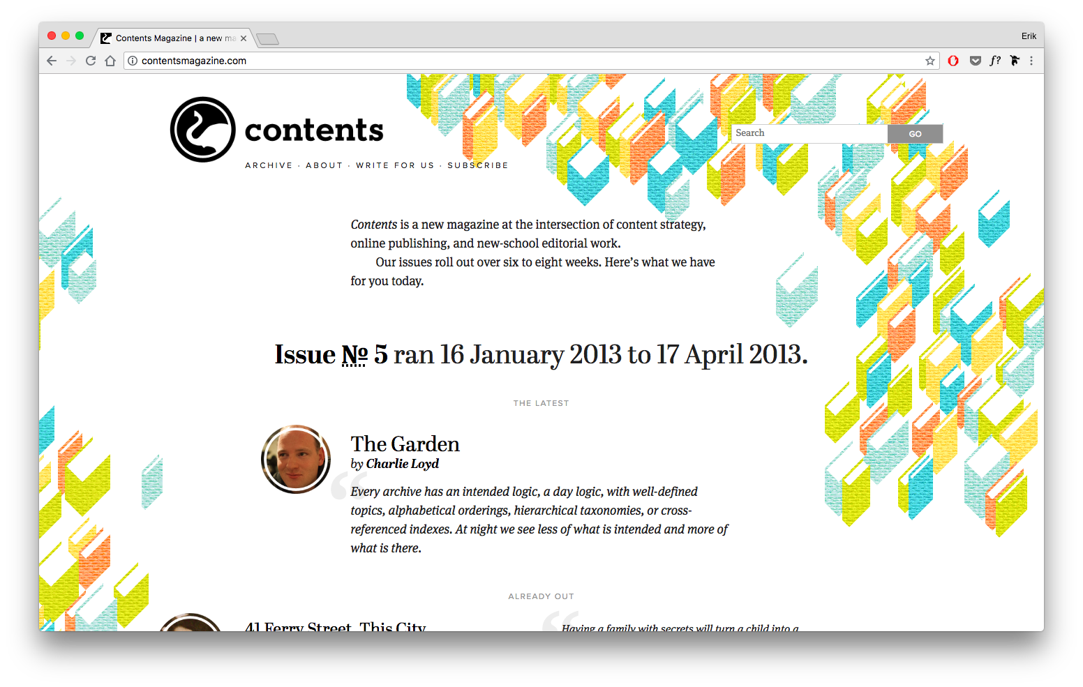
For this exercise, you should list apps/sites that have great UI (and those that have really bad UI) and you should articulate, as clearly as you can, why and what you like (or dislike) about them.
You may say “Hey, I don’t have a lot of opinions on what looks nice or awful – I can’t even tell!”, but that’s no excuse. Surely you can find something you know looks well-designed.
For instance, I like the site for Abstract – a version control tool for UI designers.
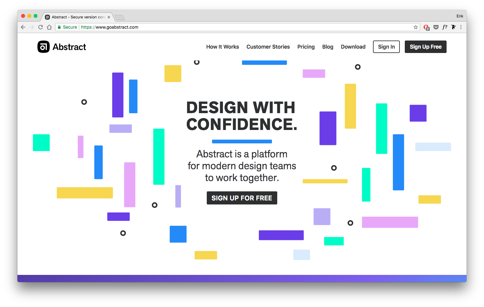
I would articulate why thusly:
- Pastel color palette is fun and relaxed
- Random scattering of rounded rectangles feels playful
- Akzidenz Grotesque, an older grotesque font, feels quirky and “imperfect”, yet clean and straightforward
- Logo, name, and scattering of shapes all back up the “abstract” brand
Now you might like Abstract.com too – but you might have totally different reasons for doing so. Fine.
The point is not that we agree so much as you understand why you feel the way you feel. Everything I just listed can be generalized into a principle that I might use in future designs.
For instance:
1/ Pastel color schemes are more relaxed than darker/more saturated schemes:
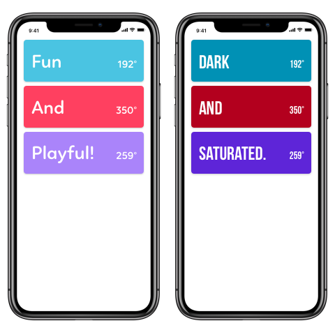
2/ Add playfulness with randomness and “grid-breaking” in your layout:
3/ Sans serif fonts with stroke-weight or kerning quirks can add to a slightly disheveled appearance
4/ Try to incorporate aspects of your brand across all elements – logo, layout, colors, etc… actually, I have a whole article on this.
I wouldn’t expect a beginning designer to necessarily pull these generalized principles out of this exercise – merely to start creating a map of the territory. And the beautiful thing about having even a fuzzy map of the territory is it gives you landmarks by which to place other data points. As you start to fill out this map of options, it becomes easier to place new lessons. You start to get a feeling of “I’ve seen this before” – because you have. Or something similar.
And before you know it, really, you’ve got a gut instinct for UI design.
WEEKLY EXERCISE 1:
List 5 sites or apps with good UI design, and 1-2 with bad design. For each, articulate in your own words why you believe it works or doesn’t work.
Exercise 2: Copywork
Copywork is an incredible exercise for improving your design skills, yet hardly any designers actually do it. I’m going to give an overview of it here, but for a full treatment (with more examples), check out my article on copywork.
In short, copywork is simply recreating an excellent existing design pixel-for-pixel in your design program of choice.
Copywork is not a new exercise with UI design. Historically, everyone from painters to writers have copied the greats before them for practice:
- Jack London copied swaths of Rudyard Kipling’s writing to adapt his forebear’s world-class cadence and phrasing.
- Robert Louis Stevenson would meticulously study sections of writing he found particularly beautiful, then reproduce them word for word from memory.
- Ben Franklin followed a variant of copywork, writing notes about each sentence in an essay and then, a few days later, trying to recreate the essay by reading his notes — and comparing the results.
- Leonardo da Vinci recommended copywork as the first painting exercise any of his students should do, saying, “The artist ought first to exercise his hand by copying drawings from the hand of a good master”
But although it was once a foundational exercise of some of the world’s greatest artists, copywork has fallen out of favor. Nowadays, it’s viewed as rote, uncreative and reeking of plagiarism.
I hope the reverse that trend among UI designers, as copywork is a powerful exercise for expanding your “design vocabulary”.
The gist is this: When you recreate a design, pixel for pixel, you’re forced to remake every decision the original designer made. Which font? How big? How are things laid out? Which images and background and decorations? You immerse yourself in the small design decisions made by awesome designers. As you re-create those decisions, you start to notice the original making decisions you wouldn’t have made, and using techniques or tricks you wouldn’t have picked up on just looking at the design.
Those tricks and techniques you can take away with you for the rest of your design career.
Let’s look at an example. Here is one piece I copied – Dan Petty’s excellent Oahu Epicurrence website:
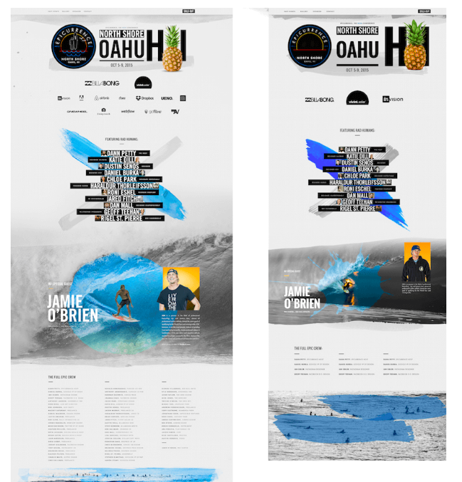
Copying this piece gave me a bunch of new ideas I could take to my own work. For instance, here are things I noticed in the header alone:
- Insanely large font size. My copy of the original included the Hawaii initials “HI” in size 365 font. Never in my years of professional work had I even considered making text that big. Yet he uses it as a visual element, aligning it with the other header elements, even putting an image between the letters. Very cool.
- Paint stroke as “shadow”. A watercolor smudge runs across the bottom of the seal, the header and the pineapple. It’s in the spot where a shadow might be, as if the shadow were painted on the page. Whoa — that’s not the usual way of doing it!
- Uppercase type with generous letter-spacing. No doubt, that uppercase text adds a strong element of alignment, and pumping up the letter-spacing is a textbook way to add some classiness to type, but I find myself getting self-conscious about doing it much. It was cool to see that all of the text here is capitalized, and basically all of it has modified letter-spacing, too.
Now, I’d seen Dann Petty’s design before deciding to copy it. I thought, “Wow, this looks great.” And even as my eyes glossed over the design, it’s not like I immediately internalized every technique he used. Only when I copied it did I start to consciously adopt those things in my UI toolkit.
These strategies are more detailed than any class on design would typically get into. They’re one-off tips and techniques that go straight from the mind of a master to yours, if you’re willing to put the effort into doing copywork.
Now, to me, there’s an art to figuring out what to copy. You can pick very specific pieces to copywork off of based on what they do well or what you lack. For instance, if you want to improve your use of color, copy something with some crazy gradients or a bold palette. If you want to get better at luxury branding, copy a preeminent website with a ritzy look and feel.
For more on copywork, read my full writeup on copywork. It goes over other questions, like:
- Where to look for good pieces to copy
- If you have to copy the original perfectly
- How to not plagiarize off the stuff you perform copywork on
And so on.
WEEKLY EXERCISE 2:
Copy the UI of a good site/app pixel-for-pixel. At the end, write down specific techniques the creator used that “expand your design vocabulary”.
(Note: this could also be done as a 30-minute daily exercise rather than done all at one time)
Exercise 3: Start a Fonts Database
If you’re serious about learning user interface design, you’re going to need to be on friendly terms with fonts. There’s just no way around it. Some say “web design is 90% typography”, and maybe that’s a huge exaggeration, but it doesn’t change the fact that typography is a critical skill to interface design.
But “typography” is also a rabbit-hole. There are thousands of fonts out there, and even then, picking fonts is the easy part. It’s much harder – and much more critical – to be able to style them well.
All in due time, though.
The first typography-related skill any designer needs is some working knowledge of decent fonts and which situations each performs best in. I’ve had limited luck Googling for lists of good fonts, as anything that has more than about 10 recommendations either drifts into pretty niche-use typefaces, or ones that are sub-par in some way or another.
I’ve actually created my own database of good (free or cheap) fonts, available for Learn UI Design students.
But until then, I recommend building out this list for yourself, not by Googling, but organically, as you stumble across beautiful typefaces in use on various sites and apps.
Like any research process, the best method is the one that works for you. Nonetheless, I would consider recording the following information any time you find a font that works particularly well:
- Font name
- Website/app it’s found on
- Usages it would be good for – body font, title font, certain types of brands, etc.
- A screenshot of it in use, particularly if you can’t download it
- Price
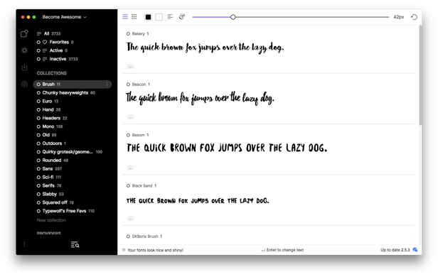
I like to put my fonts into groups (like “Brush” or “Chunky heavyweights”) in a Font Manager, such as FontBase. I use different groups to represent different usage ideas as well as different types of fonts.
If you like a font, and it’s free, download it right then and there. The reason is because you need to use a font to see if it really works for your design. And you’re not going to want to go downloading a zillion fonts you wrote down last year every time you start a project. You’re going to want to have them on hand (as much as possible), and very quickly start comparing how a paragraph of body text looks in typeface A vs. typeface B.
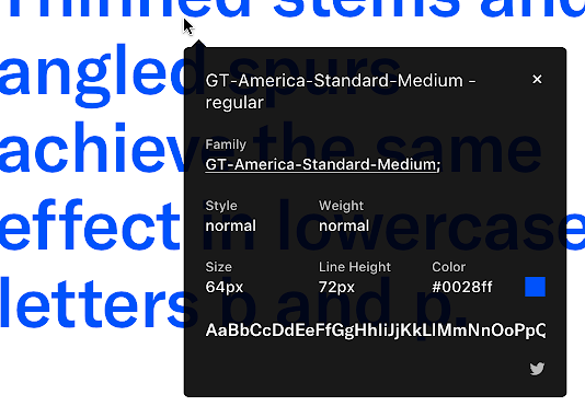
As far as what tools to use for identifying fonts, I make further recommendations here.
WEEKLY EXERCISE 3:
Record any fonts you particularly like, noting characteristics like when they seem to work well and where you’ve seen them.
Exercise 4: Style Tiles
If you’re anything like me, you can’t just build a database of your favorite fonts without wanting to use them. And you can’t analyze what all these beautiful sites are trying to do without wanting to experiment with those same ideas.
This is where style tiles come in.
Style tiles are small artboards that combine ALL the brand elements you’re thinking of – typography, color, form controls, a logo, etc. They don’t show you the finished product, but they give you a feel for what the finished product will be like.
They’re quick, one-off explorations of a certain idea you might have about a good UI.
Let’s look at an example, by yours truly.
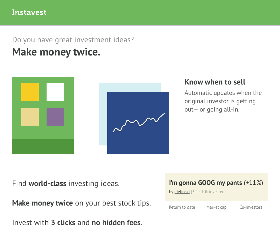
Years ago, I worked with early-stage startup Instavest, a service that allows you to model your portfolio after stock tips from top investors.
I discussed with the founders the sort of feel they were going for. They wanted a site that people felt confident leaving thousands of dollars with, yet not something too run-of-the-mill. It couldn’t look as tech-stupid as your standard bank; it needed a modern edge.
From that conversation, I started putting together the pieces. Let’s talk through them:
- Logo. I’m not a logo designers, and I don’t pretend to be one for my clients. So for this first-iteration style tile, I just wanted to create a simple text logo (in designer speak, a “wordmark”). After messing with about 3 dozen options for typeface and style, I chose Museo bold, a quirky sans serif that, when small enough, kind of feels like a serif. Good enough for starters!
- Colors. The obvious choice for any bank or financial institution is… blue. It’s the boring, dependable, no-surprises color. So I wanted to use ANYTHING BUT BLUE. Take a look at the colors on the style tile above. Does they say “money” or “financial” to you? If so, it’s because they’re the colors from the euro bills! Simple idea, seemed worth exploring, so I added it to a style tile.


- Font. For the text on the style tile, I used PT Sans. It’s high-quality, free, and slightly underused as far as great Google Fonts go. It seemed as good as anything for this exploration.
- Copy snippets. Part of the website’s brand is how it speaks. In my style tiles, I want to use phrases that could actually appear on the real site. From “3 clicks and no hidden fees” to a strikingly casual user-submitted stock tip, real text makes the style tile feel like the site actually would.
- UI element snippets. Style tiles are not style guides. My goal here is not to show every single form control in every single state, but a smattering of the sort of things that would appear on the site, such as a stock chart and a user-submitted stock tip card (though older/wiser designer-Erik cringes looking at that dirty tan color now. Take it from me, kids, cards should look clean). Frequently, a button is one of the first things I’ll throw on a style tile, since they’re so common on basically any site.
And that’s all there is to it! A few hunches about color, typography, copywriting – all transformed into something concrete and discussable. From this point on, my client and I don’t have to talk so abstractly about the brand; we can simply suggest what’s working or not working from a concept like this.
Let’s hold up a second though.
Even though style tiles are a great first UI deliverable for a client’s website, I’m suggesting them as a personal exercise for improving your own UI skills. Why?
They’re low-stakes, quick to put together, and easy to experiment with.
The moment you see a font and think, for example, “This would work really great for a luxury brand!”, actually try it out! Download that font (or, if it’s expensive, find a good free alternative), grab some classy photos from Unsplash, decide on a color palette (OK, fine, just use grayscale + gold), and experiment.
The “experiment” part is key, by the way. As with learning anything, the faster you can cycle between (A) thinking of an idea, (B) implementing it, and (C) evaluating it, the faster you will learn. With style tiles (at least as an individual exercise), there’s nothing that stands in the way of this process taking seconds. No permission, no UX constraints, no budget, no bureaucracy.
Just you, improving your craft, one step at a time.
WEEKLY EXERCISE 4:
Create 2-3 style tiles for fonts in your database that you particularly want to experiment with. Think of a concept for a site, then design out a style tile featuring:
- Realistic font choices and text elements (e.g. headers, navigational elements, body text)
- Appropriate color palette
- Example form controls or imagery
- Logo (optional)
Personal Project Mockups
The fifth and final UI exercise I recommend is to actually work on personal design projects.
This means:
- You’re NOT being paid for them (at least not by a client or employer)
- You – and you alone – have complete creative control
And the project could take on any number of formats:
- You design an app you wish existed, but currently does not
- You redesign an existing app or website that you think you could improve upon
- You design a site for a non-profit or other good cause, and potentially send it to them at the end
(I do mean the bit about “you alone” having complete creative control. Perhaps you and a partner are working on a side project. If your partner has a bunch of comments on the design, you then have two jobs: (1) understand your partner’s feedback on the design, and (2) work towards something that satisfies both of you. This is substantially harder – especially for a beginning designer – than simply trying to make something that you yourself like. So I highly recommend finding a project where the metric of success is you think it looks good. Is that how the real world works? No – of course not. But this is a learning exercise, where we intentionally remove real-world constraints in order to learn more effectively)
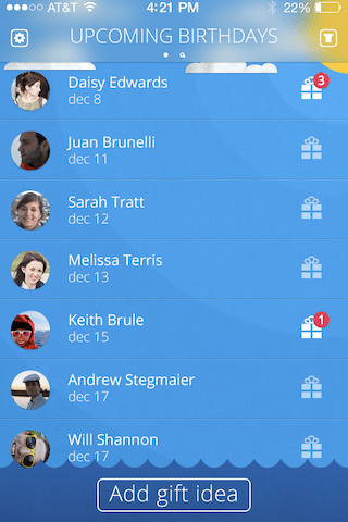
Here is a screen for one personal project I did to build my UI skills early in my career. Now, I can find a dozen things I’d improve about it, yet it was still a successful project – it furthered my skills, and even got some attention in my portfolio.
One easy way to pick a personal project is to choose a style tile that you particularly enjoyed working on, and expanding that into a more full-fledged app or website. There are basically three possible end-states here, which will affect how much of the design you complete before the point of diminishing returns:
- A personal learning project. This is something that you only do for your own educational edification – you don’t even necessarily plan to show it to anyone (or maybe you show more experienced designers in order to get feedback – see my offer below, for instance). You might skip a lot of the UX phase for a project like this, or ignore some real-world business constraints. Fine. This is largely about developing your visual skills – color, typography, etc. For the most bang for your buck, focus on the “main screens” of the app for projects like these – homepage, profiles, dashboards, feeds, articles – wherever the user would spend the bulk of their time.
- A portfolio project. For a project you’re particularly proud of and design out in its entirety, you might consider putting it on your portfolio. This is getting a bit beyond the scope of this article, but you’ll basically want to design out the entire app – not only the main screens, but also auxiliary experiences such as error states, loading pages, first-time-using-the-app flows, etc. I’ll be writing more on creating a solid portfolio on Design Hacks.
- A real app or site. If you or a partner have the development skills, what started as a quick project might become a real app. This is really beyond the scope of this article, but as you work on these 5 exercises over time, you will start to find yourself closer and closer to completing a real app. At that point, it might be time to graduate to a real curriculum.
Nonetheless, creating some realistically-branded screens for personal project apps will tie together everything you’ve done so far – the design details you’ve noticed and recorded, the lessons you’ve gained from copying the pros, the fonts you’ve collected, and the styles you’ve put together.
WEEKLY EXERCISE 5:
Drawing from the style tiles you’ve created in Exercise 4, design 1-3 screens of an app/website that you’re most interested in working on.
Getting Started Now
Alright, this post is going on 5,000 words, so I’d better wrap it up. If you want to start your journey to learn UI design today, here are the resources that will help you get started today:
General resources:
- A design app. All of these have free options with restrictions, but none are truly free for long-term use. Most recommended first:
- Figma. Web-based, free if you’re the only editor (plus 3 files where you can invite co-editors).
- Sketch. Has a 30-day free trial, but is $99/year after that (for as long as you want to receive updates, which is optional). Mac only.
- Adobe XD. Free for Windows and Mac, but less fully-featured than the above options.
- Evernote. Amazing software for creating fully-searchable “notebooks” of multimedia content. Can use on phone or desktop. Free plan covers 2 devices and 60 MB of content a month. Great option for tracking sites you like/dislike and reflections why, as well as reflections on copywork.
- My copywork bucket on dribbble. This is where I store dribbble shots of the things I’ve either done copywork on or want to. If you’re not sure where to start with copywork, try here!
Resources for identifying fonts:
- I have a full list of font-identifying tools here
Resources for managing fonts:
- FontBase. A freemium cross-platform font manager. Allows you to browse and search all Google fonts, in addition to local ones that you sync. Good option; definitely not perfect.
- Font Book. The default Mac Font manager. This is good enough to start with if you want to keep it simple. Most powerful feature? The ability to group fonts into categories.
And here is the weekly program of exercises. This pace assumes you can’t devote more than an hour or two per day learning UI design. If you’re available full-time, you should start feeling more confident in your design skills within a day. If you can only eke out an hour here or there, no problem, go at a pace you can maintain – AND MAINTAIN IT.
- List 5 sites or apps with good UI design, and 1-2 with bad design. For each, articulate in your own words why you believe it works or doesn’t work.
- Copy the UI of a good site/app pixel-for-pixel. At the end, write down specific techniques the creator used that “expand your design vocabulary”.
- Record any fonts you particularly like, noting characteristics like when they seem to work well and where you’ve seen them.
- Create 2-3 style tiles for fonts in your database that you particularly want to experiment with. Think of a concept for a site, then design out a style tile featuring:
- Realistic font choices and text elements (e.g. headers, navigational elements, body text)
- Appropriate color palette
- Example form controls or imagery
- Logo (optional)
- Design 1-3 screens of an app/website that you’re most interested in working on.
An offer for you
I’d also like to make an offer to you. From the beginning of this article, I’ve said that I want you to spend 90% of the time designing and only 10% of the time reading about design. I realize that is hard, and that the vast majority of people on this page will close the tab, no thanks, time to read another article.
So if you’re one of the few to take me up on these exercises, you start your weekly regimen of learning UI design, and you find yourself needing help, tweet me your question. If I see you’re putting in the work to do these exercises, I will answer your question, full-stop, 100%.
One thing: why twitter? Because it’s public. If our discussion can benefit others, I’d love for others to see it.
But go on and get started. You’ve already read for what, 15 minutes? That’s already couple hours of work before you can go on reading this stuff. What will you choose? – analysis, copywork, finding fonts?
It’s time to start honing your craft. You got this.
Watch me do a UI project
step-by-step
I’ll walk you through every part of a UI project — just like I’ve done for everyone from Fortune 100 companies to Y-Combinator startups.
Exclusive design tutorials. Over 50,000 subscribed. One-click unsubscribe.